

Laws of UX outside the screens
source link: https://uxplanet.org/laws-of-ux-outside-the-screens-d44298c85d94
Go to the source link to view the article. You can view the picture content, updated content and better typesetting reading experience. If the link is broken, please click the button below to view the snapshot at that time.
Laws of UX outside the screens
Applications in digital and real-world

UX Laws or the Principles of User Experience are a few guidelines designers can follow to create more user-centric and usable interfaces. The UX Laws can be defined as ‘blueprints’ of how we perceive and process the world around us.
Some principles have existed for a long while, while some recently came into the picture. Interestingly, these principles of usability and psychology are still valid with the modern world and technology. These laws are well documented in this amazing website, Laws of UX, by Jon Yablonski.
UX laws are usually perceived as something that could only be applied in the world of design. I believe these laws are being used in the real world, knowingly or unknowningly.
In this article, I aim to communicate how and where I have experienced these laws in the world. Let's go!
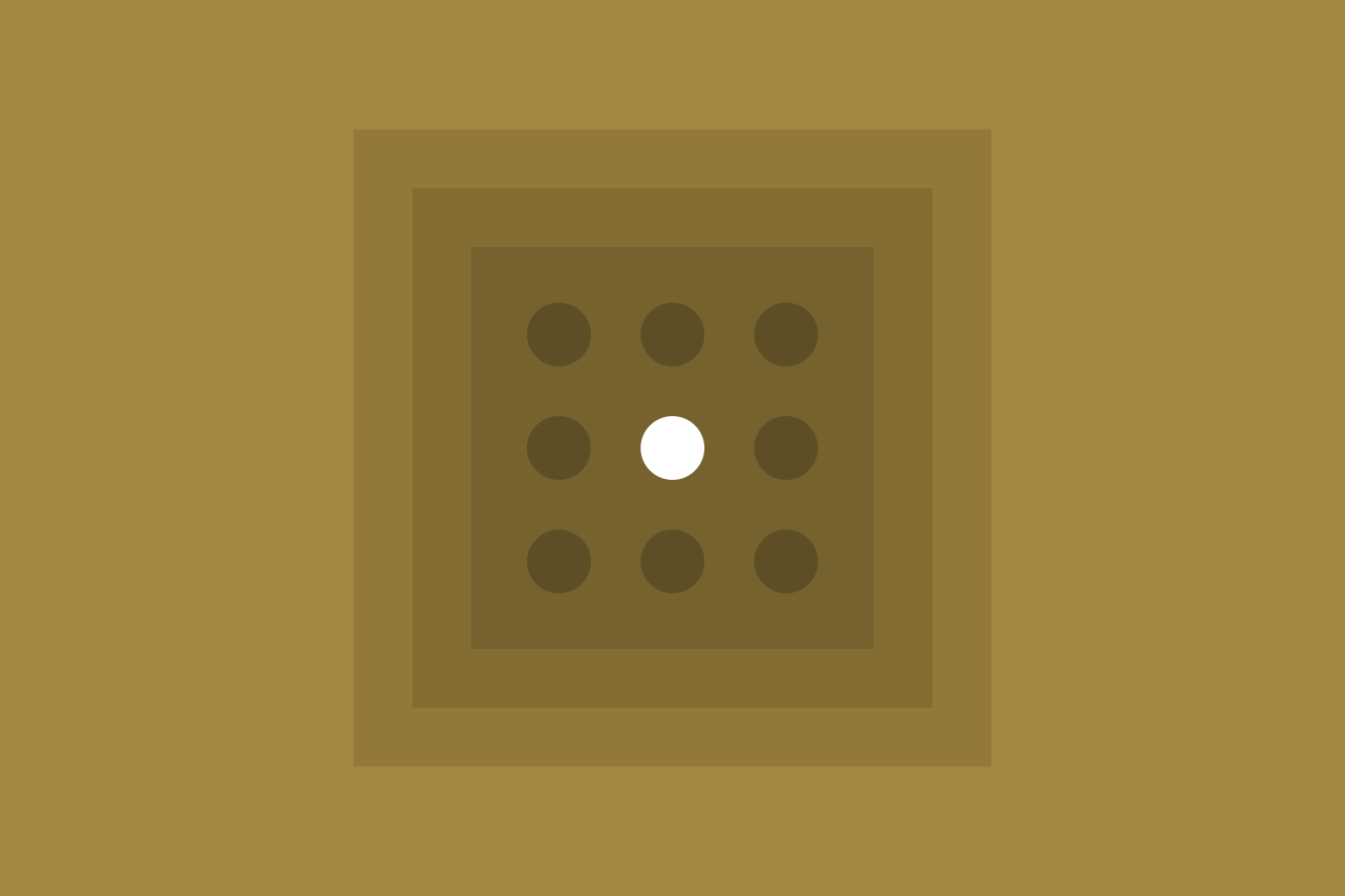
Fitts law

The time to acquire a target is a function of the distance to and size of the target.
Real-world use

The office desk
You need to join a few papers together; paper clips would be harder to find than a stapler on your desk. Similarly, spotting a particular pen on a desk across the room would be more difficult than spotting it on the desk next to you.
In a public mall
Finding the restroom sign in a mall depends on the sign's size and its distance/visibility from the walking spaces. To meet both these criteria, the signages are designed to be bigger and more accessible.
Design use

UI on the left: the CTA (button) is small in size, not highlighted and almost indistinguishable from the rest of the form. It will be time taking for the user to click on or even notice the CTA.
UI on the right: the CTA is large in size and clearly distinguishable. It is clearly identified and thus defines the task to be performed.
Hick’s law

The time it takes to make a decision increases with the number and complexity of choices.
Real-world use

At a Fast food chain 🍔
A fast-food chain offers limited options in its menu, compared to a restaurant. As a result, customers order their meals faster, and the outlet provides faster service. You walk into CCD; you will probably order a coffee.
Design use

While forwarding a message on Whatsapp, you see the Frequently contacted section above the whole list of Recent chats. Suppose you usually forward memes to a friend after work; you don’t have to scroll through all the recent chats. Those contacts will be in the 3 frequently contacted section; this becomes an easy interaction for the user.
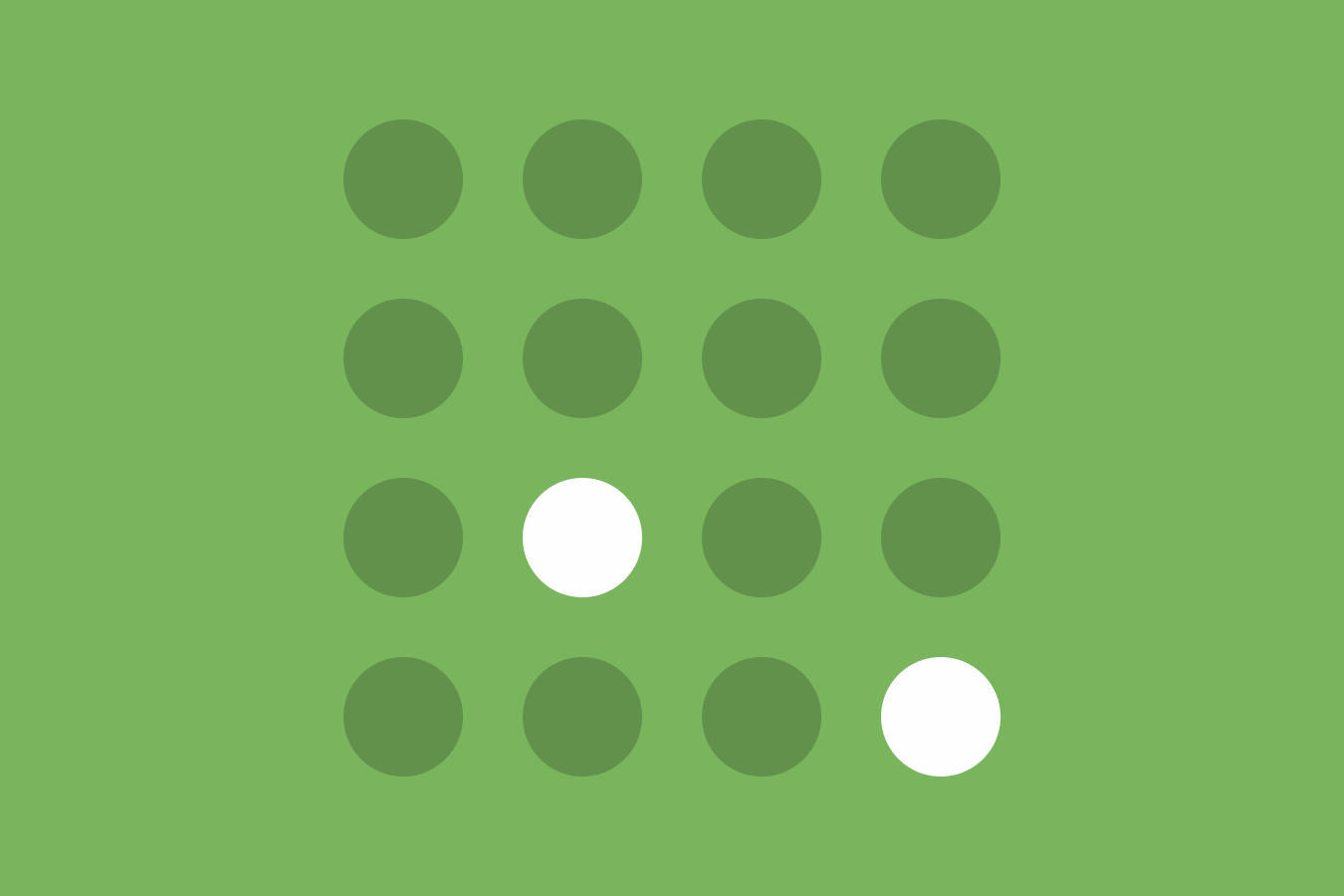
Law of Common region
Elements tend to be perceived into groups if they are sharing an area with a clearly defined boundary.
Real-world use

Walk into a clothes shop
You see the clothes grouped into different shelves for showcasing. Even if you know nothing about the shop, you will associate the items within one shelf to be similar. As you walk up to a shelf and see a shirt 👕 , you will know that all the items on that section are shirts 👕 .
Design use

Grouping the elements into certain boundaries on Myntra. You can clearly differentiate the filter/sort options from the Product search results on the search result page.
Because the filters are closed off into a separate boundary than the product pages, you can clearly identify the difference between the two sections.
Jakob’s Laws

Users spend most of their time on other sites. This means that users prefer your site to work the same way as all the other sites they already know.
Real-world use

Hotel door🚪
When you visit a hotel, you expect objects to function the same way they do in your home.
Suppose the balcony entry in your house is a push door; you might expect the hotel’s balcony door to function the same way (push). Thus, if you have a sliding door in your hotel, you would accidentally push it first.
Design use

Here are some navigation bars of famous E-commerce websites in India- Amazon, Flipkart, Myntra, Snapdeal and Paytm. The information presented in the navbar and its structure is similar in all the examples.
The logo of the brand on the left; search bar on the centre; other options like profile and category on the right.
Serial Position Effect
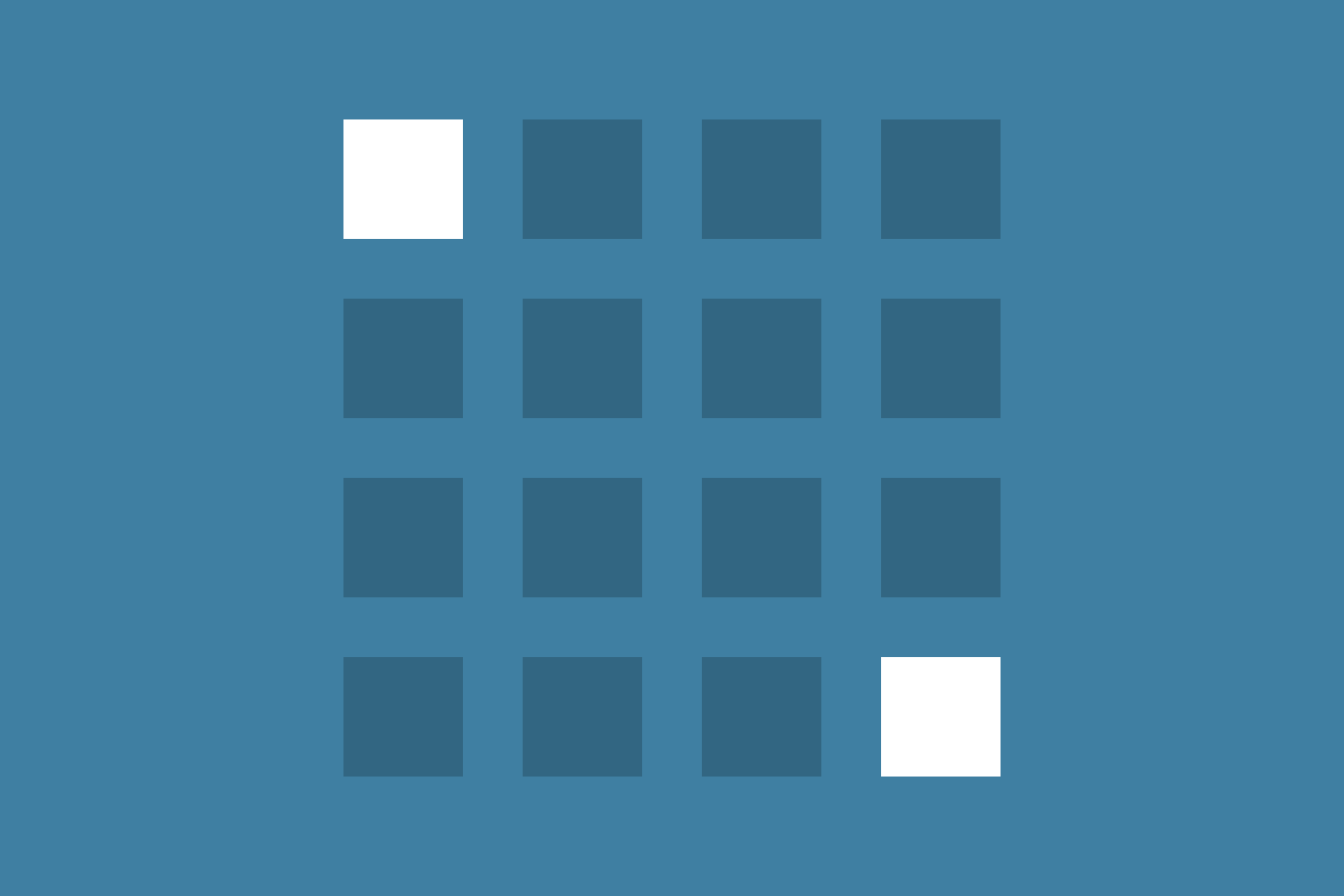
Users have a propensity to best remember the first and last items in a series.
Real-world use
Phone number
While trying to remember a friend’s number. You often remember it as the first 4 digits of their number or the last 3 digits. This law is also why a credit card number is chunked into groups of 4 digits.

Look at this list
If you look at the list above for a quick second and then it goes away. You are more likely to remember- the first few items or the last few items. You can try this yourself.
Design use

Let us consider the Amazon India homepage. The first section of the website always displays the most important things-
- The header contains logo, search, other important functionality
- Then comes the carousel, which catches the user’s gaze through some graphics towards some fresh deals or offers.
Von Restorff Effect
The Von Restorff effect, also known as The Isolation Effect, predicts that when multiple similar objects are present, the one that differs from the rest is most likely to be remembered.
Real-world use
Shopping in a mall
Creative flyers/arrangements are made with bold, bright colours and are huge in size. So while shopping, your attention goes to it. You are more likely to remember or notice a brand in a neon light green colour, having huge text in white rather than a grey coloured flyer with black text.
Walking through a street in Bangalore
Suppose you are walking on a street with many contemporary houses having glass facades. You spot one house in bright yellow colour with a slant roof and traditional architecture.
You will remember the street by that one unique house. Even when you describe that place to your friends, this is what you’ll tell them.
Design use

An alert on Whatsapp (or any app) is displayed on your phone like this. The app with alerts is clearly highlighted and thus catches your attention to click on the app and view the messages.
CTAs are designed visually distinctive from the page to be eye-catching and thus define a clear intention of the form or the page. If the CTA is not distinguishable, the user might not complete the task at hand.
Aesthetic usability effect
Users often perceive aesthetically pleasing design as design that’s more usable.
Real-world use

Visually attractive car showroom.
While visiting a car showroom for a luxury brand, you care less about the vehicle's functionality. Of course, before buying a car, you would discuss and learn about the specifications. But while in the showroom, you are in awe of the display and instantly feel positive about the car.
Design use

When you visit a clean minimal website like Airbnb, you subconsciously start trusting the product. This ensures the users’ trust in the brand.
On Airbnb, we are living in a strangers’ house for the night. So, building trust from both ends is necessary. I wouldn’t want to book the same room from a sketchy website.
Peak-end Rule
People judge an experience largely based on how they felt at its peak and at its end, rather than the total sum or average of every moment of the experience.
Real-world use

Football match
During a football match, the experience would be judged by the end of the match (who won) and the peak of the match (who scored the most goals/most exciting moment of the match).
Design use

Ordering a pizza at 2 AM
You are famished and can’t wait to destroy that Pizza. You browse the Pizza ordering app for 10 minutes and select your favourite pizza. You are at the peak of your hunger, which has since increased by seeing all the food. You order the Pizza, and the payment fails.
Now, it doesn’t really matter how good the application was or how beautifully the interface was designed. In the end, you couldn’t order your pizza, and that result is your takeaway from this experience.
Blog post by Jon Yablonski:
In the last 3 years, I have read a ton of stuff about UX Laws and how they are applied. I tried to sum up real-life interactions where I thought these laws applied by design or coincidence. I hadn’t read any previous articles mentioning real-life sources, so it was fun to think of and present these before you.
Wanna talk more about Design or Photography? Feel free to get in touch with me at: [email protected]
Recommend
About Joyk
Aggregate valuable and interesting links.
Joyk means Joy of geeK