

UI & UX micro-tips: Volume seven
source link: https://uxdesign.cc/ui-ux-micro-tips-volume-seven-d4c8154a15e4
Go to the source link to view the article. You can view the picture content, updated content and better typesetting reading experience. If the link is broken, please click the button below to view the snapshot at that time.
UI & UX micro-tips: Volume seven
A collection of handy tips to help improve your designs instantly.

The smallest changes can make a massive difference in creating efficient, accessible, and beautiful user interfaces.
In this follow-up article, I’ve provided you with another set of easy-to-implement UI & UX micro-tips.
Tips that can improve both your designs and the user experience with minimal effort.
Quick Note: Want even more UI & UX Micro-Tips? Then check out my previous articles below…
Let’s dive on in…
1. Keep your messages short and sweet. Cut out the fluff.
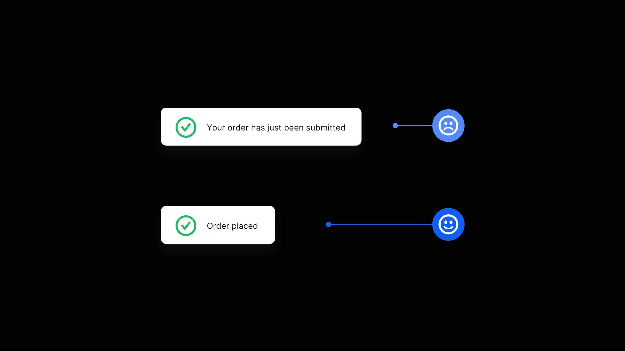
Always try to keep those messages short and to the point, and talk to the user in a voice they’ll easily understand.
If there’s no requirement for any jargon-speak, then cut it out. Avoid the fluff.
Presenting clear and concise messages to the user will assist them better in achieving their desired goals.
2. Give 20pt a try when you’re creating long-form content.

For long-form content (i.e., articles, project descriptions, etc.), use 20pt (or even a little more) for your Body copy.
This depends, of course, on the Typeface used, but most popular Body Typefaces look great at 20pt and provide a significantly better reading experience for your users when they’re presented with a wall of text.
3. Don’t rely on just colour alone to convey information with error messages.

As powerful as colour can be in your designs, don’t always rely on colour alone to convey important information to the user.
For example, with form error states, choosing the ‘imagination-free’ red border isn’t helpful enough for a large section of users.
Bringing something like an icon and descriptive text into the mix will convey your message in more detail and aid accessibility at the same time.
4. Create a harmonious vertical rhythm with the 4pt Baseline & 8pt Grid.
When it comes to Type, combining the 4pt Baseline Grid with the 8pt Grid results in a much more harmonious vertical rhythm across your designs.
Align type to a 4pt Baseline Grid, which employs a line-height value that is a multiple of 4 (4, 8, 12, 16, 20, and so on).
Why 4? For me, scaling my Baseline Grid in multiples of 8 in the past has pushed the lines too far apart when working with specific type sizes, whereas using the 4pt Baseline Grid provides more fine-grained control and significantly better results.
5. Decrease the letter spacing, and line height on those Headings.

As opposed to long-form body text, headings are typically much shorter, allowing you to reduce the line height spacing a little.
They’re also most likely to be a much bigger font size, with the spacing between the letters appearing optically larger, so reducing the letter-spacing will help your headings look more visually balanced.
Go ahead and decrease that letter spacing and line height on your headings for optimal readability.
6. Use multiple shadows, or a subtle border to make those elements pop!

Using multiple drop shadows or a very subtle 1px border (just a shade or two darker than your actual shadow) around certain elements can make them appear sharper and more defined.
Following this simple method can make your elements pop a little more, help avoid those muddy-looking shadows, and bring a subtle touch of polish to your designs.
With this short collection of tips, I hope you’ve realised how even minor adjustments to your designs can produce improved results for both yourself and your users.
Also, did you know you can build stunning UIs with my Design System; Cabana for Figma & Cabana for Sketch. Special Offer: Please use the code CABANA35 to receive 35% OFF. ENDS SOON.
Originally published at marcandrew.me on July 20th, 2021.
Recommend
About Joyk
Aggregate valuable and interesting links.
Joyk means Joy of geeK