

examples of remaking confusing data visualizations — storytelling with data
source link: https://www.storytellingwithdata.com/blog/2021/1/17/multitudes-of-makeovers
Go to the source link to view the article. You can view the picture content, updated content and better typesetting reading experience. If the link is broken, please click the button below to view the snapshot at that time.
Submissions from Dec 2020 SWDchallenge: critique, then re-create
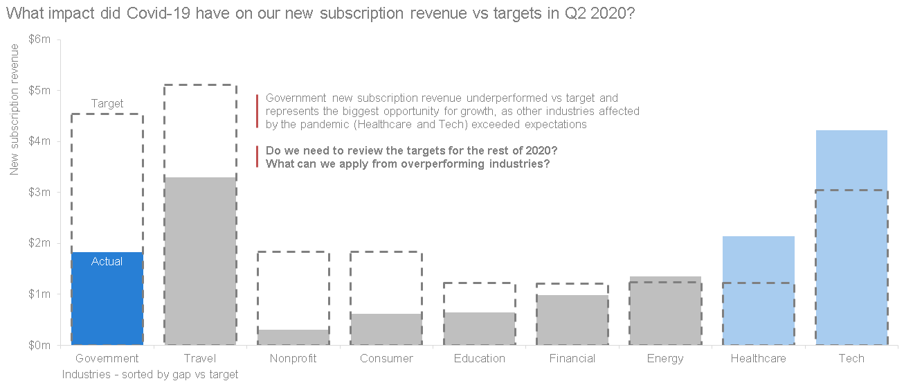
Recently, SWD has had makeovers on the brain. We launched a new makeover page full of tips and examples of effective data storytelling and we’re gearing up for another year of customized workshops, where we’ll illustrate the storytelling with data lessons by remaking examples from client organizations. Last month, we challenged you to flex your own makeover muscles by first critiquing, then re-creating this confusing visual.
This proved to be a popular challenge, as 67 people submitted their recreations. While browsing all the entries in the community, I was reminded of one of Cole’s guiding principles: there is no single “right” answer in data visualization. Two different people can approach the same challenge in very different ways and both produce an effective visual. With this challenge, we saw that different choices along many different dimensions led to a variety of effective, yet completely different, transformations.
With that said, let’s look at some overarching themes in this month’s makeovers.
First, critique thoughtfully
It’s easy to immediately jump into what’s “wrong” with someone else’s work. This challenge was two-fold for that reason: by requiring ourselves to deliver a thoughtful critique up front, we get the benefit of having a thorough, articulated assessment not only of what is “wrong,” but what is right, what is the goal, and what can be done to make the intended message more compelling and obvious. Not only is this a valuable skill to develop in providing feedback to others, but it can also be applied to your own work to great effect.
Ngarie’s critique surfaced a key point in any effective graph (what is its overarching purpose?) while Jozef and Izzy effectively transferred their thoughtful points of critique into their well-executed redesigns. Cole outlined a series of questions that she’d pose to the creator, exemplifying a Socratic approach to giving feedback.
Clustered bar makeover by Jozef Melichar
Don’t overcomplicate your graph choice
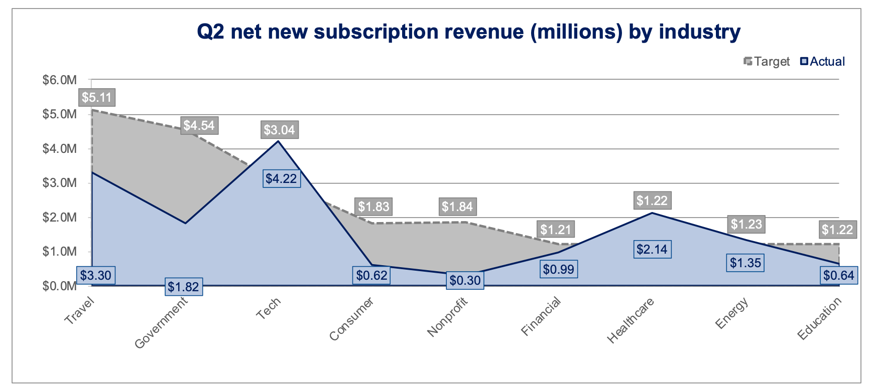
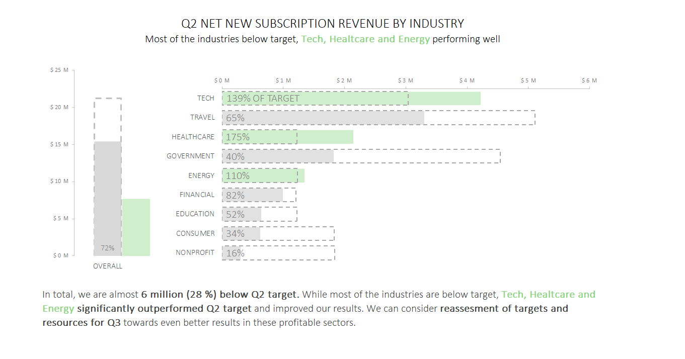
Since the data being plotted is categorical, a majority of participants commented how much more effective a bar chart would be to enable a sense of how each industry compares to the others and to its target. We saw many flavors of bars, including standard vertical and horizontal orientations, pairwise, stacked, bullet graphs, and even a waterfall.
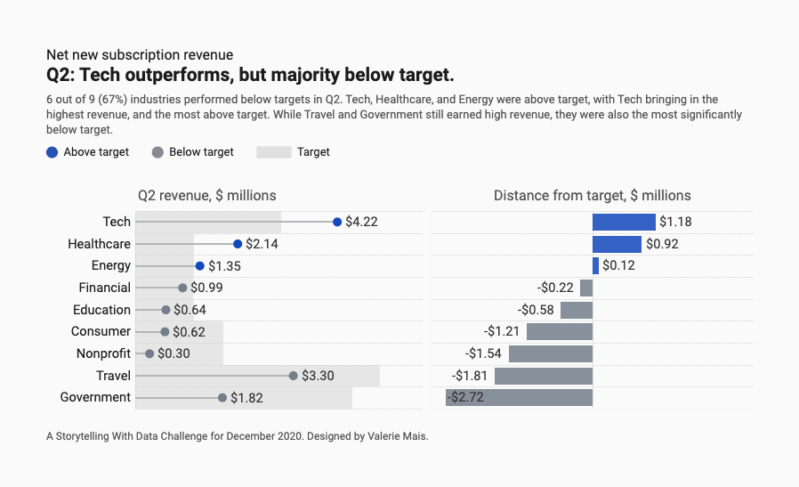
Allison’s vertical bars paired nicely with her effective use of words and color, while Remi evoked a sense of tension and action with red as his emphasis color. Syed, Sam and Pris incorporated the target effectively in their respective designs to provide an appropriate frame of reference.
Variance with bars by Allison Harris
Stacked column by Sam Cialis
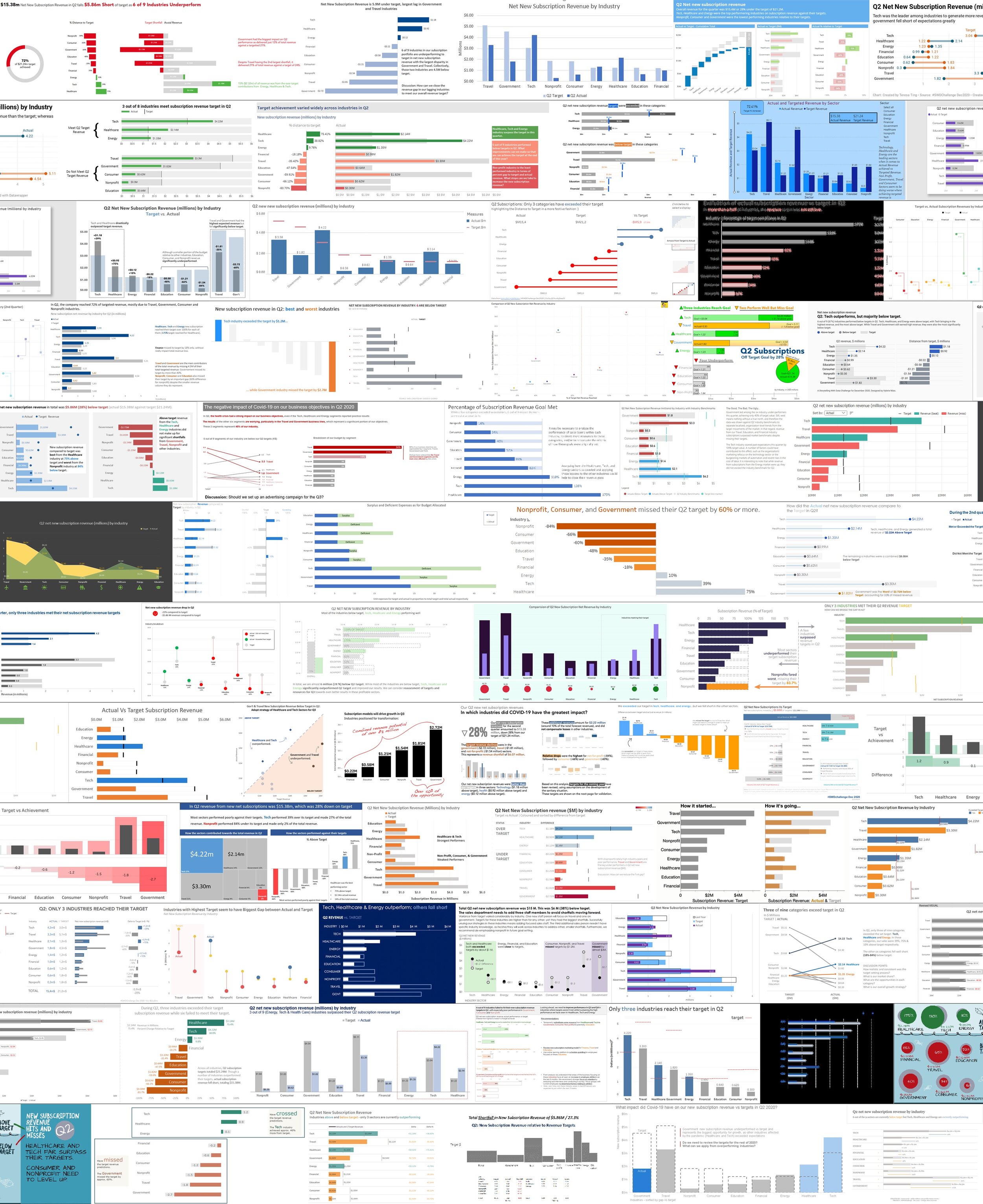
While over 80% of entries were bars, other graph types were also effective in drawing the reader in. Check out how Robyn compared actual vs target with a slopegraph, while Kuan-Pei and Charles emphasized the difference with a dotplot and lollipop, respectively. Matt’s creative bubble chart was a popular entry—showing that more whimsical approaches can be effective in certain situations if applied intentionally.
Clean designs make your audience’s job easier
Take time to consider how your layout might provide subtle (or overt) cues to your audience, so they don’t miss the important stuff. Design aspects such as affordances (characteristics that reveal how something should be used) and accessibility and aesthetics are what create stellar, effective data visualizations. For example, John used annotations and enclosures to effectively focus the audience’s attention in his bullet chart. Valerie used white space effectively in her combination lollipop/bars. Alan iterated through a few different ways to pair enclosure and proximity with annotations.
Words are your friend
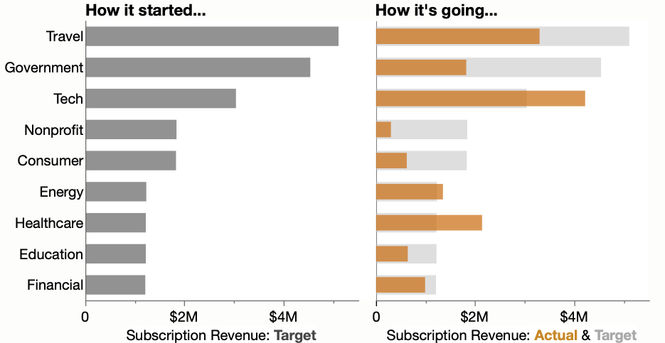
In explanatory visualizations, words are more important than we may realize. Many participants commented on how they were left wondering “what is the point?” and how a few words could point an intended audience in the appropriate direction. Xan played off the popular “how it started/how it’s going” meme, using humor to create an attention-grabbing submission and Ashley made the “so-what?” unmistakable, pairing a strong call to action with explicit annotations throughout her re-design.
Xan’s pithy chart headers
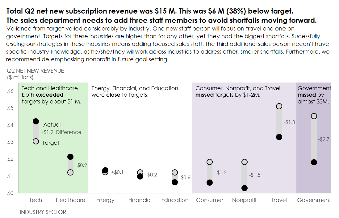
Ashley liberally and effectively incorporated words
It was a ton of fun to see the various approaches and makeovers this month. A big thanks to everyone who took the time to participate. You can check out all sixty-seven entries in the community—be sure to participate by leaving comments and datapoints on those you like. The next challenge—visualize your resume—is underway now: we look forward to seeing what you create!
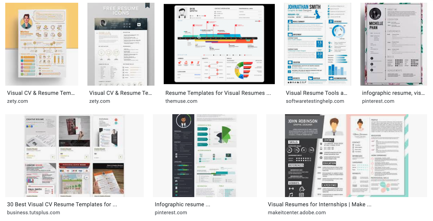
January 2021 challenge: create and share a visual resume
Don’t miss our next live event on January 26th: become a data viz superstar. Cole will share strategies to help establish yourself as a go-to resource or internal expert, or guide your team to do so. This session is open to premium members of the SWD community so upgrade today to secure your spot.
Recommend
About Joyk
Aggregate valuable and interesting links.
Joyk means Joy of geeK