

Tabletop mode on foldable devices
source link: https://medium.com/androiddevelopers/tabletop-mode-on-foldable-devices-d091b3c500b1
Go to the source link to view the article. You can view the picture content, updated content and better typesetting reading experience. If the link is broken, please click the button below to view the snapshot at that time.
Tabletop mode on foldable devices
Unfolding your video player experience
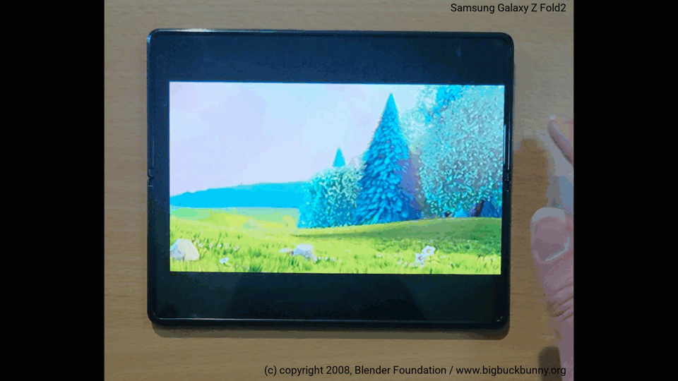
Foldable devices offer users the possibility to do more with their phones, including innovations like the Tabletop mode¹, where the phone is placed on a surface with the hinge in a horizontal position, and the folding screen is in a partially opened state.
Tabletop mode is convenient when you want to use the phone without holding it in your hand. It’s great for watching media, making video calls, taking pictures and even gaming.
A great example is the optimization that the Google Duo team did on their app to work well on tablets and foldable devices.
In this blog post you will learn a simple and efficient way to adapt your app’s layout when it runs on foldable devices.
The example is a simple media player that automatically adjusts its size to avoid having the fold in the middle of the image, and switches the location of its transport controls from embedded in-video when the screen is completely flat, to a separate panel when the device is folded, as shown in the video below:
Ingredients
The sample app uses Exoplayer, a popular open source media playback library for Android, and these Jetpack components:
- MotionLayout, a subclass of ConstraintLayout. It combines the flexibility of the parent class with smooth animations of the views during the transition from one posture to the other.
- ReactiveGuide, an invisible component that positions itself automatically when a SharedValue changes. It works with a Guideline helper.
- WindowManager, a library that helps app developers support new device form factors and provides a common API surface for different window features.
To use these libraries you must add the Google Maven repository to your project and declare these dependencies:
Layout
Consider the layout of the video player Activity, the root element is a MotionLayout that contains three child views.
Two views are from the Exoplayer suite, which allows you to specify different layouts for the PlayerView (the surface where the media is displayed) and the PlayerControlView (the container of the playback controls).
The third view is a ReactiveGuide. It is placed between the other two views and works as a Guideline, a separator between the views.
The main PlayerView is constrained to always be at the top of the ReactiveGuide. In this way, the layout transition will happen when you move the guide from the bottom of the screen to the position of the fold.
You might also want to constrain the control view to always beat the bottom of the ReactiveGuide. In this way the control view is hidden when the screen is flat, but it appears at the bottom part of the phone when the screen is partially open.
Note the attribute layout_constraintGuide_end on line 28. This is the value you need to change to move the guideline. Since the ReactiveGuide is horizontal, this attribute represents the distance of the guideline to the bottom of the parent.
Make your app fold-aware
Now the most important part: how to know when the phone is in tabletop mode and how to get the position of the fold?
After it is initialized, the WindowManager library allows you to listen for layout changes by collecting the Flow<WindowLayoutInfo> exposed by the function WindowInfoRepo.windowLayoutInfo():
If you want to know more about how to initialize and release an Exoplayer instance, see the Exoplayer codelab.
Every time you get a new layout information, you can query the display features and check if the device has a fold or hinge in the current display:
Note that if you don’t want to use Kotlin Flows, starting with the 1.0.0-alpha07 release, you can use the window-java artifact that exposes Java-friendly APIs to register and unregistered callbacks or the window-rxjava2 and window-rxjava3 artifacts for RxJava-adapted APIs.
A device can be used in tabletop mode if the orientation is horizontal and FoldingFeature.isSeparating() returns true.
When this is the case, you can calculate the relative position of the fold and move the ReactiveGuide to that position, while moving it to 0 (bottom of the screen) otherwise.
When you call the function fireNewValuein this way, the library changes the layout_constraintGuide_endattribute. When the device is flat the whole screen should be reserved for the main PlayerView.
The last question is: where should you move the ReactiveGuide when the device is folded?
The FoldingFeature object exposes the method getBounds() to retrieve the bounding rectangle of the feature within the window coordinate space.
If you are dealing with a horizontal feature, most of the time the bounds will be represented by a Rect positioned in the vertical center of the screen, as wide as the screen and with height equal to the size of the hinge (this value could be 0 in case of a foldable screen or can be equal to the distance between the screens in dual screen devices).
If your app is in full screen mode, you can constrain the PlayerView to be at the top of FoldingFeatures.getBounds().top and the ControlView at the bottom of FoldingFeatures.getBounds().bottom.
In any other situation (not full screen) you need to account for the space occupied by the navigation bar and any other UI components on the screen.
In order to move the guideline, you must specify its distance from the bottom of the parent. One possible implementation of the function that calculates the right position for the ReactiveGuide looks like this:
Summary
In this article you learned how to improve the user experience for your media app on foldable devices by implementing a flexible layout that supports tabletop mode.
Stay tuned for the next articles on development guidance for different form factors!
[1] Tabletop mode is also known as Flex mode on the Samsung Galaxy Z series foldable smartphones.
Recommend
About Joyk
Aggregate valuable and interesting links.
Joyk means Joy of geeK