
2

Fully customizable and easy to use radio button group
source link: https://reactnativeexample.com/fully-customizable-and-easy-to-use-radio-button-group/
Go to the source link to view the article. You can view the picture content, updated content and better typesetting reading experience. If the link is broken, please click the button below to view the snapshot at that time.
react-native-animated-radio-button-group
Fully customizable, animated & easy to use radio button group.
Installation
Add the dependency:
npm i react-native-animated-radio-button-group
Peer Dependencies
IMPORTANT! You need install them"@freakycoder/react-native-bounceable": ">= 0.2.5",
"react-native-animated-radio-button": ">= 0.0.4"
Usage
Import
import RadioButtonGroup from "react-native-animated-radio-button-group";
Usage
Data is just an example, you can customize each radio button with data itself. You must use the IRadioButton data model for customize the radio buttons. They take all props which is available on React Native Animated Radio Button.
Data Model
export type IRadioButton = {
  id: number,
  color: string,
  outerStyle?: ViewStyle,
  innerStyle?: ViewStyle,
};
Example Usage
<RadioButtonGroup
  initial={2}
  data={data}
  horizontal
  onChange={(item) => console.log("Selected Item: ", item)}
  onPress={() => {}}
/>
Example Data Array
const data: Array<IRadioButton> = [
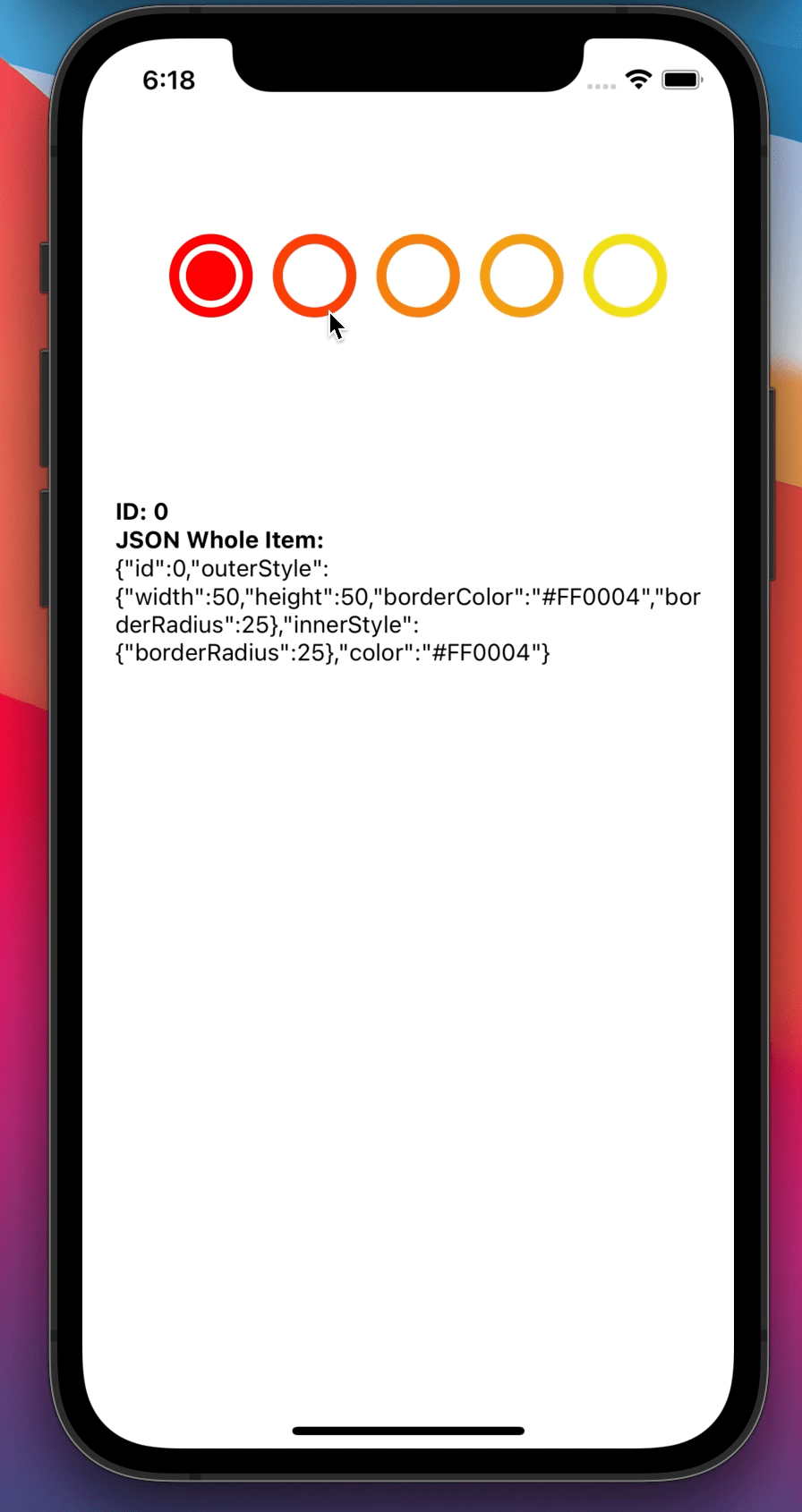
{
id: 0,
outerStyle: {
width: 50,
height: 50,
borderColor: "#FF0004",
borderRadius: 25,
},
innerStyle: {
borderRadius: 25,
},
color: "#FF0004",
},
{
id: 1,
outerStyle: {
width: 50,
height: 50,
borderColor: "#FB4009",
borderRadius: 25,
},
innerStyle: {
borderRadius: 25,
},
color: "#FB4009",
},
{
id: 2,
outerStyle: {
width: 50,
height: 50,
borderColor: "#F6800F",
borderRadius: 25,
},
innerStyle: {
borderRadius: 25,
},
color: "#F6800F",
},
{
id: 4,
outerStyle: {
width: 50,
height: 50,
borderColor: "#F4A012",
borderRadius: 25,
},
innerStyle: {
borderRadius: 25,
},
color: "#F4A012",
},
{
id: 5,
outerStyle: {
width: 50,
height: 50,
borderColor: "#F0E017",
borderRadius: 25,
},
innerStyle: {
borderRadius: 25,
},
color: "#F0E017",
},
];
Configuration - Props
Property Type Default Description initial number 0 default selection of the radio button group data Object Array null creates and customize each radio button for the group onChange function undefined you can make your business logic or get the selection of the data from this function onPress function undefined onPress function for each of themFuture Plans
- LICENSE
- TypeScript Challenge!
- Write an article about the lib on Medium
Author
FreakyCoder, [email protected]
GitHub
https://github.com/WrathChaos/react-native-animated-radio-button-group
Recommend
About Joyk
Aggregate valuable and interesting links.
Joyk means Joy of geeK