

Andrew Wheeler | Crime Analysis and Crime Mapping
source link: https://andrewpwheeler.com/
Go to the source link to view the article. You can view the picture content, updated content and better typesetting reading experience. If the link is broken, please click the button below to view the snapshot at that time.

Some microsynth notes
Nate Connealy, a criminologist colleague of mine heading to Tampa asks:
My question is from our CPP project on business improvement districts (Piza, Wheeler, Connealy, Feng 2020). The article indicates that you ran three of the microsynth matching variables as an average over each instead of the cumulative sum (street length, percent new housing structures, percent occupied structures). How did you get R to read the variables as averages instead of the entire sum of the treatment period of interest? I have the microsynth code you used to generate our models, but cannot seem to determine how you got R to read the variables as averages.
So Nate is talking about this paper, Crime control effects of a police substation within a business improvement district: A quasi-experimental synthetic control evaluation (Piza et al., 2020), and here is the balance table in the paper:

To be clear to folks, I did not balance on the averages, but simply reported the table in terms of averages. So here is the original readout from R:

So I just divided those noted rows by 314 to make them easier to read. You could divide values by the total number of treated units though in the original data to have microsynth match on the averages instead if you wanted to. Example below (this is R code, see the microsynth library and paper by Robbins et al., 2017):
library(microsynth)
#library(ggplot2) #not loading here, some issue
set.seed(10)

data(seattledmi) #just using data in the package
cs <- seattledmi
# calculating proportions
cs$BlackPerc <- (cs$BLACK/cs$TotalPop)*100
cs$FHHPerc <- (cs$FEMALE_HOU/cs$HOUSEHOLDS)*100
# replacing 0 pop with 0
cs[is.na(cs)] <- 0

cov.var <- c("TotalPop","HISPANIC","Males_1521","FHHPerc","BlackPerc")
match.out <- c("i_felony", "i_misdemea")

sea_prop <- microsynth(cs,
                       idvar="ID", timevar="time", intvar="Intervention",
                       start.pre=1, end.pre=12, end.post=16,
                       match.out.min=match.out,match.out=FALSE,
                       match.covar=FALSE,check.feas=FALSE,
                       match.covar.min=cov.var,
                       result.var=match.out)

summary(sea_prop) # balance table
And here you can see that we are matching on the cumulative sums for each of the areas, but we can divide our covariates by the number of treated units, and we will match on the proportional values.
# Can divide by 39 and get the same results
cs[,cov.var] <- cs[,cov.var]/39

sea_div <- microsynth(cs,
                      idvar="ID", timevar="time", intvar="Intervention",
                      start.pre=1, end.pre=12, end.post=16,
                      match.out.min=match.out,match.out=FALSE,
                      match.covar=FALSE,check.feas=FALSE,
                      match.covar.min=cov.var,
                      result.var=match.out)

summary(sea_div) # balance table
Note that these do not result in the same weights. If you look at the results you will see the treatment effects are slightly different. Also if you do:
# Showing weights are not equal
all.equal(sea_div$w$Weights,sea_prop$w$Weights)
It does not return True. Honestly not familiar enough with the procedure that microsynth uses to do the matching (Raking survey weights) to know if this is due to stochastic stuff or due to how the weighting algorithm works (I would have thought a linear change does not make a difference, but I was wrong).
On the bucket list is to do a matching algorithm that returns geographically contiguous areas and gives the weights all values of 1 (so creates comparable neighborhoods), instead of estimating Raking weights. That may be 5 years though before I get around to that. Gio has a nice map to show the way the weights work now is they may be all over the place (Circo et al., 2021) – I am not sure that is a good thing though.
But I did want to share some functions I used for the paper I worked with Nate on. First, this is for if you use the permutation approach, the function prep_synth returns some of the data in a nicer format to make graphs and calculate your own stats:
# Function to scoop up the data nicely
prep_synth <- function(mod){
    #Grab the plot data
    plotStats <- mod[['Plot.Stats']]
    #For the left graph
    Treat <- as.data.frame(t(plotStats$Treatment))
    Treat$Type <- "Treat"
    #This works for my data at years, will not
    #Be right for data with more granular time though
    Treat$Year <- as.integer(rownames(Treat))
    Cont <- as.data.frame(t(plotStats$Control))
    Cont$Type <- "Control"
    Cont$Year <- as.integer(rownames(Cont))
    AllRes <- rbind(Treat,Cont)
    #For the right graph
    Perm <- as.data.frame(t(as.data.frame(plotStats$Difference)))
    SplitStr <- t(as.data.frame(strsplit(rownames(Perm),"[.]")))
    colnames(SplitStr) <- c("Type","Year")
    rownames(SplitStr) <- 1:nrow(SplitStr)
    SplitStr <- as.data.frame(SplitStr)
    Perm$Type <- as.character(SplitStr$Type)
    Perm$Year <- as.integer(as.character(SplitStr$Year))
    Perm$Group <- ifelse(Perm$Type == 'Main','Treatment Effect','Permutations')
    #Reordering factor levels for plots
    AllRes$Type <- factor(AllRes$Type,levels=c('Treat','Control'))
    levels(AllRes$Type) <- c('Treated','Synthetic Control')
    Perm$Group <- factor(Perm$Group,levels=c('Treatment Effect','Permutations'))
    #Exporting result
    Res <- vector("list",length=2)
    Res[[1]] <- AllRes
    Res[[2]] <- Perm
    names(Res) <- c("AggOutcomes","DiffPerms")
    return(Res)
}
It works for the prior tables, but I really made these functions to work with when you used permutations to get the errors. (In the micro synth example, it is easier to work with permutations than in the state level example for synth, in which I think conformal prediction intervals makes more sense, see De Biasi & Circo, 2021 for a recent real example with micro place based data though.)
# Takes like 1.5 minutes
sea_perm <- microsynth(seattledmi,
                      idvar="ID", timevar="time", intvar="Intervention",
                      start.pre=1, end.pre=12, end.post=16,
                      match.out.min=match.out,match.out=FALSE,
                      match.covar=FALSE,check.feas=FALSE,
                      match.covar.min=cov.var,
                      result.var=match.out, perm=99)

res_prop <- prep_synth(sea_perm)
print(res_prop)
So the dataframe in the first slot is the overall treatment effect, and the second dataframe is a nice stacked version for the permutations. First, I really do not like the percentage change (see Wheeler, 2016 for the most direct critique, but I have a bunch on this site). So I wrote code to translate the treatment effects into crime count reductions instead of the percent change stuff.
# Getting the observed treatment effect on count scale
# vs the permutations

agg_fun <- function(x){
    sdx <- sd(x)
    minval <- min(x)
    l_025 <- quantile(x, probs=0.025)
    u_975 <- quantile(x, probs=0.975)
    maxval <- max(x)
    totn <- length(x)
    res <- c(sdx,minval,l_025,u_975,maxval,totn)
    return(res)
}

treat_count <- function(rp){
    # Calculating the treatment effect based on permutations
    keep_vars <- !( names(rp[[2]]) %in% c("Year","Group") )
    out_names <- names(rp[[2]])[keep_vars][1:(sum(keep_vars)-1)]
    loc_dat <- rp[[2]][,keep_vars]
    agg_treat <- aggregate(. ~ Type, data = loc_dat, FUN=sum)
    n_cols <- 2:dim(agg_treat)[2]
    n_rows <- 2:nrow(agg_treat)
    dif <- agg_treat[rep(1,max(n_rows)-1),n_cols] - agg_treat[n_rows,n_cols]
    dif$Const <- 1
    stats <- aggregate(. ~ Const, data = dif, FUN=agg_fun)
    v_names <- c("se","min","low025","up975","max","totperm")
    long_stats <- reshape(stats,direction='long',idvar = "Const",
                      varying=list(2:ncol(stats)),
                      v.names=v_names, times=out_names)
    # Add back in the original stats
    long_stats <- long_stats[,v_names]
    rownames(long_stats) <- 1:nrow(long_stats)
    long_stats$observed <- t(agg_treat[1,n_cols])[,1]
    long_stats$outcome <- out_names
    ord_vars <- c('outcome','observed',v_names)
    return(long_stats[,ord_vars])
}

treat_count(res_prop)
So that is the cumulative total effect of the intervention. This is more similar to the WDD test (Wheeler & Ratcliffe, 2018), but since the pre-time period is matched perfectly, just is the differences in the post time periods. And here it uses the permutations to estimate the error, not any Poisson approximation.
But I often see folks concerned about the effects further out in time for synthetic control studies. So here is a graph that just looks at the instant effects for each time period, showing the difference via the permutation lines:
# GGPLOT graphs, individual lines
library(ggplot2)
perm_data <- res_prop[[2]]
# Ordering factors to get the treated line on top
perm_data$Group <- factor(perm_data$Group, c("Permutations","Treatment Effect"))
perm_data$Type <- factor(perm_data$Type, rev(unique(perm_data$Type)))
pro_perm <- ggplot(data=perm_data,aes(x=Year,y=i_felony,group=Type,color=Group,size=Group)) +
            geom_line() +
            scale_color_manual(values=c('grey','red')) + scale_size_manual(values=c(0.5,2)) +
            geom_vline(xintercept=12) + theme_bw() +
            labs(x=NULL,y='Felony Difference from Control') +
            scale_x_continuous(minor_breaks=NULL, breaks=1:16) +
            scale_y_continuous(breaks=seq(-10,10,2), minor_breaks=NULL) +
            theme(panel.grid.major = element_line(linetype="dashed"), legend.title= element_blank(),
            legend.position = c(0.2,0.8), legend.background = element_rect(linetype="solid", color="black")) +
            theme(text = element_text(size=16), axis.title.y=element_text(margin=margin(0,10,0,0)))
And I also like looking at this for the cumulative effects as well, which you can see with the permutation lines widen over time.
# Cumulative vs Pointwise
perm_data$csum_felony <- ave(perm_data$i_felony, perm_data$Type, FUN=cumsum)
pro_cum  <- ggplot(data=perm_data,aes(x=Year,y=csum_felony,group=Type,color=Group,size=Group)) +
              geom_line() +
              scale_color_manual(values=c('grey','red')) + scale_size_manual(values=c(0.5,2)) +
              geom_vline(xintercept=12) + theme_bw() +
              labs(x=NULL,y='Felony Difference from Control Cumulative') +
              scale_x_continuous(minor_breaks=NULL, breaks=1:16) +
              scale_y_continuous(breaks=seq(-20,20,5), minor_breaks=NULL) +
              theme(panel.grid.major = element_line(linetype="dashed"), legend.title= element_blank(),
              legend.position = c(0.2,0.8), legend.background = element_rect(linetype="solid", color="black")) +
              theme(text = element_text(size=16), axis.title.y=element_text(margin=margin(0,10,0,0)))
If you do a ton of permutations (say 999 instead of 99), it would likely make more sense to do a fan chart type error bars and show areas of different percentiles instead of each individual line (Yim et al., 2020).
I will need to slate a totally different blog post to discuss instant vs cumulative effects for time series analysis. Been peer-reviewing quite a few time series analyses of Covid and crime changes – most everyone only focuses on instant changes, and does not calculate cumulative changes. See for example estimating excess deaths for the Texas winter storm power outage (Aldhous et al., 2021). Folks could do similar analyses for short term crime interventions. Jerry has a good example of using the Causal Impact package to estimate cumulative effects for a gang takedown intervention (Ratcliffe et al., 2017) for one criminal justice example I am familiar with.
Again for folks feel free to ask me anything. I may not always be able to do as deep a dive as this, but always feel free to reach out.
References
- Aldhous, P., Lee S.M., & Hirji, Z. (2021). The Texas Winter Storm And Power Outages Killed Hundreds More People Than The State Says. Buzzfeed 5/26/2021.
- Circo, G. M., Krupa, J. M., McGarrell, E., & De Biasi, A. (2021). Focused Deterrence and Program Fidelity: Evaluating the Impact of Detroit Ceasefire. Justice Evaluation Journal, 4(1), 112-130.
- De Biasi, A., & Circo, G. (2021). Capturing Crime at the Micro-place: A Spatial Approach to Inform Buffer Size. Journal of Quantitative Criminology, 37(2), 393-418.
- Piza, E. L., Wheeler, A. P., Connealy, N. T., & Feng, S. Q. (2020). Crime control effects of a police substation within a business improvement district: A quasi-experimental synthetic control evaluation. Criminology & Public Policy, 19(2), 653-684.
- Ratcliffe, J. H., Perenzin, A., & Sorg, E. T. (2017). Operation Thumbs Down: A quasi-experimental evaluation of an FBI gang takedown in South Central Los Angeles. Policing: An International Journal of Police Strategies & Management 40(2), 442-458.
- Robbins MW, Saunders J, Kilmer B (2017). A framework for synthetic control methods with high-dimensional, micro-level data: Evaluating a neighborhood-specific crime intervention, Journal of the American Statistical Association, 112(517), 109-126.
- Wheeler, A. P. (2016). Tables and graphs for monitoring temporal crime trends: Translating theory into practical crime analysis advice. International Journal of Police Science & Management, 18(3), 159-172.
- Wheeler, A. P., & Ratcliffe, J. H. (2018). A simple weighted displacement difference test to evaluate place based crime interventions. Crime Science, 7(1), 1-9.
- Yim, H. N., Riddell, J. R., & Wheeler, A. P. (2020). Is the recent increase in national homicide abnormal? Testing the application of fan charts in monitoring national homicide trends over time. Journal of Criminal Justice, 66, 101656.
PCA does not make sense after one hot encoding
Here is a general data science snafu I have seen on multiple occasions. You have some categorical variable with a very high cardinality, say 1000 categories. Well, we generally represent categorical values as dummy values. Also for high cardinality data, we often use PCA to reduce the number of dimensions.
So why not one hot encode the data and then use PCA to solve the problem? As the title of the post says, this does not make sense (as I will show in a bit). Here on the data science stackexchange we have this advice, and I have gotten this response at a few data science interviews so far. So figured a blog post why this does not make sense is in order.
I will show an example using python. First here are the libraries we will be using, and some helper functions to work with sklearn’s pca models.
################################################
# Libraries we need and some functions to
# work with PCA model object
import numpy as np
import pandas as pd
from sklearn.decomposition import PCA
# via https://scentellegher.github.io/machine-learning/2020/01/27/pca-loadings-sklearn.html
def pca_loadings(mod,data):
load = mod.components_.T
list_PC = ['PC' + str(i+1) for i in range(load.shape[0])]
loadings = pd.DataFrame(mod.components_.T,
columns=list_PC,
index=list(data))
print(loadings.round(3))
return loadings
# nice print function for variance explained
def var_exp(mod):
var_rat = mod.explained_variance_ratio_
list_PC = ['PC' + str(i+1) for i in range(var_rat.shape[0])]
ve = pd.DataFrame(var_rat,index=list_PC,columns=['VarExplained'])
print(ve.round(3))
return ve
# Returns a nicer dataframe after transform with named PC columns
def nice_trans(mod,data):
np_dat = mod.transform(data)
list_PC = ['PC' + str(i + 1) for i in range(np_dat.shape[1])]
pd_dat = pd.DataFrame(np_dat,columns=list_PC,index=data.index)
return pd_dat
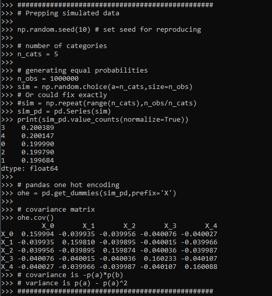
################################################Now lets simulate some simple data, where we have 5 categories, and each category has the same overall proportion in the data. Then we turn that into a one-hot encoded matrix (so 5 dummy variables). We will be using the covariance matrix to do the PCA decomposition (but does not really matter), and the covariance matrix has a nice closed form solution just based on the proportions.
################################################
# Prepping simulated data

np.random.seed(10) # set seed for reproducing

# number of categories
n_cats = 5

# generating equal probabilities
n_obs = 1000000
sim = np.random.choice(a=n_cats,size=n_obs)
# Or could fix exactly
#sim = np.repeat(range(n_cats),n_obs/n_cats)
sim_pd = pd.Series(sim)
print(sim_pd.value_counts(normalize=True))

# pandas one hot encoding
ohe = pd.get_dummies(sim_pd,prefix='X')

# covariance matrix
ohe.cov()
# covariance is -p(a)*p(b)
# variance is p(a) - p(a)^2
################################################
Now we are ready to fit the PCA model on the one hot encoded variables.
# Fitting the PCA and extracting loadings
pca_mod = PCA()
pca_mod.fit(ohe) #based on covariance matrix

# The loadings matrix
bin_load = pca_loadings(pca_mod,ohe)

# showing what the transform looks like on simple data
simple_ohe = pd.DataFrame(np.eye(n_cats,dtype=int),columns=list(ohe))
print( nice_trans(pca_mod,simple_ohe).round(3) )
And we can see all looks ok, minus the final principal component is a constant. This is because when we use all five dummy variables in a one-hot encoded matrix, one column is a linear transformation of the others. So the covariance matrix is just short of being full rank by 1 variable. (Hence why for various algorithms, such as regression, we typically drop one of the dummy variables.)
So typically we interpret PCA as an information compressor – we try to squeeze much of our variance into a smaller number of dimensions. You can interpret each principal component as contributing to the overall variance, and here is that breakdown for our example:
# Showing variance explained
var_equal = var_exp(pca_mod)
So you can see that our reduction in information is not a reduction at all. Typically if we had say 100 dimensions, we may only take the first 10 principal components. While we could do that here, it doesn’t gain us anything. It will essentially be no different than just using the dummy variables for the top k most frequent categories – which with essentially equal categories is just a random set of 10 possible dummy variables.
What about if we do unequal proportions?
#################################################
# What happens with variance explained for unequal
# proportions?

n_probs = [0.75,0.15,0.05,0.045,0.005]
sim = np.random.choice(a=n_cats,size=n_obs,p=n_probs)
sim_pd = pd.Series(sim)
print(sim_pd.value_counts(normalize=True))
ohe = pd.get_dummies(sim_pd,prefix='X')
print(ohe.cov())

pca_mod_unequal = PCA()
pca_mod_unequal.fit(ohe)

# Showing variance explained
var_unequal = var_exp(pca_mod_unequal)

# Showing the loadings
bin_load_unequal = pca_loadings(pca_mod_unequal,ohe)
#################################################
You can see that the variance explained is similar to the overall proportions in the data. Using the first k principal components will not be exactly the same as keeping the k most frequent categories in the data, as you can see the loading matrix has a particular format (signs can be flipped, PC1 loads opposite on top category and 2nd category, then PC2 loads high on 1,2 and opposite on 3, etc., so looks offhand similar to some type of contrast encoding). But there is no reason offhand to think it will result in a better fit for your particular data than taking the top K (or fitting a model for all dummy variables). (This is generally true for any data reduction via PCA though.)
I attempted to derive a general formula for the eigenvalues from the base proportions, but I was unable to (that determinant and characteristic polynomial form is tricky!). But it appears to me that they mostly just follow the overall proportions in the data. (See at the end of post showing the form of the covariance matrix, and failed attempt at using sympy to derive a general form for the eigenvalues.)
Here is another example with 1000 categories with random probabilities drawn from a uniform distribution. I can generate the eigenvalues without generating a big simulated dataset, since the covariance matrix has a particular form just based on the proportions.
#################################################
# Lets try with a very high cardinality

many_cats = 1000
n_probs = np.random.random(many_cats)
n_probs /= n_probs.sum()
n_probs = -np.sort(-n_probs)
# ?sorted makes the eigenvalues sorted as well?

# I can calculate the eigenvalues without
# generating the big dataset

def ohe_pca(probs):
    # Creating the covariance matrix
    p_len = len(probs)
    pnp = np.array(probs).reshape((p_len,1)) #2d array
    cov = -np.dot(pnp,pnp.T)
    np.fill_diagonal(cov, pnp - pnp**2)
    plabs = ['PC' + str(i+1) for i in range(p_len)]
    cov_pd = pd.DataFrame(cov,columns=plabs,index=plabs)
    # SVD of covariance
    loadings, eigenvals, vh = np.linalg.svd(cov, hermitian=True)
    print('Variance Explained')
    print( (eigenvals / eigenvals.sum()).round(3) )
    return cov_pd, eigenvals, loadings

covbig, eig, load = ohe_pca(n_probs)
#################################################
And here you can see again that the variance explained for each component essentially just follows the overall proportion for each distinct category in the data.
So you don’t gain anything by doing PCA on a one hot encoded matrix, besides creating a more complicated rotation of your binary data.
Covariance of one-hot-encoded and sympy
So first, I state in the comments that the covariance matrix for one-hot encoded variables takes on the form Cov(a,b) = -p(a)p(b). So the definition of the covariance between two values a and b is below, where E[] is the expected value operator.
Cov(a,b) = E[ (a - E[a])*(b - E[b]) ]For binary variables 0/1, E[a] = p(a), where p(a) is the proportion of 1’s in the column vector. So we can make that replacement above and then expand the inner multiplications:
E[ (a - p(a))*(b - p(b)) ] =

E[ a*b - a*p(b) - p(a)*b + p(a)*p(b) ]
Due to bilinearity of the expected value, we can then break this down into:
E[a*b] - E[a*p(b)] - E[p(a)*b] + E[p(a)*p(b)]The value E[a*b] = 0, because the categories are mutually exclusive (if one is 1, the other is 0). The value E[a*p(b)] means multiply the vector of a values by the proportion of b and take the expected value. For a vector of 0’s and 1’s, this reduces to simply p(a)*p(b). So by that logic we have:
0 - p(a)*p(b) - p(a)*p(b) + p(a)*p(b)

-p(a)*p(b)
This same logic works for the variance, except the term E[a*b] is now E[a*a], which does not equal zero, but for a vector of 0’s and 1’s just equals itself, and so reduces to p(a), hence for the variance we have:
p(a) - p(a)^2 = p(a)*(1 - p(a))I have attempted to write the covariance matrix in this form, and then determine a closed form expression for the eigenvalues, but no luck so far. Here are my attempts to let the sympy python library help. You can see even for a covariance matrix of only three categories, the symbolic representation of the eigenvalues is pretty hairy. So not sure if any simplification is possible:
import sympy

# Returns a covariance matrix
# and proportion dictionary
# in sympy
def covM(n):
    pdict = {}
    for i in range(n):
        pstr = 'p_' + str(i+1)
        pdict[pstr] = sympy.Symbol(pstr,positive=True)
    mlist = []
    for i in range(n):
        a = 'p_' + str(i + 1)
        aex = pdict[a]
        mrow = []
        for j in range(n):
            b = 'p_' + str(j + 1)
            bex = pdict[b]
            if a == b:
                mrow.append(aex*(1 - aex))
            else:
                mrow.append(-aex*bex)
        mlist.append(mrow)
    M = sympy.Matrix(mlist)
    return M, pdict


M, ps = covM(3) #cannot do 5 roots!
ev = M.eigenvals()
ev_list = [k for k in ev.keys()]
e1 = ev_list[0]
print( e1 )

# Not sure how to simplify/collect/whatever
# Into a simpler expression
If you can simplify that I am all ears! (Maybe should be working with M.charpoly() instead?)
Using google places API in criminology research?
In my ask me anything series, Thom Snaphaan, a criminologist at Ghent University writes in with this question (slightly edited by me):
I read your blog post on using the Google Places API for criminological research. I am interested in using these data in the context of my PhD research. Can I ask you some questions on this matter? We think Google Places might be a very rich data source, specifically the user ratings of places. (1) Is it allowed to use these data on a large scale (two large cities) for scientific research? (2) Is it possible to download a set without the limit of 1,000 requests per day? (3) Are there, in your experience, other (perhaps more interesting) data sources to conduct this study? Many thanks! Best, Thom
And for my responses to Thom,
For 1) I believe it is OK to use for research purposes. You are not allowed to download the data and resell it though.
For 2) The quotas for the places API are much larger, it is now you get $200 credit per month, which amounts to 100,000 API calls. So that should be sufficient even for a large city.
For 3) I do not know, I haven’t paid much attention to the different online apps that do user reviews. Here in the states we have another service called Yelp (mostly for restaurants), I am not sure if that has more reviews or not though.
One additional piece of information not commonly used in place based research (but have seen it used some Hipp, 2016; Perenzin-Askey, 2018), is the use of the number of employees or sales volume at particular crime generators/attractors. This is not available via google, but is via Reference USA or Lexis Nexis. For Dallas IIRC Reference USA had much better coverage (almost twice as many businesses), but I recently reviewed a paper that did boots on the ground validation for Google data in the Indian city of Chennai and the validation for google businesses was very high (Kuralarason & Bernasco, 2021)
Answer in the comments if you think you have more helpful information on leveraging the place based user reviews in research projects.
In the past I have written about using various google APIs, and which I have used in my research for several different projects.
Google has new pricing now, where you get $200 in credits per month per API. But overall the Places and the streetview API you get a crazy ton of potential calls, so will work for most research projects. Looking it over I actually don’t think I have used Google places data in any projects, in Wheeler & Steenbeek, 2021 I use reference USA and some other sources.
Geocoding and distance API limits are tougher, I ended up accidentally charging myself ~$150 for my work with Gio on gunshot fatalities (Circo & Wheeler, 2021) calculating network distance and approximate drive times. The vision API is also quite low (1000 per month), so will need to budget/plan if you need those services for your project. Geocoding you should be able to find alternatives, like the census geocoder (R, python) and then only use google for the leftovers.
References
- Circo, G. M., & Wheeler, A. P. (2021). Trauma Center Drive Time Distances and Fatal Outcomes among Gunshot Wound Victims. Applied Spatial Analysis and Policy, 14(2), 379-393.
- Hipp, J. R. (2016). General theory of spatial crime patterns. Criminology, 54(4), 653-679.
- Kuralarasan, K., & Bernasco, W. (2021). Location Choice of Snatching Offenders in Chennai City. Journal of Quantitative Criminology, Online First.
- Perezin-Askey, A., Taylor, R., Groff, E., & Fingerhut, A. (2018). Fast food restaurants and convenience stores: Using sales volume to explain crime patterns in Seattle. Crime & Delinquency, 64(14), 1836-1857.
- Wheeler, A. P., & Steenbeek, W. (2021). Mapping the risk terrain for crime using machine learning. Journal of Quantitative Criminology, 37(2), 445-480.
Wald tests via statsmodels (python)
The other day on crossvalidated a question came up about interpreting treatment effect differences across different crime types. This comes up all the time in criminology research, especially interventions intended to reduce crime.
Often times interventions are general and may be expected to reduce multiple crime types, e.g. hot spots policing may reduce both violent crimes and property crimes. But we do not know for sure – so it makes sense to fit models to check if that is the case.
For crimes that are more/less prevalent, this is a case in which fitting Poisson/Negative Binomial models makes alot of sense, since the treatment effect is in terms of rate modifiers. The crossvalidated post shows an example in R. In the past I have shown how to stack models and do these tests in Stata, or use seemingly unrelated regression in Stata for generalized linear models. Here I will show an example in python using data from my dissertation on stacking models and doing Wald tests.
The above link to github has the CSV file and metadata to follow along. Here I just do some upfront data prep. The data are crime counts at intersections/street segments in DC, across several different crime types and various aspects of the built environment.
# python code to stack models and estimate wald tests
import pandas as pd
import numpy as np
import statsmodels.formula.api as smf
import patsy
import itertools

# Use dissertation data for multiple crimes
#https://github.com/apwheele/ResearchDesign/tree/master/Week02_PresentingResearch
data = pd.read_csv(r'DC_Crime_MicroPlaces.csv', index_col='MarID')

# only keep a few independent variables to make it simpler
crime = ['OffN1','OffN3','OffN5','OffN7','OffN8','OffN9'] #dropping very low crime counts
x = ['CFS1','CFS2'] #311 calls for service
data = data[crime + x].copy()
data.reset_index(inplace=True)

# Stack the data into long format, so each crime is a new row
data_long = pd.wide_to_long(data, 'OffN',i='MarID',j='OffCat').reset_index()
And here you can see what the data looks like before (wide) and after (long). I am only fitting one covariate here (detritus 311 calls for service, see my paper), which is a measure of disorder in an area.

For reference the offense categories are below, and I drop homicide/arson/sex abuse due to very low counts.
'''
Offense types in the data
OffN1   ADW: Assault with Deadly Weapon
OffN2   Arson #drop
OffN3   Burglary
OffN4   Homicide #drop
OffN5   Robbery
OffN6   Sex Abuse #drop
OffN7   Stolen Auto
OffN8   Theft
OffN9   Theft from Auto
'''
Now we can fit our stacked negative binomial model. I am going right to negative binomial, since I know this data is overdispersed and Poisson is not a good fit. I account for the clustering induced by stacking the equations, although with such a large sample it should not be a big deal.
# Fit a model with clustered standard errors
covp = {'groups': data_long['MarID'],'df_correction':True}
nb_mod = smf.negativebinomial('OffN ~ C(OffCat) + CFS1:C(OffCat) - 1',data_long).fit(cov_type='cluster',cov_kwds=covp)
print(nb_mod.summary())
So this is close to the same if you fit a separate regression for each crime type. You get an intercept for each crime type (the C(OffCat[?]) coefficients), as well as a varying treatment effect for calls for service across each crime type, e.g. CFS1:C(OffCat)[1] is the effect of 311 calls to increase Assaults, CFS1:C(OffCat)[3] is to increase Burglaries, etc.
One limitation of this approach is that alpha here is constrained to be equal across each crime type. (Stata can get around this, either with the stacked equation fitting an equation for alpha based on the offense categories, or using the suest command.) But it is partly sweating the small stuff, the mean equation is the same. (So it may also make sense to not worry about clustering and fit a robust covariance estimate to the Poisson equation.)
Now onto the hypothesis tests. Besides seeing whether any individual coefficient equals 0, we may also have two additional tests. One is whether the treatment effect is equal across the different crime types. Here is how you do that in python for this example:
# Conduct a Wald test for equality of multiple coefficients
x_vars = nb_mod.summary2().tables[1].index
wald_str = ' = '.join(list(x_vars[6:-1]))
print(wald_str)
wald_test = nb_mod.wald_test(wald_str) # joint test
print(wald_test)
Given the large sample size, even though all of the coefficients for garbage 311 calls are very similar (mostly around 0.3~0.5), this joint test says they do not all equal each other.
So the second hypothesis people are typically interested in is whether the coefficients all equal zero, a joint test. Here is how you do that in python statsmodels. They have a convenient function .wald_test_terms() to do just this, but I also show how to construct the same string and use .wald_test().
# Or can do test all join equal 0
nb_mod.wald_test_terms()
# To replicate what wald_test_terms is doing yourself
all_zero = [x + '= 0' for x in x_vars[6:-1]]
nb_mod.wald_test(','.join(all_zero))
So we have established that when testing the equality between the coefficients, we reject the null. But this does not tell us which contrasts are themselves different and the magnitude of those coefficient differences. We can use .t_test() for that. (Which is the same as a Wald test, just looking at particular contrasts one by one.)
# Pairwise contrasts of coefficients
# To get the actual difference in coefficients
wald_li = []
for a,b in itertools.combinations(x_vars[6:-1],2):
    wald_li.append(a + ' - ' + b + ' = 0')

wald_dif = ' , '.join(wald_li)

dif = nb_mod.t_test(wald_dif)
print(dif)

# c's correspond to the wald_li list
res_contrast = dif.summary_frame()
res_contrast['Test'] = wald_li
res_contrast.set_index('Test', inplace=True)
print(res_contrast)
You can see the original t-test table does not return a nice set of strings illustrating the actual test. So I show here how they correspond to a particular hypothesis. I actually wrote a function to give nice labels given an input test string (what you would submit to either .t_test() or .wald_test()).
# Nicer function to print out the actual tests it interprets as
# ends up being 1 - 3, 3 - 5, etc.
def nice_lab_tests(test_str,mod):
    # Getting exogenous variables
    x_vars = mod.summary2().tables[1].index
    # Patsy getting design matrix and constraint from string
    di = patsy.DesignInfo(x_vars)
    const_mat = di.linear_constraint(test_str)
    r_mat = const_mat.coefs
    c_mat = list(const_mat.constants)
    # Loop over the tests, get non-zero indices
    # Build the interpreted tests
    lab = []
    for i,e in enumerate(c_mat):
        lm = r_mat[i,:] #single row of R matrix
        nz = np.nonzero(lm)[0].tolist() #only need non-zero
        c_vals = lm[nz].tolist()
        v_labs = x_vars[nz].tolist()
        fin_str = ''
        in_val = 0
        for c,v in zip(c_vals,v_labs):
            # 1 and -1 drop values and only use +/-
            if c == 1:
                if in_val == 0:
                    fin_str += v
                else:
                    fin_str += ' + ' + v
            elif c == -1:
                if in_val == 0:
                    fin_str += '-' + v
                else:
                    fin_str += ' - ' + v
            else:
                if in_val == 0:
                    fin_str += str(c) + '*' + v
                else:
                    if c > 0:
                        sg = ' + '
                    else:
                        sg = ' - '
                    fin_str += sg + str(np.abs(c)) + '*' + v
            in_val += 1
        fin_str += ' = ' + str(e[0]) #set equality at end
        lab.append(fin_str)
    return lab
So if we look at our original wald_str, this converts the equality tests into a series of difference tests against zero.
# Wald string for equality across coefficients
# from earlier
lab_tests = nice_lab_tests(wald_str,nb_mod)
print(lab_tests)
And this function should work for other inputs, here is another example:
# Additional test to show how nice_lab_tests function works
str2 = 'CFS1:C(OffCat)[1] = 3, CFS1:C(OffCat)[3] = CFS1:C(OffCat)[5]'
nice_lab_tests(str2,nb_mod)
Next up on the agenda is a need to figure out .get_margeff() a bit better for these statsmodels (or perhaps write my own closer to Stata’s implementation).
Ask me anything
So I get cold emails probably a few times a month asking random coding questions (which is perfectly fine — main point of this post!). I’ve suggested in the past that folks use a few different online forums, but like many forums I have participated in the past they died out quite quickly (so are not viable alternatives currently).
I think going forward I will mimic what Andrew Gelman does on his blog, just turn my responses into blog posts for everyone (e.g. see this post for an example). I will of course ask people permission before I post, and omit names same as Gelman does.
I have debated over time of doing a Patreon account, but I don’t think that would work very well (imagine I would get 1.2 subscribers for $3 a month!). Ditto for writing books, I debate on doing a Data Science for Crime Analysts in Python or something along those lines, but then I write the outline and think that is too much work to have at best a few hundred people purchase the book in the end. I will do consulting gigs for folks, but the majority of questions people ask do not take long enough to justify running a tab for the work (and I have no desire to rack up charges for grad students asking a few questions).
So feel free to ask me anything.
aggregate retention/churn models in python
Instead of having so much code just randomly floating around in blog posts, I need to start making packages (both in R and python) more often. I took it as a challenge to make a simple python package, here retenmod (pypi, github). I got the idea after answering a question on crossvalidated. (The resources I leveraged the most were these two sites/tutorials, packaging projects and minimal example.)
It is a simple port of the R package foretell that provides several different models to forecast churn based on aggregate survival probabilities. So it only has three functions, and I did not focus too much on extras (like building sphinx docs). Buit it has just the amount of complexity to make a nice intro get my feet wet example.
So you can now download/install the package via pip:
pip install retenmodAnd it will automatically install scipy and numpy if you do not have them already installed. For a very simple example, I don’t have retention probabilities for any police department offhand, but this document has estimates for how many staff positions police tend to retain after increases.

Here is a simple example of using the library, in particular the BdW model.
import retenmod
import matplotlib.pyplot as plt

large = [100,66,56,52,49,47,44,42]
time = [0,1,2,3,4,5,10,15]

# Only fitting with the first 3 values
train, ext = 4, 15
lrg_bdw = retenmod.bdw(large[0:train],ext - train + 1)

# Showing predicted vs observed
pt = list(range(16))
fig, ax = plt.subplots()
ax.plot(pt[1:], lrg_bdw.proj[1:],label='Predicted',
        c='k', linewidth=2, zorder=-1)
ax.scatter(time[1:],large[1:],label='Observed',
           edgecolor='k', c='r', s=50, zorder=1)
ax.axvline(train - 0.5, label='Train', color='grey',
           linestyle='dashed', linewidth=2, zorder=-2)
ax.set_ylabel('% Retaining Position')
ax.legend(facecolor='white', framealpha=1)
plt.xticks(pt[1:])
plt.show()
So you can see even with only fitting the data to the first three years, years 4 and 5 were forecasted quite well. It underestimates retention further out at 10 and 15 years (the model has a hard time going down very fast from 100 to 66 and then flattening out in a reasonable way). But even so the super far out forecasts are not that crazy given only three data points.
I will have to work on an example later of showing how to translate this to cost-benefit analysis (although would prefer actual retention data from a PD). Essentially you can calculate the benefit of trying to save officers (retain them) vs hiring new officers and training them up based on just aggregate data. If you wanted to do something like estimate if retention is going down due to recent events, I would probably use micro-level data and estimate a survival model directly.
Next up I will try to turn my Exact distribution tests (R Code) for day of week/Benford’s analysis into a simple R package and see if I can get it on Cran. Posting to pypi is quite easy.
Open source code projects in criminology
TLDR; please let me know about open source code related criminology projects.
As part of my work with CrimRxiv, we have started the idea of creating a page to link to various open source criminology focused projects. That is overly broad, but high level here we are thinking for pragmatic resources (e.g. code repositories/packages, open source text books), as opposed to more traditional literature.
As part of our overlay journal we are starting, D1G1TAL & C0MPUTAT10NAL CR1M1N0L0GY, we are trying to get folks to submit open source work for a paper. (As a note, this will not have any charges to publish.) The motivation is two-fold: 1) this gives a venue to get your code peer reviewed (e.g. similar to the Journal of Open Source Software). This is mainly for the writer, to give academic recognition for your open source work. 2) Is for the consumer of the information, it is a nice place to keep up on current developments. If you write an R package to do some cool analysis I want to be aware of it!
For 2, we can accomplish something similar by just linking to current projects. I have started a spreadsheet of links I am collating for now, (in the future will update to this page, you need to be signed into CrimRxiv to see that list). For examples of the work I have collated so far:
- Crime Analysis ArcGIS John Beck/Chris Delaney have started a video series on using ArcGIS crime analyst plug-in. (Even though ArcGIS is not open source, the tutorials are, so I am counting this.)
- Grant Drawve has video tutorials on Youtube using Excel to conduct various crime analyses. (Again Excel is not open source, but the tutorials are.)
- Jacob Kaplan’s Crime by the Numbers is an R tutorial.
- Reka Solymosi & Juanjo Medina, Crime Mapping in R
- Matt Ashby, crime open database and crimedata for managing the open crime data easier (both in R)
- Jill Dando Institute JDI open resources has a bunch of different lectures on open science, such as Patricio Estévez-Soto has a tutorial on creating R packages
Then we have various R packages from folks floating around; Greg Ridgeway, Jerry Ratcliffe, Wouter Steenbeek (as well as the others I mentioned previously you can check out their other projects on Github). Please add in info into the google spreadsheet, comment here, or send me an email if you would like some work you have done (or know others have done) that should be added.
Again I want to know about your work!
KDE plots for predicted probabilities in python
So I have previously written about two plots post binary prediction models – calibration plots and ROC curves. One addition to these I am going to show are kernel density estimate plots, broken down by the observed value vs predicted value. One thing in particular I wanted to make these for is to showcase the distribution of the predicted probabilities themselves, which can be read off of the calibration chart, but is not as easy.
I have written about this some before – transforming KDE estimates from logistic to probability scale in R. I will be showing some of these plots in python using the seaborn library. It will be easier instead of transforming the KDE to use edge weighting statistics to get unbiased estimates near the borders for the way the seaborn library is set up.
To follow along, you can download the data I will be using here. It is the predicted probabilities from the test set in the calibration plot blog post, predicting recidivism using several different models.
First to start, I load my python libraries and set my matplotlib theme (which is also inherited by seaborn charts).
Then I load in my data. To make it easier I am just working with the test set and several predicted probabilities from different models.
import pandas as pd
from scipy.stats import norm
import matplotlib
import matplotlib.pyplot as plt
import seaborn as sns

#####################
# My theme

andy_theme = {'axes.grid': True,
              'grid.linestyle': '--',
              'legend.framealpha': 1,
              'legend.facecolor': 'white',
              'legend.shadow': True,
              'legend.fontsize': 14,
              'legend.title_fontsize': 16,
              'xtick.labelsize': 14,
              'ytick.labelsize': 14,
              'axes.labelsize': 16,
              'axes.titlesize': 20,
              'figure.dpi': 100}

matplotlib.rcParams.update(andy_theme)
#####################
And here I am reading in the data (just have the CSV file in my directory where I started python).
################################################################
# Reading in the data with predicted probabilites
# Test from https://andrewpwheeler.com/2021/05/12/roc-and-calibration-plots-for-binary-predictions-in-python/
# https://www.dropbox.com/s/h9de3xxy1vy6xlk/PredProbs_TestCompas.csv?dl=0

pp_data = pd.read_csv(r'PredProbs_TestCompas.csv',index_col=0)
print(pp_data.head())

print(pp_data.describe())
################################################################
So you can see this data has the observed outcome Recid30 – recidivism after 30 days (although again this is the test dataset). And then it also has the predicted probability for three different models (XGBoost, RandomForest, and Logit), and then demographic breakdowns for sex and race.
The plot I am interested in seeing is a KDE estimate for the probabilities, broken down by the observed 0/1 for recidivism. Here is the default graph using seaborn:
# Original KDE plot by 0/1
sns.kdeplot(data=pp_data, x="Logit", hue="Recid30",
            common_norm=False, bw_method=0.15)
One problem you can see with this plot though is that the KDE estimates are smoothed beyond the data. You cannot have a predicted probability below 0 or above 1. Because we are using a gaussian kernel, we can just reweight observations that are close to the edge, and then clip the KDE estimate. So a predicted probability of 0 would get a weight of 1/0.5 – so it gets double the weight. Note to do this correctly, you need to set the bandwidth the same for the seaborn kdeplot as well as the weights calculation – here 0.15.
# Weighting and clipping
# Amount of density below 0 & above 1
below0 = norm.cdf(x=0,loc=pp_data['Logit'],scale=0.15)
above1 = 1- norm.cdf(x=1,loc=pp_data['Logit'],scale=0.15)
pp_data['edgeweight'] = 1/ (1 - below0 - above1)

sns.kdeplot(data=pp_data, x="Logit", hue="Recid30",
            common_norm=False, bw_method=0.15,
            clip=(0,1), weights='edgeweight')
This results in quite a dramatic difference, showing the model does a bit better than the original graph. The 0’s were well discriminated, so have many very low probabilities that were smoothed outside the legitimate range.
Another cool plot you can do that again shows calibration is to use seaborn’s fill option:
cum_plot = sns.kdeplot(data=pp_data, x="Logit", hue="Recid30",
                       common_norm=False, bw_method=0.15,
                       clip=(0,1), weights='edgeweight',
                       multiple="fill", legend=True)
cum_plot.legend_._set_loc(4) #via https://stackoverflow.com/a/64687202/604456
As expected this shows an approximate straight line in the graph, e.g. 0.2 on the X axis should be around 0.2 for the orange area in the chart.
Next seaborn has another good function here, violin plots. Unfortunately you cannot pass a weight function here. But another option is to simply resample your data a large number of times, using the weights you provided earlier.
n = 1000000 #larger n will result in more accurate KDE
resamp_pp = pp_data.sample(n=n,replace=True, weights='edgeweight',random_state=10)

viol_sex = sns.violinplot(x="Sex", y="XGB", hue="Recid30",
                          data=resamp_pp, split=True, cut=0,
                          bw=0.15, inner=None,
                          scale='count', scale_hue=False)
viol_sex.legend_.set_bbox_to_anchor((0.65, 0.95))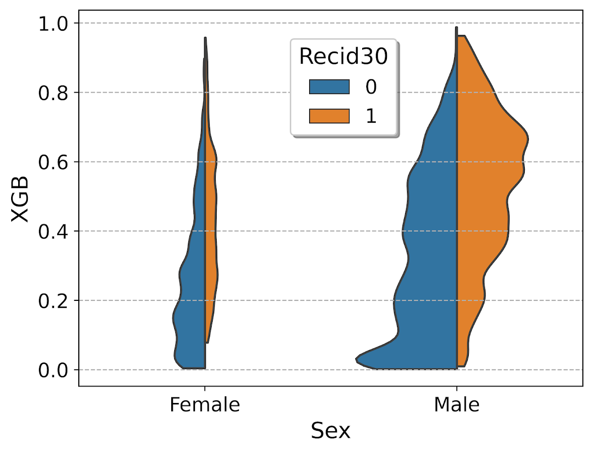
So here you can see we have more males in the sample, and they have a larger high risk blob that was correctly identified. Females have a risk profile more spread out, although there is a small clump of basically 0 risk that the model identifies.
You can also generate the graph so the areas for the violin KDE’s are normalized, so in both the original and resampled data we have fewer females, and more black individuals.
# Values for Sex for orig/resampled
print(pp_data['Sex'].value_counts(normalize=True))
print(resamp_pp['Sex'].value_counts(normalize=True))

# Values for Race orig/resampled
print(pp_data['Race'].value_counts(normalize=True))
print(resamp_pp['Race'].value_counts(normalize=True))
But if we set scale='area' in the chart the violins are the same size:
viol_race = sns.violinplot(x="Race", y="XGB", hue="Recid30",
                           data=resamp_pp, split=True, cut=0,
                           bw=0.15, inner=None,
                           scale='area', scale_hue=True)
viol_race.legend_.set_bbox_to_anchor((0.81, 0.95))
I will have to see if I can make some time to contribute to seaborn to make it so you can pass in weights to the violinplot function.
Using simulations to show ROI for predictive models in python
Two resources I have been consuming lately I would highly recommend:
- How to measure anything by Douglas Hubbard
- Keith McCormick’s short LinkedIn courses, particularly just went through estimating return on investment
Keith’s perspective is nearly a 100% match to my experiences, e.g. should aim for projects that have around $1 million in expected revenue to justify a data science person/team, up front estimates should be on the low end, the easiest projects you can formulate as micro-decisions and you use a model to improve those binary decisions, etc. How to measure anything fits right into this as well, where Hubbard basically says get a prior distribution on expected outcomes, and then do simulations to see possible outcomes.
Here I am going to show an example that is very close to several of the projects I have done to show the potential increase in revenue from taking a model based approach using simulations in python.
Background
So the point in the data science project I am going to be illustrating is you have already decided to do an initial pilot model, and you have historical cases and then predicted probabilities from your model. Here I am thinking of the case of auditing some type transaction (it can be whatever you want, tax-returns, bank transactions, insurance claims, etc.). Here I am going to simulate some fake data to illustrate the later ROI estimates, but in real life you would use your own data for the business.
Here the variables I simulate are:
- 5000 transactions,
total_cases - a model based predicted probability,
prob - a dollar value for the transaction,
dollar - a historical marker whether a transaction was audited,
audit - a historical marker whether the transaction was bad,
hit
To be clear, this would be data you would normally already have for your business use case (e.g. historical transactions). To just illustrate my point I am making 100% fake data for everyone to follow along.
####################################
# Simulating data, probabilities
# and money values

from scipy.stats import norm
from scipy.stats import binom
from scipy.stats import beta
import numpy as np
import pandas as pd
from matplotlib import pyplot as plt

np.random.seed(10)
total_cases = 5000

# Beta(1,5), to generate the probs
prob = beta.rvs(1, 5, size=total_cases)

# Lognormal for the dollar values, clipped
dollar = np.exp(norm.rvs(7,2,size=total_cases)).clip(500,25000)

# Historical auditing process, all cases over 15000
audit = (dollar > 15000)*1

# Out of these, random 10% are hits
hit = binom.rvs(1, 0.10, size=total_cases)

# Putting into a dataframe
cases = pd.concat([pd.Series(dollar),pd.Series(audit),
                   pd.Series(prob), pd.Series(hit)],
                   axis=1)
cases.columns = ['value','audit','prob', 'hit']
cases['revenue'] = cases['hit']*cases['value']*cases['audit']

cases['revenue'].sum() # about 1.1 million

cases.head()
####################################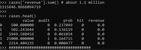
These are all simulated from various probability distributions to look somewhat like real data. Probabilities and dollar values are right skewed. They are independent here, but it is ok if in your real data they are not.
Here I pretend the historical audit selection process is they automatically audit all large transactions, over $15k. And these historical audits have a 10% probability of finding a hit (think of it as fraud if you want). So the context is given our model estimates prob, how much more money do we think we can make if you use these model based decision as opposed to our simple threshold that is the current process?
Revenue Simulations
So here for my revenue simulations, what I am going to do is pretend I can audit the same number of cases (471), based on my model estimates, audit_total.
audit_total = audit.sum() #pretend we get to model the same
                          #number of cases
cases['model_expected'] = cases['prob']*cases['value']
cases['model_rank'] = cases['model_expected'].rank(method='first', ascending=False)
cases['model_audit'] = 1*(cases['model_rank'] >= audit_total)

# Expected revenue from our model based approach
(cases['model_audit']*cases['model_expected']).sum()
# About 1.3 million
So if our model is well calibrated, we can take those predicted probabilities and estimate what we think should happen if we used our model to audit 471 cases. Here we think we would make around 1.3 million, so about a lift of over $200k.
But, these models are probabilistic estimates. So I like to use simulations to hedge a bit when I am presenting to the business. Here I do 5000 simulations where I select my 471 cases, use a binomial random number generator to flip the coin whether the case results in a hit or not, and then calculate the total revenue.
# Simulating binomial process, seeing what the revenue is
cases_audit = cases[cases['model_audit'] == 1].copy()
rev_sim = [] #doing 5000 simulations
for i in range(5000):
    hit_sim = binom.rvs(1, cases_audit['prob'])
    sim_outs = hit_sim * cases_audit['value']
    rev_sim.append( (sim_outs.sum(), hit_sim.mean()) )

rev_sim = pd.DataFrame(rev_sim, columns=['RevSim','HitRateSim'])
We can then turn this into a nice graph of simulated potential outcomes. In our model approach, on average we would expect to make $1.3 million (versus the actual revenue of $1.1 million), but we have variance around that estimate:
# making a nice graph
actual_rev = cases['revenue'].sum()/1000000
ax = (rev_sim['RevSim']/1000000).hist(bins=100, alpha=0.8, color='grey')
ax.grid(False)
ax.axvline(actual_rev, color='r', linewidth=3)
ax.set_xlabel('Audit Revenue in $1,000,000')
plt.text(actual_rev + 0.008, 150, 'Actual Revenue', color='r')
plt.title('Simulated Revenue when using Model')
plt.show()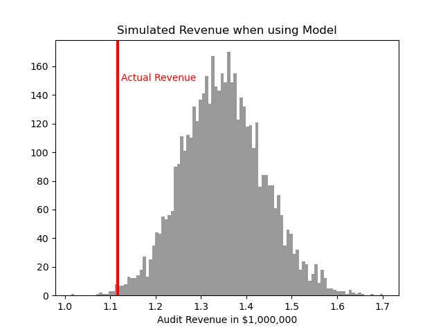
So you can see on a very few occasions we make less than the revenue under the current strategy of audit all large cases. But in just as many circumstances we are making over $400k in additional profit.
You may ask why 5000 simulations instead of more or less? Well these are small enough I can easily do them quickly, so I could up the simulations to a higher value if I wanted. Long story short, if you look at the histogram of outcomes and it is still quite bumpy, you should probably do more simulations. Here 5000 is plenty, although 1000 was clearly more bumpy.
If you don’t want to present the histogram, or have more complicated scenarios and prefer a table laying those scenarios out, you can pull out simulated confidence intervals of the additional revenue outcomes:
# If you want to put a confidence interval on it
# Per 1000 dollars
diff = (rev_sim['RevSim'] - cases['revenue'].sum())/1000
diff.describe()

# 95% confidence interval
diff.quantile([0.025,0.975])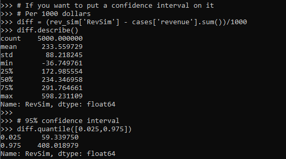
One of the benefits of having a model, even if the revenue is not increased, is that you can generate estimates for other types of interventions. In the auditing case, you can potentially justify more auditors (e.g. we can hire more people to investigate 400 more cases and still expect to make a profit). (Here I have a related criminal justice example for bail decisions.) Or you can apply the models as a potential sales pitch to a new client. E.g. if you hire us to do these audits, given your data and our model, we think we can make the $X dollars.
Model based approaches also allow you to meet more constraints, such as increasing the hit rate, or meeting fairness constraints. Here in this simulation if we use a model based approach, the hit rate goes up to around 15% as opposed to 10%. Which may be worth it for your investigators or clients depending on the situation.
Fitting a pytorch model
Out of the box when fitting pytorch models we typically run through a manual loop. So typically something like this:
# Example fitting a pytorch model
# mod is the pytorch model object
opt = torch.optim.Adam(mod.parameters(), lr=1e-4)
crit = torch.nn.MSELoss(reduction='mean')
for t in range(20000):
    opt.zero_grad()
    y_pred = mod(x)   #x is tensor of independent vars
    loss = crit(y_pred,y) #y is tensor of outcomes
    loss.backward()
    opt.step()
And this would use backpropogation to adjust our model parameters to minimize the loss function, here just the mean square error, over 20,000 iterations. Best practices are to both evaluate the loss in-sample and wait for it to flatten out, as well as evaluate out of sample.
I recently wrote some example code to make this process somewhat more like the sklearn approach, where you instantiate an initial model object, and then use a mod.fit(X, y) function call to fit the pytorch model. For an example use case I will just use a prior Compas recidivism data I have used for past examples on the blog (see ROC/Calibration plots, and Balancing False Positives). Here is the prepped CSV file to download to follow along.
So first, I load the libraries and then prep the recidivism data before I fit my predictive models.
###############################################
# Front end libraries/data prep

import pandas as pd
import numpy as np
import matplotlib.pyplot as plt
import torch

# Setting seeds
torch.manual_seed(10)
np.random.seed(10)

# Prepping the Compas data and making train/test
recid = pd.read_csv('PreppedCompas.csv')

#Preparing the variables I want
recid_prep = recid[['Recid30','CompScore.1','CompScore.2','CompScore.3',
                    'juv_fel_count','YearsScreening']].copy()
recid_prep['Male'] = 1*(recid['sex'] == "Male")
recid_prep['Fel'] = 1*(recid['c_charge_degree'] == "F")
recid_prep['Mis'] = 1*(recid['c_charge_degree'] == "M")
dum_race = pd.get_dummies(recid['race'])

# White for reference category
for d in list(dum_race):
    if d != 'Caucasion':
        recid_prep[d] = dum_race[d]

# reference category is separated/unknown/widowed
dum_mar = pd.get_dummies(recid['marital_status'])
recid_prep['Single'] = dum_mar['Single']
recid_prep['Married'] = dum_mar['Married'] + dum_mar['Significant Other']

#Now generating train and test set
recid_prep['Train'] = np.random.binomial(1,0.75,len(recid_prep))
recid_train = recid_prep[recid_prep['Train'] == 1].copy()
recid_test = recid_prep[recid_prep['Train'] == 0].copy()

#Independant variables
ind_vars = ['CompScore.1','CompScore.2','CompScore.3',
            'juv_fel_count','YearsScreening','Male','Fel','Mis',
            'African-American','Asian','Hispanic','Native American','Other',
            'Single','Married']

# Dependent variable
y_var = 'Recid30'
###############################################
Now next part is more detailed, but it is the main point of the post. Typically we will make a pytorch model object something like this. Here I have various switches, such as the activation function (tanh or relu or pass in your own function), or the final function to limit predictions to 0/1 (either sigmoid or clamp or again pass in your own function).
# Initial pytorch model class
class logit_pytorch(torch.nn.Module):
    def __init__(self, nvars, device, activate='relu', bias=True,
                 final='sigmoid'):
        """
        Construct parameters for the coefficients
        activate - either string ('relu' or 'tanh',
                   or pass in your own torch function
        bias - whether to include bias (intercept) in model
        final - use either 'sigmoid' to squash to probs, or 'clamp'
                or pass in your own torch function
        device - torch device to construct the tensors
                 default cuda:0 if available
        """
        super(logit_pytorch, self).__init__()
        # Creating the coefficient parameters
        self.coef = torch.nn.Parameter(torch.rand((nvars,1),
                    device=device)/10)
        # If no bias it is 0
        if bias:
            self.bias = torch.nn.Parameter(torch.zeros(1,
                    device=device))
        else:
            self.bias = torch.zeros(1, device=device)
        # Various activation functions
        if activate == 'relu':
            self.trans = torch.nn.ReLU()
        elif activate == 'tanh':
            self.trans = torch.nn.Tanh()
        else:
            self.trans = activate
        if final == 'sigmoid':
            self.final = torch.nn.Sigmoid()
        elif final == 'clamp':
            # Defining my own clamp function
            def tclamp(input):
                return torch.clamp(input,min=0,max=1)
            self.final = tclamp
        else:
            # Can pass in your own function
            self.final = final
    def forward(self, x):
        """
        predicted probability
        """
        output = self.bias + torch.mm(x, self.trans(self.coef))
        return self.final(output)
To use this though again we need to specify the number of coefficients to create, and then do a bunch of extras like the optimizer, and stepping through the function (like described at the beginning of the post). So here I have created a second class that behaves more like sklearn objects. I create the empty object, and only when I pass in data to the .fit() method it spins up the actual pytorch model with all its tensors of the correct dimensions.
# Creating a class to instantiate model to data and then fit
class pytorchLogit():
    def __init__(self, loss='logit', iters=25001,
                 activate='relu', bias=True,
                 final='sigmoid', device='gpu',
                 printn=1000):
        """
        loss - either string 'logit' or 'brier' or own pytorch function
        iters - number of iterations to fit (default 25000)
        activate - either string ('relu' or 'tanh',
                   or pass in your own torch function
        bias - whether to include bias (intercept) in model
        final - use either 'sigmoid' to squash to probs, or 'clamp'
                or pass in your own torch function. Should not use clamp
                with default logit loss
        opt - ?optimizer? should add an option for this
        device - torch device to construct the tensors
                 default cuda:0 if available
        printn - how often to check the fit (default 1000 iters)
        """
        super(pytorchLogit, self).__init__()
        if loss == 'logit':
            self.loss = torch.nn.BCELoss()
            self.loss_name = 'logit'
        elif loss == 'brier':
            self.loss = torch.nn.MSELoss(reduction='mean')
            self.loss_name = 'brier'
        else:
            self.loss = loss
            self.loss_name = 'user defined function'
        # Setting the torch device
        if device == 'gpu':
            try:
                self.device = torch.device("cuda:0")
                print(f'Torch device GPU defaults to cuda:0')
            except:
                print('Unsuccessful setting to GPU, defaulting to CPU')
                self.device = torch.device("cpu")
        elif device == 'cpu':
            self.device = torch.device("cpu")
        else:
            self.device = device #can pass in whatever
        self.iters = iters
        self.mod = None
        self.activate = activate
        self.bias = bias
        self.final = final
        self.printn = printn
        # Other stats to carry forward
        self.loss_metrics = []
        self.epoch = 0
    def fit(self, X, y, outX=None, outY=None):
        x_ten = torch.tensor(X.to_numpy(), dtype=torch.float,
                             device=self.device)
        y_ten = torch.tensor(pd.DataFrame(y).to_numpy(), dtype=torch.float,
                             device=self.device)
        # Only needed if you pass in an out of sample to check as well
        if outX is not None:
            x_out_ten = torch.tensor(outX.to_numpy(), dtype=torch.float,
                             device=self.device)
            y_out_ten = torch.tensor(pd.DataFrame(outY).to_numpy(), dtype=torch.float,
                             device=self.device)
        self.epoch += 1
        # If mod is not already created, create a new one, else update prior
        if self.mod is None:
            loc_mod = logit_pytorch(nvars=X.shape[1], activate=self.activate,
                                    bias=self.bias, final=self.final,
                                    device=self.device)
            self.mod = loc_mod
        else:
            loc_mod = self.mod
        opt = torch.optim.Adam(loc_mod.parameters(), lr=1e-4)
        crit = self.loss
        for t in range(self.iters):
            opt.zero_grad()
            y_pred = loc_mod(x_ten)
            loss = crit(y_pred,y_ten)
            if t % self.printn == 0:
                if outX is not None:
                    pred_os = loc_mod(x_out_ten)
                    loss_os = crit(pred_os,y_out_ten)
                    res_tup = (self.epoch, t, loss.item(), loss_os.item())
                    print(f'{t}: insample {res_tup[2]:.4f}, outsample {res_tup[3]:.4f}')
                else:
                    res_tup = (self.epoch, t, loss.item(), None)
                    print(f'{t}: insample {res_tup[2]:.5f}')
                self.loss_metrics.append(res_tup)
            loss.backward()
            opt.step()
    def predict_proba(self, X):
        x_ten = torch.tensor(X.to_numpy(), dtype=torch.float,
                             device=self.device)
        res = self.mod(x_ten)
        pp = res.cpu().detach().numpy()
        return np.concatenate((1-pp,pp), axis=1)
    def loss_stats(self, plot=True, select=0):
        pd_stats = pd.DataFrame(self.loss_metrics, columns=['epoch','iteration',
                                                            'insamploss','outsamploss'])
        if plot:
            pd_stats2 = pd_stats.rename(columns={'insamploss':'In Sample Loss', 'outsamploss':'Out of Sample Loss'})
            pd_stats2 = pd_stats2[pd_stats2['iteration'] > select].copy()
            ax = pd_stats2[['iteration','In Sample Loss','Out of Sample Loss']].plot.line(x='iteration',
                            ylabel=f'{self.loss_name} loss')
            plt.show()
        return pd_stats
Again it allows you to pass in various extras, which here are just illustrations for binary predictions (like the loss function as the Brier score or the more typical log-loss). It also allows you to evaluate the fit for just in-sample, or for out of sample data as well. It also allows you to specify the number of iterations to fit.
So now that we have all that work done, here as some simple examples of its use.
# Creating a model and fitting
mod = pytorchLogit()
mod.fit(recid_train[ind_vars], recid_train[y_var])
So you can see that this is very similar now to sklearn functions. It will print at the console fit statistics over the iterations:

So it defaults to 25k iterations, and you can see that it settles down much before that. I created a predict_proba function, same as most sklearn model objects for binary predictions:
# Predictions out of sample
predprobs = mod.predict_proba(recid_test[ind_vars])
predprobs # 1st column is probability 0, 2nd prob 1
And this returns a numpy array (not a pytorch tensor). Although you could modify to return a pytorch tensor if you wanted it to (or give an option to specify which).
Here is an example of evaluating out of sample fit as well, in addition to specifying a few more of the options.
# Evaluating predictions out of sample, more iterations
mod2 = pytorchLogit(activate='tanh', iters=40001, printn=100)
mod2.fit(recid_train[ind_vars], recid_train[y_var], recid_test[ind_vars], recid_test[y_var])
I also have an object function, .loss_stats(), which gives a nice graph of in-sample vs out-of-sample loss metrics.
# Making a nice graph
dp = mod2.loss_stats()
We can also select the loss function to only show later iterations, so it is easier to zoom into the behavior.
# Checking out further along
mod2.loss_stats(select=10000)
And finally like I said you could modify some of your own functions here. So instead of any activation function I pass in the identity function – so this turns the model into something very similar to a vanilla logistic regression.
# Inserting in your own activation (here identity function)
def ident(input):
    return input

mod3 = pytorchLogit(activate=ident, iters=40001, printn=2000)
mod3.fit(recid_train[ind_vars], recid_train[y_var], recid_test[ind_vars], recid_test[y_var])
And then if you want to access the coefficients weights, it is just going down the rabbit hole to the pytorch object:
# Can get the coefficients/intercept
print( mod3.mod.coef )
print( mod3.mod.bias )
This type of model can of course be extended however you want, but modifying the pytorchLogit() and logit_pytorch class objects to specify however detailed switches you want. E.g. you could specify adding in hidden layers.
One thing I am not 100% sure the best way to accomplish is loss functions that take more parameters, as well as the best way to set up the optimizer. Maybe use *kwargs for the loss function. So for my use cases I have stuffed extra objects into the initial class, so they are there later if I need them.
Also here I would need to think more about how to save the model to disk. The model is simple enough I could dump the tensors to numpy, and on loading re-do them as pytorch tensors.
Recommend
About Joyk
Aggregate valuable and interesting links.
Joyk means Joy of geeK