

Add notifications to your react native app with ease
source link: https://reactnativeexample.com/add-notifications-to-your-react-native-app-with-ease/
Go to the source link to view the article. You can view the picture content, updated content and better typesetting reading experience. If the link is broken, please click the button below to view the snapshot at that time.

toastify-react-native
toastify-react-native allows you to add notifications to your react-native app (ios, android) with ease. No more nonsense!
Features
- Smooth enter/exit animations
- Plain simple and flexible APIs
- Resize itself correctly on device rotation
- Swipeable
- Easy to set up for real, you can make it work in less than 10sec!
- Super easy to customize
- RTL support
- Swipe to close ?
- Can choose swipe direction
- Super easy to use an animation of your choice. Works well with animate.css for example
- Define behavior per toast
- Pause toast by click on the toast ?
- Fancy progress bar to display the remaining time
- Possibility to update a toast
- You can control the progress bar a la nprogress ?
- You can display multiple toast at the same time
- Dark mode ?
- And much more !
Installation
$ npm install toastify-react-native
The gist
import React, { useState } from 'react';
import { Button } from 'react-native';
import Toast from 'toastify-react-native';

export default function App() {
  const [toastify, setToastify] = useState()

  return (
    <View>
      <Toast ref={(c) => setToastify(c)} />

      <Button onPress={() => toastify.success("Success")} />
    </View>
  );

}
A complete example
import React, { useState } from 'react';
import { StyleSheet, View, TouchableOpacity, Text } from 'react-native';
import Toast from 'toastify-react-native';
export default function App() {
const [toastify, setToastify] = useState()
const [toastify2, setToastify2] = useState()
const [toastify3, setToastify3] = useState()
const showToasts = async () => {
toastify.success("Success");
toastify2.info("Some info");
toastify3.error("This is an Error");
}
return (
<View style={styles.container} >
{/* Toasts */}
<Toast ref={(c) => setToastify(c)} />
<Toast position="center" animationStyle="fancy" ref={(c) => setToastify2(c)} />
<Toast position="bottom" animationStyle="rightInOut" ref={(c) => setToastify3(c)} />
{/* Button */}
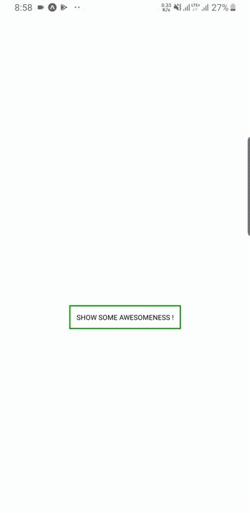
<TouchableOpacity style={{ marginTop: 200, backgroundColor: "white", borderColor: "green", borderWidth: 2, padding: 10 }} onPress={() => showToasts()} >
<Text>
SHOW SOME AWESOMENESS !
</Text>
</TouchableOpacity>
</View>
);
}
const styles = StyleSheet.create({
container: {
flex: 1,
backgroundColor: '#fff',
alignItems: 'center',
justifyContent: 'center',
}
});
For a more complex example take a look at the /example directory.
Available props
Name Type Default Description width number 256 Width of toast height number 68 Height of the toast style any null Style applied to the toast position top, center or bottom top Position of toast positionValue number 50 position value of toast duration number 3000 The display time of toast. animationStyle rightInLeftOut, rightInOut or fancy rightInLeftOut The animation style of toast animationIn string or object 'slideInRight' Toast show animation animationOut string or object 'slideOutLeft' Toast hide animation animationInTiming number 300 Timing for the Toast show animation (in ms) animationOutTiming number 300 Timing for the toast hide animation (in ms) backdropTransitionInTiming number 300 The backdrop show timing (in ms) backdropTransitionOutTiming number 300 The backdrop hide timing (in ms) hasBackdrop bool false Render the backdrop backdropColor string 'black' The backdrop background color backdropOpacity number 0.5 The backdrop opacity when the toast is visible
GitHub
Recommend
About Joyk
Aggregate valuable and interesting links.
Joyk means Joy of geeK