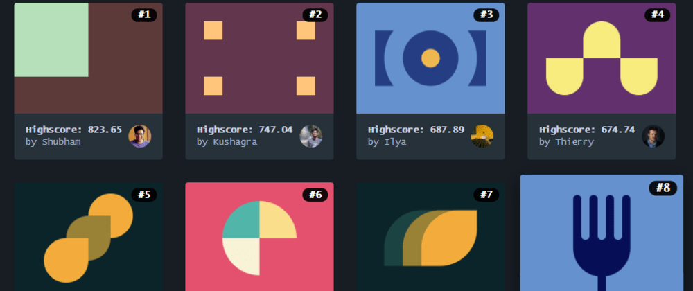

CSS Battle #1 - Simply Square
source link: https://dev.to/pheeria/css-battle-1-simply-square-c19
Go to the source link to view the article. You can view the picture content, updated content and better typesetting reading experience. If the link is broken, please click the button below to view the snapshot at that time.

CSS Battle #1 - Simply Square
Jun 4, 2019
・Updated on Jun 5, 2019
・3 min read
CSS Battle (12 Part Series)
I am one of those people, who like to think that knowing only HTML and CSS is not enough. I know, it is unfair and I don’t even need to prove anything to myself. CSS is extremely difficult. At least, for me. So, I decided to try to get my hands dirty with it. Luckily, there is a nice interactive website with CSS challenges. And who doesn’t like challenges?
You are supposed to recreate the stylesheet only given an image. You get a percent approximation of how much your output matches and extra points if you achieve it with as few characters as possible.
After seeing the shortest solution to the first problem, I decided not bothering myself with the high score and to concentrate on the learning part instead. If you wonder why, well here is that solution:
<img style=box-shadow:0+0+0+2in#b5e0ba,0+0+0+5in#5d3a3a>
Because the score requires the solution to be correct in the first and be short in the second, I’d prefer to concentrate on correctness. And since CSS is very powerful in providing with alternatives, I’ll try to come up with different answers to the same questions.
1. Absolute Values
The first one is pretty straightforward. We create a square division of 200 by 200 pixels and give it a background color. Since the normal document flow is from top to bottom and left to right the square should be at the top left corner of the screen. Except that it isn’t. We’d need to remove the browser default margin.
Removing browser defaults is called normalizing and there is a splendid library which does exactly that (there is a library for everything). I recommend to read through the source code – it is short and has descriptive comments. Since we are only concerned about the margin, we will set it to zero in for the body tag, which also gets a background color.
<div></div>
<style>
  body {
    margin: 0;
    background: #5d3a3a;
  }

  div {
    width: 200px;
    height: 200px;
    background: #b5e0ba;
  }
</style>
2. Relative Values
In order not to bind ourselves to hardcoded values, we can replace width with calc(100vw / 2) and height with calc(100vh * 2 / 3).
<div></div>
<style>
  body {
    margin: 0;
    background: #5d3a3a;
  }

  div {
    width: calc(100vw / 2);
    height: calc(100vh * 2 / 3);
    background: #b5e0ba;
  }
</style>
calc() allows us to mix different units within the same computation. Or because the width is obvious, you can write it directly as 50vw. 66vh for height will not be accepted as the correct answer. 66.6vh however will be.
3. Border
So far the solutions were following pretty much the same logic, differing only in the size computation. Here is another approach. What if we could have placed the same square, but this time instead of coloring body background, we’d create a border instead?
<div></div>
<style>
  div {
    margin: -8px;
    width: 200px;
    height: 200px;
    background: #b5e0ba;
    border-right: 200px solid #5d3a3a;
    border-bottom: 200px solid #5d3a3a;
  }
</style>
Setting margin here to a negative value is done only to remove the impact of the default margin and avoid styling two tags.
4. Box Shadow
The last one is inspired by the shortest solution. Apparently, it is possible to duplicate existing objects to create shadows. box-shadow, as it is called, is used to create a staple effect. There is even a generator for that! The first two values are X and Y offsets, which can be negative. The third one is a blur radius. And the last before the color is spread radius, which is responsible for scale, which in our case I arbitrarily set to a big enough value to cover up the whole 400 x 300 screen.
<div></div>
<style>
  div {
    margin: -8px;
    width: 50vw;
    height: 66.6vh;
    background: #b5e0ba;
    box-shadow: 0 0 0 200px #5d3a3a;
  }
</style>
Which one of these solutions would you prefer? Do you know any others?
Recommend
About Joyk
Aggregate valuable and interesting links.
Joyk means Joy of geeK