
2

canvas绘制折线路径动画
source link: https://segmentfault.com/a/1190000039969428
Go to the source link to view the article. You can view the picture content, updated content and better typesetting reading experience. If the link is broken, please click the button below to view the snapshot at that time.
最近有读者加我微信咨询这个问题:

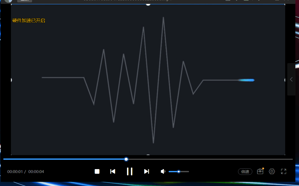
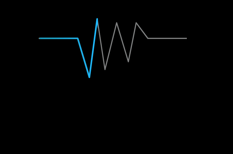
其中的效果是一个折线路径动画效果,如下图所示:
要实现以上路径动画,一般可以使用svg的动画功能。或者使用canvas绘制,结合路径数学计算来实现。
如果用canvas来绘制,其中的难点在于:
- 需要计算子路径,这块计算比较复杂。(当然是可以实现的)
- 渐变的计算, 从图中可以看出,动画的子路径是有渐变效果的,如果要分段计算渐变也很复杂。
本文介绍一种思路,使用clip方法,动态移动clip的区域,来达到近似的效果。具体怎么做。
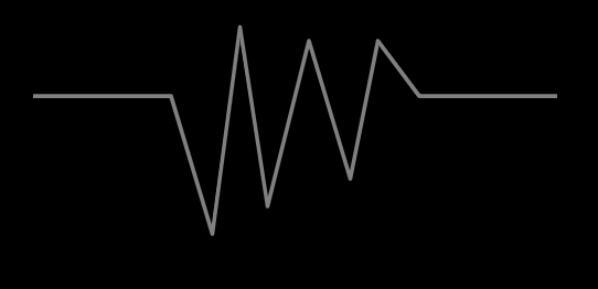
绘制灰色路径
绘制路径的代码比较简单,此处就不详细说明,下面代码就模拟了了一个折线路径的绘制:
 ctx.beginPath();
 ctx.moveTo(100,100);
 ctx.lineTo(200,100);
 ctx.lineTo(230,200);
 ctx.lineTo(250,50);
 ctx.lineTo(270,180);
 ctx.lineTo(300,60);
 ctx.lineTo(330,160);
 ctx.lineTo(350,60);
 ctx.lineTo(380,100);
 ctx.lineTo(480,100);
 ctx.strokeStyle = "gray";
 ctx.lineJoin = "round";
 ctx.stroke();
效果如下:
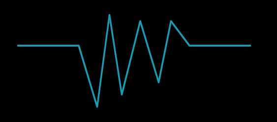
绘制亮色路径
绘制亮色路径的代码和绘制灰色路径的代码一样,只是样式是一个亮的颜色:
ctx.save();
            ctx.beginPath();
            ctx.moveTo(100,100);
            ctx.lineTo(200,100);
            ctx.lineTo(230,200);
            ctx.lineTo(250,50);
            ctx.lineTo(270,180);
            ctx.lineTo(300,60);
            ctx.lineTo(330,160);
            ctx.lineTo(350,60);
            ctx.lineTo(380,100);
            ctx.lineTo(480,100);
            ctx.strokeStyle = "gray";
            ctx.lineJoin = "round";
            ctx.stroke();
效果如下:
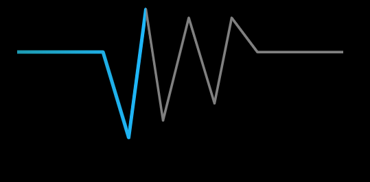
clip控制亮色路径的绘制区域
canvas的clip方法可以控制绘制的区域,通过该方法,可以控制智绘制路径的一部分:
ctx.beginPath();
ctx.rect(offset,0,100,500); // offset 等于0
ctx.clip();
...
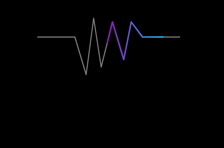
ctx.stroke(); clip之后,亮色路径就只会绘制一部分,如下图:
通过不断变化offset的值,就可以大道亮色路径移动的效果,代码如下:
 offset += 2;
 if(offset > 600){
       offset = 100;
 }
requestAnimationFrame(animate);
最终效果如下:
我们知道渐变没法沿着任意路径,如果计算折线,分段计算渐变又很麻烦。 其实在本案例中,虽然是折线,但是整体的运动方向总是从左往右的,所以可以用从左往右的渐变来近似模拟既可以:
function createGradient(ctx,x0,y0,x1,y1){
          var grd = ctx.createLinearGradient(x0,y0,x1,y1);
           grd.addColorStop(0,'#129ab3');
           grd.addColorStop(1,"#19b5fe");
           return grd;
}

ctx.strokeStyle = createGradient(ctx,offset,0,offset + 100,0);
最终效果如下所示:
<!DOCTYPE html>
<html lang="en">
<head>
    <meta charset="UTF-8">
    <title>line animate</title>
    <style>
        canvas {
            border: 1px solid #000;
        }
    </style>
</head>
<body>
    <canvas id="canvas" width="600" height="400"></canvas>
    <script>
        var ctx = document.getElementById( 'canvas' ).getContext( '2d' );
        var w = canvas.width,
                h = canvas.height;

        var x = w / 2,y = h / 2;

        function setupCanvas(canvas) {
            let width = canvas.width,
            height = canvas.height,
            dpr = window.devicePixelRatio || 1.0;
            if (dpr != 1.0 ) {
            canvas.style.width = width + "px";
            canvas.style.height = height + "px";
            canvas.height = height * dpr;
            canvas.width = width * dpr;
            ctx.scale(dpr, dpr);
            }
        }
        setupCanvas(canvas);
        var offset = 100;
        function createGradient(ctx,x0,y0,x1,y1){
           var grd = ctx.createLinearGradient(x0,y0,x1,y1);
           grd.addColorStop(0,'#9a12b3');
           grd.addColorStop(1,"#19b5fe");
           return grd;
        }

        function animate(){
            ctx.fillStyle = "black";
            ctx.fillRect(0,0,canvas.width,canvas.height);
            ctx.lineWidth = 3;
            ctx.save();
            ctx.beginPath();
            ctx.moveTo(100,100);
            ctx.lineTo(200,100);
            ctx.lineTo(230,200);
            ctx.lineTo(250,50);
            ctx.lineTo(270,180);
            ctx.lineTo(300,60);
            ctx.lineTo(330,160);
            ctx.lineTo(350,60);
            ctx.lineTo(380,100);
            ctx.lineTo(480,100);
            ctx.strokeStyle = "gray";
            ctx.lineJoin = "round";
            ctx.stroke();

            ctx.beginPath();
            ctx.rect(offset,0,150,500);
            ctx.clip();
            ctx.beginPath();
            ctx.moveTo(100,100);
            ctx.lineTo(200,100);
            ctx.lineTo(230,200);
            ctx.lineTo(250,50);
            ctx.lineTo(270,180);
            ctx.lineTo(300,60);
            ctx.lineTo(330,160);
            ctx.lineTo(350,60);
            ctx.lineTo(380,100);
            ctx.lineTo(480,100);
            ctx.lineWidth = 4;
            ctx.strokeStyle = createGradient(ctx,offset,0,offset + 150,0);
            ctx.lineCap = "round";
            // ctx.globalCompositeOperation = 'lighter';
            ctx.lineJoin = "round";
            ctx.stroke();

            ctx.restore();

            offset += 2;
            if(offset > 600){
                offset = 100;
            }

            requestAnimationFrame(animate);
        }

        animate();
    </script>
</body>
</html>
其实整体思路是用了近似,而不是严格的控制路径长度和渐变效果,这样可以更方便实现以上功能。 其实人眼有时候是分辨不出来一些细节,可视化,有的时候只有能够达到让人“觉得”是那么回事,其实目的也就达到了。
以上方案只能适用于,折线路径的整体方向是一致的。如果整体方向是先水平向右,然后在垂直向下,或者甚至出现往回拐的情况,就不适合了。
关注公众号“ITMan彪叔” 可以及时收到更多有价值的文章。另外如果对可视化感兴趣,可以和我交流,微信541002349.
Recommend
About Joyk
Aggregate valuable and interesting links.
Joyk means Joy of geeK