

高级,这个Python库助力pandas智能可视化分析
source link: https://zhuanlan.zhihu.com/p/369497954
Go to the source link to view the article. You can view the picture content, updated content and better typesetting reading experience. If the link is broken, please click the button below to view the snapshot at that time.
高级,这个Python库助力pandas智能可视化分析
Pandas是用于数据处理的核心库,它也可以进行简单的可视化,绘制散点、折线、直方等基础图表都不在话下。
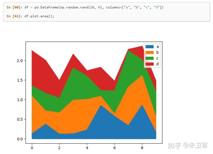
Pandas自带的可视化方法是基于matplotlib的函数接口,在Jupyter里可以静态展示。
这次介绍一个可视化工具-LUX,它能自动地将DataFrame数据转化为统计图表,让你一目了然地看到相关性、分布、频率等信息。
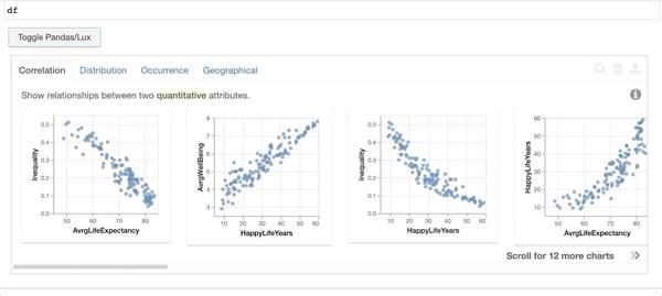
LUX在Jupyter Notebook或Lab中进行交互,图表与数据可以同步显示。
项目地址: https://github.com/lux-org/lux
使用LUX
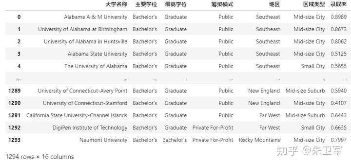
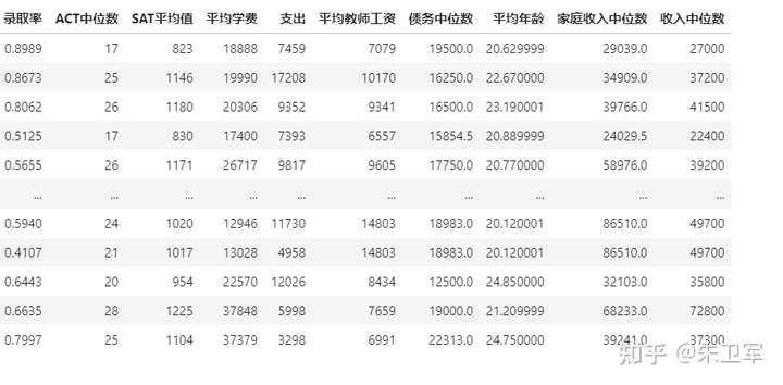
以下面数据集(美国各大学信息表)为例:
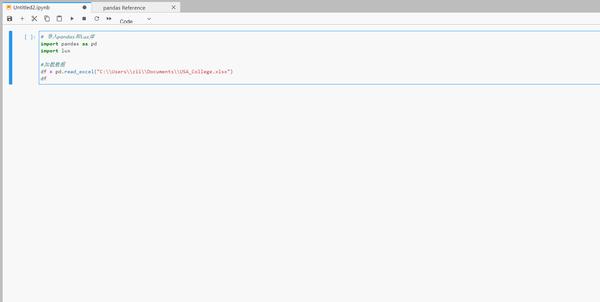
# 导入pandas和lux库
import pandas as pd
import lux

#加载数据
df = pd.read_excel("C:\\Users\\zii\\Documents\\USA_College.xlsx")
df
读取的数据如下:
除了显示的数据表外,同时你还会看到数据集上面出现一个按钮,可以进行数据/图表的交换显示。
所以说只需要导入lux库,就能直接使用图表功能。
大家看到下面有三种类型的图表,代表的统计学含义分别是相关性、直方分布、事件频次。
除了全表的可视化探索外,你还可以研究特定变量间的关系。
比如,我想看SAT平均值和收入中位数的关联性.
df.intent = ['SAT平均值','收入中位数']
df
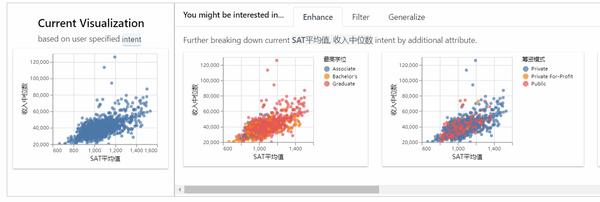
左边的表是两个变量的总体分布,右边是在有筛选条件下的分布。
导出图表
LUX支持图表的导出,既可以导出图表文件,也可以导出相应的matplotlib、altair代码。
首先选定一个或多个图表,点击导出按钮。
可以直接将选定的图表单独显示出来:
- 导出html
df.save_as_html('hpi.html') - 导出matplotlib代码
vis = df.exported
print (vis[0].to_matplotlib())
- 导出altair代码
vis = df.exported
print(vis[0].to_Altair())
导出的代码可以直接运行:
import altair as alt

chart = alt.Chart(df).mark_circle().encode(
    x=alt.X('SAT平均值',scale=alt.Scale(domain=(666, 1534)),type='quantitative', axis=alt.Axis(title='SAT平均值')),
    y=alt.Y('收入中位数',scale=alt.Scale(domain=(20200, 125600)),type='quantitative', axis=alt.Axis(title='收入中位数'))
)
chart = chart.configure_mark(tooltip=alt.TooltipContent('encoding')) # Setting tooltip as non-null
chart = chart.interactive() # Enable Zooming and Panning
chart = chart.encode(color=alt.Color('最高学位',type='nominal'))

chart = chart.configure_title(fontWeight=500,fontSize=13,font='Helvetica Neue')
chart = chart.configure_axis(titleFontWeight=500,titleFontSize=11,titleFont='Helvetica Neue',
labelFontWeight=400,labelFontSize=8,labelFont='Helvetica Neue',labelColor='#505050')
chart = chart.configure_legend(titleFontWeight=500,titleFontSize=10,titleFont='Helvetica Neue',
labelFontWeight=400,labelFontSize=8,labelFont='Helvetica Neue')
chart = chart.properties(width=160,height=150)

chart
安装设置
lux安装过程和其他库一样,可以通过pip或conda安装,直接在命令行输入:
pip install lux-api
conda install -c conda-forge lux-api
因为lux一般用在Jupyter生态中,所以需要安装并激活luxwidget拓展,才能显示交互式窗口。
如果你是在Jupyter Notebook或VSCode中使用,使用下面代码激活拓展:
jupyter nbextension install --py luxwidget
jupyter nbextension enable --py luxwidget
如果你使用的是Jupyter Lab,则激活lab拓展:
jupyter labextension install @jupyter-widgets/jupyterlab-manager
jupyter labextension install luxwidget
总结
LUX是一个不错的数据可视化分析工具,能智能地辅助Pandas做数据探索,省去了很多不必要的操作。
Recommend
About Joyk
Aggregate valuable and interesting links.
Joyk means Joy of geeK