

Replicating Book Worm UI in Xamarin Forms
source link: https://askxammy.com/replicating-book-worm-ui-in-xamarin-forms/
Go to the source link to view the article. You can view the picture content, updated content and better typesetting reading experience. If the link is broken, please click the button below to view the snapshot at that time.
Replicating Book Worm UI in Xamarin Forms
 In this case we are going to replicate a Book Worm UI App obtained from Dribble. You can check the design here!
 Before starting, to get the best out of the post, I’ll leave you some instructional notes so that you have a better experience reproducing the UI:
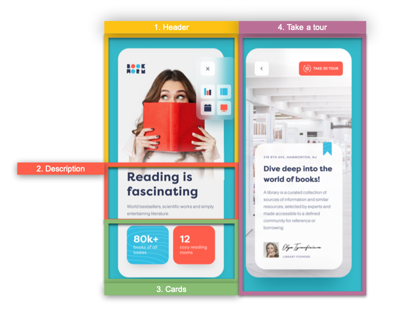
 At the beginning, you will see an image with the original UI where you will see divided into blocks as we’ll be working on each part of the design. Each block presents the image with the design explicitly that we’ll be working on that block, they are highlighted in a box. In each of the code blocks, you can see a comment that says: “Here add the code that is being explained in the next block“. To keep you as focused as possible, this part indicates to you that the next block code explanation goes right where the comment line is added. I will not be using styles so that the properties added to the various components can be seen and understood faster in the explanation process.
Let’s start!
Let’s divide the original design into blocks
To better understand, I have divided the original design into blocks, which are listed in the order in which we will be reproducing each one, these are:

Let’s start creating our main layout structure which will be contained in a Grid. If you want to know more information about Grid, you can enter here.
<!-- Main layout structure--> <Grid ColumnDefinitions="*,*" RowDefinitions="Auto,Auto,Auto,*"> <!-- Here add the code that is being explained in all the Blocks contained in the first page--> </Grid>
Then, add a Background color to the page! 
BackgroundColor="#e4e4e4"

Let’s start creating our first block, we’ll include the header components which is composed by three controls that are the following:
Book Worm logo
Close Button
Main image
In this case, we need to make a gradient in the main picture, to explain it better let devide in two parts:
 . Let’s start including the first two components:
<!-- 1. Header --> <Image Grid.Column="0" Grid.Row="0" Source="BookWormLogo" Margin="{OnPlatform iOS='30,60,0,0', Android='30,20,0,0'}" HeightRequest="50" HorizontalOptions="Start" VerticalOptions="Start"/> <Button Grid.Column="1" Grid.Row="0" CornerRadius="16" ImageSource="Close" BackgroundColor="#eef2f3" WidthRequest="50" HeightRequest="50" Margin="{OnPlatform iOS='0,60,25,0', Android='0,20,25,0'}" VerticalOptions="Start" HorizontalOptions="End"/>
<!-- Here add the code that is being explained in the next block-->
 . Finally, let’s work with the gradient in the image.
How will we do it?
First, let’s add the Image, then let’s continue adding a Frame with a LinearGradientBrush to achieve that on both platforms the gradient is perceived on the image and thus achieve the desired effect. If you want to know more information about Gradients in Xamarin Forms you can read this article, it’s a very useful topic.
<!-- Main Image--> <Image Grid.Column="0" Grid.Row="0" Grid.ColumnSpan="2" Source="WomenBG" TranslationY="{OnPlatform iOS='65', Android='60'}" VerticalOptions="Start" Aspect="AspectFit" HeightRequest="{OnPlatform Android='280', iOS='420'}"/> <!-- Frame to achieve the gradient over the image--> <Frame Grid.Column="0" Grid.Row="0" Grid.ColumnSpan="2" TranslationY="{OnPlatform iOS='60', Android='65'}" HasShadow="False"> <Frame.Background> <LinearGradientBrush EndPoint="0,1"> <GradientStop Color="Transparent" Offset="0.6" /> <GradientStop Color="#e4e4e4" Offset="0.9" /> </LinearGradientBrush> </Frame.Background> </Frame>
<!-- Here add the code that is being explained in the next block-->


For the second block we just need to add two controls which are the following:
Title
Description
<!-- 2. Description -->
<Label Grid.Column="0" Grid.ColumnSpan="2" Grid.Row="1" Text="Reading is fascinating" Margin="25,-10,0,0" CharacterSpacing="3" FontAttributes="Bold" TextColor="#353f5f" FontSize="40"/>
<Label Grid.Column="0" Grid.ColumnSpan="2" Grid.Row="2" Text="World bestsellers, scientific worlds and simply entertaining literature." FontSize="20" TextColor="#9196a6" Margin="25,20,0,35"/>
<!-- Here add the code that is being explained in the next block-->

To finish the blocks that complete the first screen, let’s add the “Cards”.
<!-- 3. Cards --> <Frame Grid.Row="3" BackgroundColor="#3bc4e5" Grid.Column="0" Margin="{OnPlatform Android='25,0,5,30', iOS='25,0,5,70'}" HasShadow="False" CornerRadius="20"> <Label TextColor="White" VerticalTextAlignment="Center"> <Label.FormattedText> <FormattedString> <Span Text="80K+ " FontAttributes="Bold" FontSize="33"/> <Span Text="Books of all tastes" FontSize="20"/> </FormattedString> </Label.FormattedText> </Label> </Frame> <Frame Grid.Row="3" Grid.Column="1" Margin="{OnPlatform Android='5,0,25,30', iOS='5,0,25,70'}" HasShadow="False" BackgroundColor="#fe6954" CornerRadius="20"> <Label TextColor="White" VerticalTextAlignment="Center"> <Label.FormattedText> <FormattedString> <Span Text="12 " FontAttributes="Bold" FontSize="33"/> <Span Text="cazy reading rooms" FontSize="20"/> </FormattedString> </Label.FormattedText> </Label> </Frame>

Let’s continue with the last screen which we will be named RoomPage! To build it we’ll be breaking down each one of the parts it contains. Let’s start step by step!
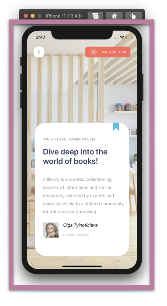
. Preparing main layout and Upper components: We will start working with the Background image and we’ll be adding top buttons which are the Back and Take a Tour Button.
<!-- Main layout and Upper components-->
<Grid RowDefinitions="Auto,*" ColumnDefinitions="*,*"> <!-- Background Image--> <Image Grid.Row="0" Grid.RowSpan="2" Grid.Column="0" Grid.ColumnSpan="2" Aspect="AspectFill" Opacity="0.7" Source="Room"/> <!-- Back Button--> <Button Grid.Column="0" Grid.Row="0" CornerRadius="16" ImageSource="Arrow" BackgroundColor="White" WidthRequest="40" HeightRequest="40" Margin="{ OnPlatform Android='25,30,0,0' , iOS='25,60,0,0'}" VerticalOptions="Start" HorizontalOptions="Start"/> <!--Take a Tour Button--> <Button Grid.Column="1" Grid.Row="0" CornerRadius="10" ImageSource="Tour" BackgroundColor="#fc695a" Text="TAKE A 3D TOUR" TextColor="White" Margin="{ OnPlatform Android='0,30,25,0' , iOS='0,60,25,0'}" FontSize="{OnPlatform iOS='12', Android='9'}" HeightRequest="40" WidthRequest="170" VerticalOptions="Start" HorizontalOptions="EndAndExpand"/>
<!-- Here add the code that is being explained in the step number two-->
</Grid>
. Working with the Frame structure: In addition to adding the Frame, in this part, we will be working with the layout structure that the Frame will contain.
<Frame Grid.Column="0" Grid.ColumnSpan="2" Grid.Row="1" HasShadow="False" VerticalOptions="EndAndExpand" Margin="30,50" Padding="20,0,0,20" CornerRadius="40" HeightRequest="480"> <ScrollView HorizontalScrollBarVisibility="Never"> <Grid RowSpacing="{OnPlatform iOS='20'}" VerticalOptions="Center" RowDefinitions="Auto,Auto,Auto,Auto,Auto,Auto" ColumnDefinitions="Auto,*" Padding="10,0,15,0">
<!-- Here add the code that is being explained in the step number three-->
</Grid> </ScrollView> </Frame>
 . Adding the components inside the Frame.
<!-- Blue Band Image--> <Image Grid.Column="1" Grid.Row="0" VerticalOptions="Start" HorizontalOptions="End" HeightRequest="40" Margin="0,-7,20,0" Source="Band"/>
<!-- Address--> <Label Grid.Column="0" Grid.ColumnSpan="2" Grid.Row="1" Text="218 8TH AVE, HAMMONT, NJ" FontSize="14" FontAttributes="Bold" TextColor="#a09fb8" VerticalOptions="Start" />
<!-- Title--> <Label Grid.Column="0" Grid.ColumnSpan="2" Grid.Row="2" Text="Dive deep into the world of books!" FontSize="{OnPlatform Android='20',iOS='30'}" FontAttributes="Bold" TextColor="#353f5f"/>
<!-- Description--> <Label Grid.Column="0" Grid.ColumnSpan="2" Grid.Row="3" Padding="0,10" TextColor="#969bac" LineHeight="1.5" Text="A library is a curated collection og sources of information and similar resources, selected by experts and made accesible to a defined community for reference or borrowing." />
<!-- Olga's signature information--> <Image Grid.Column="0" Grid.Row="4" Grid.RowSpan="2" Source="OlgaT" VerticalOptions="Start" HorizontalOptions="Start" WidthRequest="60"/> <Label Grid.Column="1" Grid.Row="4" Text="Olga Tyinoficieva" Padding="10,0,0,0" FontAttributes="Italic" VerticalOptions="End" HorizontalOptions="Start"/> <Label Grid.Column="1" Grid.Row="5" Text="LIBRARY FOUNDER" Padding="10,0,0,0" HorizontalOptions="Start" FontSize="10" FontAttributes="Bold" TextColor="Silver"/>
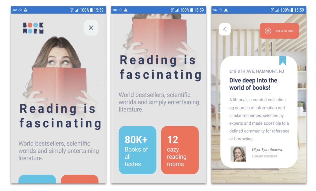
In the main image of this post, I added some screenshots of the IOS version, now I’ll leave those of the Android one.
 .
.

Recommend
About Joyk
Aggregate valuable and interesting links.
Joyk means Joy of geeK