

自适应表格连续字符换行及单行溢出点点点显示
source link: https://www.zhangxinxu.com/wordpress/2014/04/%e8%87%aa%e9%80%82%e5%ba%94%e8%a1%a8%e6%a0%bc-%e5%ad%97%e7%ac%a6%e6%8d%a2%e8%a1%8c-%e6%ba%a2%e5%87%ba%e7%82%b9%e7%82%b9%e7%82%b9-table-text-overflow-ellipsis-word-wrap-break-all/
Go to the source link to view the article. You can view the picture content, updated content and better typesetting reading experience. If the link is broken, please click the button below to view the snapshot at that time.

自适应表格连续字符换行及单行溢出点点点显示
这篇文章发布于 2014年04月10日,星期四,00:59,归类于 CSS相关。 阅读 46338 次, 今日 164 次 8 条评论
by zhangxinxu from http://www.zhangxinxu.com
本文地址:http://www.zhangxinxu.com/wordpress/?p=4105
我们应该都知道使用
word-break: break-all;
让连续的英文数字字符换行显示;
以及
white-space: nowrap; overflow: hidden; text-overflow: ellipsis;
让单行文字超出的时候使用点点点表示(Chrome目前有属性可以让多行文字点点点,且点的位置是在中间,见下2行示例代码)。
display: -webkit-box; /* height: 36px; line-height: 18px; */ -webkit-line-clamp: 2; -webkit-box-orient: vertical; overflow: hidden;
但是,如果是自适应的表格中,我们要实现上面两个效果,可能就会遇到挫折,你会发现屡试不爽的方法现在完全被无视了!
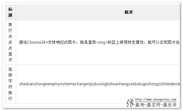
例如,连续的英文字符会撑开单元格,而无视其外部的宽度设置,类似下面截图效果:
以及单行文字溢出点点点效果也会无效,因为单元格的流动性,使得文字根本就不存在溢出这种说法。
如果解决这个问题呢?实际上很简单,给最外面的table标签增加一个声明:
table-layout: fixed;
table-layout: fixed的作用在于,让表格布局固定,也就是表格的宽度不是跟随单元格内容多少自动计算尺寸。
您可以狠狠地点击这里:连续英文换行以及单行文字点点点demo
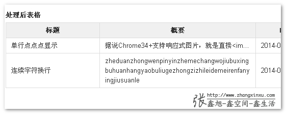
下图为demo页面表格table-layout: fixed后的效果截图:
兼容IE6+
以后,大家或多或少,或者已经开始使用表格相关display属性帮助构建web页面了,总会遇到类似的连续英文字符不换行,或者单行文字溢出没有效果的。此时,您就可以想到table-layout: fixed这厮。您可以试试:
display:table; width:100%; table-layout:fixed;
这样的固定组合解决方案。zxx.lib.css中的.cell_bk就是类似的处理。
可以应用在父容器,可以是内部子元素。
总之,希望能对遇到类似问题的人提供一点帮助,以上~感谢阅读~ 本文应该不会有人吐槽啰嗦了吧!
 是不是学到了很多?可以
 有话要说?点击
Recommend
-
53
-
46
Shell 文本处理编写单行指令的诀窍
-
60
(点击上方公众号,可快速关注) 来源:飒然Hang , www.rowkey.me/blog/2017/...
-
55
本文列举了十个使用一行代码即可独立完成(不依赖其他代码)的业务逻辑,主要依赖的是Java8中的Lambda和Stream等新特性以及try-with-resources、JAXB等。
-
61
文本间隔: ——– # 在每一行后面增加一空行 sed G # 将原来的所有空行删除并在每一行后面增加一空...
-
49
2019年06月13日 阅读 4785
-
7
PDF是非常有用的存储医疗和财务文档的格式。这些文档中的大多数都包含表格,我们需要从其中提取数据以满足业务需求。 我们以前写过关于电光光学字符识别中表检测和提取的内容,而在这篇文章中,我们将更详细地介绍如何从pdf中提取表格数据。
-
4
您现在的位置:首页 --> MySQL --> sql 语句查换行隐形字符 sql 语句查换行隐形字符...
-
5
本文整理了一些实用的 JavaScript 单行代码,非常好用~~获取浏览器Cookie的值通过document.cookie 来查找cookie值const cookie = name => `; ${document.cookie}`.split(...
-
5
.NET/C# 程序如何在控制台/终端中以字符表格的形式输出数据 吕毅 发表于 3 天前 在一篇在控制台窗口中监听前台窗口的博客中,我在控制台里以表格的形式输出了每一个前台窗口的信息。在控制台里编写一个字符表格其实并不...
About Joyk
Aggregate valuable and interesting links.
Joyk means Joy of geeK