

Getting started with visual hierarchy in design
source link: https://uxplanet.org/getting-started-with-visual-hierarchy-in-design-3b5546ede88e
Go to the source link to view the article. You can view the picture content, updated content and better typesetting reading experience. If the link is broken, please click the button below to view the snapshot at that time.
Getting started with visual hierarchy in design
3 ways to easily create hierarchy

Hierarchy ranks the importance of design elements on a page. What do you want someone to see first? Should it be the title on a webpage that creates a strong call to action or maybe a photo or illustration that gives more context? Let’s dive into these design examples and learn how to create better hierarchy.
What is visual hierarchy?
There are multiple definitions of hierarchy, most refer to a system of organized rankings or order or power structure to help everyone know who is on top and most important in a chain of command. But when it comes to design, visual hierarchy is related to all the elements you see in a design and how they are perceived in order of importance.
The best examples of hierarchy in design come from poster design. Similar to a billboard, posters are usually displayed large outside of a building or somewhere there is high foot traffic. But you have only a few seconds to catch someone’s attention before they walk past. One way to do this is to design the poster in a way that something stands out in importance.
Take a look at this poster, notice how the design is simple, it uses a limited color palette and mostly typography and lines to create this striking design. But even though the design is mostly made up of type, there is still a level of hierarchy, you notice the large headline “One night only” first because it’s larger in size, it’s set to all caps, and it uses a bold typeface.

Why is visual hierarchy important in design?
If every part of your design is of equal importance, then nothing will stand out. When it comes to web or app design, this is crucial to avoid. Using hierarchy will help you guide the user along the correct path. Is this the first time they are using this app? A good onboarding experience will help introduce them to the key functions of the app. Likewise, the first impression someone has of a website is vital for them to return.
Take a look at this flyer example. Yes, it has some nice design elements, for one it’s an animated GIF that helps grabs someone's attention. But there is so much going on, where do you look first? there are fun line-art illustrations, quirky typography, and bold colors.
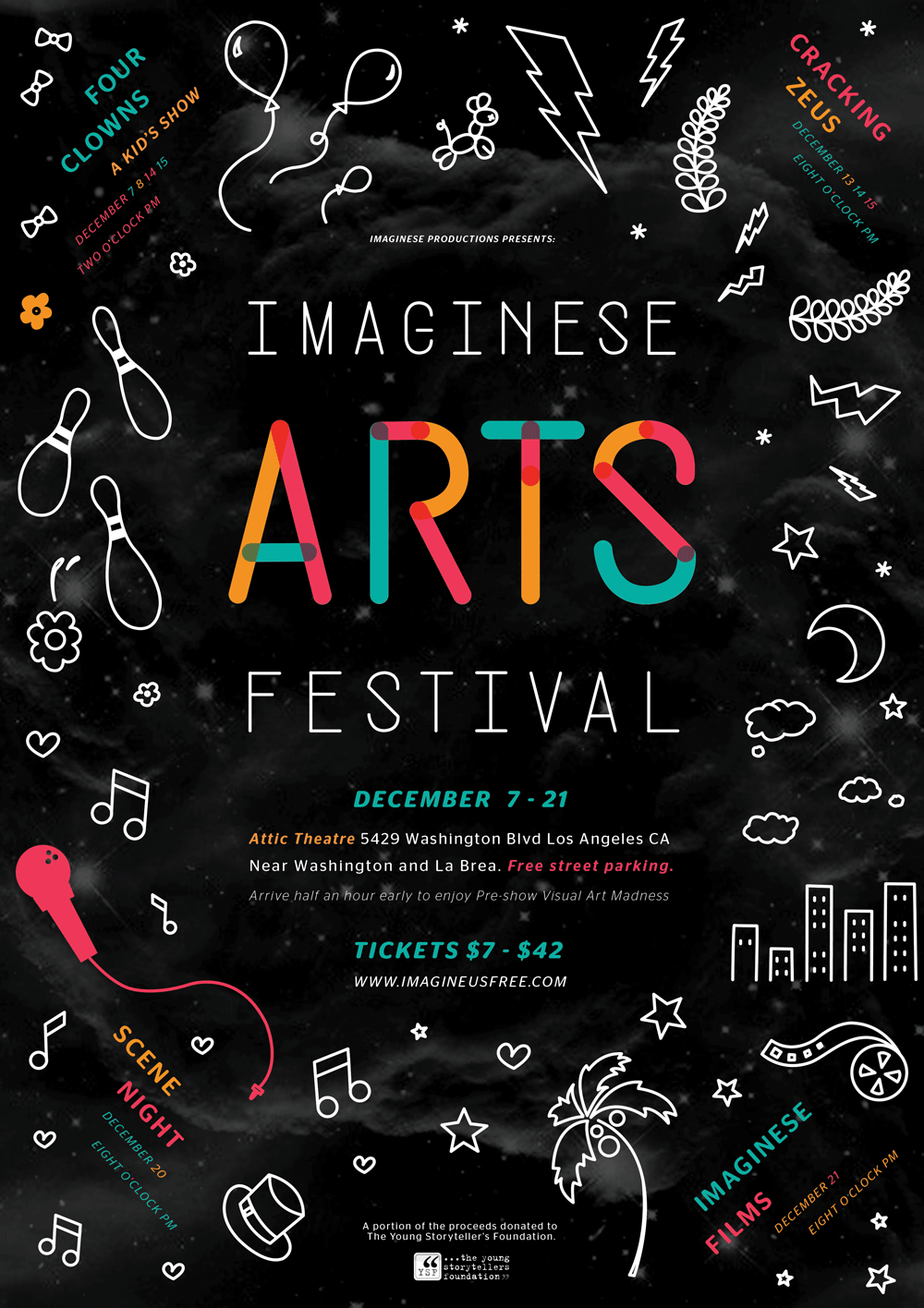
To help make this design more successful, you might want to think more about negative space and scaling down the importance of some of the illustrations to help the even name stand out more.
3 ways to create visual hierarchy
Now that we have a better idea of what visual hierarchy is and how important it is for the user to navigate through and understand our design, let’s walk through 3 of the easiest ways to create visual hierarchy in your designs.
You’ll soon realize while one design principle might be more dominant in creating hierarchy, most of these examples (and design in general) use many design principles to create a successful design.
1. Scale
One of the simplest and most straightforward ways to create hierarchy in your design immediately is to make one element dramatically larger than the rest. You want to have a good variation in scale across all elements, but one should be the focal point.
In this fan recreation of the Little Women movie, we see scale used in a way that might break the rules of design but is actually quite effective for communicating the plot of this film.
Based on what we mentioned earlier, when using scale to create hierarchy, one element should be larger than the other. But in the storyline of this plot, four different female characters carry equal weight. For this reason, it makes sense that the silhouettes of all four women are the same size. What varies is what’s shown inside each silhouette which gives you a glimpse into that character.

In this poster, scale is used in another clever way. The main focal point is the collage of cropped jazz instruments and musicians. No one image is more important than the other but when they are tiled together thoughtfully with space and color, they create one large photo that serves as the highest in the hierarchy. Immediately, we know this is advertising for a jazz music event. If we want to learn more, we scan through to the bottom to read the event dates, location, and artist information.

This poster design draws your attention in not only with the use of scale but with leading lines and perspective. The largest design element is the illustrated word “Blame” boxed within a black shape connected to a silhouette standing within a doorway. From the use of colors, we immediately get the sense that this is the plot for a murder mystery film.

2. Color
Another way to create hierarchy in design is to use color strategically. Maybe you decide to use a limited color palette or the brand you’re designing with has its own predetermined color palette. Use this to your advantage to help draw the eye to one part of your design over another.
In this example, the design uses a limited color palette of mostly yellow, black, white, and pink. Yellow and pink are two bold colors, but the way they are used together helps draw attention and create hierarchy. The bright yellow is a fun and vibrant background but the pop of pink in the container holding the piano keys really narrows your attention in here. But notice how other design principles are used as well such as scale and good use of negative space.

Depending on the colors you use for a design, one usually adds more contrast and therefore attention. In this example, that color is black. Black has a tendency to stand out the most in design, so you should use it sparingly.
Not only is the title large and bold but because it’s in black while all the other background colors are lighter in contrast, it helps to create a seamless sense of hierarchy. If someone is intrigued enough, they’ll move in closer to read the supplementary text to learn more.

Here is a poster design example that uses a monochromatic color palette to help create hierarchy and unity. The umbrella uses a dark, almost black, blue. The movie title and raindrops are reversed out of the main duotone image of a character singing in the rain. A good use of negative space around the umbrella and image, help to draw your attention even more.

3. Whitespace or negative space
Whitespace (also known as negative space) doesn’t literally have to mean “white” space. It more so has to do with how you use negative space or breathing space. Newbie designers might try to pack their design with as much as possible, thinking that will help make it look better. This is a mistake. Good design involves removing unnecessary elements until all that remains is what’s most important and still gets the point across.
This is a beautiful example of creating hierarchy with whitespace and scale. The date and title of the event are set in a larger typeface but it is also separated by whitespace or negative space from the other bits of type and rich gradient color element.

This poster uses negative space in a clever way to create its title. Notice how the a in the title “jam” is shown inside the j and m. With the use of color (black creates dark contrast when paired with other colors), scale, and whitespace, this design calls attention to itself in an engaging way.

Not all examples of using whitespace to create hierarchy have to have a minimal aesthetic. Here’s an example where there is a lot going on in the top half of the poster, but it’s all leading down to one endpoint in the bottom middle. Illustration, pattern, and hand-lettered type fit organically into shapes that create streams of smoke. It’s colorful, vibrant, fun, and there’s still a strong sense of hierarchy.

Tips for creating better visual hierarchy
If you’re wondering how else to improve the hierarchy in your design, consider some of these tips.
Create multiple versions
No matter what you are designing, you should create multiple versions. If you’re designing a landing page for a business or creating a poster for an event, before you start creating pixel-perfect designs, wireframe or sketch out multiple solutions. Keep your ideation and design iterations to the beginning of your design process to help you move quickly and come up with the best solution right away.

A great way to do this is to try out the “crazy eights” exercise. Take a piece of paper, fold it in half, then fold it in half once more. Now you have eight panels to sketch out eight different possibilities for a design problem.
Ask for feedback
After you’ve worked on a few wireframes and sketches and you start to design a higher fidelity version in your favorite design program, get feedback early and often. Show your design to someone who knows nothing about design and ask them open-ended questions.
For example, if you’re designing a landing page, ask them what do they notice first when they look at this webpage? Is there any part they find confusing? What action are they trying to take as they scan through the webpage? This is called user testing but you can use a form of it for just about anything you design. After all, we are designing for people, so we should make sure they understand our designs. If they don’t, our design solution is a failure which is ok, we just need to reassess and redesign.
Study design
The more you study design and spend time designing, you’ll notice how much design lives around you in your everyday life. Take note of what you see, learn from it, question it. How would you improve it if you were the designer creating the experience?
Recommend
About Joyk
Aggregate valuable and interesting links.
Joyk means Joy of geeK