

Faster user experience: Optimistic UI
source link: https://uxplanet.org/faster-user-experience-optimistic-ui-41b151feaa28
Go to the source link to view the article. You can view the picture content, updated content and better typesetting reading experience. If the link is broken, please click the button below to view the snapshot at that time.
Faster user experience: Optimistic UI
Optimistic UI; a design and application/web-oriented method to improve the user experience. Its use and operation are slightly different, but its purpose is the same as many UX improvements; not to reflect delays to the user.
We don’t want to show the user lags most of the time. Even other similar examples; skeleton screens and animations. The main goal is to eliminate the feeling of freezing and not loading on the screen.

How does it work?
As it is known, web and mobile are two separate platforms, user habits are different from each other. But the optimistic UI works similarly on both platforms. Normally when we interact with the screen, the change is sent to the server before it appears on the screen. The server returns a response and the change/interaction we made appear on the screen. What the server checks are whether this operation can be done under the current conditions. For example, your internet connection affects the server’s response. If there is no problem caused by the user, the server returns a successful response.
This is where the Optimistic UI focuses. Basically, there is an “optimistic approach”; Assuming that the server will return a successful result. When the user interacts with the screen, we show a successful result on the screen without waiting for a successful response from the server. So just as we don’t show the background stuff to the user, they shouldn’t wait for the interface. The user interacts with the screen → Positive result appears on the screen → Server request (We will discuss the error situation later)

Why do we need it?
In the early days of the web, users didn’t have to worry about latency. Maybe they didn’t even realize it was a problem. But over time, the number of people using the web has increased. And with this increase, users who do not know what is going on behind have also used the web. It has become mandatory to give feedback to the user. This event is not all about the Optimistic UI, it is also about how UX was born on the web. Then the processes on the web accelerated and the users adapted to this speed. Optimistic UI has now evolved into a method used to provide a better experience for users who adapt to speed. Just like other UX improvements.
In short, the main reason for these improvements is the users and their feelings. It’s about the psychology of the users.
Optimistic UI in familiar applications
For example, in messaging applications, the latest status of the message has been known for a long time. Check icons are great feedback. We know what check icons mean. Most messaging apps do not show the following when the message is not delivered: “Error!” or “red alerts (eg alert box)”. Now the check icon or a more passive icon is used as an “attention alert”. The user has learned these, even if they are less noticeable. But I like it; providing user habits is better if you ask me. Here is an example;
The best-known example of Optimistic UI in other popular social media applications is liked. For example, when you like a photo with a double-tap on Instagram, the number of likes increases with a beautiful heart animation. The server process is completed until the animation appears and disappears. But if you pay attention when the error occurs, you will not “like” the photo and you will not be notified. So you are not actually increasing the number of likes. This is a little odd, but as a user, we got used to it too. Here is another example;
What about spinner?
In the past, in the early days of the web, you would interact with the screen and there would be no changes on the screen until the server responded. Consequently, it was a very bad idea not to give feedback.
Then we used spinners, and it is still used frequently today. Spinners mean ‘something running in the background’. But as you can imagine, the user gets bored with the spinners on the screen as the time gets longer. Sometimes it leaves the screen and sometimes completely leaves the site or app. Because this long spinner process gives the user the impression that “the page is not working”.
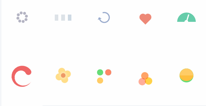
Another thing that can be considered as a spinner; animations. The response from the server can sometimes take a long time. The animations manage to keep the user on the screen a little longer without boring. Until the animation plays, the background process is complete. Therefore, from my own point of view, I pay great attention to the use of animation.
What problems might be?
The most important problem we may encounter is a negative (error) result from the server. The user should be given feedback in case of an error. And the change in the interface should revert to its old look.
However, some common social media applications (Twitter, Instagram) take the initiative in terms of feedback. Social media applications provide feedback to the user by using icons or alert boxes in important situations such as sending messages. However, in relatively insignificant situations such as liking a photo/tweet/pin, only the interface change on the screen returns to its old state. (You can try liking photos on Instagram, without your internet connection)
This is what I know and what I want to say about Optimistic UI. When you look at the apps and the web carefully, you will notice how often they are actually used.
Recommend
About Joyk
Aggregate valuable and interesting links.
Joyk means Joy of geeK