

The Ultimate Guide to Creating a Design System — Part Three, Complex Buttons
source link: https://blog.prototypr.io/the-ultimate-guide-to-creating-a-design-system-part-three-complex-buttons-36b4fd9f554d
Go to the source link to view the article. You can view the picture content, updated content and better typesetting reading experience. If the link is broken, please click the button below to view the snapshot at that time.

In this part, we will be going over how to create a button element within Figma. But, we won’t be making any old button. We will be going over how we can use a few of Figmas’s powerful features to make these buttons easy to use, update and manage throughout your projects.
Ok, so our Color & Text Styles are created, it is time to start creating UI Elements. 🎉
Rules for buttons
Buttons seem like a simple thing to design; however, there are a few golden rules to follow when creating a button, such as;
- Alignment
- Radius
- Shadows
- Accessibility
There are plenty of posts here on Medium that talk about these rules if you wanted to learn more, but for the sake of this post, I will be focusing more on the setup and architecture of the button component than I will be explaining the thoughts behind the UI.
Creating the “Master” Button
Typically in a design project, we will have multiple types of buttons with various states. That means that if you are using Figmas component system, any changes you make will have to be made to all of the various components/instances.
To combat this, we will instead make a “master” button, which will allow us to make sweeping changes with minimal effort.
This may be confusing right now, but it will make sense soon. Trust me.
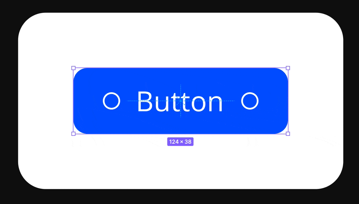
Ok, so first, we want to grab a placeholder icon(s). Feel free to use your favorite icon resource for this. I personally love using remixicon.com as they have some great icons. You can copy-paste straight to your Figma document.
I have grabbed myself a single icon for this demonstration, but you can grab two if you like. Then, go ahead and create a component using this icon and give it a name. Mine is going to be “Icon/Circle” for this particular icon.

Then, we are going to create two instances of this component, size them down to 12x12(px) and create a label in the middle of them.
I will be using the text-style “Header/Regular/16px” from part two of this design series. You can too, or create your very own text style and call it what you like (I sometimes create a text style for my buttons, such as “button/label/small” but for this tutorial, I want to keep everything simple)
Next, select the two icons and label, turn them into a group (cmd + g), and make this group an auto-layout group. Use the auto-layout align tool and align “Left-Center”, with a “spacing between items” of 8px.

Finally, let’s make everything in this group white, then give the group-layer a fill of “Primary/500”, border of 8px and padding of 8px top and bottom, 16px left and right. Turn this group into a component and give it a name such as “Button/Master”

That’s it, that is your master button.
(consider taking a moment now to name your layers, check out the working file on how this may look)
Creating The Layout Variants
Figma released a pretty nifty feature called Variants. This feature allows us to make powerful components and a button is a great way to show it off.
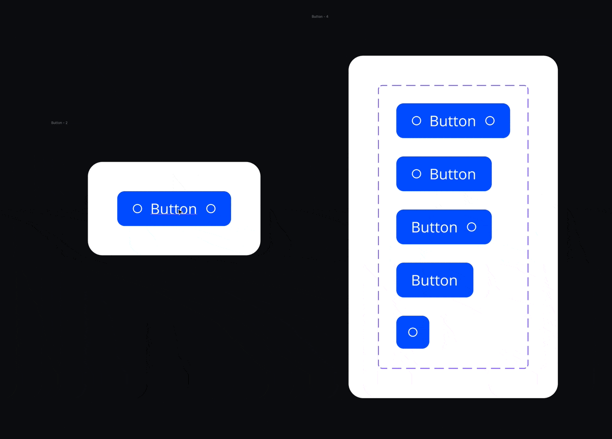
First, copy an instance of the master component and turn that copy into its own component. Next, with this new component selected, click the “Variants” row on the right tab to turn this into a variant. Click the little “+” inside your new purple box until you have 5 versions (that should all look similar).

What we are going to do now, is create all our layout variations. To do this, select the second button, then select the icon on the right, and press delete (or backspace). Next, select the third, grab the icon on the left, and again, press delete. The fourth one, delete both icons, and the fifth, delete the label and right icon. (the sizing may go funny on this fifth one, if so just go ahead and adjust the padding of the nested master component until the button height matches the other buttons' heights. For me, this was 12px)

Now, we need to name these variations in a way that will allow us to toggle on and off the various button elements. So, select the variants box (the dotted purple box) and on the right, you will see a “variants” panel with a “property” within it. Go ahead and create 2 more (a total of 3) and label them as “Icon Left, Label, Icon Right”.

Now, we will assign those values to the components. Select the top button and on the right name the values as “True, True, True”. Do this for all of the buttons, but changing the value to “false” for the corresponding buttons;
Button 1 = True, True, True
Button 2 = True, True, False
Button 3 = False, True, True
Button 4 = False, True, False
Button 5 = True, False, False
Now, you should be able to grab an instance of the top button (either select, copy and paste outside of the variants box, or drag from the assets panel) and toggle on and off through all the variations.
Controlling All Instances
Now, before we finish up, let me show you the power of creating (and nesting) a master component into the variants.
Go back to your original master component. Now, change something about it. Maybe the radius, color, icon, label, spacing. Whatever you like. You will notice this will change every single instance and variant you created. How amazing is that…
There you have it, you have created a pretty powerful button!
Now, that is not all, you can apply this same technique to create the state of the button too. Simply create variants of each of these buttons, and add a new property called “state”. Giving each button layout its own state. If this seems a bit complex, or you don’t want to spend hours setting these up, check out simplekits.co as I have used this exact process for not just buttons, but the majority of the components of the kit.
Wrapping Up and Next Steps
Next post, we will expand upon what we learned on this part and dive into the world of inputs. Covering more advanced nesting architecture, variants settings, and more.
Want a design system without the hassle of creating ever single component yourself? Then check out simplekits, a Design System Kit made with all the core components you could need for any project.
Recommend
About Joyk
Aggregate valuable and interesting links.
Joyk means Joy of geeK