

How I learned to stop worrying and love the hamburger menu
source link: https://pointieststick.com/2021/04/03/how-i-learned-to-stop-worrying-and-love-the-hamburger-menu/
Go to the source link to view the article. You can view the picture content, updated content and better typesetting reading experience. If the link is broken, please click the button below to view the snapshot at that time.
How I learned to stop worrying and love the hamburger menu
Yesterday we introduced KHamburgerMenu to the world, and I wanted to talk a bit more about it, because I think it’s a very exciting UI control in ways that may not be immediately obvious.
But first some background: a few years ago I wrote a big long post criticizing GNOME-style headerbars, and one of my complaints was that adopting them requires the replacement of traditional menu bars with hamburger menus. You know, this little thing:
Specifically, here are the problems I see with GNOME’s hamburger menus:
- They are mandatory with the headerbar design because there is no place to put a traditional in-window menu bar.
- To condense the entire app’s non-visible functionality into a small hamburger menu, you have to remove a lot of features, making it unsuitable for large and complex apps because there’s simply no way to fit in all the functionality.
- GNOME hamburger menus don’t show keyboard shortcuts, so they fail to teach users how to become more proficient right at the point of use for each feature.
- GNOME headerbar items can’t have custom drag behaviors in order to preserve window draggability, so they don’t let you click-and-hold to open, slide the cursor over an item, and release to select that item.
- GNOME hamburger menus are implemented as a widget inside the app’s window, so they can get cut off if the window is too small–reinforcing the need to avoid putting too much stuff in them (EDIT: apparently this is fixed in GTK4 on Wayland):
Our grass isn’t that much greener
However, I think at the time I was being too kind to traditional menu bars to help me make my argument. Over time I have sometimes found myself frustrated with how hard it is to actually find anything quickly in traditional menu bars. Every time I use a GNOME headerbar app, I have to admit that as an infrequent user, I appreciate the approachability and speed of their simple and consistent hamburger menus. The apps feel friendly and easy to use, not overwhelming as some KDE apps can be (though I think we’re getting better about this). And I think our flagship apps’ use of huge menu bar structures is a part of that feeling of overwhelmingness. If we’re being honest with ourselves, we need to admit that traditional menu bars can suffer from a variety of well-known problems that we can’t just ignore:
- Menu bars are designed to show everything, so they are inherently duplicative; a button visible in the toolbar or status bar still needs an item in the menu bar. This causes the menu structure to become enormous with medium to large apps. Because menu bars are not context-aware, they’re always full of disabled menu items that you have to ignore, or wonder why they’re disabled. Thus it becomes harder to find any given menu item since you need to mentally filter out all the irrelevant ones.
- Menu bars require strict categorization for every action which can become nebulous or nonsensical. Why are the “New Tab” and “Quit” menu items typically in the File menu? Why is “Search” in the Edit menu? Why is “Donate” in the Help menu? Because there weren’t any better places to put them without adding even more top-level menus, which would make everything harder to find. And depending on the toolkit or OS, an app’s “Preferences/Configure” item can be found in the Edit menu, the Tools menu, the Settings menu, or even somewhere else entirely!
- Finding anything in a menu bar is slow. There are generally between 4 and 12 top-level menus, and because items are imperfectly categorized, in practice you end up having to just scrub through all of them to find what you’re looking for. With big apps, menus are very long, so this takes forever. macOS goes so far as to offer a menu item search feature just because it’s usually faster to search than to actually use the menu structure!
- Because a traditional in-window menu bar consumes a row in the window’s header area, it wastes all the space to the right of the menu, and can cause the header area to become quite thick when it also has a titlebar, a toolbar, a tab bar, a URL bar, and so on. This can add up, especially for laptops with 16:9 aspect ratio screens.
So if the grass isn’t greener on the other side, but it isn’t greener on our side either… where can we find some green grass? It can’t be a barren wasteland everywhere!
A place for everything, and everything in its place
For big apps with lots of features, menu bars are probably here to stay. They aren’t perfect, but humanity hasn’t yet figured out something appreciably better: hamburger menus can’t fit everything without becoming insane; ribbons take up much more space and suffer from the same categorization problems; sidebars take up even more space; trying to put all the controls inline with 100% context sensitivity becomes overwhelming. The jury’s still out on this one.
And this is fine: since KDE apps don’t use headerbars, there is a place for a powerful app’s menu bar to live without infringing on any other UI element’s turf. We fully support traditional menu bars and we always will!
However for smaller apps with less functionality, a menu bar can be overkill. As I mentioned earlier, I think a well-designed hamburger menu is quite pleasant to use, even if its implementation in GNOME is quite limiting and suffers from technical restrictions. If only there were a way to have the advantages of such a clean and friendly setup for small-to-medium apps, without any of its disadvantages…
KHamburgerMenu to the rescue
And this is where KHamburgerMenu comes in. While designing it, we were conscious of the problems with GNOME hamburger menus and specifically set out to avoid them, while also trying to match it to KDE’s existing technical and cultural conventions:
- The hamburger menu provided by KHamburgerMenu is optional; if you just don’t like hamburger menus, you can use a full traditional menu bar if you like. And apps that are so powerful and complex that they demand the use of a full menu bar do not have to adopt KHamburgerMenu at all if they don’t want!
- A KHamburgerMenu toolbar button is just another ordinary toolbar button, so you can move it to another place, give it some text, change its icon, or remove it entirely if you are a fussy advanced user who wants no menubar and no hamburger menu. It’s your choice! The system adapts to you, not the reverse.
- KHamburgerMenu menus provide emergency access to the full menu structure in case the curated set of actions isn’t enough, which eliminates the need to remove features to conform to the new UI style for apps that do adopt it!
- KHamburgerMenu menus show keyboard shortcuts, so they teach the user how to become more proficient in using the software!
- KHamburgerMenu menus let you click-drag-release to quickly trigger an item!
- KHamburgerMenu menus are traditional menus, so they aren’t limited to the dimensions of the window even on X11, further reducing the pressure to make them as small as possible!
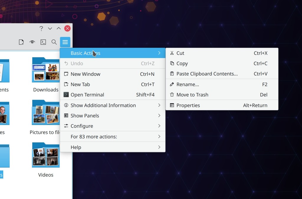
- KHamburgerMenu can modify the contents of its menu according to what’s visible on the toolbar. For example in Dolphin, the menu can avoid showing the “Sort By” item because this would be redundant with the one on the toolbar, but if you remove that button from the toolbar… it can become visible in the hamburger menu!

I think KHamburgerMenu will truly bridge the gap for KDE’s moderately powerful QWidgets-based apps like Dolphin, Okular, Gwenview, Konsole, KWrite, and KCalc–providing the space savings and pleasing single entry point of GNOME-style hamburger menus, without its drawbacks of being inflexible, mandatory, limited in size, hiding keyboard shortcuts, and requiring that adopting apps remove functionality. If we get it right, our flagship apps will feel much more approachable while not losing any of their powerful features or customizability. Doing this in a flexible and optional way is more work, of course–and if we’re honest with ourselves, it will probably lead to more corner-case bugs. But that’s the KDE way. We have to be true to who we are, even when we march boldly into the future!
Related
On HeaderbarsDecember 18, 2018In "User Interface Design"
This week in KDE: KHamburgerMenu and some good bugfixesApril 2, 2021In "This Week in KDE"
More on Headerbars: RebuttalsMarch 6, 2019In "User Interface Design"
Recommend
About Joyk
Aggregate valuable and interesting links.
Joyk means Joy of geeK