

How to write inclusive, accessible digital products
source link: https://uxdesign.cc/how-to-write-inclusive-accessible-digital-products-2f4b35ec59a2
Go to the source link to view the article. You can view the picture content, updated content and better typesetting reading experience. If the link is broken, please click the button below to view the snapshot at that time.
How to write inclusive, accessible digital products
Good UX writing invites everyone to use the interface.

There’s one piece of writing advice I give to everyone:
Read your writing out loud.
Yes, out loud. Not out loud in your head. Out loud out loud. Move your mouth. Make sound. Listen to your sentences. It’s a simple technique, but it works.
Listening lets you detach from your work to catch — and correct — things you might’ve missed. It’s a way of smoothing things out. Words just feel different when they’re spoken.
The first goal of good UX writing is usability. Before you give digital products personality, those products need to make sense. That means the words need to work for everyone.
For UX writers who work on digital products, listening to the writing in an interface is doubly useful. That’s because the technique is a pretty good approximation for how a screen reader works. Listening can make your UX writing better and your products more usable.
The nomenclature of digital product design is anchored around one word: user. User experience. User testing. User research. That one word can sometimes hide an obvious but important truth:
Users are people. And people read differently.
Some people understand English as a second language. Some people make their font size really big. Some people have cognitive impairments, or limited vocabularies, or backgrounds that shape a different understanding of a common word.
Inclusive, accessible UX writing is a way of reminding people that they belong, that this product — and this planet — has a place for everyone.
So start by reading everything out loud. Here are some other things to do.
Write clearly.
Clarity, not creativity, is the backbone of good UX writing. Choose simple words and craft shorter sentences. Explain acronyms users might not know. Use proper punctuation. Be extra careful about things like cleverness, wordplay, and idioms that might affect usability. Above all, write to be understood.

Use inclusive language.
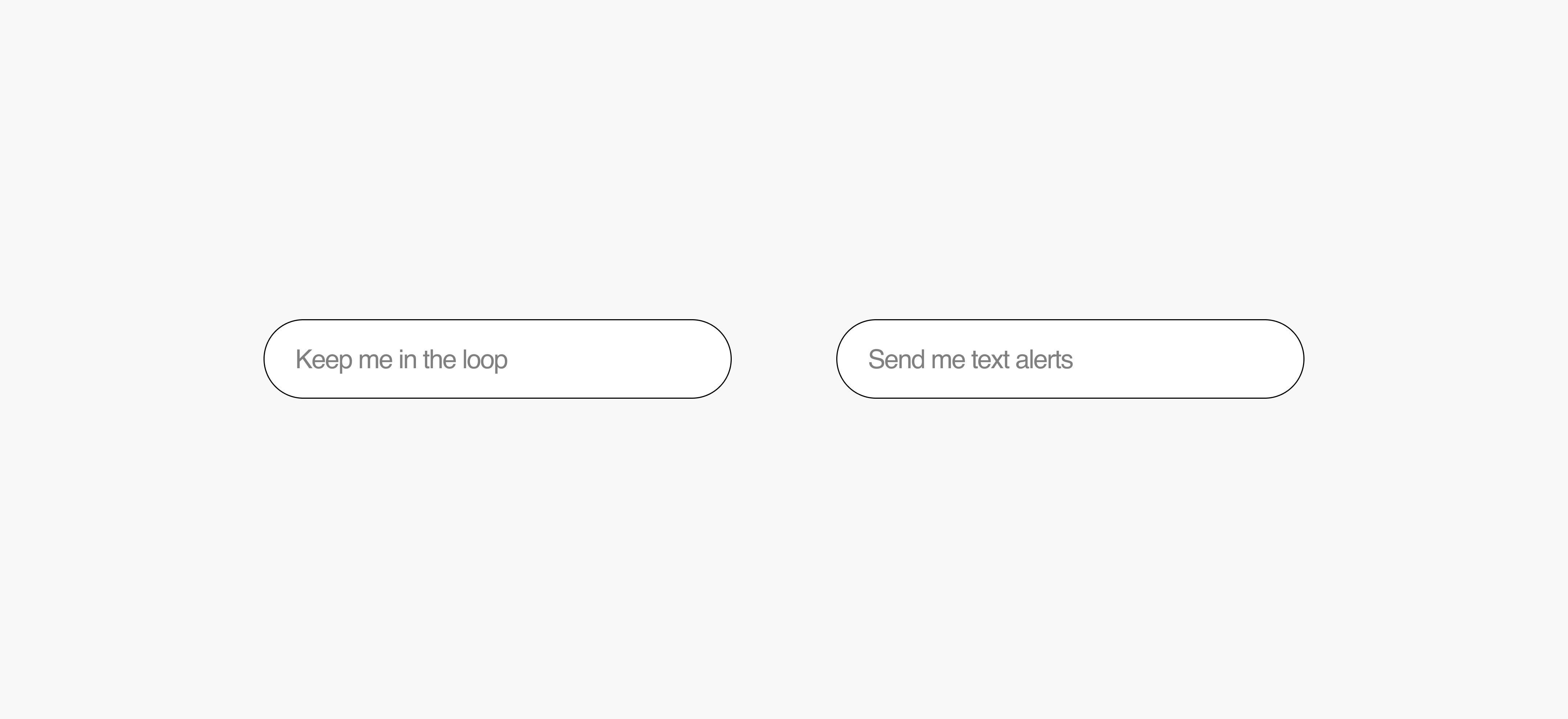
Write to people as people. Be respectful with pronouns. Avoid ableism, racism, sexism, and stereotypes. And remember, language evolves. Inclusive UX writing can help shape that evolution. Thoughtful writing in an interface today can influence the way people think and behave tomorrow. Write on the side of progress. Write the world you want to live in.
Respect every use case.
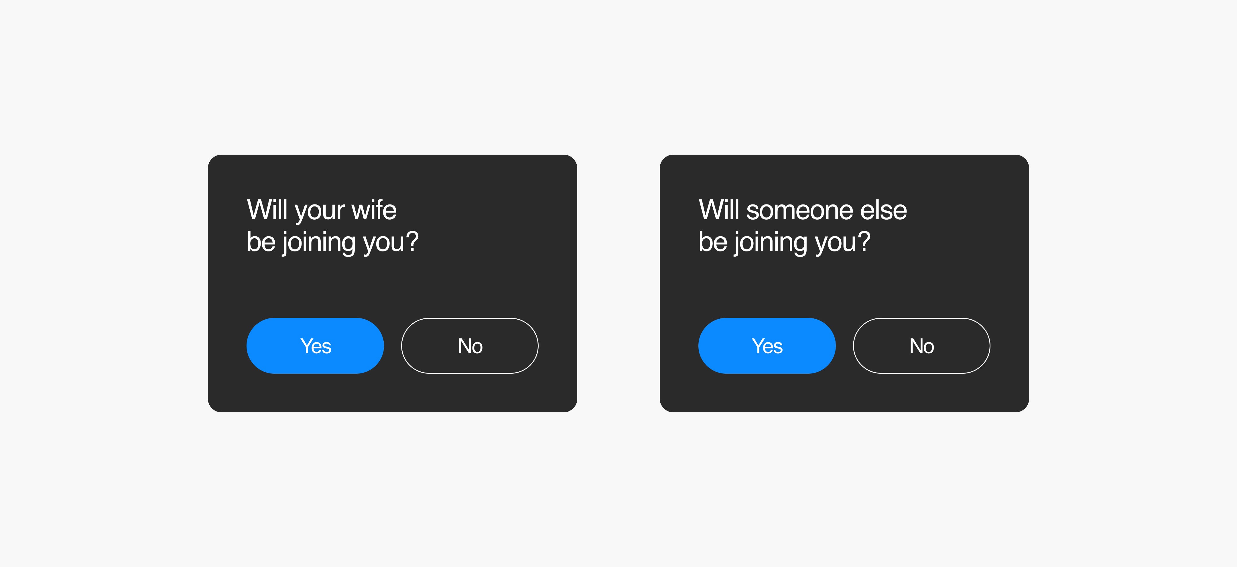
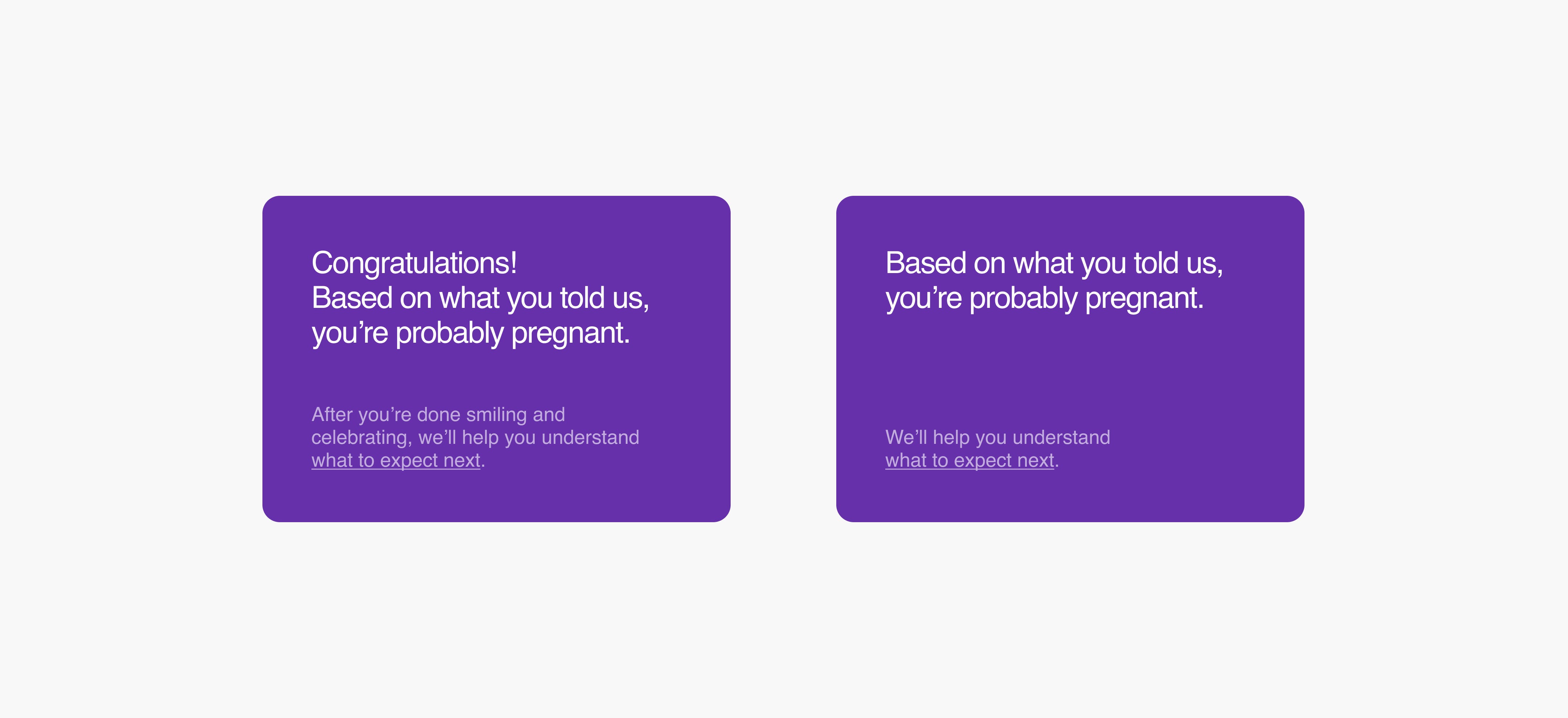
User needs and emotions can be wildly different, even for the same flow in the same product. Consider two users both booking a rental car in San Diego. One might be excited; they’re about to take a west coast road trip. The other might be terrified; they’re flying home to care for a friend who just had surgery. Good UX writing never presumes.
Use neutral placeholder text.
Placeholder text can help explain an interface. It can also make people feel judged or start comparing themselves. This kind of UX writing works best when it nudges people toward the right input or formatting. But avoid pre-filling information about things like gender, race, health, and wealth.
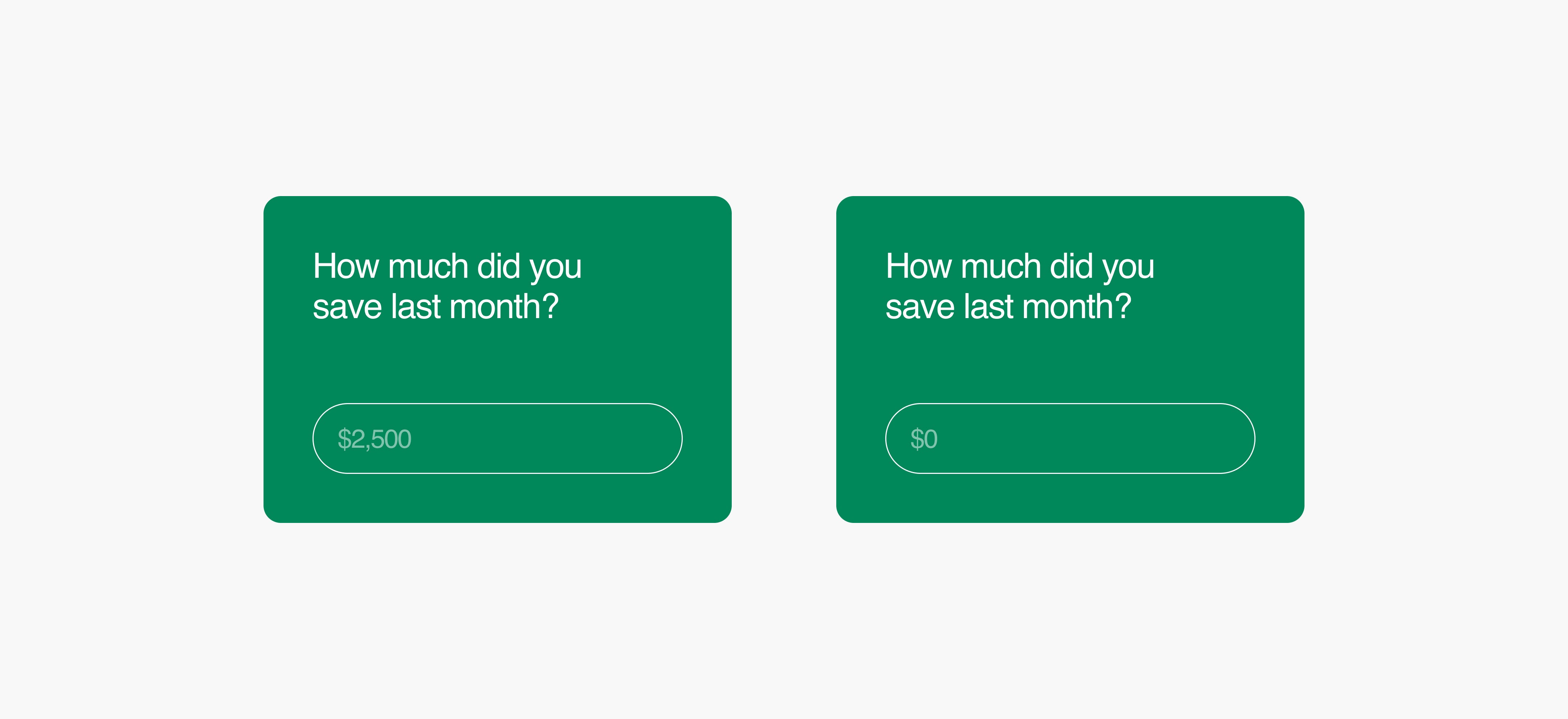
The right: users simply know to enter a dollar amount.
Write boring CTAs.
Slippery phrasing never works. Use CTAs to set a clear, correct expectation for the user. And always tell the truth. A free trial that — surprise! — asks for a credit card is unethical, amateurish, and annoying.
Test all writing with normal formatting.
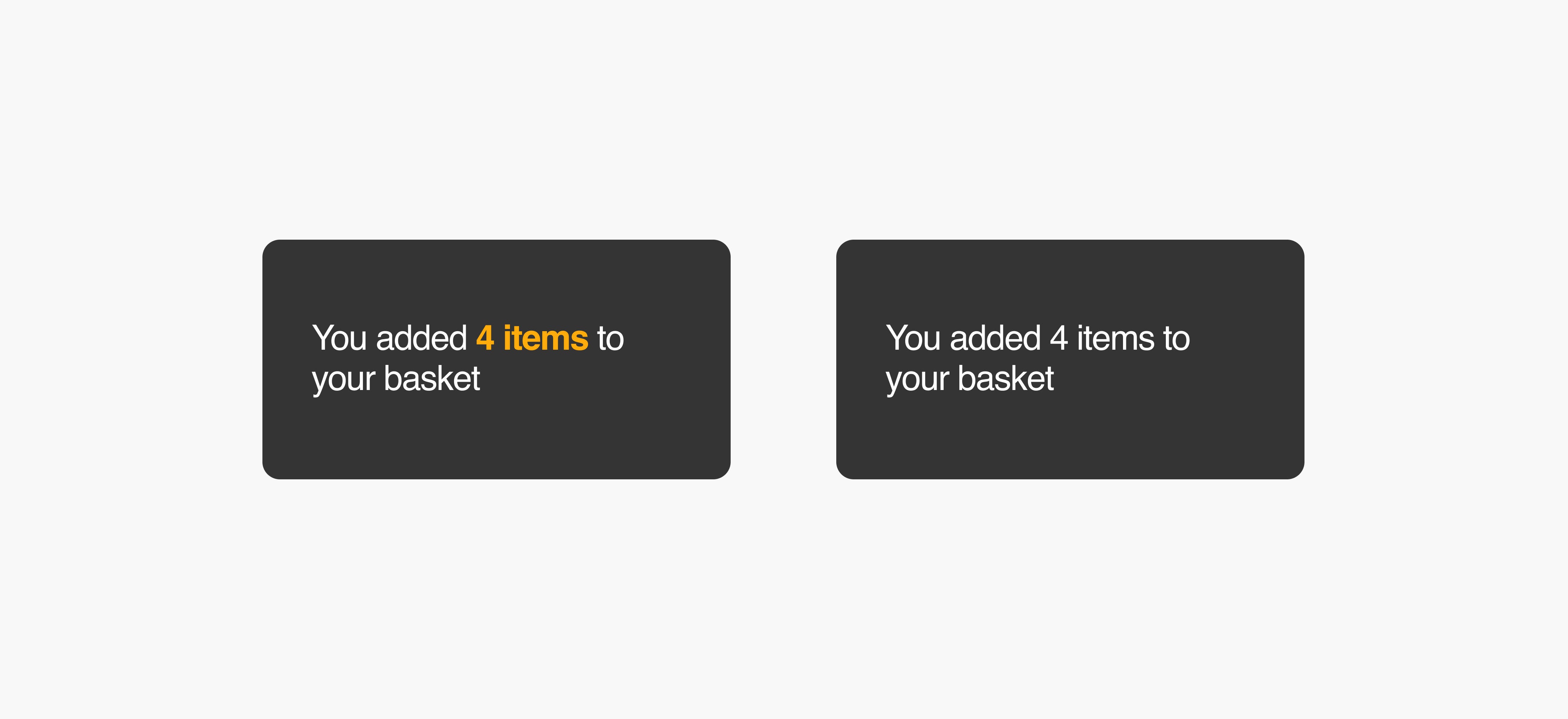
Many screen readers don’t recognize bold or italics or colored text. It’s often easier to write without those things, emphasizing ideas and information with clear phrasing and punctuation. But if you choose to write with colors and varying type styles, make sure the writing still works when those things are stripped away. UX writing should still make sense when the colors, sizes, and styles are gone.
Use words that make sense for every interface.
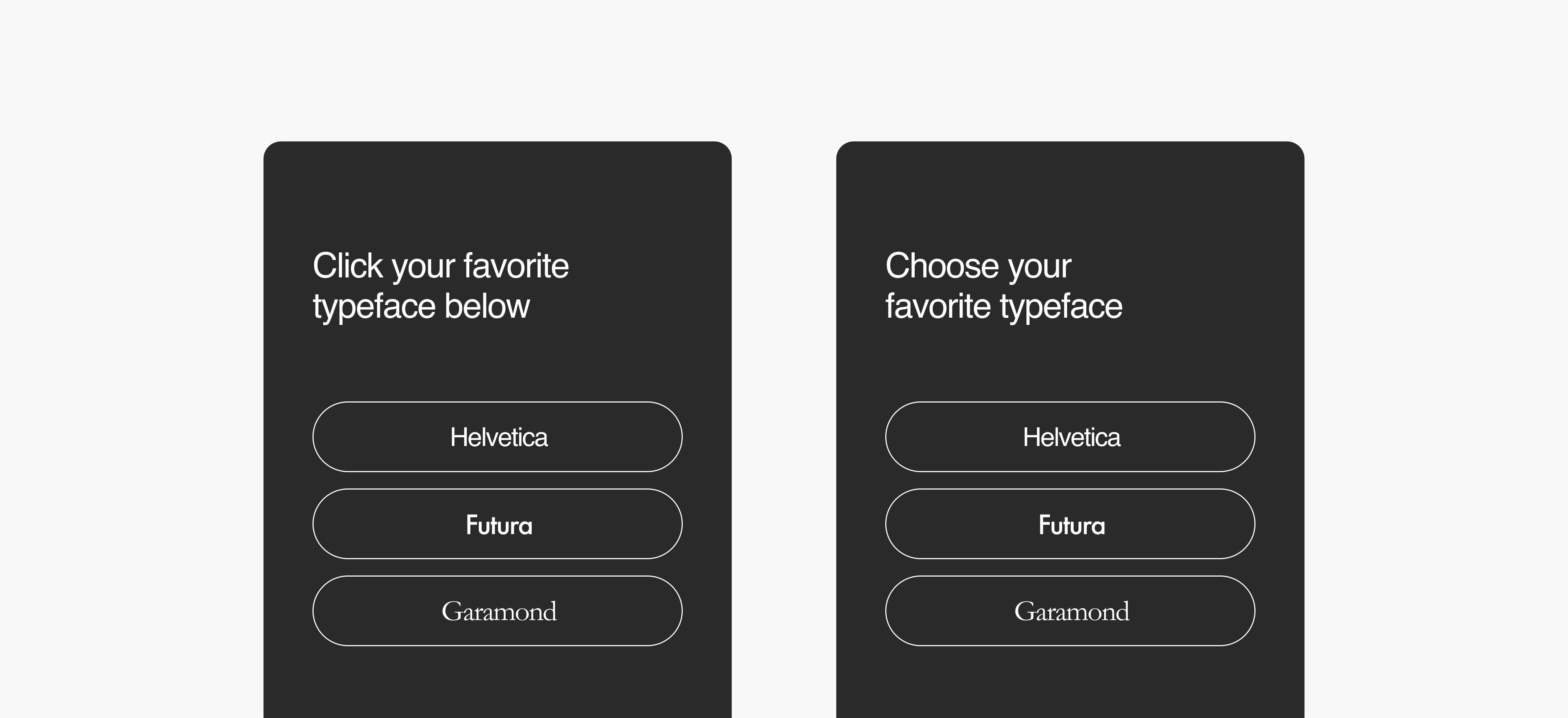
Write for people using different devices, browsers, and accessibility tools. Get rid of anything that only applies to one kind of user. That means ditching platform-specific verbs like “click” and “tap.” It also means removing any directional language like “on the right.” Good UX writing shouldn’t try to explain a UI. And directional language doesn’t make much sense to the person using a screen reader.
Add alt text and captions.
Some UX writing works behind the scenes. It’s not in the product’s visual interface, but it’s there to help the users who need it. Every image needs alt text. Every video needs captions. Work with your product and engineering teams to get these things added in.

Write clearly.
It’s important enough to make this list twice. A product with mediocre writing can be beautiful. Good writing will make it usable.
Recommend
About Joyk
Aggregate valuable and interesting links.
Joyk means Joy of geeK