

How To Use CSS object-fit to Scale and Crop Images
source link: https://www.digitalocean.com/community/tutorials/css-cropping-images-object-fit
Go to the source link to view the article. You can view the picture content, updated content and better typesetting reading experience. If the link is broken, please click the button below to view the snapshot at that time.
Introduction
You will likely encounter a scenario where you will want to preserve the original aspect ratio when working with images. Preserving the aspect ratio will prevent images from appearing distorted by either being stretched or squished. A common solution for this problem is to use the background-image CSS property. A more modern approach would be to use the object-fit CSS property.
In this article, you will explore the effects of the fill, cover, contain, none, and scale-down values available to the object-fit CSS property and how it can crop and scale images. You will also explore the object-position CSS property and how it can offset images.
Prerequisites
If you would like to follow along with this article, you will need:
- Understanding CSS property and values.
- Using CSS declarations inline with the
styleproperty. - A code editor.
- A modern web browser that supports
object-fitandobject-position.
Observing the Default Behavior of a Sample Image
Consider the following code used to display a sample image:
<img
  src="https://assets.digitalocean.com/articles/alligator/css/object-fit/example-object-fit.jpg"
  width="600"
  height="337"
  style="width: 600px; height: 337px;"
  alt="Sample image of a turtle riding on top of an alligator that is swimming in the water - scaled to 600 x 337."
/>
This code will produce the following result in the browser:
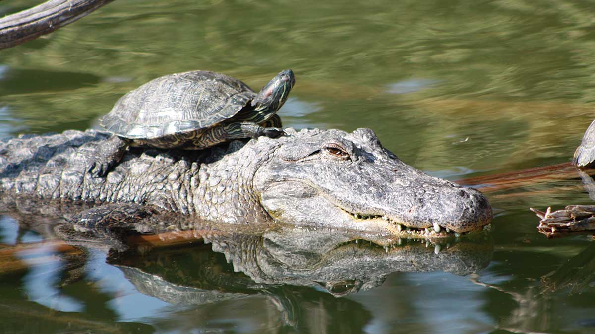
This image has an original width of 1200px and a height of 674px. Using img attributes, the width has been set to 600 and 337 - half the original dimensions - preserving the aspect ratio.
Now, consider a situation where the layout expects images to occupy a width of 300px and a height of 337px:
<img
  src="https://assets.digitalocean.com/articles/alligator/css/object-fit/example-object-fit.jpg"
  width="600"
  height="337"
  style="width: 300px; height: 337px;"
  alt="Sample image of a tutle riding on top of an alligator that is swimming in the water - scaled to 300 x 337."
/>
This code will produce the following result in the browser:
The resulting image no longer preserves the original aspect ratio and appears to be visually “squished”.
Using object-fit: fill
The fill value is the initial value for object-fit. This value will not preserve the original aspect ratio.
<img
  ...
  style="width: 300px; height: 337px; object-fit: fill;"
  ...
/>
This code will produce the following result in the browser:
As this is the “initial” value for browser rendering engines, there is no change in appearance from the scaled image. The resulting image still appears squished.
Using object-fit: cover
The cover value preserves the original aspect ratio, but the image occupies all the available space.
<img
  ...
  style="width: 300px; height: 337px; object-fit: cover;"
  ...
/>
This code will produce the following result in the browser:
In certain situations, object-fit: cover will result in the image appearing cropped. In this example image, some parts of the original image on the left and right do not appear because they cannot fit within the bounds of the declared width.
Using object-fit: contain
The contain value preserves the original aspect ratio, but the image is also constrained to not exceed the bounds of the available space.
<img
  ...
  style="width: 300px; height: 337px; object-fit: contain;"
  ...
/>
This code will produce the following result in the browser:
In certain situations, object-fit: contain will result in the image not filling all the available space. In this example image, there is vertical space above and below the image because the declared height is taller than the scaled-down height.
Using object-fit: none
The none value does not resize the image at all.
<img
  ...
  style="width: 300px; height: 337px; object-fit: none;"
  ...
/>
This code will produce the following result in the browser:
In situations where the image is larger than the available space, it will appear cropped. In this example image, some parts of the original image on the left, right, top, and bottom do not appear because they cannot fit within the bounds of the declared width and height.
Using object-fit: scale-down
The scale-down value will either display an image like contain or none depending on which would result in a smaller image.
<img
  ...
  style="width: 300px; height: 337px; object-fit: scale-down;"
  ...
/>
This code will produce the following result in the browser:
In this example image, the image has been scaled down to behave like contain.
Using object-fit and object-position
If the resulting image from object-fit appears cropped, by default the image will appear centered. The object-position property can be used to change the point of focus.
Consider the object-fit: cover example from before:
Now let’s change the position of the visible part of the image on the X-axis to reveal the right-most edge of the image:
<img
  ...
  style="width: 300px; height: 337px; object-fit: cover; object-positon: 100% 0;"
  ...
/>
This code will produce the following result in the browser:
In this example image, the turtle has been cropped out of the image.
And finally, let’s observe what happens if the position is specified outside of the bounds of the available space:
<img
  ...
  style="width: 300px; height: 337px; object-fit: cover; object-positon: -20% 0;"
  ...
/>
This code will produce the following result in the browser:
In this example image, the turtle and alligator heads have been cropped out of the image. There is also spacing to make up the 20% of offset on the left of the image.
Conclusion
In this article, you explored the values available for the object-fit and object-position CSS properties.
object-fit also supports inherit, initial, and unset.
Before using object-fit in your project, verify that it is supported in the browsers used by your intended audience by checking the browser support on Can I Use?.
If you’d like to learn more about CSS, check out our CSS topic page for exercises and programming projects.
Recommend
About Joyk
Aggregate valuable and interesting links.
Joyk means Joy of geeK