

How to Center in CSS with CSS Grid
source link: https://coryrylan.com/blog/how-to-center-in-css-with-css-grid
Go to the source link to view the article. You can view the picture content, updated content and better typesetting reading experience. If the link is broken, please click the button below to view the snapshot at that time.
How to Center in CSS with CSS Grid
Cory Rylan
- 4 minutes
Using CSS Grid, we can layout content in a two-dimensional grid with columns and
rows. CSS grid is a fantastic CSS API to layout content on the web. Often we need
to center content within a page or container. We can accomplish this in many
different ways in CSS. In a previous post, we learned how to center using Flexbox;
in this post, we will learn how to center content using CSS Grid.
In our example, we have two elements: a parent element and the child element.
We want to center the child element within the width of the parent element
container.
section {
  width: 200px;
  border: 1px solid #2d2d2d;
}

div {
  color: #fff;
  background: #2d2d2d;
  padding: 12px;
  display: inline-block;
}
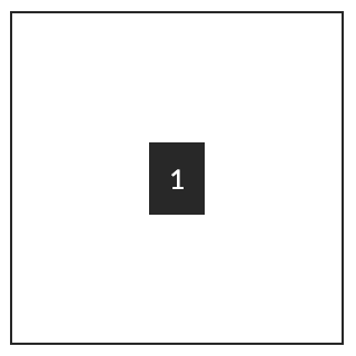
To center our item, we need to set the parent element to render as a CSS Grid.
section {
  width: 200px;
  border: 1px solid #2d2d2d;
  display: grid;
  justify-content: center;
}
First, we set the section to have configured to display: grid. This CSS property sets the element
to render using CSS Grid. Now each direct child element will be a grid item
placed in a column. To align the item horizontally within the grid, we use
the justify-content property and set it to center.
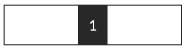
With justify-content we can align the columns start, end, stretch or center.
Centering Vertically
Now that the element is centered horizontally, we can center the element vertically.
Let's increase our parent container to be 200px high.
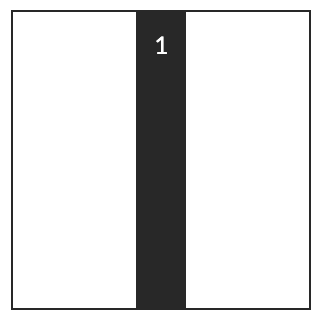
Similar to Flexbox, Grid columns will fill the space where they are defined. To
center the item vertically we set align-content: center;.
Web Component Essentials
Start building now!section {
display: grid;
justify-content: center;
align-content: center;
}
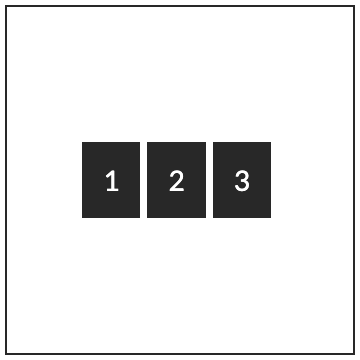
To center multiple items, we need to add a couple more CSS properties to
the parent grid element.
<section>
  <div>1</div>
  <div>2</div>
  <div>3</div>
</section>
section {
display: grid;
justify-content: center;
align-content: center;
gap: 4px;
grid-auto-flow: column;
}The first property gap allows us to define space between grid items. The second
property grid-auto-flow, will enable us to define the direction we want items
to layout, such as from left to right or vertically stacked as rows.
When using justify-content and align-content, we are aligning the columns
relative to the parent Grid container. In our next example, we will see how
we can align items relative to the column instead of the parent grid container.
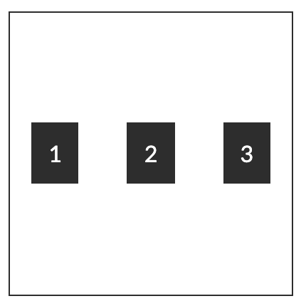
Centering Items within a CSS Grid Column
CSS Grid is very powerful and gives us excellent grain control of our layouts.
We learned how to center columns in a grid but now lets center items within
a column.
For our example, we will create a grid layout with three columns and three items.
.item-center {
  display: grid;
  grid-auto-flow: column;
  gap: 4px;
  align-items: center;
  justify-items: center;
}
To center the items within a column, we use align-items and justify-items
instead of the align-content and justify-content in our previous example.
Using the item properties, we can align our items just like we did with our
columns.
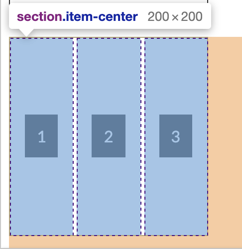
If we use the dev tools and inspect the grid, we can see the outlined columns and our items centered relative to the assigned column.
CSS Grid is a fantastic tool to use for layouts in our Web pages and Web Applications. Check out the full working demo below!
Recommend
About Joyk
Aggregate valuable and interesting links.
Joyk means Joy of geeK