

Having an open dialog
source link: https://www.scottohara.me/blog/2019/03/05/open-dialog.html
Go to the source link to view the article. You can view the picture content, updated content and better typesetting reading experience. If the link is broken, please click the button below to view the snapshot at that time.
Having an open dialog
Published: Mar 5, 2019
Tag(s): accessibility, HTML, semantics
I’ve written about building accessible modal dialogs a few times over the past five-ish years. Most recently I dissected the current state of modal dialog accessibility where I outlined UX expectations and accessibility gotchas when building custom modal dialogs.
Since publishing that breakdown in June of 2018, some things have changed, which is expected. Technology is constantly evolving, improving and often providing better support and features. However, each time I’ve written about modal dialogs I’ve briefly discussed the native <dialog> element. And each time I bring up that element it’s typically to mention its continued lackluster level of implementation from browsers.
tldr; I’m just going to say right now that the dialog element and its polyfill are not suitable for use in production. And it’s been that way since the dialog’s earliest implementation in Chrome, six-ish years ago.
Un-flagged support is still limited to Blink-based browsers, much as it was in 2014, back when Chrome 37 beta was the bleeding edge release.
Edge will be joining the family of Chromium based browsers, and when it does, support for the dialog element will hopefully come along with it. But temporarily putting aside what “support” actually entails, how would someone implement the dialog element right now?
Building a native modal dialog
Before we get started, please note that this article looks at the dialog element specifically in the context of it being modal. There is quite a bit of other information about the dialog element that this article purposefully doesn't cover.
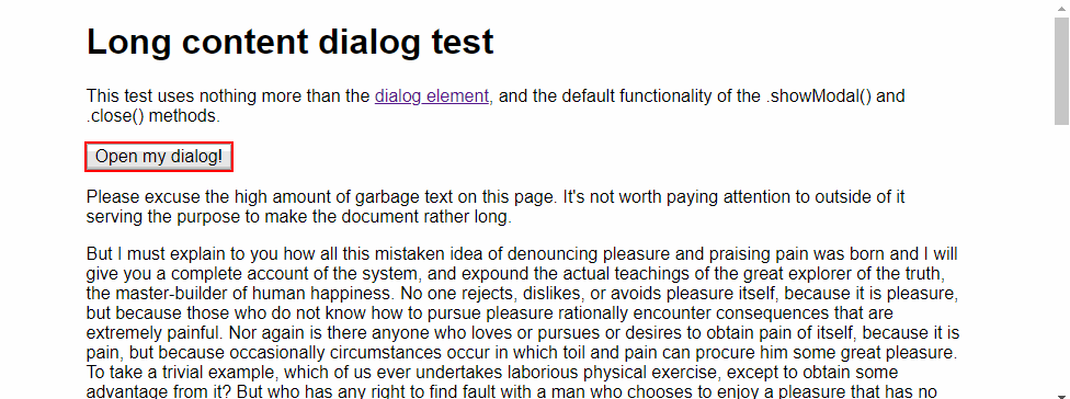
To build a native modal dialog you’ll need more than just the <dialog> element. You’ll also need a bit of JavaScript (and if you think that’s odd, you’re not the only one). Such a requirement makes dialogs unique compared to other natively interactive HTML elements (re: some of the more intricate HTML5 form controls or the interactive details and summary elements).
For example, adding a dialog to a web document would then require another element (such as a button) to serve as the user interface control to invoke the dialog element’s .show() or .showModal() methods. Otherwise the dialog would remain hidden:
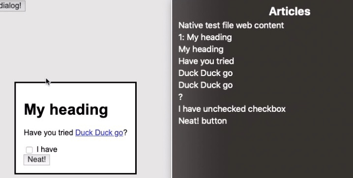
<dialog id="my_dialog">
  <h1>My heading</h1>
  <p>
    Have you tried
    <a href="https://duckduckgo.com">
      <code>Duck Duck Go</code>
    </a>?
  </p>

  <label>
    <input type="checkbox">
    I have
  </label>

  <button type="button"
    id="close_dialog"
    onclick="closeDialog()">
    Neat!
  </button>
</dialog>
A dialog recognizes the open attribute when set to it. e.g. <dialog open>. When manually applied in the HTML, the open attribute will cause a dialog to be auto-revealed on document load, as a non-modal dialog. Authors would need to write a function to allow the .close() method to be invoked by the user (again likely via a button within the dialog). Otherwise there would be no method to dismiss the non-modal dialog. A non-modal dialog does not close when the Esc is pressed.
Just a quick aside, but I won’t be talking about open or the .show() method from here on out, as they do not invoke modal dialogs. Also, per this Twitter thread about open, seems I could go down a whole other rabbit hole.
Unlike a non-modal dialog, a dialog that is invoked with the .showModal() method has the added functionality of allowing the Esc key to close it. This doesn’t mean that authors should leave out an explicit element (button) to close the modal dialog, especially since not all devices have keyboards, nor is clicking or tapping outside of the modal dialog a native means to dismiss it. However, the Esc key serves as a fail safe for keyboard users in the event an author were to leave out a more explicit control to dismiss the modal.
A separate interactive control (again button) is also necessary to allow users to open a modal dialog from the base document.
<button onclick="showDialog()">
  Open my dialog!
</button>

<script>
  var myDialog = document.getElementById('my_dialog');

  var showDialog = function () {
    myDialog.showModal();
  }

  var closeDialog = function () {
    myDialog.close();
  }
</script>
If you’re using Chrome, the following iframe contains the minimal outlined example.
Or, view the minimal test demo by itself.
UX and accessibility of modal dialogs
From a sighted mouse user’s perspective, modal dialogs that use the minimal required JavaScript likely appear to work as expected. Click button, open dialog. Click other button to close. Heck, even the Esc key works. Neat.
What may be the most visible quirk of the current dialog’s implementation is if a dialog contains content that is long enough which would cause it to scroll. For instance, a terms of service (TOS) within a modal dialog.
The issue being the dialog’s focus algorithm. It states that unless a dialog contains a control with the autofocus attribute, then the first focusable element within the dialog will receive keyboard focus.
In the TOS example, the first focusable element is near the end of the dialog’s content. This means the modal dialog will automatically scroll so the focused element will be in view, visually skipping over the content that came before it. Now, I’m sure there are many sighted users who might not mind this behavior, but from experience I’d wager many companies’ legal departments would be none to happy about the majority of their legal document being skipped over.
Auto-scrolled dialog gif
Oh, did you want to read what came before? You're going to need to put a focusable element towards the top of the dialog, even if you didn't need or want one.
Furthermore, if an author does not provide a max-height and overflow to their modal dialog, then the entire document will scroll to ensure the focused element is within the viewport. Coupled with the fact that the current dialog implementation doesn’t return focus to the element that invoked it, this means that all users will have to re-scroll the document to return to their original position.
Granted, these are not just failings of the native dialog, but of its contents and use. Ideally long form content and complex UI would go on its own page, allowing for a direct link to it and bypassing the need for a modal dialog all together. However, a TOS within a modal is a real world use case I’m sure many have experience time and again.
Keyboard Alone
Shifting gears from that of a sighted mouse user to that of a keyboard user, let’s look at how the dialog presently behaves. Upon invoking a modal dialog, keyboard focus will immediately shift from the element that opens the dialog to an element with the autofocus attribute applied to it. If no such element exists, then focus will be placed on the first focusable element within the dialog.
If a modal dialog lacks a focusable element, focus visually appears to be lost (which is much more prevalent if using a screen reader, but more on that in a bit). Granted, this sort of scenario should be avoided as it creates a situation where people cannot close the modal dialog without a keyboard.
While a modal dialog is open keyboard focus cannot return to the document beneath it. However, unlike many custom modal dialogs which typically create a focus trap by forcing an endless loop of the focusable elements within the dialog, a native modal dialog allows keyboard focus to escape the modal and return to the browser’s chrome (e.g. the address bar and other such controls).
An acknowledged gap in a modal dialog’s UX is that closing one doesn’t explicitly return keyboard focus to the element that invoked it. Instead focus will linger wherever the modal dialog appeared in the DOM order. Consider the following markup:
  <button>Opens Dialog</button>
  <dialog>Goes here</dialog>
  <p>More content and <a href="...">a link</a>.</p>
As the dialog exists between the button that invoked it and a link, keyboard users hitting Tab or Shift + Tab, after closing the modal dialog, will find themselves in an expected location. However, if dialogs are inserted towards the top or bottom of the DOM, when closing the modal dialog a user’s focus could wind up in unexpected locations. For instance, the browser’s address bar.
Without a more explicit re-focusing of the invoking element, it means that keyboard users will have a much higher likelihood of having to reorientate themselves and re-navigate portions of the document to get back to where they previously left off. We don’t ask sighted mouse users to re-read or scroll documents after they close modals, but providing such functional equality would be on authors to script.
Screen readers
Screen readers follow similar functionality to default keyboard functionality. Keyboard and screen reader focus are restricted to the modal dialog and cannot access the base document.
However, it was the variations in how each screen reader paired with Chrome announced the modal dialog and its contents that exposed some unexpected quirks.
JAWS 2019
Opening the minimal test dialog, “modal dialog” is announced, the text and role of the focused element is announced, and then general announcements of the number of important elements on the “page” are announced. e.g. number of headings and links.
After these initial announcements, JAWS appears to rely on some heuristics to determine what will happen next. For example, JAWS will begin announcing content starting at the focused link within the test modal dialog. The content prior to the link is ignored.
In the TOS modal dialog, JAWS will announce the link at the bottom of the dialog, and then return to the top of the dialog to begin announcing the content that was skipped over. However, JAWS starts announcing with the “Please read these…” paragraph, skipping over the heading and first paragraph (date).
If a modal dialog contains no focusable element JAWS will begin reading content at a point dependent on the length of the dialog’s contents. For instance, the smaller dialog will start announcing at the heading. The long dialog will start announcing somewhere in the middle.
In all situations, it would be on the JAWS user to recognize content may not have been announced. They’d then need to make the decision to search the dialog for any missed details.
As with standard keyboard focus, the location of the dialog in the DOM is going to determine where focus is placed when the modal dialog is closed. Though, testing showed that JAWS will often place the virtual cursor back to the element that invoked the modal, even if keyboard focus was returned to a different location in the DOM. This is both a benefit and a quirk, as depending on the next key press (arrow keys or Tab), a JAWS user could find themselves in very different locations in the document.
NVDA 2018.4.1
The manner in which the contents of the modal dialog is announced is determined behind the scenes by NVDA, similarly to JAWS.
Opening the minimal test dialog, the first link is auto focused and the contents of the dialog are read multiple times, except for the heading which is not announced at all.
NVDA's announcements for the minimal test dialog
Regarding the TOS modal dialog, NVDA begins reading the content of the dialog starting with “Last updated” and announces all paragraph content, skipping over headings and other semantics. After completing, NVDA will start re-announcing the content from the initially focused element. This time NVDA will announce the headings and other semantics it left out in the initial pass.
When closing the modal dialog NVDA’s focus, as well as keyboard focus, were returned to the button that opened the modal dialog. This allowed for either the Tab key or virtual cursor to be used to start re-navigating the document.
In the modal dialog containing no focusable element example, NVDA is unable to enter the modal dialog at all.
macOS 10.14.3 VoiceOver
Chrome and VoiceOver are the only pairing that don’t skip over announcing any content of the modal dialog, and are generally succinct in those announcements. However, there are quirks here as well.
For example, certain content may not have its role announced when allowing VoiceOver to announce all content of the modal dialog by default (specifically the checkbox or the button in the minimal test). VoiceOver will also add an announcement of “group” after announcing the content of the modal dialog.
Another interesting quirk, if reviewing “articles” in the VoiceOver rotor, you’ll be presented with the following:
For a dialog that had zero article elements within it, that sure is a lot of articles!
Closing the modal dialog returns VoiceOver focus to the document root, which requires the user to re-enter (Control + Option + Shift + Down Arrow) and navigate the document to get back to their previous position. If the VoiceOver user pressed the Tab key, they’d find themselves at the start of the browser chrome.
Android 8.1 with TalkBack 7.2
Opening the dialog in the minimal test, the first focusable element within the dialog is focused and announced. However, TalkBack doesn’t announce the dialog’s role when focus shifts, which may cause some confusion as to what’s happened for some users. Additionally, none of the content preceding the focused element is automatically announced, as other screen readers behave. A user would have to discover the content manually, and again, infer for themselves that they’ve entered a modal dialog.
When closing the modal dialog, TalkBack will send focus to the web view container (essentially the document root). The user will still need to re-navigate the document to get back to their previous position.
Does the polyfill help?
As noted, only Blink-based browsers even support the dialog right now. There is a dialog polyfill, but it does not provide a fully robust, accessible user experience.
Using the demos from the polyfill repo to test against, the polyfilled dialog experienced the following issues:
JAWS with Firefox
When the modal dialog is opened, virtual cursor is trapped within the modal, however Tab key appears to be able to escape and focus elements within the primary document. Opening JAWS’s dialog of links (Insert + F7) all of the links of the primary document are still available and accessible to JAWS (this should not be the case). Opening JAWS dialogs to quickly navigate to other types of elements also list elements that should be inaccessible as long as a modal dialog is open.
JAWS with IE11
The polyfill has some quirks in general, but most importantly doesn’t send JAWS into the dialog element itself. Virtual cursor remains on the button that launches the dialog, and navigating with it will walk through the document beneath the modal dialog. Hitting Tab to try and quickly navigate to the dialog consistently crashed IE11 (regardless if JAWS was on or not).
NVDA with Firefox
Using the Tab key, NVDA can escape an opened modal dialog. Nothing will be announced by NVDA, but after exiting, the virtual cursor can be used to navigate the base document, and NVDA will announce the content it is highlighting.
If within the modal dialog, NVDA’s virtual cursor cannot escape.
If opening NVDA’s dialog of elements (Insert + F7) within the modal dialog, no elements but those within the dialog will be exposed. However, if a user has tabbed outside of the modal dialog and opens the same NVDA dialog, all elements of the base document will be exposed.
macOS VoiceOver with Safari
VoiceOver doesn’t appear to allow the Tab key to leave the opened modal dialog. However, there is no resistance at all to leaving the modal when navigating by VoiceOver’s cursor. The rotor menu will also continue to list all elements within the primary document.
iOS 12.1.4 VoiceOver with Safari
A VoiceOver user will find it very easy to escape polyfilled modal dialogs. VoiceOver does not get trapped inside the modal dialog when opened. Swiping or navigating by rotor will allow easy access out of the modal dialog.
TalkBack and Android Firefox
TalkBack focus does not move to the modal dialog when using Firefox. Once you do get TalkBack to enter the exposed modal dialog, it works similarly to VoiceOver and Safari, in that it’s very easy to swipe out of the modal dialog.
So what to do?
Modal dialogs continue to be hard, and that was a lot of information to take in. So let’s wrap this all up at a high-level:
- In my opinion, Chrome’s current implementation, and the manner in which screen readers presently interact with modal dialogs range from:
- Adequate (Chrome with macOS VoiceOver).
- Too quirky (Chrome with JAWS and NVDA).
- Too kinda awful (Chrome with TalkBack).
- Presently the specification seems geared towards dialogs that contain short form content, and where a focusable element will always be one of the first child elements.
- For right or wrong, in the real world modal dialogs are used for a range of purposes. From marketing ads, informative messages, error alerts, forms, sub-applications (e.g. media managers in CMSes), to long form content (again TOS).
- Conversations to update the specification have stalled out. Additionally, there’s apparently talk about if
dialogshould be removed from the specification all together (which would be quite unfortunate, regardless of its current issues). - Hopefully Edge moving to Chromium can kick start work on this element. At the very least allowing for conversations to be re-opened, and more attention given to the accessibility gaps of the
dialogelement.
- The Google Chrome polyfill serves the purpose of allowing the
dialogelement to function outside of Blink-based browsers. However, testing proves it lacks robust accessibility support. Additionally, it acknowledges that WAI-ARIA suggests further functionality that the polyfill alone, nor the HTML specification cover. - Speaking of WAI-ARIA, to build a fully accessible modal dialog you might as well ignore the
dialogelement for now, and implement a fully custom version (there’s a lot to keep in mind here too). Or, better yet, ask yourself if you really need a modal at all?
The dialog element could have the potential to replace the many inaccessible custom modal dialogs across the web, and mitigate future ones from being built. But with its current issues, it presently makes little sense to use the dialog element at all.
I hope this changes soon. If only because I selfishly don’t want to write about the dialog element’s lack of implementation and quirks the next time I get an itch to write about modal dialogs.
I just wanted to say thank you to Eric Bailey, Léonie Watson, and Adrian Roselli who all provided feedback on this piece. Thank you again for helping me sentence better.
Recommend
About Joyk
Aggregate valuable and interesting links.
Joyk means Joy of geeK