

5 UX Lessons from Nike GO FlyEase
source link: https://uxplanet.org/5-ux-lessons-from-nike-go-flyease-3e9d0e694996
Go to the source link to view the article. You can view the picture content, updated content and better typesetting reading experience. If the link is broken, please click the button below to view the snapshot at that time.
5 UX Lessons from Nike GO FlyEase
Human-Centred Innovation at its best
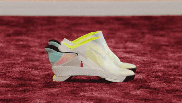
The second I saw this GIF popping up in my scrolling-of-doom Twitter feed I was obsessed. What you’re seeing is the recently announced Nike GO FlyEase, a pair of hands-free sneakers where engineering meets user experience.
In terms of functionality, this product is very easy to summarize: a pair of shoes that have flexible tensioners to facilitate the taking-on and taking-off movement of the foot while also providing the perfect fit during walking.
In terms of user experience, I could talk about it for hours. I am a confessed fan of innovative designs, more than commercial products, and I consider Nike GO FlyEase a disruptive concept that should be carefully studied. It is a simple solution for a complex problem, bravely addressing the border between opposite spheres, such as business and society, rationality and emotion. This being said, let me detail why Nike GO FlyEase makes a great UX case study:
1 — Making users a Design’s North Star
In 2012, Matthew Walzer, a 16-year-old with cerebral palsy, wrote to Nike. In his letter, he addressed his need for shoes with ankle support and detailed how his inability to lace it himself made had a negative impact on his daily life and mental health. Nike not only replied to him but also sent an invitation to collaborate in the design of the original adaptive Nike FlyEase shoe. In the same year, Walzer received a new model to test and was able to report direct feedback to the brand.
This is user-centered design in its pure form: the user needs were the primary reason why the FlyEase line was created and user testing was applied to gather feedback essential for the design iteration.
2 — Accessibility is Key
Let’s be real: companies are not including minorities in their target audiences just for social justice. They know that expanding their niches increases profit. There are 61 million Americans with disabilities, which means 61 million potential customers. The big problem is, despite profits being the driven factor for any brand, some demographics have been ignored for ages.
The inspiration for the FlyEase line may have been people with disabilities, but it’s a product with mass production potential. A hands-free shoe can slightly improve the life quality of a pregnant person, an elder with mobility issues, a busy parent, or simply a lazy teenager.
The big lesson that product designers can take from Nike GO FlyEase is that designing with accessibility in mind adds value to the product. This approach can be pitched to clients as a way to expand their consumers’ base while doing the right thing.
3 — Empower the User
A good user experience empowers the user to get the most out of a product. When a user feels in control, he doesn’t only get satisfied, he becomes confident in his actions.
In the case of Nike GO FlyEase design, we enter the emotional design domain. For the common person, these are just very nice shoes that save a few minutes in the morning. But for users with disabilities or mobility restrictions, hands-free sneakers are life-improving. The impact on the customer’s emotions is evident in Walzer declarations:
“When I put the shoes on every morning, they give the greatest sense of independence and accomplishment I have ever felt in my life” — Matthew Walzer
4 — All Design is re-Design
The GO FlyEase model didn’t come up overnight. Tobie Hatfield, the designer responsible for FlyEase, took Nike’s existing silhouettes as a starting point.
“[Other Nike’s footwear] provided the ankle support Matthew needed, but of course getting into and out of high-top shoes can present its own challenges, so we focused not just on replacing the lacing system but also creating an easier entry system for the foot.” — Tobie Hatfield
Hatfield’s words are the key to understanding Nike’s process of innovation. He reconsidered existing designs through different lenses and reflected which features he could remove, which ones needed modification, and how he could add the missing ones. This is the same mindset of the SCAMPER method, a popular design ideation technique, that can be systematically applied in the ideation of new and improved products and services.
It is crucial to keep in mind that the ideation process of a good design is never complete. Even after a product is commercially launched, it follows constant experimentation and reassessment process, to follow technology and social progress. Nike GO FlyEase wouldn’t exist if LeBron Soldier 8 FlyEase wasn’t designed first. Before LeBron’s model, there was Zoom Soldier 8 FlyEase. And even before that, there was one year of design iterations from an entire team of designers.
This is a lesson especially important for junior designers who may be struggling with their projects. Always keep in mind that the best designs are usually the result of years of prototyping, testing, and re-defining.
5 — Good Design is Self-Explanatory
By watching the animated GIF on the top of this article, tell me: would you need any manual to learn how to use these sneakers?
Users need to know how to interact with the product intuitively. Even if it is beautiful, if it is not self-explanatory, it’s unfinished.
Nike GO FlyEase utilization can be broken down to “easy on, easy off”, meeting a golden rule in user experience: good design needs no explanation.
Recommend
About Joyk
Aggregate valuable and interesting links.
Joyk means Joy of geeK