

Use CSS Clamp to create a more flexible wrapper utility
source link: https://piccalil.li/quick-tip/use-css-clamp-to-create-a-more-flexible-wrapper-utility
Go to the source link to view the article. You can view the picture content, updated content and better typesetting reading experience. If the link is broken, please click the button below to view the snapshot at that time.

Use CSS Clamp to create a more flexible wrapper utility
A handy way to use modern CSS functions to give yourself fine-grained, yet flexible, design control.
You can use clamp() to set three values: a minimum, an ideal and a maximum.
This is really handy in the context of a wrapper, because it’s a mostly fluid element, often limited with a max-width. This becomes a slight issue in mid-sized viewports, such as tablets in portrait mode, in long-form content, such as this article because contextually, the line-lengths feel very long.

Even though the line lengths are set to a sensible width in CSS, contextually, they still look very long in medium viewports.
If we use clamp() to use a viewport unit as the ideal and use what we would previously use as the max-width as the clamp’s maximum value, we get a much more flexible setup.
/**
 * WRAPPER
 * Sets a max width, adds a consistent gutter and horizontally
 * centers the contents
 */
.wrapper {
  width: 90vw;
  width: clamp(16rem, 90vw, 70rem);
  margin-left: auto;
  margin-right: auto;
  padding-left: 1.5rem;
  padding-right: 1.5rem;
  position: relative;
}
We can set two instances of width so browsers that don’t support clamp() can get a sensible default. Browsers that do support clamp() will override that first value. Good ol’ progressive CSS, right?
You could also use logical properties to set margin and padding. I choose not to in this context because we’re setting both horizontal values anyway.
Here’s how it looks after setting our new wrapper:
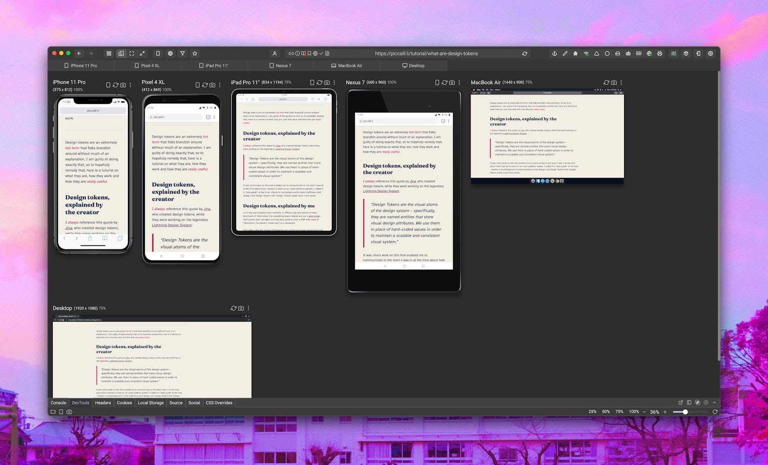
This is much better now and the content looks like it has much more breathing room, making it easier to read.
The app I’m using for this responsive design testing is called Sizzy and it’s absolutely fantastic. You should get it!
This is a very small tweak, but these design details are what makes the user-experience that little bit better. Check out this handy write-up by Una Kravets.
Recommend
-
11
Feature Privacy, data protection regulations clamp down on biometrics use The highly sensitive nature of biometric data and new regulations aimed to prote...
-
13
A Brief History of CSS BoundsBefore I dive into CSS cl...
-
6
A look at LLVM - comparing clamp implementations duk Apr 9, 2021 Please note that...
-
11
最后更新日期:2009-05-31 转自:http://www.tsubasa2005.com/bbs/thread-15018-1-1.html 原作者已不可考 好久没有新贴,无聊时在网上看到的,还不错就转发来大家一起看看
-
11
了解CSS min()/max()/clamp()数学函数 这篇文章发布于 2020年04月12日,星期日,23:29,归类于 CSS相关。 阅读 13304 次, 今日 11 次...
-
15
Practical Uses of CSS Math Functions: calc, clamp, min, max Posted on: Aug 15, 2021 Written by Stephanie Eckles This is episode #28 in a series examining mo...
-
9
Russia: Google told to clamp down on Navalny's 'Smart Voting' A Moscow court has ordered Google to stop displaying the term "smart voting" in its search results — two weeks before elections. Smart Voting is a strategy developed by Na...
-
6
Creating a Fluid Type Scale with CSS Clamp Dec 27, 2021 For a long time, many design systems implemented static font sizing, with a set of progressively larger and smaller font size variables on eit...
-
8
Modern Fluid Typography Using CSS Clamp ...
-
6
Bank Of Uganda to Clamp Down on Mobile Money Operators Facilitating Crypto Transactions "Bank of Uganda has noted press reports and adverts advi...
About Joyk
Aggregate valuable and interesting links.
Joyk means Joy of geeK