

Pandas DataFrame Visualization Tools
source link: https://pbpython.com/dataframe-gui-overview.html
Go to the source link to view the article. You can view the picture content, updated content and better typesetting reading experience. If the link is broken, please click the button below to view the snapshot at that time.
Introduction
I have talked quite a bit about how pandas is a great alternative to Excel for many tasks. One of Excel’s benefits is that it offers an intuitive and powerful graphical interface for viewing your data. In contrast, pandas + a Jupyter notebook offers a lot of programmatic power but limited abilities to graphically display and manipulate a DataFrame view.
There are several tools in the Python ecosystem that are designed to fill this gap. They range in complexity from simple JavaScript libraries to complex, full-featured data analysis engines. The one common denominator is that they all provide a way to view and selectively filter your data in a graphical format. From this point of commonality they diverge quite a bit in design and functionality.
This article will review several of these DataFrame visualization options in order to give you an idea of the landscape and evaluate which ones might be useful for your analysis process.
Background
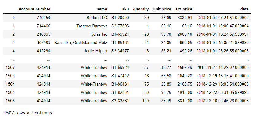
For this article, we will use a sample sales data set we have used in the past. Here is a view of the data in a traditional notebook:
import pandas
url = 'https://github.com/chris1610/pbpython/blob/master/data/2018_Sales_Total_v2.xlsx?raw=True'
df = pd.read_excel(url)

df
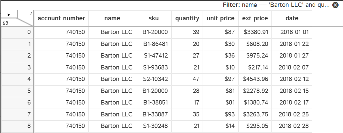
Here’s a similar view in Excel with a filter applied to all columns:
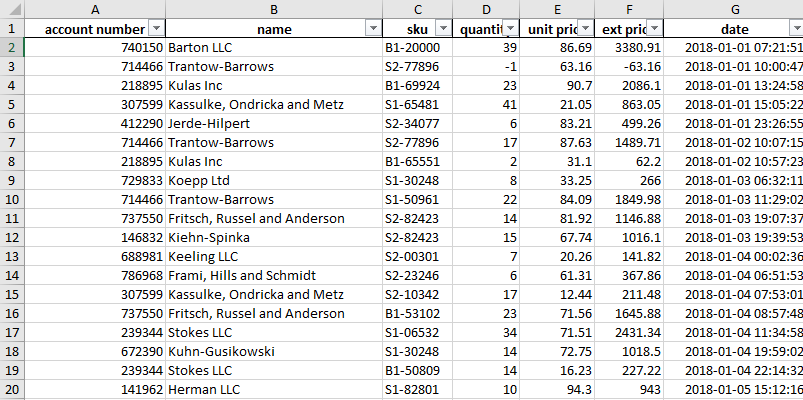
This familiar view in Excel allows you to easily see all your data. You can filter and sort to inspect the data and dive deeper into the details where needed. This type of functionality is most useful when you are exploring a new dataset or tackling a new problem on an existing dataset.
Obviously this is not feasible with millions of rows of data. However, even if you have large datasets and are a pandas expert, I expect you still dump DataFrames to Excel and view subsets of data. I know I do.
Part of the reason I use Excel + python is that the ad-hoc abilities to inspect the data in Excel are much better than the vanilla DataFrame views.
With that background, let’s look at some of the options for replicating this easy viewing capability we have in Excel.
JavaScript tools
The simplest approach is to use a JavaScript library to add some interactivity to the DataFrame view in a notebook.
Qgrid
The first one we will look at it Qgrid from Quantopian. This Jupyter notebook widget uses the SlickGrid component to add interactivity to your DataFrame.
Once it is installed, you can display a version of your DataFrame that supports sorting and filtering data.
import qgrid
import pandas
url = 'https://github.com/chris1610/pbpython/blob/master/data/2018_Sales_Total_v2.xlsx?raw=True'
df = pd.read_excel(url)

widget = qgrid.show_grid(df)
widget
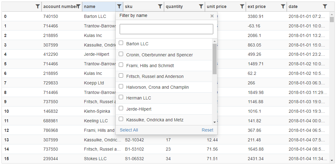
Qgrid supports intuitive filtering using various widgets based on the underlying data types. In addition, you can configure some of the rendering features and then read the selected data into a DataFrame. Which is a pretty useful feature.
Qgrid does not perform any visualization nor does it allow you to use pandas expressions to filter and select data.
Overall, Qgrid works well for simple data manipulation and inspection.
PivottableJs
The next option isn’t really for viewing a DataFrame but I think it’s a really useful tool for summarizing data so I’m covering it.
The pivottablejs module uses a pivot table JavaScript library for interactive data pivoting and summarizing.
Once it is installed, usages is simple:
from pivottablejs import pivot_ui

pivot_ui(df)
In this example, I summarized quantity purchased for each customer by clicking and dragging.
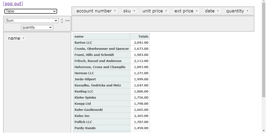
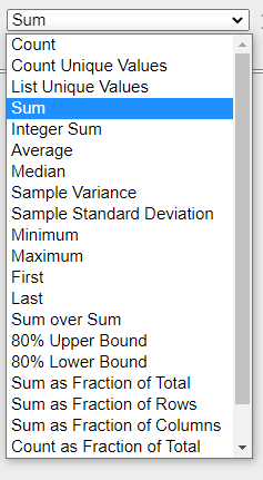
In addition to basic sum functions, you can do some visualization and statistical analysis as well.
This widget is not useful for filtering a raw DataFrame but is really powerful for pivoting and summarizing data. One of the nice features is that you can filter the data once you build your pivot table.
The other downside with this widget is that it does not leverage any of the pandas pivoting or selecting functions. Still, pivottablejs is a really useful tool for quick pivots and summaries.
Data Analysis Applications
The second category of GUI applications are full-fledged applications typically using a web back-end like Flask or a separate application based on Qt. These applications vary in complexity and capability from simple table views and plotting capabilities to robust statistical analysis. One aspect that is unique about these tools is that they closely integrate with pandas so you can use pandas code to filter the data and interact with these applications.
PandasGUI
The first application I will discuss is PandasGUI. This application is unique in that it is a standalone app built with Qt that can be invoked from a Jupyter notebook.
Using the same data from the previous example, import the
show
command:
from pandasgui import show

show(df)
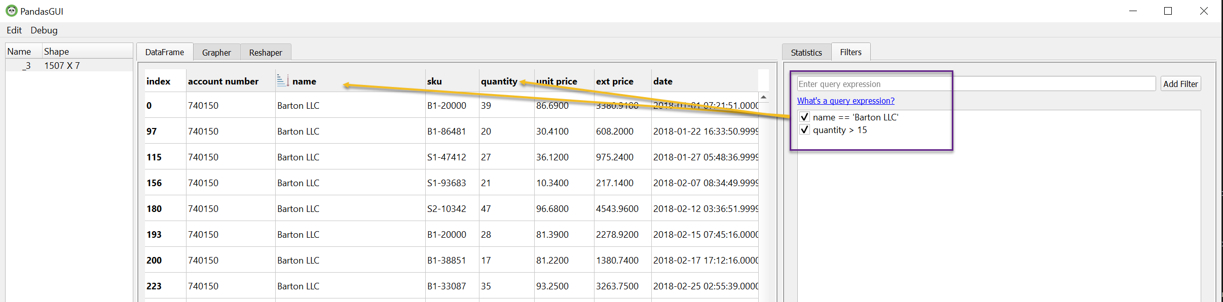
If everything works, you will end up with a separate GUI. Because it is a standalone application, you can configure the view quite a bit. For example, I have moved a couple of the tabs around to show more of the capability on one page.
In this example, I’m filtering the data using pandas query syntax to show one customer and purchase quantities > 15.
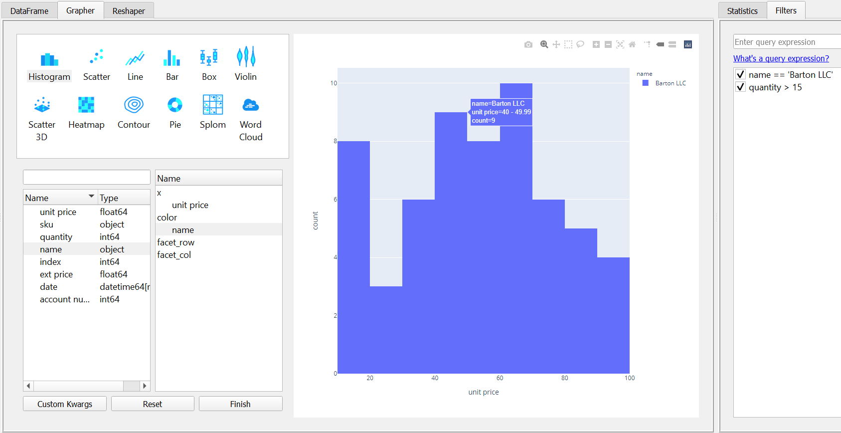
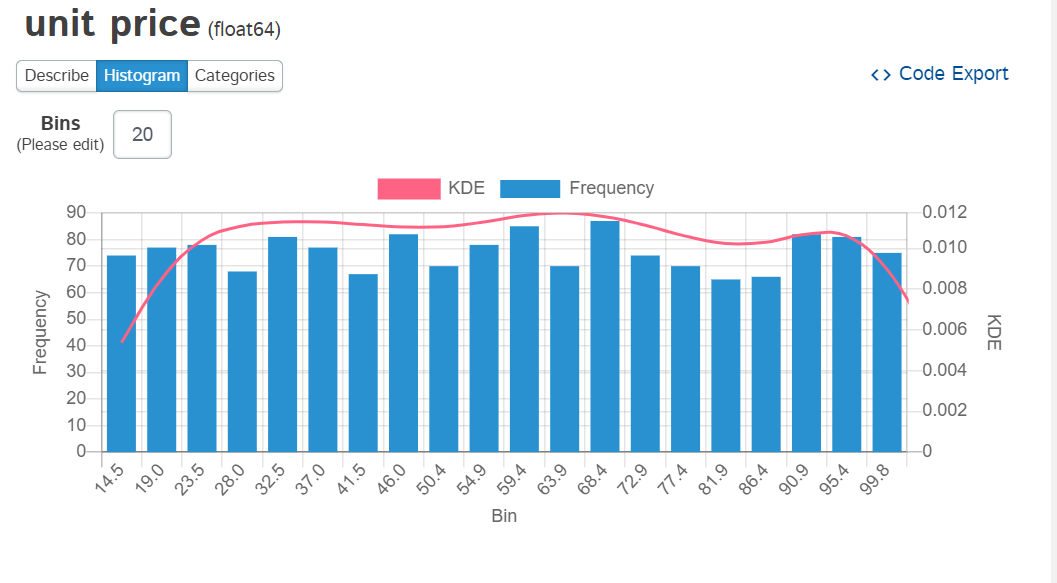
PandasGUI integrates with Plotly and allows you to build visualizations as well. Here is an example histogram of the unit price:
One nice capability of PandasGUI is that the filters are in effect for the DataFrame across all the tabs. You can use this feature to try different views of the data when plotting or transforming the data.
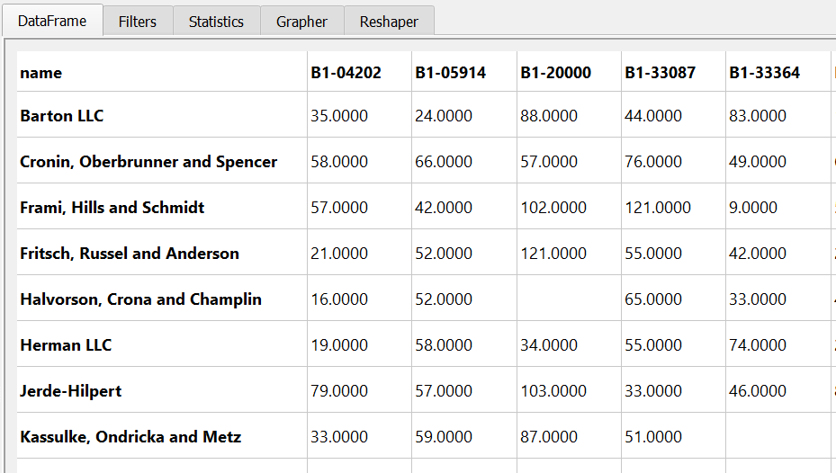
The other capability that PandasGUI has is that you can reshape the data by pivotting or melting it. Here’s a summary of the unit sales by SKU.
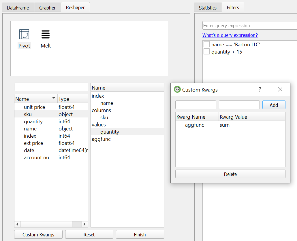
Here’s what the resulting view looks like:
PandasGUI is an impressive application. I like how it keeps track of all the changes and is just a small wrapper over standard pandas functionality. The program is under active development so I will be following it closely to see how it improves and grows over time.
If you are curious to see more functionality, this video shows another good walk through.
Tabloo
This one gets the award for the name that makes me smile every time I see it. Hopefully a big commercialization visualization tool doesn’t get too upset about the similarity!
Anyway, Tabloo uses a Flask backend to provide a simple visualization tool for DataFrames as well as plotting capability similar to PandasGUI.
Using Tabloo is very similar to PandasGUI:
import tabloo

tabloo.show(df)
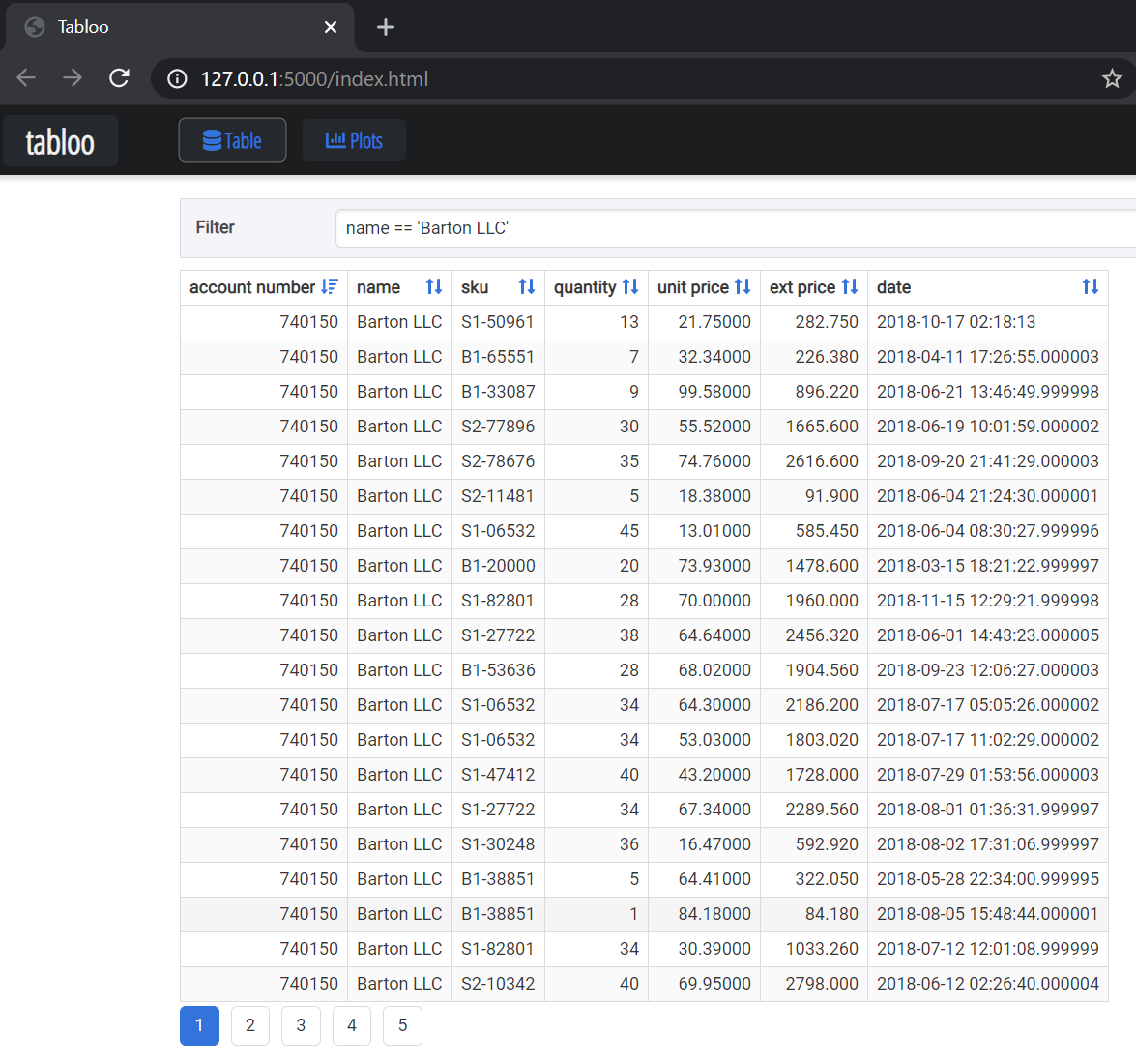
Tabloo uses query syntax like PandasGUI but I could not figure out how to add multiple filters like I did in PandasGUI.
Finally, Tabloo does have some basic plotting functionality as well but it is not as rich as PandasGUI.
Tabloo has some interesting concepts but does not have as much capability as PandasGUI. It has not been updated in a while so it may be dormant but I wanted to include this for as complete a survey as possible.
Dtale
The final application is Dtale and it is the most sophisticated of the options. Dtale’s architecture is similar to Tabloo in that it uses a Flask back-end but includes a robust React front-end as well. Dtale is a mature project with a lot of documentation and a lot of functionality. I will only cover a small subset of capabilities in this post.
Getting started with Dtale is similar to the other applications in this category:
import dtale

dtale.show(df)
This view gives you a hint that Dtale is much more than a DataFrame viewer. It is a very
robust statistical toolset. I can not go through all the enhanced functionality here but here is
a quick example showing a histogram of the
unit price
column:
One of the features I really like about Dtale is that you can export the code and see what it is doing. This is a really powerful feature and differentiates Excel + Python solution from vanilla Excel.
Here is an example of the code export from the visualization above.
# DISCLAIMER: 'df' refers to the data you passed in when calling 'dtale.show'

import numpy as np
import pandas as pd

if isinstance(df, (pd.DatetimeIndex, pd.MultiIndex)):
    df = df.to_frame(index=False)

# remove any pre-existing indices for ease of use in the D-Tale code, but this is not required
df = df.reset_index().drop('index', axis=1, errors='ignore')
df.columns = [str(c) for c in df.columns]  # update columns to strings in case they are numbers

s = df[~pd.isnull(df['{col}'])][['{col}']]
chart, labels = np.histogram(s, bins=20)
import scipy.stats as sts

kde = sts.gaussian_kde(s['unit price'])
kde_data = kde.pdf(np.linspace(labels.min(), labels.max()))
# main statistics
stats = df['unit price'].describe().to_frame().T
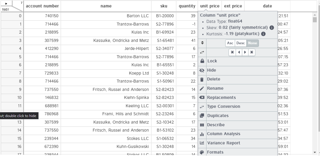
On the topic of filtering data, Dtale also allows you to do formatting of the data. In the example below, I formatted the currency and date columns to be a little easier to read.
As I said earlier, Dtale is a robust tool with a lot of capability. If you are interested, I encourage you to check it out and see if it works for you.
One aspect to watch out for is that you may run into Windows Firewall issues when trying to run Dtale. On a locked down corporate machine, this might be a problem. Refer to the documentation for more details on the various installation options.
Regardless of that issue, I think it’s definitely worth checking out Dtale - even if it is just to see all the functionality available to you.
IDE Variable Viewers
If you are doing development in a tool such as VS Code or Spyder, you have access to a simple DataFrame variable viewer.
For example, here is the view of our DataFrame using Spyder’s variable explorer:
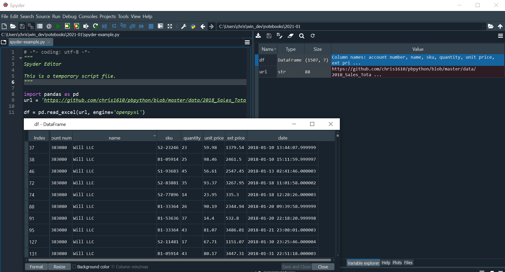
This viewer is very convenient if you are using Spyder. You don’t have any ability to filter the data in the GUI but you can change the sort order.
VS Code has a similar feature. You can review my previous article if you want to see how to use VS Code + Python.
Here is a simple view showing how you can filter the data:
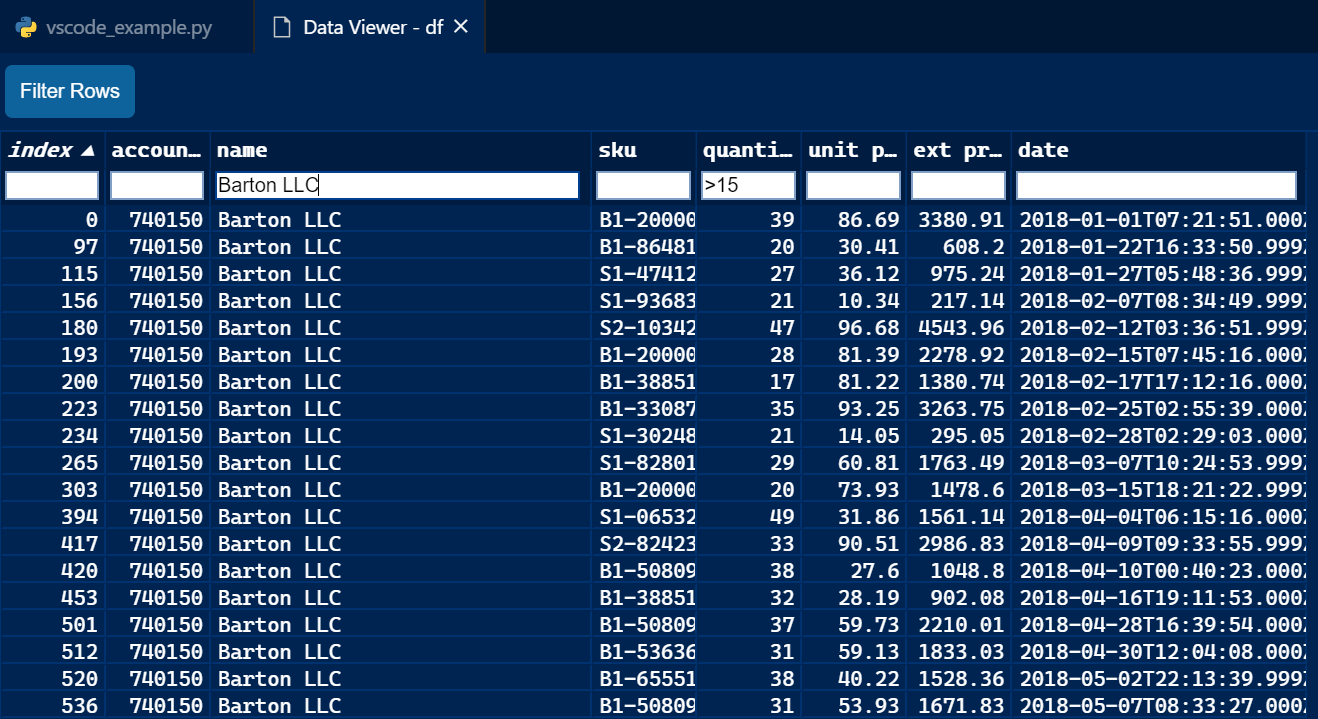
Both of these features are useful if you are already doing your work in Spyder or VS code. However, they do not have nearly the power of Dtale when it comes to complex filtering or sophisticated data analysis.
I am hopeful though that VS Code will continue to improve their DataFrame viewer. It looks like VS Code can do just about anything these days so I’ll be interested to see how this feature evolves.
Excel
Recently, there has been a lot of interest in an article describing how to use Jupyter notebooks in Excel. If we want to combine the benefits of Excel and Pandas, maybe this is a good option?
PyXLL
The previously mentioned article requires the PyXLL package which is a commercial application. I have no issues with a company developing a commercial product. I think it is critical for the success of the Python ecosystem. However, a paid option means you probably need to get more buy-in to bring it into your organization. Fortunately you can try it for free for 30 days and see if it meets your needs.
With that caveat aside, let’s try it with our example data set:
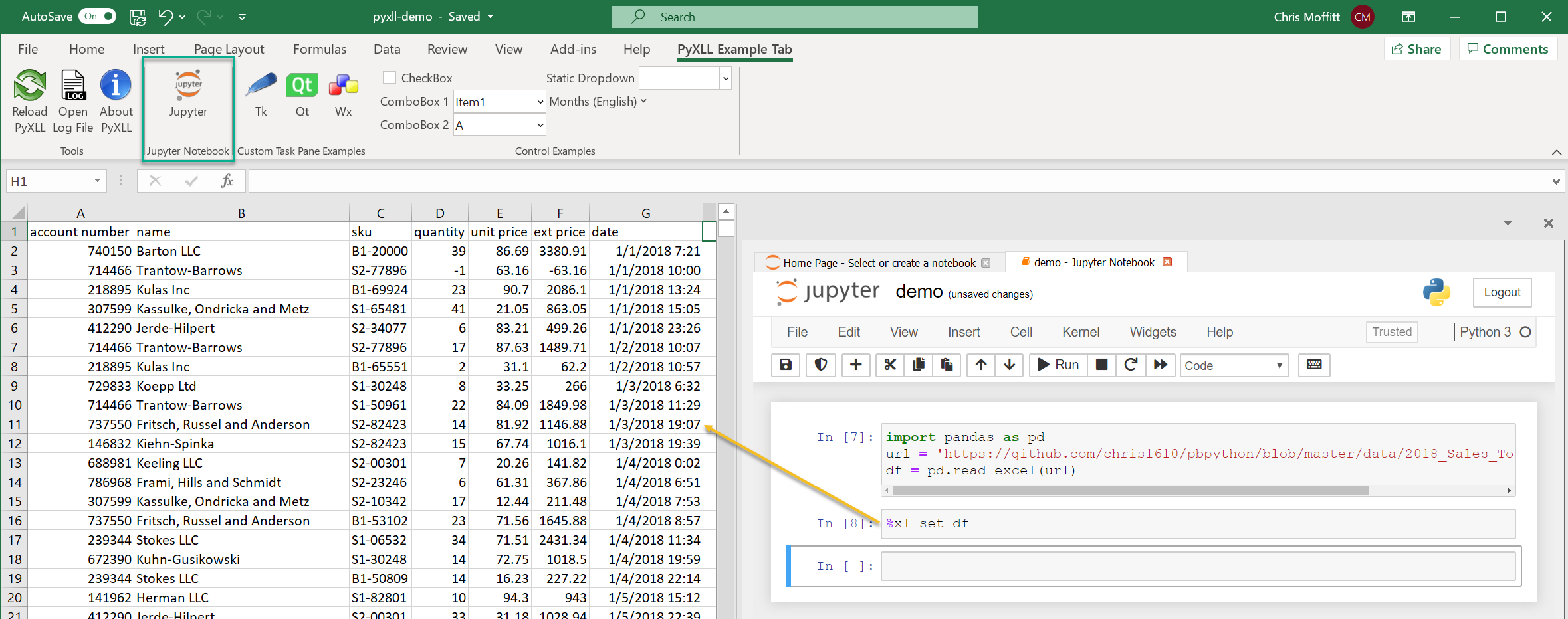
The real power is that you can have the notebook side by side with Excel and use jupyter
magic commands to exchange data between the notebook and Excel. In this example, using
%xl_set df
will place the DataFrame directly into the Excel file. Then, you can
work with Excel in a hybrid mode.
PyXLL has a lot of different capabilities for integrating Python and Excel so it’s difficult to compare it to the earlier discussed frameworks. In general, I like the idea of using the visual components of Excel plus the power of Python programming. If you are interested in this combination of Python and Excel you should definitely check out PyXLL.
xlwings
xlwings has been around for a while, in fact, I wrote an old article about xlwings in 2016. xlwings is similar to PyXLL in that it is also supported by a commercial company. However there is a community edition which is Open Source as well as a Pro version that is paid. The example here uses the community edition. The full Pro xlwings package has several different features for integration Excel and Python.
While xlwings does not integrate directly with a Jupyter notebook, you can populate an Excel spreadsheet with a DataFrame in real time and use Excel for analysis.
Here is a short code snippet:
import pandas as pd
import xlwings as xw

url = 'https://github.com/chris1610/pbpython/blob/master/data/2018_Sales_Total_v2.xlsx?raw=True'
df = pd.read_excel(url)

# Create a new workbook and add the DataFrame to Sheet1
xw.view(df)
This code will open up a new Excel instance and place the
df
into cell A1. Here is
what it looks like:
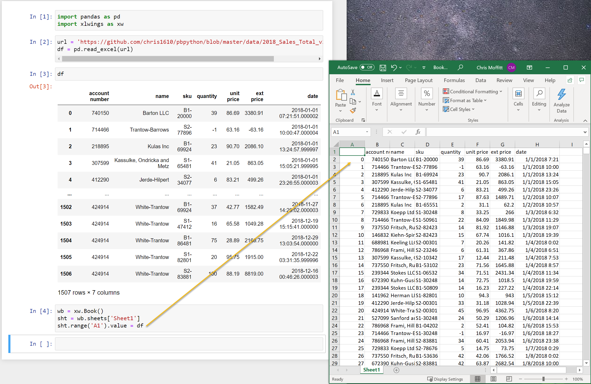
This can be a quick shortcut instead of saving and re-opening Excel to look at your data. It’s actually simple to do this so I will likely try this out some more in my own data analysis.
Summary
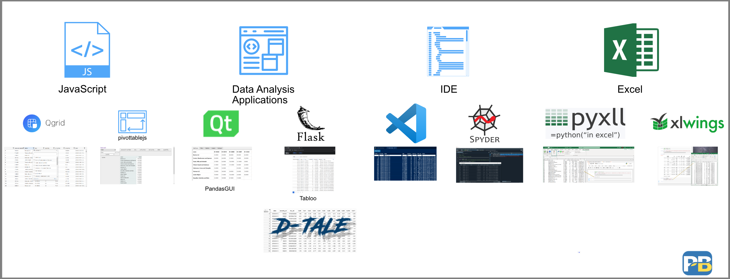
This article has covered a lot of ground. Here’s an image that summarizes all the options we discussed.
Is there one solution that works for everyone? I don’t think so. Part of the reason I wanted to write this article is that I wanted to generate discussion about the “optimal” solution. I am hoping that you will take this opportunity to check out some of these solutions and see if they fit into your analysis process. Each of these solutions addresses different aspects of the problem in different ways. I suspect that users will likely combine several of these together - depending on the problem they are trying to solve.
I predict we will continue to see evolution in this space. I am hopeful that we can find a solution that leverages some of the interactive intuitive aspects of Excel plus the power and transparency associated with using Python and pandas for data manipulation. With Guido van Rossum joining Microsoft, maybe we will see some more activity in this space?
I don’t know where we will ultimately land but I am excited to see what the community develops. If I have missed anything or if you have thoughts, let me know in the comments. It’s always appreciated.
Changes
- 12-Jan-2021: Update the xlwings example to use a simpler version -
xw.view()
Recommend
About Joyk
Aggregate valuable and interesting links.
Joyk means Joy of geeK