

Bringing Spacer GIFs Back, to handle spacing elements in React and CSS
source link: https://www.joshwcomeau.com/react/modern-spacer-gif/?ref=sidebar
Go to the source link to view the article. You can view the picture content, updated content and better typesetting reading experience. If the link is broken, please click the button below to view the snapshot at that time.
Let's Bring Spacer GIFs Back!
Possibly my most controversial idea yet…
Let's imagine we're building a HomeButton component, something we can pop in a header to make it easy for users to find their way back home.
Here's what we have so far:
function HomeButton() { return ( <LinkButton href="/"> <BackIcon /> Go back home </LinkButton>render(<HomeButton />);We're on the right track, but our arrow icon is all “smushed up” against the text. It feels absolutely claustrophobic to me. 😬
We can fix this by wrapping our text in a <span> and giving it some margin:
function HomeButton() { return ( <LinkButton href="/"> <BackIcon /> <span style={{ marginLeft: 16}} Go back home </span> </LinkButton>render(<HomeButton />);Is margin really the best tool for the job, though?
Here's an alternative solution:
function HomeButton() { return ( <LinkButton href="/"> <BackIcon /> <Spacer size={16} /> Go back home </LinkButton>render(<HomeButton />);Instead of using margin, I create a new element explicitly to add some space between the icon and text!
This isn't a new idea—in fact, it's a very old idea. And I think it's time for a comeback.
In the late 90s, if you were to pop open the source of a typical website, you'd likely encounter this curious fella:
CSS didn't exist yet, and web layouts were built using HTML tables. Tables were finnicky, and an empty cell would collapse and break the layout, so developers would toss this image into a table cell to keep it open.
GIFs were used because GIFs were the only image format that supported transparency (this is pre-PNG). Our spacer friend consisted of a single transparent pixel, a completely empty image.
This versatile tool had one other purpose: it could be stretched and squashed into any size or shape, creating an invisible buffer between elements. If you wanted a bit of a gap between two tables, for example, the spacer GIF was #1 on your speed dial.
So what happened to it? Well, the spacer GIF was a small part of a larger shift over a tumultuous decade.
CSS was added to the browser to offer an alternative to styling. The language wasn't originally designed with layout in mind, but developers quickly realized that — through the use of some clever float hacks — it could entirely replace table layouts!
This was debated ad nauseum online. The old guard was happy with their table layouts and their spacer GIFs and their comfortable way of life, while a new school of magpies advocated for eschewing HTML layouts and giving CSS sole custody of all things presentational.
This debate happened alongside another transformation on the web: the stuff we were building was getting more complex, more like applications and less like documents. “Jambalaya development” was great for getting something shipped quickly, but it was messy and hard to maintain and not as scalable.
By separating our concerns—HTML for structure, CSS for layout and presentation, JS for behaviour—we had a convention that would help us keep complexity down, ultimately making it easier to maintain things.
It became a faux pas to do anything presentational in HTML. Tags like <font>, <center>, <strike>, and <marquee> were excommunicated, and replaced with CSS alternatives. <table> became reserved for actual tables.
For a decade, everyone agreed that having distinct pillars for each concern was a good idea. And then Facebook released FaxJS React.js.
One of the defining characteristics of React.js is that HTML is created from within JS. Add in a tool like styled-components, and our three pillars have merged into one. We've come full-circle, and Jambalaya development is back en vogue.
React is undeniably a powerful tool when it comes to managing complexity in a large, sprawling web application like Facebook. Does this mean that the community made the wrong choice, all those years ago, when we separated concerns by technology?
I don't think so. I remember tinkering with web development in the early 2000s, and it was the Wild West; I remember using PHP to dynamically generate JS that would update HTML to change the CSS. It was a hot mess.
So the structure was a great idea, and it still is a great idea, but it's not the only great idea. There isn't One Right Way to build a product. The trick is to have some sort of convention in place, so that as the app grows in size and complexity, things don't turn to spaghetti.
I really like this now-famous image:
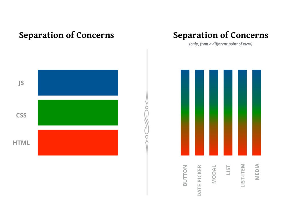
The important thing is that you can draw boundary lines. It matters less which axis those lines are drawn across.
In the original Jambalaya table-layout days, the spacer GIF was a tasty complementary ingredient. It didn't taste so good when we switched to making deconstructed sandwiches. But now that many of us are working with component-driven architectures, our code might benefit from a pinch of spacer GIF.
Here's how my spacer component is written:
If you don't use styled-components/Emotion, here's a plain-React alternative:
The only required prop is size. By default, it produces a square:
You can also specify a single axis:
This component uses pixel values, because I find it's often necessary to pick out-of-scale values for optical alignment. That said, this pattern can easily be adapted to use design tokens instead:
You may wonder why I made certain decisions with my Spacer code. Let's dig into some of them!
Originally, my <Spacer> component rendered a div instead of a span, but I found it was a little limiting. According to the HTML spec, divs aren't supposed to be put within certain elements, like p and button.
span is a much more flexible tag, but it defaults to display: inline, and inline elements really aren't designed for layout tasks; you can't give them an explicit width or height, which is the whole reason we want a Spacer!
In general, I want my <Spacer> to separate block-level elements, so it made sense to give it display: block instead of display: inline-block. In the rare instances where I wanted to separate inline elements, it can be done with a bit of composition:
In addition to setting width and height, I also set min-width and min-height.
This is done because width is really more of a suggestion than a hard constraint. Consider this situation:
function HomeButton() { return ( <LinkButton href="/" style={{ maxWidth: 200 }}> <BackIcon /> {/* Quick Spacer implementation */} <span style={{ display: 'inline-block', width: 16, height: 16, background: 'hotpink', /> Go back home </LinkButton>render(<HomeButton />);In this example, the container's width is constrained with maxWidth, and we don't have enough space. I've replaced the <Spacer> with a pink box, so we can see what's going on.
The pink box wants to be 16px by 16px, but it's probably obvious from the rendered output that it's getting squeezed; it's not a square!
We've put the browser in a tough spot: there isn't enough space to render everything! By default, it makes an educated guess, and decides to squeeze the empty child. This is a reasonable assumption, but it's not what we want in this case!
min-width is a more stalwart property. It won't be pushed around. This lets us tell the browser that this element is important, and we don't want it to get squeezed. It should find a different element to pick on.
Try changing the pink box's width to minWidth to see this dynamic in action!
Why is our Spacer more important than its siblings? Because consistent spacing is absolutely critical when it comes to maintaining a professional, polished UI. I want to be able to trust that every button on my page will have a consistent gap between the icon and text, even if it means having truncated or multi-line text.
The <Spacer /> component shown above isn't responsive; it takes up the same amount of space at every viewport.
I tend to use this component in cases like the one depicted above, situations that don't require dynamic spacing. But if I ever do run into a situation that would benefit from a responsive spacer, I'd update it to use an API like this:
I like using the prop name when for things that are contextual; it reads nicely (from the consumer side, at least. Which is the most important perspective IMO).
The implementation of this prop would depend on your particular styling solution and theme.
Alright, so why on earth would I want to do this? Why not use margin, like everyone else?
I have a few reasons:
- Semantically, it feels weird to me sometimes. In our home-button example, should the margin go on the back-arrow, or the text? It doesn't feel to me like either element should "own" the space. It's a distinct layout concern.
- Margins are funky. They collapse in weird and surprising ways. In the example above, the margin doesn't collapse, but there's an intrinsic mental overhead; I always need to keep it in mind, and factor it in.
- There are structural implications. In the example above, I wrapped the text in a
<span>, which can cause issues in certain situations (eg. children in a grid). Putting an extra layer between parent and child can be problematic. - Margins are fundamentally at-odds with modern component architectures. They bleed out, seeping through the component boundary, leaking into neighboring elements.
More and more developers are retiring margin, and relying on layout components instead. <Spacer> is a great tool in that toolkit.
When you work with CSS Grid, a heavenly property becomes available: grid-gap. With grid-gap, you can set up spacing between all children in a container in an intuitive, semantic way. I love grid-gap.
The CSS specification has recently added a gap property, which works in exactly the same way, but can also be used with flexbox. This is wonderful. 💯
Browser support is getting better every day, but it's not quite ready for prime-time yet.
What about when it's fully spported? Will this make my Spacer component redundant? I don't think so. I still spend plenty of time working in “flow layout”, outside of a grid/flex parent. gap will solve many of our problems, but it won't solve all of them.
I started experimenting with <Spacer> components a couple years ago, and in that time, I've added about 100 instances to this blog (including hosted projects like my Effective Portfolio book and Operator Lookup).
It's honestly been pretty great. I don't really have any complaints!
The biggest concern I had was around DOM size. Google recommends keeping pages under 1500 DOM nodes, a threshold that some of my more-complex pages exceed.
I haven't found I've needed to add that many spacers, though. In practice, I treat it like my <ShiftBy> component—it's a “special agent” I can deploy in specific circumstances. Most pages will only need a small handful.
Most of my spacing concerns are handled by padding, other layout components, and grid-gap / gap. And, yes, I still do use margin sometimes, though I'm reaching for it less and less.
There are other reasons to avoid DOM pollution, such as accessibility and SEO. As far as I know, though, a few extra empty spans aren't harmful in these respects.
As I was doing a bit of research for this blog post, I stumbled upon spacerGIF.org, an API that serves spacer gifs! It isn't a relic from a decade ago, either; it's grown 30x over the past year!
I suspect many readers, especially those who have been in the game for a long time, will have a visceral negative reaction to this idea. It carries a lot of baggage from the early messy days of the web. But today's ecosystem is different, and this old dog fits surprisingly nicely into a component system. Don't be so quick to write it off!
I fully expect this to be one of my most controversial blog posts yet!
I don't have a comments system, but you can share a reaction on Twitter. Just please be respectful. 😅
Recommend
About Joyk
Aggregate valuable and interesting links.
Joyk means Joy of geeK