

Analyzing the new tesla UI 🎄“2020 48 26” 🎄
source link: https://uxplanet.org/analyzing-the-new-tesla-ui-2020-48-26-8dccd52dd594
Go to the source link to view the article. You can view the picture content, updated content and better typesetting reading experience. If the link is broken, please click the button below to view the snapshot at that time.
Analyzing the new tesla UI 🎄“2020 48 26” 🎄
The new user interface that Tesla has launched as a Christmas gift has not left its users indifferent. Many of them are extremely angry and ask for the option to revert to the previous version.

For us, as users, it is very difficult to accept the iterations of the interfaces of the applications to which we are used, especially if it is a system that we use daily, such as the interface of our car. Unconsciously, we tend to memorize those applications that we use the most, being able to point out with our eyes closed the functionalities that we use the most. Therefore, if that interface that we can access with our eyes closed, is transformed in an unexpected way, even though it is to improve our security, we will probably get a little angry.

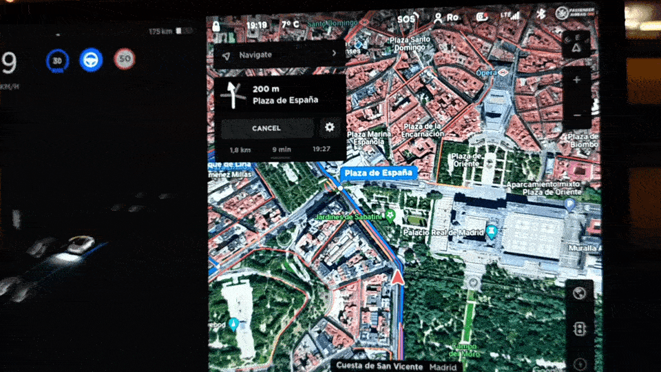
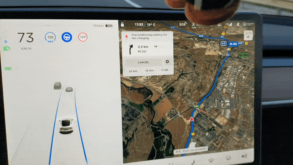
In this new version, Tesla has decided to enlarge the driving information area (left) and reduce the size of the map of the navigation part (right).
Before v. 48 26

New UI V. 48 26

For many Tesla owners, this has been a big mistake because it was more important to them to have a broader view of the part of the map than of the vehicle information area. Apparently, Elon Musk, hearing so many complaints, has announced that users can probably customize the layout of the application or at least have the option to go back to the previous version. What Musk’s comment tells us is that this is a “work in progress”;)

Redesign of the vehicle and driving information zone
The skeuomorphism is more protagonist than ever, now the vehicle is shown in greater detail, it has been closer to what the mobile app already showed. The opening of doors and trunks, as well as if the windows are lowered, are very realistically shown. In the small GIF, the lowering of the window through the black background is not seen in detail, but when the dark mode is not activated it is better appreciated.
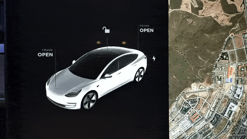
The biggest change on a visual level is that the icons that are part of the general information that is displayed when the vehicle is running have changed location.
In the image below you can see the before and after the interface change.

- The Tesla design team has decided to place the battery indicator in the upper right part, despite being vehicles that have great autonomy, it is important information, but perhaps it should not be competing with the speed at which the car circulates. From its new position at the top, you can also access information regarding the battery and charging. To improve: The battery icon, as the part that is charged appears in dark gray, gives the sensation of emptiness, it was more visual in green as it appeared previously.
- The regenerative brake bar has been placed on the same level as the data on the battery, grouping elements that refers to similar information is a very good solution. To improve: it is thicker and many users find it difficult to see the changes in its status.
- The icons indicating the gear the vehicle is in and the lights are now displayed on the left, vertically aligned. In this way, more space has been gained to show the information that the cameras are collecting and it is possible to have a better view of the road and the vehicles that circulate around it. This image shows the amount of information that the 8 cameras of the vehicle are capable of displaying.
- The icons that refer to the speed at which the car is moving, the maximum speed set by the user and the speed of the road have been grouped together, as well as the icon that indicates whether the autosteer is active. Below I will talk about the importance of being displayed in a somewhat exaggerated way if the autosteer is activated.
- The lower icon bar has been modified and a very interesting feature has been added, previously when you selected, for example, to see the status of the vehicle’s battery, the navigation indications were lost, now, as the driving area is larger, the indications, if they are to be hidden, are moved to the left so that they are not lost at any time as shown in the image below.

- Some users complain because they don’t like that the temperature is not centered on the panel like in the previous version. It is true that some action highlighted centrally in the panel is missed.
- It is a bit strange that there are two icons to access the cameras from the two lines of icons, maybe some of those icons will be removed in future versions and replaced by a new functionality and they have included it to maintain the number of items in the grid.

- In this version, it has not been contemplated to offer the driver the possibility of making phone calls from the main menu. To make a call, it is necessary to access the submenu. It would be interesting to place it for example, before or after the music icon.
- Another feature that users miss is that in the previous version, information about the vehicle’s software could be accessed through the Tesla icon that appeared on the map screen, now you have to access the vehicle icon on the part bottom and there it is inside the menu.
The importance of autosteer visibility
For those of you who are unfamiliar with the driving modes that Tesla offers, the autosteer is an option that allows the car to accelerate, brake, stop and move the steering wheel, but does not make lane changes or overtaking on the road. When a user has been driving on the road for several hours and each time they need to overtake the autosteer is deactivated, when they return to their lane they have to manually reactivate it. From a safety point of view, it would be very important for the user to be warned that it is not activated when he returns to his lane, just as if his hands are not on the wheel, alerts are sent to him so that he can place them on the wheel because after a while driving it can be dangerous for the driver to think that he has it activated and that the vehicle is the one that has control over the steering wheel.
This video shows a mistake that could end up in tragedy because the driver thought that he had activated the autosteer after overtaking a truck. That is why Tesla should incorporate messages to the user so that they are aware that autosteer is disabled.
Front camera recordingRight camera recordingIn this new version, it becomes more visible that it is activated by accentuating the color more and making it more evident that the hands are not on the wheel.
Let’s stop getting serious … Boombox and new games
It is not necessary but it can be a lot of fun.
Boombox allows you to configure the sound outside the vehicle, not only to organize an outdoor party;) but to configure sounds while driving to alert users that a silent vehicle is approaching.
Unfortunately, in Europe we will not be able to enjoy this little Christmas gift because the external speaker is not included and in the USA only those models manufactured as of September 2019.
In this new version, three more games have also been included, The Battle of Polytopia (Civitilitation strategy game), Cat Quest (Adventure), and Solitaire, the co-pilot can indicate that he is not a passenger and play while the vehicle is in motion, as with the karaoke option.

To finish … How did I find this new UI?
From a security point of view, I think it is a good idea to give more importance and space to this visual area. The navigation map continues to be quite extensive, but if, as Elon Musk affirms, for future versions, they have in mind to be able to customize the layout, the problem would be solved.
It is very interesting that several layers of navigation have been included, but the icon bar I think would allow improvements for the ease of use of the application and user comfort.
And above all, include notices of possible errors that the user may make, such as deactivating the autosteer. I know that the solution would be to hire the full self-driving feature, but if a shorter version is offered it should include all possible security measures.
Recommend
About Joyk
Aggregate valuable and interesting links.
Joyk means Joy of geeK