

How to Create a Toggle/Switch Button in React
source link: https://webomnizz.com/how-to-create-a-toggle-switch-button-in-react/
Go to the source link to view the article. You can view the picture content, updated content and better typesetting reading experience. If the link is broken, please click the button below to view the snapshot at that time.
In this article, we are going to create a Toggle/Switch button in React using hooks. We are using the CRA( create-react-app ) to set up our react project without any efforts. You can find the complete source code for this toggle button at the bottom of this article. Let’s get starting without further delay.
Setup React Project for Toggle Button
Open the terminal and write the below command and hit enter the setup the basic project with zero effort. The create-react-app helps you to setup the development environment with latest version of the required packages.
npx create-react-app react-toggleCreate Toggle/Switch Component
The first step is to create a basic layout for our toggle button. Let’s create a file under /src/components directory and name it ToggleButton.js and start with creating the required elements.
<div className="wrg-toggle">
    <div className="wrg-toggle-container">
        <div className="wrg-toggle-check">
            <span></span>
        </div>
        <div className="wrg-toggle-uncheck">
            <span></span>
        </div>
    </div>
    <div className="wrg-toggle-circle"></div>
    <input className="wrg-toggle-input" type="checkbox" aria-label="Toggle Button" />
</div>
Let’s add the above DOM elements to our react component and related CSS to give it a nice look.
const ToggleButton = () => {
    return(
        <div className="wrg-toggle">
            <div className="wrg-toggle-container">
                <div className="wrg-toggle-check">
                    <span></span>
                </div>
                <div className="wrg-toggle-uncheck">
                    <span></span>
                </div>
            </div>
            <div className="wrg-toggle-circle"></div>
            <input className="wrg-toggle-input" type="checkbox" aria-label="Toggle Button" />
        </div>
    )
}

export default ToggleButton;
Open App.css and paste the following CSS style for the Toggle button.
.wrg-toggle {
  touch-action: pan-x;
  display: inline-block;
  position: relative;
  cursor: pointer;
  background-color: transparent;
  border: 0;
  padding: 0;
  -webkit-touch-callout: none;
  -webkit-user-select: none;
  -ms-user-select: none;
  user-select: none;
  -webkit-tap-highlight-color: rgba(0,0,0,0);
  -webkit-tap-highlight-color: transparent;
}

.wrg-toggle-input {
  border: 0;
  clip: rect(0 0 0 0);
  height: 1px;
  margin: -1px;
  overflow: hidden;
  padding: 0;
  position: absolute;
  width: 1px;
}

.wrg-toggle-check, .wrg-toggle-uncheck {
  position: absolute;
  width: 10px;
  height: 10px;
  top: 0;
  bottom: 0;
  margin-top: auto;
  margin-bottom: auto;
  line-height: 0;
  opacity: 0;
  transition: opacity .25s ease;
}
.wrg-toggle-check {
  left: 8px;
}
.wrg-toggle-uncheck {
  opacity: 1;
  right: 10px;
}

.wrg-toggle-uncheck span,
.wrg-toggle-check span {
  align-items: center;
  display: flex;
  height: 10px;
  justify-content: center;
  position: relative;
  width: 10px;
}

.wrg-toggle-container{
  width: 50px;
  height: 24px;
  padding: 0;
  border-radius: 30px;
  background-color: #4d4d4d;
  transition: all .2s ease;
}

.wrg-toggle-circle{
  transition: all .5s cubic-bezier(.23,1,.32,1) 0ms;
  position: absolute;
  top: 1px;
  left: 1px;
  width: 22px;
  height: 22px;
  border: 1px solid #4d4d4d;
  border-radius: 50%;
  background-color: #fafafa;
  box-sizing: border-box;
  transition: all .25s ease;
}
The state for a Toggle/Switch button either be true or false. The true state for On/Check and the false for Off/Uncheck. Set the default state to false.
import React, { useState } from 'react';

const ToggleButton = () => {

    const [toggle, setToggle] = useState(false);

    return(
        <div className="wrg-toggle">
            ....
            ....
        </div>
    )
}

export default ToggleButton;
Now, the toggle state should only be changed by clicking on the toggle button. Let’s create an event and map it with the onClick event handler.
const ToggleButton = () => {

    const [toggle, setToggle] = useState(false);

    const triggerToggle = () => {
        setToggle( !toggle )
    }

    return(
        <div onChange={triggerToggle} className="wrg-toggle">
            ....
            ....
        </div>
    )
}
These codes won’t impact the toggle button UI, we have to add a class which works based on the toggle state. If the toggle state true then add a class wrg-toggle--checked.
<div onChange={triggerToggle} className={`wrg-toggle ${toggle ? 'wrg-toggle--checked' : ''}`}>Now add CSS to the App.css file related to the parent wrg-toggle--checked.
.wrg-toggle--checked .wrg-toggle-check{
  opacity: 1;
}
.wrg-toggle--checked .wrg-toggle-uncheck {
  opacity: 0;
}
.wrg-toggle--checked .wrg-toggle-circle {
  left: 27px;
}
The checked and the unchecked DOM element and our circle button behaves based on the wrg-toggle--checked class.
Global Settings for Toggle Button
Let’s add some global settings to make our toggle button component extendable like disable the toggle button, change the default value, change icons, callback event on state change, additional class name etc.
import PropTypes from 'prop-types';Now, go to the bottom of the page and start adding the property types to ToggleButton component.
import React, { useState } from 'react';
import PropTypes from 'prop-types';


const ToggleButton = () => {

    const [toggle, setToggle] = useState(false);

    const triggerToggle = () => {
        setToggle( !toggle )
    }

    return(
        <div onChange={triggerToggle} className={`wrg-toggle ${toggle ? 'wrg-toggle--checked' : ''}`}>
            ....
            ....
        </div>
    )
}

ToggleButton.propTypes = {
    ....
    ....
};

export default ToggleButton;
Let’s step by step define all the accepted properties.
ToggleButton.propTypes = {
    disabled: PropTypes.bool,
    defaultChecked: PropTypes.bool,
    className: PropTypes.string,
    onChange: PropTypes.func,
    icons: PropTypes.oneOfType([
        PropTypes.bool,
        PropTypes.shape({
            checked: PropTypes.node,
            unchecked: PropTypes.node
        })
    ])
};
You can learn more about the available prop types through the documentation.
We have added the disabled (boolean value, if true then our toggle button must disable), defaultChecked (boolean value, default it’s false ), className ( string value, any name for additional class ), onChange ( callback function, trigger on state change ), icons ( Node, for checked and unchecked ) properties to ToggleButton component.
Implement the Accepted Properties
Now, let’s implement the accepted properties to the ToggleButton component. Let’s start with the disabled property. Our ToggleButton should not work if the disabled property sets to true.
const ToggleButton = ( props ) => {

    const [toggle, setToggle] = useState(false);
    const { disabled } = props;

    const triggerToggle = () => {

        if ( disabled ) { return; }
        setToggle( !toggle )
    }

    return(
        <div onChange={triggerToggle} className={`wrg-toggle ${toggle ? 'wrg-toggle--checked' : ''}`}>
            ....
            ....
        </div>
    )
}
As you can see that we have accessed the disabled property to our functional component and checked it to the triggerToggle event. Because the triggerToggle event has the responsibility to change the toggle state and we required to check for the disabled property.
if ( disabled ) { return; }It won’t work with the ToggleButton UI. It should be faded to highlight the disabled element. Let’s add an additional class based on the disabled property. We will use the classnames package to merge and manage the CSS classes injection based on conditions. Let’s install the package with npm i classnames.
import React, { useState } from 'react';
import PropTypes from 'prop-types';
import classNames from 'classnames';

const ToggleButton = ( props ) => {

    const { disabled, className } = props;

    ....
    ....

    const toggleClasses = classNames('wrg-toggle', {
        'wrg-toggle--checked': toggle,
        'wrg-toggle--disabled': disabled
    }, className);

    return (
        <div onClick={triggerToggle} className={toggleClasses}>
            ....
            ....
        </div>
    )
}
Now, let’s move to another property i.e. defaultChecked. To implement this property, we need to use the useEffect hook. Let’s take an example to understand it. Let’s say, we have two ToggleButton and the second toggle button depends on the first one state. In this case, we required to use the useEffect hook that depends on defaultChecked property.
const [toggle, setToggle] = useState(false);
const { defaultChecked, disabled, className } = props;

useEffect(() => {
    if (defaultChecked) {
        setToggle(defaultChecked);
    }
}, [defaultChecked]);
Now, move to the next property i.e. onChange callback function. We can access the toggle state value to the parent component through this callback function.
This might be interesting to you: Change Parent Component State with Child Component
Let’s implement the onChange callback function. We are implementing this callback under the setToggle() setter function.
const { defaultChecked, onChange, disabled, className } = props;

....
....

const triggerToggle = () => {
    if ( disabled ) {
        return;
    }

    setToggle(!toggle);

    if ( typeof onChange === 'function' ) {
        onChange(!toggle);
    }
}

....
....
Toggle Button Icons Options: Let’s add the icons through default properties and access them to our ToggleButton component.
const CheckedIcon = () => <></>;
const UncheckedIcon = () => <></>;

const ToggleButton = ( props ) => {
    ....
    ....

    const getIcon = (type) => {
        const { icons } = props;
        if ( ! icons ) {
            return null;
        }

        return icons[type] === undefined ?
            ToggleButton.defaultProps.icons[type] :
            icons[type];
    }

    ....
    ....

    return (
        <div onClick={triggerToggle} className={toggleClasses}>
            <div className="wrg-toggle-container">
                <div className="wrg-toggle-check">
                    <span>{ getIcon('checked') }</span>
                </div>
                <div className="wrg-toggle-uncheck">
                    <span>{ getIcon('unchecked') }</span>
                </div>
            </div>
            <div className="wrg-toggle-circle"></div>
            <input type="checkbox" aria-label="Toggle Button" className="wrg-toggle-input" />
        </div>
    )
}

ToggleButton.defaultProps = {
    icons: {
        checked: <CheckedIcon />,
        unchecked: <UncheckedIcon />
    }
};

ToggleButton.propTypes = {
    ....
    ....

    icons: PropTypes.oneOfType([
        PropTypes.bool,
        PropTypes.shape({
            checked: PropTypes.node,
            unchecked: PropTypes.node
        })
    ])
}
We have used the defaultProps property to define the default property to our ToggleButton component. As you noticed, we have created two separate nodes i.e. CheckedIcon, UncheckedIcon and used them with icons checked and unchecked property.
The getIcon function takes the type ( checked or unchecked ) as a parameter and returns the related icon if it exists.
const getIcon = (type) => {
    const { icons } = props;
    if ( ! icons ) {
        return null;
    }

    return icons[type] === undefined ?
        ToggleButton.defaultProps.icons[type] :
        icons[type];
}
Using Toggle Button Component
const Checked = () => <></>;
const UnChecked = () => <></>;
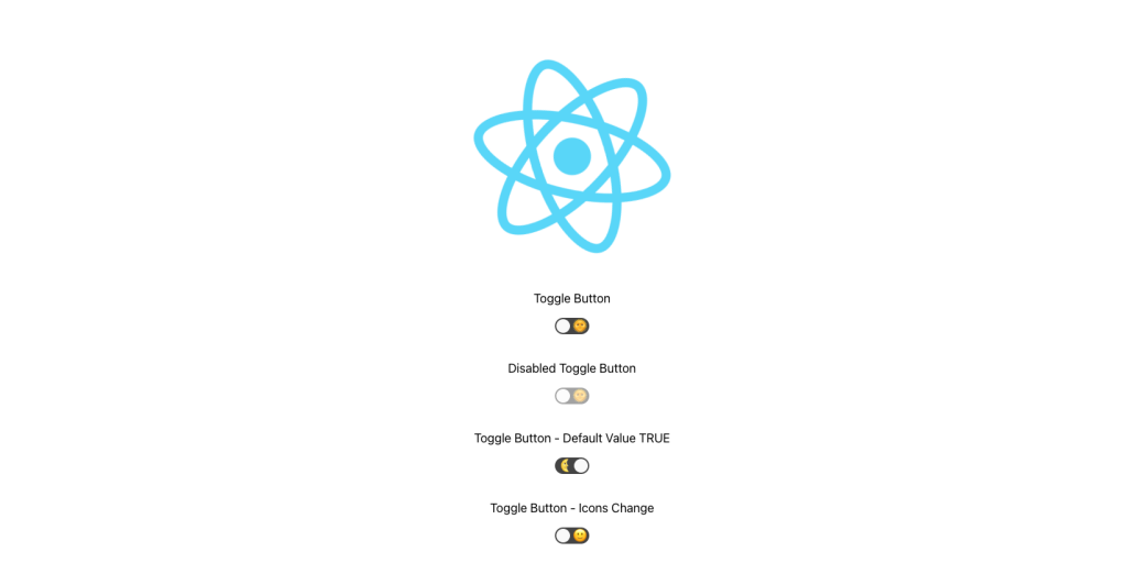
function App() {
return (
<div className="App">
<header className="App-header">
<img src={logo} className="App-logo" alt="logo" />
<p>Toggle Button</p>
<ToggleButton />
<br/>
<p>Disabled Toggle Button</p>
<ToggleButton onChange={state => console.log(state)} disabled={true} />
<br/>
<p>Toggle Button - Default Value TRUE</p>
<ToggleButton onChange={state => console.log(state)} defaultChecked={true} />
<br/>
<p>Toggle Button - Icons Change</p>
<ToggleButton onChange={state => console.log(state)} icons={{checked: <Checked />, unchecked: <UnChecked />}} />
</header>
</div>
);
}
We hope this article will help you to learn the how to create a toggle/switch button with react. If you like it then please follow us on Facebook and Twitter.
- Category: ReactJs
Posted by Jogesh Sharma
Jogesh Sharma is a web developer and blogger who loves all the things design and the technology, He love all the things having to do with PHP, WordPress, Joomla, Magento, Durpal, Codeigniter, jQuery, HTML5 etc. He is the author of this blog.
Post navigation
Recommend
About Joyk
Aggregate valuable and interesting links.
Joyk means Joy of geeK