

What Do You Think of GM's New Logo?
source link: https://www.roadandtrack.com/news/a35164108/gm-new-logo-discussion/
Go to the source link to view the article. You can view the picture content, updated content and better typesetting reading experience. If the link is broken, please click the button below to view the snapshot at that time.
What Do You Think of GM's New Logo?
As part of its push toward an electric future, GM released a new logo. We're not quite sure about it, though. How about you?
Jan 8, 2021
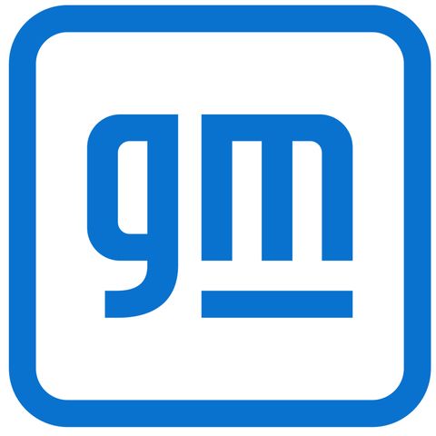
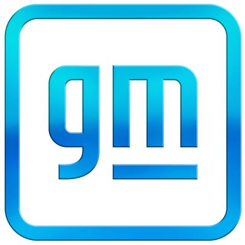
General Motors has changed its logo. The traditional white-on-blue, simple "GM" letter badge famously affixed to recession-era GM products has been replaced by a new, future-forward design.
Transforming the world begins with transforming ourselves. pic.twitter.com/7kCGzWu0Qj
— General Motors (@GM) January 8, 2021
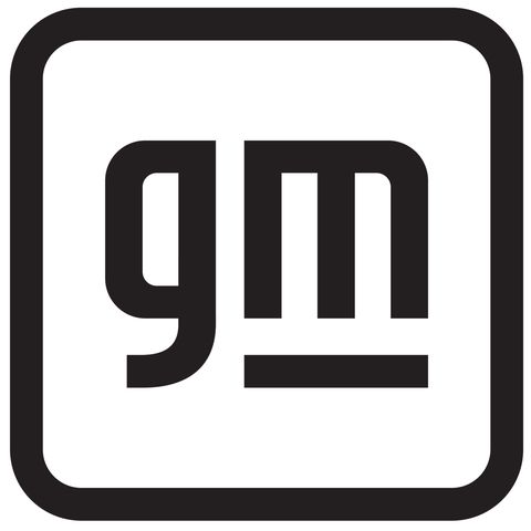
The core of the logo is still the letters "GM," although this time lowercase. They're rendered in an electric blue gradient and placed on a transparent background with a rounded circle border also shaded in electric blue. The negative space in the "M" is supposed to represent an electric plug, signaling the General's massive electric vehicle push detailed here. The company also released flat blue and black versions of the logo, but the gradient one appears to be the primary branding GM will use.
Reviews around the Road & Track virtual office are mixed. I personally believe GM rebranding and shedding the old pre-bailout logo is largely a good thing, a visual marker that the company is undergoing yet another reinvention. But the logo itself harkens back to an earlier era of electro-futurism, more rooted in 2013-era post-skeuomorphic tech design than in the modern, minimalist design movement that defines EV branding today. Perhaps avoiding what's trendy in this moment will give the logo better staying power, as GM has only changed its logo a handful of times and tends to keep them around for quite some time. But my colleagues seem less optimistic:
Deputy editor Bob Sorokanich: "This looks like some 'intel inside' bullshit from 2007. I guarantee you, part of the reason why it looks so old is that it took GM like seven years to get every department's approval."
Senior reporter Chris Perkins: "'When I said Photoshop a new logo, I didn’t mean copy Photoshop, Jim' - Mary Barra."
Contributor Fred Smith: "Looks like the logo for an app called 'Good Morning' that sends daily positive affirmations and also mines data from your phone to sell to a defense contractor."
Staff writer Brian Silvestro: "This is the type of logo that will get normal people even more confused about whether General Motors and General Electric are the same company or not."
Contributor John Krewson: "I actually like diet spearmint Goodwill’s new logo."
Clearly, not everyone is on board. These things never go over easy. But what do you think? Is it a much-needed change, a hamfisted attempt, a goofy design, or all three? Besides intel and Photoshop, is there any other logo this brings to mind?
Recommend
About Joyk
Aggregate valuable and interesting links.
Joyk means Joy of geeK