
Techniques for Color Blind Friendly Web Apps using Chrome DevTools
source link: https://blog.bitsrc.io/technique-for-color-blind-friendly-web-apps-using-chrome-devtools-fe25d8fcb83e
Go to the source link to view the article. You can view the picture content, updated content and better typesetting reading experience. If the link is broken, please click the button below to view the snapshot at that time.
Techniques for Color Blind Friendly Web Apps using Chrome DevTools
Around 4.5% of people globally suffer from color vision deficiencies, and it’s high time to make them accessible

Although there are many tools and concepts in the modern world supporting usability and user experience, focus on color blindness is often forgotten.
According to colourblindawareness.org, approximately 1 in 12 men(8%) and 1 in 200 women(0.5%) in the world suffer from color vision deficiencies.
However, looking at the numbers makes a lot of sense to ensure your web app is accessible for color-blind users. And the good news is, Chrome DevTools provides some great features to ensure accessibility.
The end result should be your own themeable design system that supports accessibility (for colorblind as well as other vision deficiencies). This will save you much time in future projects.
One tool that does that best is Bit (Github). Each component “exported” to Bit’s cloud can be installed and even maintained as a completely independent module. That means, you can gradually expand your design system, and do so while collaborating with others on each individual component separately.
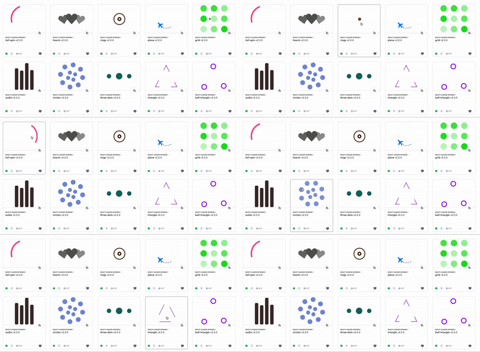
React loader components shared on Bit.devColor Vision Deficiency
Color vision deficiency (CVD), also known as color blindness, is a set of conditions that influence the viewpoint of color.
People with normal color vision can identify more than 100 different hues, whereas people who are strongly color blind might only see 20 different shades.
The most common accessibility issue on the web that affects color blindness is the low contrast text.
According to accessibility analysis done by WebAim’s of the top one million websites, over 86% of home pages have a low discrepancy, and on average, every home page has 36 different instances of low contrast.
Several Chrome DevTools are available to improve contrast & make more accessible color schemes for web apps. Let’s see how we can use Chrome DevTools to address these issues regarding color blindness.
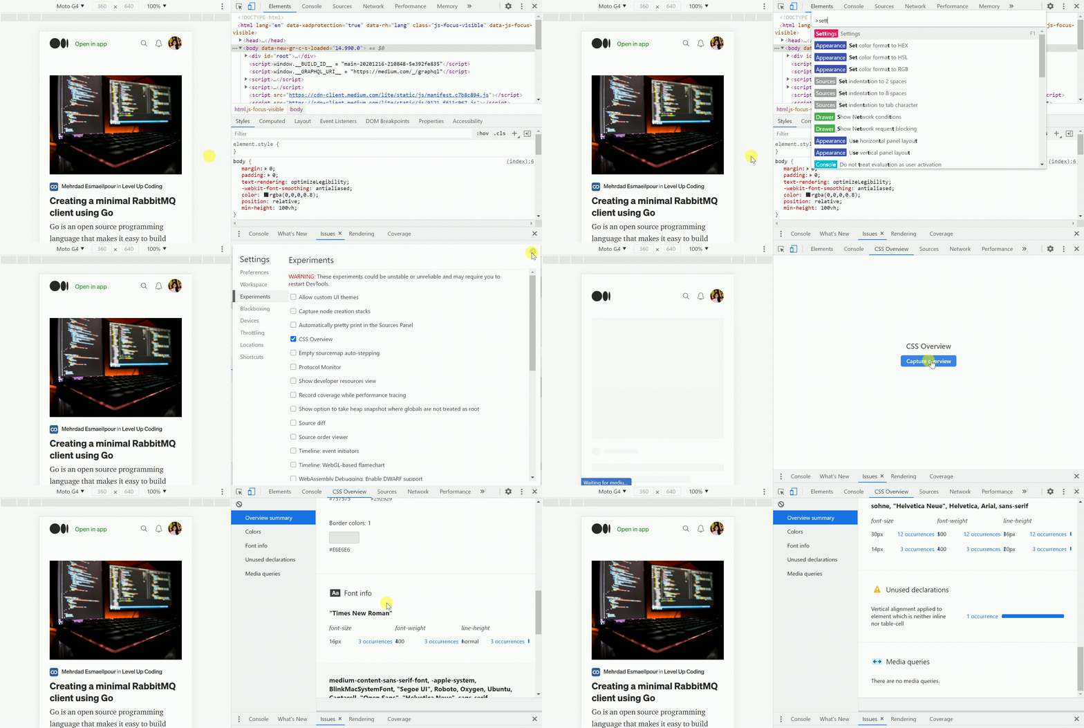
1. CSS Overview Panel
This fancy experimental feature in Chrome DevTools provides an overview of the site’s CSS, including color and fonts used on the page, media queries, and unused declarations.

Since this feature provides more of an overview, you can use it as a starting point to analyze the colors and contrast ratios used across the application. After that, it will be easier to understand the state and dive deep into areas where you can improve accessibility.
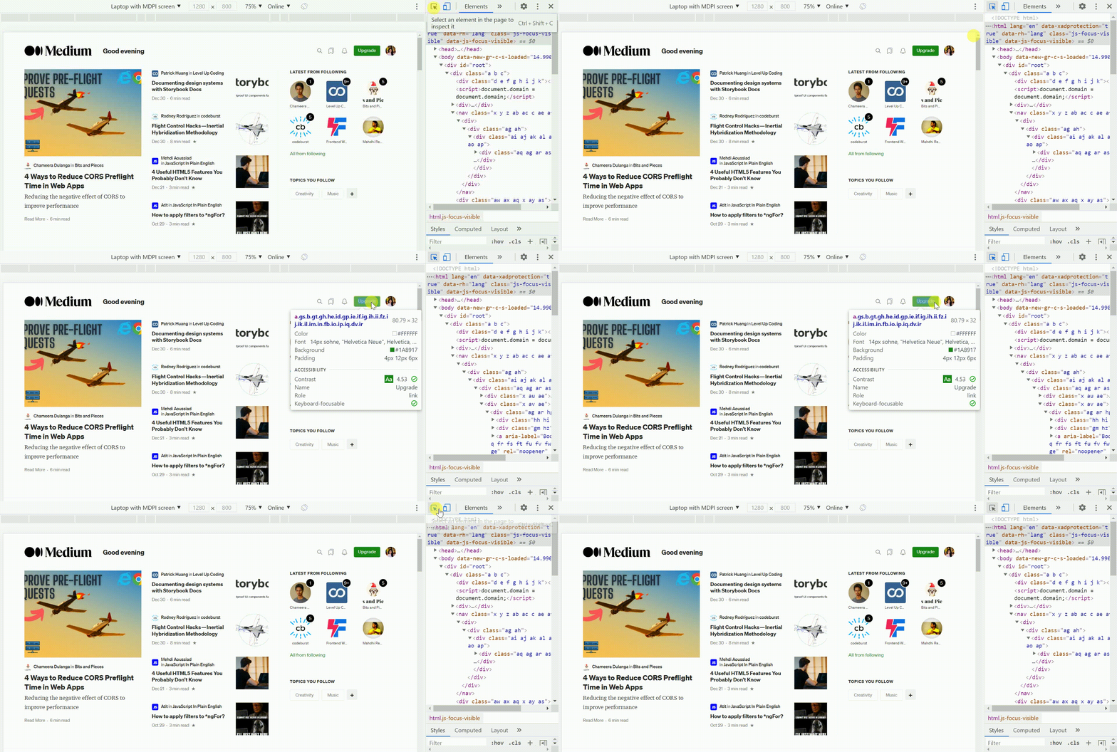
2. Inspect Mode Tooltip
DevTools displays an expanded tooltip containing important information like font details, contrast ratio, and box model dimensions when inspecting a node.

According to the WCAG 2.0 guidelines, there are three different levels of conformance specified to meet the needs of various situations and groups:
- Level A (Minimal compliance)
- Level AA (Acceptable compliance)
- Level AAA (Optimal Compliance).
A website should be understandable and usable for anyone with or without disabilities to meet the Level AA conformance; hence, it is the most used in accessibility rules and regulations worldwide. Though Level AAA conformance will give a similar web experience for almost all the users, W3 states that:
“It is not recommended that Level AAA conformance be required as a general policy for entire sites because it is not possible to satisfy all Level AAA Success Criteria for some content.”
Based on the WCAG guidelines, the recommended contrast ratio for Level AA is 4.5, while for Level AAA, it is 7.
As you can notice, using the Inspect Mode Tooltip can view the current conformance level of an inspected text and make sure it has enough contrast to come away from the background for legibility.
Okay, now think that a particular text doesn’t satisfy any of the conformance levels. Then how can we find the perfect color contrast between the background and foreground content to ensure legibility? That’s where DevTools Color Picker can help out!
3. DevTools Color Picker
DevTools Color Picker identifies terrible contrast ratios of text elements and displays a recommended contrast line to manually select a better color. You can also automate the selection by suggesting accessible colors that you can apply with a single click.

Here the contrast ratio of the Dribble home page’s “Sign-Up” button is 2.51, which is lower than the accepted parameters for accessibility; it shows a red warning symbol.
So, how can you find an excellent color for the text? Did you notice two lines appear along the top of the color picker? That’s where the answer lies. Colors below the top-dividing line are the text colors that meet the “Level AA” standards, while colors below the bottom-dividing line meet the standards of “Level AAA.” However, anything above the top-line will get flagged with red warning symbols to tell you the color combination poses a problem for accessibility.
All the above-listed Chrome DevTools mainly focus on identifying contrast ratio information and giving you options to fix them.
But this may not be the case always. To give users a better experience, you might need to understand how your website looks to users with vision problems.
Don’t worry! In Chrome 83, a new DevTool has been introduced to mimic visual impairments like color blindness. By simulating the color vision deficiency’s effect, developers/ designers can find and fix the contrast issues and understand them!
4. Emulate Vision Deficiencies
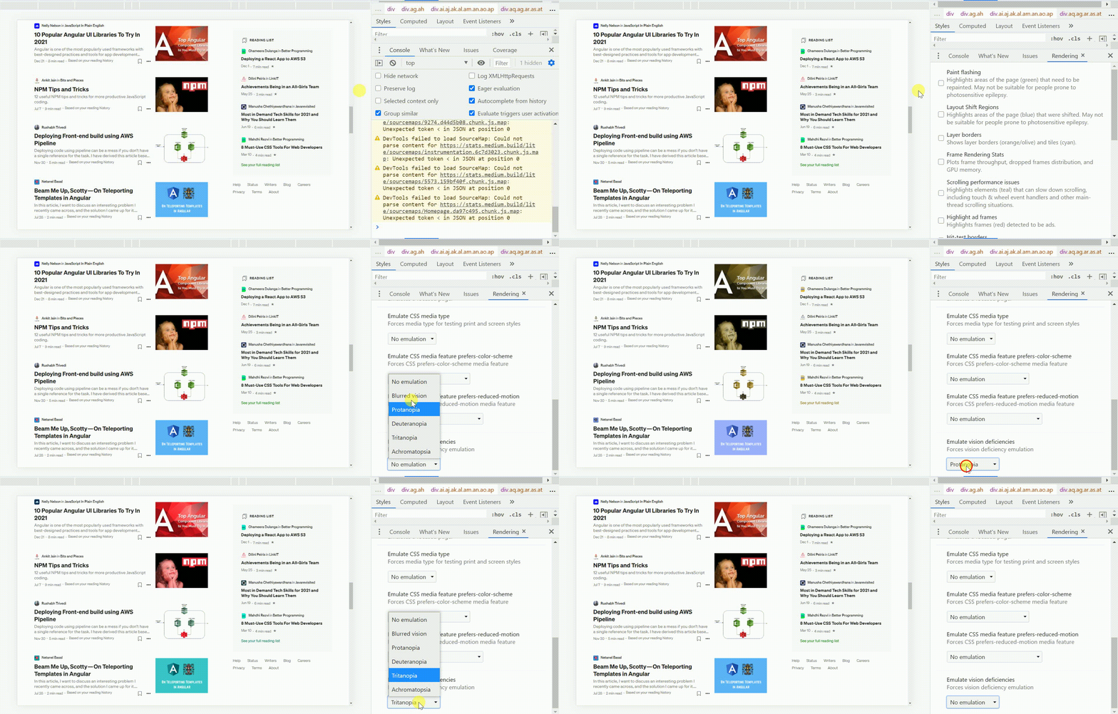
Emulate vision deficiencies is a new feature available in the DevTools rendering tab to simulate how people with a color vision deficiency experience your web app.
Emulate Vision Deficiency helps designers and developers get an idea of what their website looks like to the users with vision problems and decide whether they need to make adjustments in their color or contrast choices.
The feature provides the following options to simulate different vision deficiencies.
- No emulation — Vision deficiency emulation is disabled
- Blurred vision — Where the vision is less precise (Increasing the text size helps)
- Protanopia — Insensitivity to red color
- Deuteranopia —Insensitivity to both red and green colors
- Tritanopia — Impaired blue and yellow vision
- Achromatopsia — Total absence of color vision
Awesome! 😎 Now since you’ve got a better idea of the Emulation options available, let’s see how we can use it!!
First, you need to view the Rendering view and scroll down to select the Emulate vision deficiencies dropdown.
Tip: If the Renderingview hasn’t appeared at the bottom of the Chrome DevTools, at the top right corner of Chrome DevTools, click the three vertical dots icon to open the customization menu and select Rendering from the More tools option.

Then you can assess whether your critical application functionalities are accessible for visually impaired users by emulating the deficiency and making the necessary adjustments. After that, it’s advisable to complete a quick verification before releasing any significant color theme changes.
Final Words
It's difficult for a person with normal vision to visualize how your web app will look like to a color-blind eye. And yet, this can make a huge impact. Therefore, it is vital to make your website accessible to everyone. Apart from making the website accessible to users who are color blind, there are other benefits you get from making the site color friendly. Including,
- Accessible websites are more likely to be ranked well in the search engines.
- Your website becomes more professional if it doesn't exclude the impaired or disabled.
- By designing color-blind accessible websites, devices used for web access like PDAs, 3G phones are also targeted.
Chrome DevTools is a powerful tool when designing and developing a color-blind accessible website. In this article, I have mentioned three methods that help you to identify and fix the color vision deficiency and another tool that you can use to simulate the color vision deficiencies.
Thank You for reading. Feel free to hit me up with your thoughts in the comment section below 👇.
Happy Coding!
Recommend
About Joyk
Aggregate valuable and interesting links.
Joyk means Joy of geeK
