

Why Toggle Buttons Should Never Look Like Action Buttons
source link: https://uxmovement.com/buttons/why-toggle-buttons-should-never-look-like-action-buttons/?utm_campaign=Feed%3A+uxmovement+%28UX+Movement%29
Go to the source link to view the article. You can view the picture content, updated content and better typesetting reading experience. If the link is broken, please click the button below to view the snapshot at that time.

Why Toggle Buttons Should Never Look Like Action Buttons
Toggle buttons should never look like action buttons. A common mistake is to use the same color cue on them. Doing this increases visual noise and makes every toggle button look like an action button. As a result, the action button has less of a signal is harder to spot.
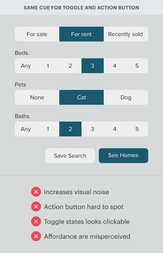
Not only that but using the same color cue will make active toggle states look clickable when they aren’t. An active toggle state should only signify the selected option. But when it uses the same cue as an action button, it causes users to click the active state by mistake. They think the button will perform an action when it’s only indicating option selection.
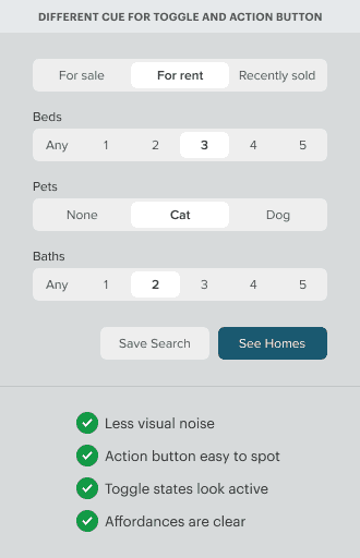
Toggle and action buttons need different cues, or users will misperceive their affordances. The difference in cues tells users that they can expect different affordances when they interact with them. It’ll also reduce visual noise and make action buttons easier to recognize. Toggle states will appear active without misleading users.
Learn the Design Details
Knowing what to do isn’t enough. You also need to know how to do it. How do you design toggle buttons correctly? What design techniques should you use? Subscribe to learn the design details in the premium article.
Toolkits
Affiliates
Recommend
-
13
Using HTML buttons and inputs with the form, form-method and form-action attributes The default way you would wite an HTML form would be like this: <form action="/action_page.php" method="get" id="form1"&g...
-
7
The Best & Worst Words to Use in Your Website Call to Action Buttons [Infographic] Published July 17, 2021 By
-
28
Can I make the WPF radio buttons look like CheckBoxes? advertisements I want to have the behavior of RadioButtons, but show them as CheckBoxes...
-
5
Closed Bug 1725583 Opened 4 months ago Closed 21 days ago...
-
12
The Components You Should Look For In Naruto Action Figure ...
-
7
Get a Look at the Never Before Seen, Live Action Sailor Moon ShowYoutuber Ray Mona found the footage after a long, intensive search.August 22, 2022, 2:57pm
-
11
Radio buttons, checkboxes, toggle switche...
-
13
Drop-Downs or Radio Buttons? Never Make This Mistake AgainIf you care about your users, then you should learn that we have a few best practices to accelerate your assertiveness in the world of UX/UI Des...
-
5
Phone manufacturers: please give us the power button back / I don’t want to talk to Siri, Google, or Bixby. Please just make the power button do what it’s supposed to do. Dec 24, 2022, 4:30...
-
6
Did you realize that on DEV you have the ability to embed a call-to-action button? For example, it looks like this: Learn about Community Moderation on DEV Want to...
About Joyk
Aggregate valuable and interesting links.
Joyk means Joy of geeK