

CSS Grid Layout Module Level 3
source link: https://drafts.csswg.org/css-grid-3/
Go to the source link to view the article. You can view the picture content, updated content and better typesetting reading experience. If the link is broken, please click the button below to view the snapshot at that time.

CSS Grid Layout Module Level 3
Editor’s Draft, 22 October 2020
Specification MetadataCopyright © 2020 W3C® (MIT, ERCIM, Keio, Beihang). W3C liability, trademark and permissive document license rules apply.
Abstract
This module introduces masonry layout as an additional layout mode for CSS Grid containers.
CSS is a language for describing the rendering of structured documents (such as HTML and XML) on screen, on paper, etc.Status of this document
This is a public copy of the editors’ draft. It is provided for discussion only and may change at any moment. Its publication here does not imply endorsement of its contents by W3C. Don’t cite this document other than as work in progress.
Please send feedback by filing issues in GitHub (preferred), including the spec code “css-grid” in the title, like this: “[css-grid] …summary of comment…”. All issues and comments are archived. Alternately, feedback can be sent to the (archived) public mailing list [email protected].
This document is governed by the 15 September 2020 W3C Process Document.
Table of Contents
1. Introduction
This section is not normative.
Grid Layout is a layout model for CSS that has powerful abilities to control the sizing and positioning of boxes and their contents. Grid Layout is optimized for 2-dimensional layouts: those in which alignment of content is desired in both dimensions.
Although many layouts can be expressed with regular Grid Layout, restricting items into a grid in both axes also makes it impossible to express some common layouts on the Web.
This module defines a layout system that removes that restriction so that items can be placed into Grid-like tracks in just one of the axes, while stacking them one after another in the other axis. Items are placed into the column (or row) with the most remaining space based on the layout size of the items placed so far. This module also extends CSS Grid with this new grid item placement strategy and CSS Box Alignment with new alignment features.
1.1. Background and Motivation
Masonry layout is a common Web design pattern where a number of items — commonly images or short article summaries — are placed one by one into columns, in a way that loosely resembles stone masonry. Unlike regular multi-column layout, where items are placed vertically in the first column until they must spill over to the second column, masonry layout selects a column for each new item such that it is generally closer to the top of the layout than items placed later.
The Pinterest search results page exemplifies this layout:
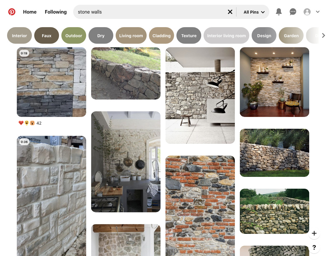 Representative masonry layout example
Here, each item has a different height (depending on the content and the width of the column), and inspecting the DOM reveals (as the visual content itself gives no indication of ordering) that each item has been placed into the column with the smallest height so far.
This layout superficially looks similar to multi-column layout; but it has the advantage that scrolling down will naturally lead to "later" items in the layout (that is, those less relevant in the search results).
It’s not possible to achieve this layout using earlier CSS layout models, unless you know up-front how tall each item will be, or use JavaScript for content measurement or placement.
1.2. Value Definitions
This specification follows the CSS property definition conventions from [CSS2] using the value definition syntax from [CSS-VALUES-3]. Value types not defined in this specification are defined in CSS Values & Units [CSS-VALUES-3]. Combination with other CSS modules may expand the definitions of these value types.
In addition to the property-specific values listed in their definitions, all properties defined in this specification also accept the CSS-wide keywords as their property value. For readability they have not been repeated explicitly.
2. Masonry Layout
Masonry layout is supported for grid containers by specifying the value masonry for one of its axes. This axis is called the masonry axis, and the other axis is called the grid axis.
This allows us to use the full power of CSS Grid in the grid axis. Line names and track sizes can be specified and grid items can be placed into the tracks and span them using grid-column / grid-row as usual. The CSS Box Alignment properties work the same as in a regular grid container in this axis. In the masonry axis however, items are laid out one after another using the § 2.4 Masonry Layout Algorithm.
 Rendering of the example above.
Subgrid grid items are supported, but subgridding only occurs in the grid container’s grid axis; see § 8 Subgrids for details.
If masonry is specified for both grid-template-columns and grid-template-rows, then the used value for grid-template-columns is none, and thus the inline axis will be the grid axis.
Grid items are formed and blockified exactly the same as in a regular grid container.
All CSS properties work the same as in a regular grid container unless otherwise specified by this specification. For example, order can be used to specify a different layout order for the items.
2.1. Line Name Resolution
Grid item line name resolution works the same as if masonry were replaced with none, i.e. line names are resolved in both axes. The line name resolution works exactly is in CSS Grid.
2.2. Grid Item Placement
Grid items are placed using these steps:
- Place the items as if the masonry axis had none specified in that axis.
- For any items that were placed at the first (hypothetical) implicit line in the masonry axis in step 1, those items keep their placement in both axes as their final placement. They will be laid out first in each grid axis track and their grid axis placement is considered definite henceforth. All other items ignore their placement from step 1. Any item with with a specified definite placement in the masonry axis that doesn’t result in it being placed at the first implicit line in the masonry axis will be treated as having auto-placement in that axis.
- Place items using the Masonry layout algorithm below.
(The reason for step 1 above is to determine which items contribute to intrinsic track sizing in the grid axis; see § 2.3 Grid Axis Track Sizing below.)
2.3. Grid Axis Track Sizing
Track sizing works the same as in CSS Grid, except that that the algorithm is run only with the subset of items that have a known grid axis placement. This subset contains the items placed at the first implicit line in the masonry axis in Grid Item Placement above, plus the items that have a specified definite placement in the grid axis, plus the items that span all grid axis tracks (which obviously will be placed at the first implicit line since there is no other way to place them). Other items will be placed in the grid axis by the § 2.4 Masonry Layout Algorithm below and don’t contribute to intrinsic track sizing (because that would create circular dependencies).
2.3.1. repeat(auto-fit)
repeat(auto-fit) behaves as repeat(auto-fill) when the other axis is a masonry axis. The reason for this is that auto-placed items depend on the layout size of their siblings. Removing empty tracks after layout wouldn’t be possible in most cases since it might affect any intrinsic track sizes. Even if all track sizes are definite, the containing block size could change for grid-aligned absolutely-positioned descendants. This makes repeat(auto-fit) impossible to support in a grid container with masonry layout.
2.4. Masonry Layout Algorithm
Items are placed in order-modifed document order, but items with a definite placement are placed before items with an indefinite position (as in regular grid layout). For each of the tracks in the grid axis, keep a running position initialized to zero. For each item placed at the first implicit line in the masonry axis in Grid Item Placement step 1 above:
- Position the item at the content edge of the grid container in the masonry axis and at its start track in the grid axis.
- Calculate the size of the containing block and then layout the item. Then, calculate its resulting margin-box in the masonry axis. Set the running position of the grid axis tracks the item spans to the maximum of
margin-box-end + grid-gapand the current running position of those tracks.
Note: This means that items with a definite placement at line 1 in the masonry axis by Grid Item Placement step 1 can be made to intentionally overlap.
The remaining items get their final placement using the following steps:
-
If the item has an indefinite placement in the grid axis, then resolve its definite placement in the grid axis using these substeps:
- Starting at the first grid axis line in the implicit grid...
- Find the largest running position of the grid axis tracks that the item would span if it were placed at this line, and call this position
max_pos. - Increment the line number and repeat step 2 until the item would no longer fit inside the grid.
- Pick the line that resulted in the smallest
max_posas the item’s definite placement in the grid axis.
- Position the item at its grid axis start track and the maximum of the running positions of the tracks it spans.
- Calculate the size of the item’s containing block and then layout the item. Then calculate its resulting margin-box in the masonry axis. Set the running position of the grid axis tracks the item spans to
max_pos + margin-box-end + grid-gap.
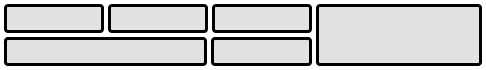
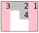
2.5. The masonry-auto-flow Property
The § 2.4 Masonry Layout Algorithm above can be modified in two ways, using the new masonry-auto-flow property:
Name: masonry-auto-flow Value: [ pack | next ] || [definite-first | ordered ] Initial: pack Applies to: grid containers with masonry layout Inherited: no Percentages: n/a Computed value: specified keyword(s) Canonical order: per grammar Animation type: discreteFirst, picking definite items first for placement can be inhibited by specifying the ordered keyword so that a plain order-modifed document order is used instead. Second, instead of placing the items in the track(s) with the most remaining space as described above we can place them one after another in the grid axis by specifying the next keyword, for example:
<style>
.grid {display: inline-grid;grid: masonry / repeat(3,2ch);border:1px solid;masonry-auto-flow: next;}

item {background: silver }
item:nth-child(2n+1){background: pink;height:4em;}
</style>
<divclass="grid"><item>1</item><item>2</item><item>3</item><item>4</item></div>
 Rendering of the masonry-auto-flow: next example above.
(Without masonry-auto-flow: next, item 4 would be placed below item 2.)
3. Containing Block
The containing block for a grid item is formed by its grid area in the grid axis and the grid container’s content-box in the masonry axis.
4. The Implicit Grid
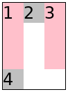
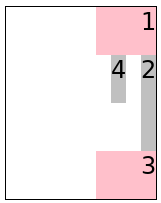
The implicit grid is formed in the same way as for a regular grid container. However, it’s only used in the grid axis. The flow axis specified by grid-auto-flow is ignored — items are always placed by filling the grid axis (though note that the grid-auto-flow property’s dense keyword does have an effect in determining which items end up at line 1 in the masonry axis, in § 2.2 Grid Item Placement step 1). direction:rtl reverses the grid if the inline-axis is the grid axis (as usual for a regular grid container) and it makes items flow from right to left if the inline-axis is the masonry axis.<style>
.grid {display: inline-grid;direction: rtl;grid: masonry / repeat(4,2ch);border:1px solid;}
item {background: silver }
item:nth-child(2n+1){background: pink;height:4em;}
</style>
<divclass="grid"><item>1</item><itemstyle="grid-column:span 2">2</item><item>3</item><item>4</item></div>
 Rendering of the direction: rtl example above.
<style>
.grid {display: inline-grid;direction: rtl;width:10ch;column-gap:1ch;grid:repeat(4,2em) / masonry;border:1px solid;}

item {background: silver }
item:nth-child(2n+1){background: pink;width:4ch;}
</style>
<divclass="grid"><item>1</item><itemstyle="grid-row:span 2">2</item><item>3</item><item>4</item></div>
 Rendering of the direction: rtl example above.
5. Sizing Grid Containers
Sizing Grid Containers works the same as for regular grid containers but with the following addendum for the masonry axis: The max-content size (min-content size) of a grid container in the masonry axis is the largest distance between the grid container’s content-box start edge and the maximum margin-box end of all the items, when sized under a max-content constraint (min-content constraint).
<style>
.grid {display: inline-grid;grid: masonry / 50px100px auto;grid-gap:10px;border:1px solid;}
item {background: silver;margin:5px;}
</style>
<divclass="grid"><itemstyle="border:10px solid">1</item><item>2</item><item>3</item><itemstyle="height:50px">4</item><item>5</item><item>6</item></div>
 Rendering of the grid container intrinsic sizing example above.
6. Alignment and Spacing
Gutters are supported in both axes. In the masonry axis, the gap is applied between the margin boxes of each pair of adjacent items. Margins do not collapse in either axis.
In the grid axis, alignment works the same as in a regular grid container.
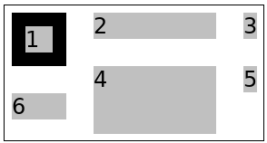
In the masonry axis, content-distribution is applied to the content as a whole, similarly to how it behaves in block containers. More specifically, the alignment subject is the masonry box, which is the area between the content-box edge of the grid container and the margin-box end edge of the item that is the furthest away in the masonry axis, as indicated by the dashed border here:
 The extent of the masonry box is indicated by the dashed border.
(Note that item 1 has a 5px bottom margin here.)
The extent of the masonry box is indicated by the dashed border.
(Note that item 1 has a 5px bottom margin here.) Note that there is only ever one alignment subject for these properties in the masonry axis, so the unique align-content / justify-content values boil down to start, center, end, stretch and baseline alignment. (normal behaves as stretch as usual for grid containers). In the figure above, the grid container has align-content: start; but if align-content were at its default normal value, then the masonry box would fill the grid container's content box, due to being stretched. Moreover: if the grid items overflowed the grid container's content box in the masonry axis, then the masonry box would be larger than the grid container's content box.
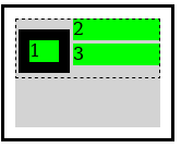
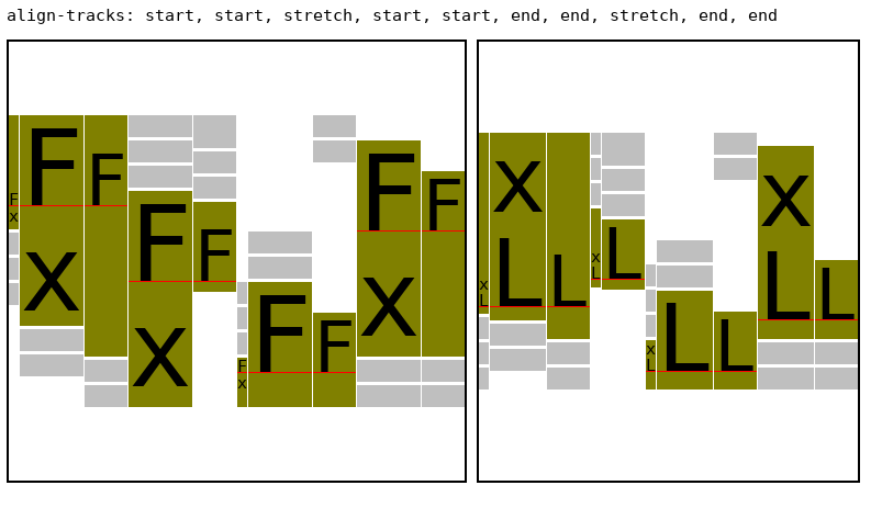
6.1. The align-tracks and justify-tracks Properties
This specification adds two new properties to align the items in the masonry axis for each individual grid axis track:
Name: justify-tracks Value: [normal | <content-distribution> | <overflow-position>? [ <content-position> | left | right ] ]# Initial: normal Applies to: grid containers with masonry layout in their inline axis Inherited: no Percentages: n/a Computed value: specified keyword(s) Canonical order: per grammar Animation type: discreteNote: These values are the same as for align-content / justify-content, but here we accept multiple values in a comma-separated list.
Unlike align-content / justify-content, normal behaves as start for these properties. So the default rendering is the expected packed masonry layout as shown in the top left corner in the example below. When multiple values are specified, the first track in the grid axis uses the first value, the second track uses the second value, etc. If there are fewer values than tracks, then the last value is used for the remaining tracks. If there are more values than tracks, then the remaining values have no effect on the rendering.
 The rendering of the align-tracks example above.
 6.2. Stretch Alignment in the Masonry Axis
stretch will stretch the items in the masonry axis for each track separately, to fill the grid container’s content-box. Any item can opt out from stretching by setting align-self / justify-self to something other than normal or stretch in the relevant axis. A stretched item with an indefinite size in the masonry axis will stretch its content-box size, but only up to its max size. An item with a definite size and an auto margin in the masonry axis will stretch by increasing auto margin(s). Otherwise, the item doesn’t stretch.
Only the purple items have auto height, so they are the ones that may grow by default. A few items worth noting: item 4 has max-height: 40px so it only grows up to that size and then the other items in its track picks up the remaining size. Item 16 opts out from resizing by setting align-self: end. Item 18 has margin-block: auto so it’s centered in its allotted space instead of growing. Item 20 has margin-top: auto so it’s aligned to the end while its top-margin grows.
6.3. Individual Track Alignment in the Masonry Axis
align-tracks / justify-tracks values can be specified per track.
 Rendering of the align-tracks alignment example above.
 6.4. Baseline Alignment in the Masonry Axis
Item baseline alignment inside the grid axis tracks works as usual for a regular grid container, and the grid container’s baseline is determined the same as for a regular grid container in that axis.
Baseline alignment is supported also in the masonry axis, on the first and last item in each track (but not on items "in the middle" of the track). Only tracks with the align-tracks / justify-tracks values start, end or stretch support baseline alignment. There are four different sets of baseline-sharing groups:
- the first item in each start track + the first item in each stretch track
- the last item in each start track
- the first item in each end track
- the last item in each end track + the last item in each stretch track
Each of those sets can have a first baseline set and a last baseline set, resulting in eight unique baseline sets in the masonry axis.
specify how the grid container’s first(last) baseline in the masonry axis is determined
 The rendering of the example above.
 this needs more details about edge cases, caveat about misalignment in stretch, etc
Authors are advised to be careful with using alignment values other than start when some items span more than one track, because it’s easy to cause items to unintentionally overlap in this case.
maybe we can make stretch alignment (at least) smarter so that we avoid overlapping spanning items in a few more cases that would be useful to authors?
7. Fragmentation
7.1. Fragmentation in the Masonry Axis
Each grid axis track is fragmented independently in the masonry axis. If a grid item is fragmented, or has a forced break before/after it, then the running position for the tracks that it spans in the grid axis are set to the size of the fragmentainer so that no further items will be placed in those tracks. An item that is split into multiple fragments retains its placement in the grid axis for all its fragments. A grid item that is pushed, however, is placed again by the next grid container fragment. Placement continues until all items are placed or pushed to a new fragment.
7.2. Fragmentation in the Grid Axis
Fragmentation in the grid axis with masonry layout in the other axis is also supported. In this case the fragmentation behaves more like in a regular grid container; however, there’s a separate step to determine which grid-axis track each item is placed into, before fragmentation occurs.
8. Subgrids
Masonry layout is supported in subgrids (e.g. grid: subgrid / masonry), and grids that use masonry can have subgrids as children. However, only a parent grid axis can be subgridded in the normal sense. A subgrid axis with a parent masonry axis will behave as masonry, unless the subgrid’s other axis is also masonry in which case it behaves as none (because a grid container can only have one masonry axis). auto-placed subgrids don’t inherit any line names from their parent grid, because that would make the placement of the subgrid’s grid items dependent on layout results; but the subgrid’s tracks are still aligned to the parent’s tracks as usual. Here’s a subgrid example:
<style>
.grid {display: inline-grid;grid: auto auto 100px / masonry;align-content: center;height:300px;border:1px solid;}

.grid > * {margin:5px;background: silver;}
.grid > :nth-child(2n){background: pink;}

.grid subgrid {display: grid;grid: subgrid / subgrid;grid-row:2 / span 2;grid-gap:30px;}
.grid subgrid > * {background: cyan;}
</style>
<divclass="grid"><item>1</item><item>2</item><item>3</item><subgrid><itemstyle="height:100px">subgrid.1</item><item>sub.2</item><item>s.3</item></subgrid><item>4</item><item>5</item><itemstyle="width: 80px">6</item><item>7</item></div>
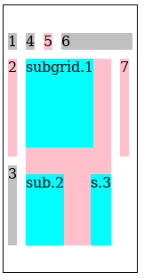 The rendering of the subgrid example above.
 Note how the subgrid’s first item ("subgrid.1") contributes to the intrinsic size of the 2nd row in the parent grid. This is possible since the subgrid specified a definite placement so we know which tracks it will occupy. Note also that trying to subgrid the parent’s masonry axis results in the subgrid getting masonry layout in its inline-axis.
9. Absolute Positioning
Grid-aligned absolute-positioned descendants are supported. In the masonry axis, all grid positions except line 1 are treated as auto. Line 1 in the masonry axis corresponds to the start of the masonry box (which is usually also the content-box start edge) and auto uses the grid container padding edge as usual. The containing block is the extent of the tracks the item spans in the grid axis and the position of line 1 and the padding-box edge in the masonry axis.
It might be useful to define a static position in the masonry axis. Maybe it could defined as the max (or min?) current running position of the grid-axis tracks at that point? Or the end of the item before it?
It would also be useful to be able to align the masonry box end edge somehow, but for that we need a way to address the end line in an implicit grid, or could we just use any non-auto line number other than 1 to indicate the end line given that we don’t really have any lines in this axis other than line 1?
10. Performance Notes
In general, masonry layout should have significantly better performance than the equivalent regular (2-axis) grid layout, particularly when the masonry axis is the block-axis since the intrinsic sizing of grid rows is typically quite expensive. Any intrinsic track sizing in the grid axis should be cheaper too, because, typically, only a subset of items contribute to the intrinsic sizing in a masonry layout, contrary to a 2-axis grid where all items spanning an intrinsically-sized track contribute. That said, align-tracks: stretch specifically adds a cost proportionate to the number of items that are resized. (Note that stretch isn’t the default value for these properties though.) Stretched items do a second layout with the new size (when it actually changed) so this can be costly if there are a huge amount of stretched items that each contains a lot of content. Especially nested stretched masonry layouts should be avoided unless they are small/trivial.
This can be ameliorated by the author by opting out from the stretching on most items though, e.g. specifying align-items:start and then opting in for just a few items with align-self:stretch to let those items fill the masonry axis. Other justify-tracks / align-tracks values such as center, end and '<content-distribution>' (other than stretch) shouldn’t be a problem though since they just reposition the items which is fast. (This performance analysis is from a Gecko perspective, but I suspect there’s some truth to it for other layout engines as well.)
11. Graceful Degradation
Typically, a masonry design can be expected to degrade quite nicely in a UA that supports Grid layout but not masonry layout if the grid/grid-template shorthands are avoided and the longhands are used instead. e.g.
  grid-template-rows: masonry;/* ignored by UAs that don’t support it */
  grid-template-columns: 150px100px50px;
12. Acknowledgements
Thanks goes to Cameron McCormack who wrote a masonry layout explainer document (from which I lifted the Background chapter) and presented it to the CSSWG. Thanks also to everyone who provided feedback on the initial proposal for this feature.
Conformance
Document conventions
Conformance requirements are expressed with a combination of descriptive assertions and RFC 2119 terminology. The key words “MUST”, “MUST NOT”, “REQUIRED”, “SHALL”, “SHALL NOT”, “SHOULD”, “SHOULD NOT”, “RECOMMENDED”, “MAY”, and “OPTIONAL” in the normative parts of this document are to be interpreted as described in RFC 2119. However, for readability, these words do not appear in all uppercase letters in this specification.
All of the text of this specification is normative except sections explicitly marked as non-normative, examples, and notes. [RFC2119]
Examples in this specification are introduced with the words “for example”
or are set apart from the normative text with class="example",
like this:
This is an example of an informative example.
Informative notes begin with the word “Note” and are set apart from the
normative text with class="note", like this:
Note, this is an informative note.
Advisements are normative sections styled to evoke special attention and are
set apart from other normative text with <strong class="advisement">, like
this: UAs MUST provide an accessible alternative.
Conformance classes
Conformance to this specification is defined for three conformance classes:
style sheet A CSS style sheet. renderer A UA that interprets the semantics of a style sheet and renders documents that use them. authoring tool A UA that writes a style sheet.A style sheet is conformant to this specification if all of its statements that use syntax defined in this module are valid according to the generic CSS grammar and the individual grammars of each feature defined in this module.
A renderer is conformant to this specification if, in addition to interpreting the style sheet as defined by the appropriate specifications, it supports all the features defined by this specification by parsing them correctly and rendering the document accordingly. However, the inability of a UA to correctly render a document due to limitations of the device does not make the UA non-conformant. (For example, a UA is not required to render color on a monochrome monitor.)
An authoring tool is conformant to this specification if it writes style sheets that are syntactically correct according to the generic CSS grammar and the individual grammars of each feature in this module, and meet all other conformance requirements of style sheets as described in this module.
Partial implementations
So that authors can exploit the forward-compatible parsing rules to assign fallback values, CSS renderers must treat as invalid (and ignore as appropriate) any at-rules, properties, property values, keywords, and other syntactic constructs for which they have no usable level of support. In particular, user agents must not selectively ignore unsupported component values and honor supported values in a single multi-value property declaration: if any value is considered invalid (as unsupported values must be), CSS requires that the entire declaration be ignored.
Implementations of Unstable and Proprietary Features
To avoid clashes with future stable CSS features, the CSSWG recommends following best practices for the implementation of unstable features and proprietary extensions to CSS.
Non-experimental implementations
Once a specification reaches the Candidate Recommendation stage, non-experimental implementations are possible, and implementors should release an unprefixed implementation of any CR-level feature they can demonstrate to be correctly implemented according to spec.
To establish and maintain the interoperability of CSS across implementations, the CSS Working Group requests that non-experimental CSS renderers submit an implementation report (and, if necessary, the testcases used for that implementation report) to the W3C before releasing an unprefixed implementation of any CSS features. Testcases submitted to W3C are subject to review and correction by the CSS Working Group.
Further information on submitting testcases and implementation reports can be found from on the CSS Working Group’s website at http://www.w3.org/Style/CSS/Test/. Questions should be directed to the [email protected] mailing list.
Index
Terms defined by this specification
https://drafts.fxtf.org/compositing-2/#valdef-blend-mode-normalReferenced in: https://drafts.csswg.org/css-align-3/#typedef-baseline-positionReferenced in: https://drafts.csswg.org/css-align-3/#typedef-content-distributionReferenced in: https://drafts.csswg.org/css-align-3/#typedef-content-positionReferenced in: https://drafts.csswg.org/css-align-3/#typedef-overflow-positionReferenced in: https://drafts.csswg.org/css-align-3/#propdef-align-contentReferenced in: https://drafts.csswg.org/css-align-3/#propdef-align-selfReferenced in: https://drafts.csswg.org/css-align-3/#alignment-subjectReferenced in: https://drafts.csswg.org/css-align-3/#baseline-alignmentReferenced in: https://drafts.csswg.org/css-align-3/#baseline-sharing-groupReferenced in: https://drafts.csswg.org/css-align-3/#valdef-self-position-centerReferenced in: https://drafts.csswg.org/css-align-3/#valdef-self-position-endReferenced in: https://drafts.csswg.org/css-align-3/#first-baseline-setReferenced in: https://drafts.csswg.org/css-align-3/#propdef-justify-contentReferenced in: https://drafts.csswg.org/css-align-3/#last-baseline-setReferenced in: https://drafts.csswg.org/css-align-3/#valdef-justify-content-normalReferenced in: https://drafts.csswg.org/css-align-3/#valdef-self-position-startReferenced in: https://drafts.csswg.org/css-align-3/#valdef-align-self-stretchReferenced in: https://drafts.csswg.org/css-box-4/#propdef-margin-topReferenced in: https://drafts.csswg.org/css-break-4/#forced-breakReferenced in: https://drafts.csswg.org/css-break-4/#fragmentainerReferenced in: https://drafts.csswg.org/css-display-3/#blockifyReferenced in: https://drafts.csswg.org/css-display-3/#containing-blockReferenced in: https://drafts.csswg.org/css-grid-2/#valdef-grid-auto-flow-denseReferenced in: https://drafts.csswg.org/css-grid-2/#propdef-gridReferenced in: https://drafts.csswg.org/css-grid-2/#grid-areaReferenced in: https://drafts.csswg.org/css-grid-2/#grid-containerReferenced in: https://drafts.csswg.org/css-grid-2/#grid-itemReferenced in: https://drafts.csswg.org/css-grid-2/#grid-positionReferenced in: https://drafts.csswg.org/css-grid-2/#propdef-grid-columnReferenced in: https://drafts.csswg.org/css-grid-2/#propdef-grid-rowReferenced in: https://drafts.csswg.org/css-grid-2/#propdef-grid-templateReferenced in: https://drafts.csswg.org/css-grid-2/#propdef-grid-template-columnsReferenced in: https://drafts.csswg.org/css-grid-2/#propdef-grid-template-rowsReferenced in: https://drafts.csswg.org/css-grid-2/#implicit-gridReferenced in: https://drafts.csswg.org/css-grid-2/#valdef-grid-template-rows-noneReferenced in: https://drafts.csswg.org/css-grid-2/#subgridReferenced in: https://drafts.csswg.org/css-logical-1/#propdef-margin-blockReferenced in: https://drafts.csswg.org/css-sizing-3/#valdef-width-autoReferenced in: https://drafts.csswg.org/css-sizing-3/#definiteReferenced in: https://drafts.csswg.org/css-sizing-3/#indefiniteReferenced in: https://drafts.csswg.org/css-sizing-3/#max-widthReferenced in: https://drafts.csswg.org/css-sizing-3/#max-content-constraintReferenced in: https://drafts.csswg.org/css-sizing-3/#max-contentReferenced in: https://drafts.csswg.org/css-sizing-3/#propdef-max-heightReferenced in: https://drafts.csswg.org/css-sizing-3/#min-content-constraintReferenced in: https://drafts.csswg.org/css-sizing-3/#min-contentReferenced in: https://drafts.csswg.org/css-values-4/#mult-commaReferenced in: https://drafts.csswg.org/css-values-4/#mult-optReferenced in: https://drafts.csswg.org/css-values-4/#css-wide-keywordsReferenced in: https://drafts.csswg.org/css-values-4/#comb-oneReferenced in: https://drafts.csswg.org/css-values-4/#comb-anyReferenced in: https://drafts.csswg.org/css-writing-modes-3/#propdef-directionReferenced in:Terms defined by reference
-
[compositing-2] defines the following terms:
- normal
-
[css-align-3] defines the following terms:
- <baseline-position>
- <content-distribution>
- <content-position>
- <overflow-position>
- align-content
- align-self
- alignment subject
- baseline alignment
- baseline-sharing group
- center
- first baseline set
- justify-content
- last baseline set
- normal (for justify-content)
- start
- stretch (for align-self)
-
[css-box-4] defines the following terms:
- margin-top
-
[css-break-4] defines the following terms:
- forced break
- fragmentainer
-
[css-display-3] defines the following terms:
- blockify
- containing block
-
[css-grid-2] defines the following terms:
- dense
- grid area
- grid container
- grid item
- grid position
- grid-column
- grid-row
- grid-template
- grid-template-columns
- grid-template-rows
- implicit grid
- subgrid
-
[css-logical-1] defines the following terms:
- margin-block
-
[css-sizing-3] defines the following terms:
- definite size
- indefinite size
- max size
- max-content constraint
- max-content size
- max-height
- min-content constraint
- min-content size
-
[css-values-4] defines the following terms:
- css-wide keywords
-
[css-writing-modes-3] defines the following terms:
- direction
References
Normative References
[COMPOSITING-2] Compositing and Blending Level 2 URL: https://drafts.fxtf.org/compositing-2/ [CSS-ALIGN-3] Elika Etemad; Tab Atkins Jr.. CSS Box Alignment Module Level 3. 21 April 2020. WD. URL: https://www.w3.org/TR/css-align-3/ [CSS-BREAK-4] Rossen Atanassov; Elika Etemad. CSS Fragmentation Module Level 4. 18 December 2018. WD. URL: https://www.w3.org/TR/css-break-4/ [CSS-DISPLAY-3] Tab Atkins Jr.; Elika Etemad. CSS Display Module Level 3. 18 December 2020. CR. URL: https://www.w3.org/TR/css-display-3/ [CSS-GRID-2] Tab Atkins Jr.; Elika Etemad; Rossen Atanassov. CSS Grid Layout Module Level 2. 18 December 2020. CR. URL: https://www.w3.org/TR/css-grid-2/ [CSS-SIZING-3] Tab Atkins Jr.; Elika Etemad. CSS Box Sizing Module Level 3. 18 December 2020. WD. URL: https://www.w3.org/TR/css-sizing-3/ [CSS-VALUES-3] Tab Atkins Jr.; Elika Etemad. CSS Values and Units Module Level 3. 6 June 2019. CR. URL: https://www.w3.org/TR/css-values-3/ [CSS-VALUES-4] Tab Atkins Jr.; Elika Etemad. CSS Values and Units Module Level 4. 11 November 2020. WD. URL: https://www.w3.org/TR/css-values-4/ [CSS2] Bert Bos; et al. Cascading Style Sheets Level 2 Revision 1 (CSS 2.1) Specification. 7 June 2011. REC. URL: https://www.w3.org/TR/CSS21/ [RFC2119] S. Bradner. Key words for use in RFCs to Indicate Requirement Levels. March 1997. Best Current Practice. URL: https://tools.ietf.org/html/rfc2119Informative References
[CSS-BOX-4] Elika Etemad. CSS Box Model Module Level 4. 21 April 2020. WD. URL: https://www.w3.org/TR/css-box-4/ [CSS-LOGICAL-1] Rossen Atanassov; Elika Etemad. CSS Logical Properties and Values Level 1. 27 August 2018. WD. URL: https://www.w3.org/TR/css-logical-1/ [CSS-WRITING-MODES-3] Elika Etemad; Koji Ishii. CSS Writing Modes Level 3. 10 December 2019. REC. URL: https://www.w3.org/TR/css-writing-modes-3/Property Index
Issues Index
Recommend
-
39
CSS Grid has taken over the world of web design since its introduction. It’s cool and awesome. There are plenty of tutorials, blogs an...
-
20
Notes on CSS Grid Layout 10 May 2016 ・ category: notes In preparation of the
-
11
I've come across many articles and comments stating it's time to replace the framework's grid system with CSS Grid Layout. I can't entirely agree. ⚡️ Design 10x faster with our library of 32...
-
7
CSS Grid Layout Module Level 1↑ → Abstract This CSS module defines a two-dimensional grid-based layout s...
-
7
Guide to CSS Grid Layout Aug 11 ・9 min read ...
-
5
CSS Grid Layout For tips Frontend Developer Aug 14 ・2 min read ...
-
10
Simple tables with CSS grid layoutThis website uses cookies to ensure you get the best experience on our website. Learn more
-
8
Top 5 CSS Grid Layout GeneratorsRecommended visual CSS grid layout generators in 2021Modern web applications are responsive. Though many CSS libraries and frameworks support Grid systems, usin...
-
17
CSS Flexbox vs Grid layoutUnderstanding the differences between the two CSS layout models.Flexbox and Grid are two CSS layout models that can be used to create complex web app...
-
9
CSS Grid Layout Module Level 2↑ → Abstract This CSS module defines a two-dimensional grid-based layout s...
About Joyk
Aggregate valuable and interesting links.
Joyk means Joy of geeK