

Highlight current timeslice in a QGIS Atlas layout
source link: https://hannes.enjoys.it/blog/2019/12/highlight-current-timeslice-in-a-qgis-atlas-layout/
Go to the source link to view the article. You can view the picture content, updated content and better typesetting reading experience. If the link is broken, please click the button below to view the snapshot at that time.
Highlight current timeslice in a QGIS Atlas layout
Did this for an ex-colleague some months ago and forgot to share the how-to publically. We needed a visual representation of the current time in a layout that showed both a raster map (different layer per timeslice) and a timeseries plot of an aspect of the data (this was created outside QGIS).
Have lots of raster layers you want to iterate through. I have:
./ECMWF_ERA_40_subset/2019-01-01.tif
./ECMWF_ERA_40_subset/2019-01-02.tif
./ECMWF_ERA_40_subset/2019-01-03.tif
./ECMWF_ERA_40_subset/2019-01-04.tif
./ECMWF_ERA_40_subset/2019-01-05.tif
./ECMWF_ERA_40_subset/2019-01-06.tif
...
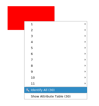
Create a new layer for your map extent. Draw your extent as geometry. Duplicate that geometry as many times as you have days. Alternatively you could of course have different geometries per day. Whatever you do, you need a layer with one feature per timeslice for the Atlas to iterate though. I have 30 days to visualise so I duplicated my extent 30 times.
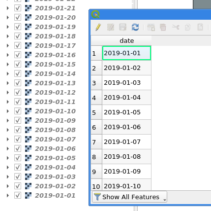
Open the Field Calculator. Add a new field called date as string type (not as date type until some bug is fixed (sorry, did not make a note here, maybe sorting is/was broken?)) with an expression that represents time and orders chronologically if sorted by QGIS. For example: '2019-01-' || lpad(@row_number,2,0) (assuming your records are in the correct order if you have different geometries…)
Have your raster layers named the same way as the date attribute values.
Make a new layout.
For your Layout map check “Lock layers” and use date as expression for the “Lock layers” override. This will now select the appropriate raster layer, based on the attribute value <-> layer name, to display for each Atlas page.
Cool, if you preview the Atlas now you got a nice animation through your raster layers. Let’s do part 2:
In your layout add your timeseries graph. Give it a unique ID, e. g. “plot box”. Set its width and height via new variables (until you can get those via an expression this is needed for calculations below).
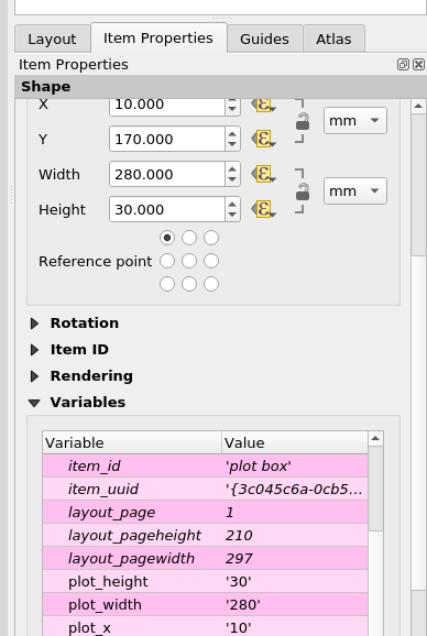
Create a box to visualise the timeslice. Set its width to map_get(item_variables('plot box'), 'plot_width') / @atlas_totalfeatures. For the height and y use/adjust this expression: map_get(item_variables('plot box'), 'plot_height'). For x comes the magic:
with_variable(
     'days_total',
     day(to_date(maximum("date"))-to_date(minimum("date")))+1,
       -- number of days in timespan
       -- +1 because we need the number of days in total
       -- not the inbetween, day() to just get the number of days
     with_variable(
         'mm_per_day',
         map_get(item_variables('plot box'), 'plot_width') / @days_total,
         with_variable(
             'days',
             day(to_date(attribute(@atlas_feature, 'date'))-to_date(minimum("date"))),
               -- number of days the current feature is from the first day
               -- to_date because BUG attribute() returns datetime for date field
             @mm_per_day * @days + map_get(item_variables('plot box'), 'plot_x')
         )
     )
 )
This will move the box along the x axis accordingly.
Have fun!
Recommend
About Joyk
Aggregate valuable and interesting links.
Joyk means Joy of geeK