

ConstraintLayout 完全解析 快来优化你的布局吧
source link: https://blog.csdn.net/lmj623565791/article/details/78011599
Go to the source link to view the article. You can view the picture content, updated content and better typesetting reading experience. If the link is broken, please click the button below to view the snapshot at that time.
ConstraintLayout 完全解析 快来优化你的布局吧
本文已在我的公众号hongyangAndroid原创首发。
转载请标明出处:
http://blog.csdn.net/lmj623565791/article/details/78011599
本文出自张鸿洋的博客本文已在我的公众号hongyangAndroid原创首发,文章合集。
ConstraintLayout出现有一段时间了,不过一直没有特别去关注,也多多少少看了一些文字介绍,多数都是对使用可视化布局拖拽,个人对拖拽一直不看好,直到前段时间看到该文:
非常详尽的介绍了ConstraintLayout的性能优势,于是乎开始学习了一下ConstraintLayout。
本文的重点不在与可视化界面的学习,而在于如何手写各类约束布局属性。对于可视化界面学习推荐:
下面开始进入正题,大家都知道,当布局嵌套深入比较深的时候,往往会伴随着一些性能问题。所以很多时候我们建议使用RelativeLayout或者GridLayout来简化掉布局的深度。
而对于简化布局深度,ConstraintLayout几乎可以做到极致,接下来我们通过实例来尽可能将所有常见的属性一步步的介绍清楚。
首先需要引入我们的ConstraintLayout,在build.gradle中加入:
compile 'com.android.support.constraint:constraint-layout:1.0.2'
二、来编写一个Feed Item
我们先看一个简单的新闻列表中常见的feed item。
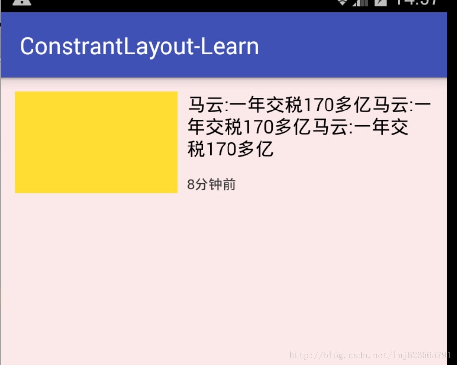
看到这样的布局,大家条件反射应该就是使用RelativeLayout来做,当然了,本案例我们使用ConstraintLayout来写:
<android.support.constraint.ConstraintLayout
    xmlns:android="http://schemas.android.com/apk/res/android"
    xmlns:app="http://schemas.android.com/apk/res-auto"
    xmlns:tools="http://schemas.android.com/tools"
    android:id="@+id/activity_main"
    android:layout_width="match_parent"
    android:layout_height="match_parent"
    android:background="#11ff0000"
    tools:context="com.zhy.constrantlayout_learn.MainActivity">


    <TextView
        android:id="@+id/tv1"
        android:layout_width="140dp"
        android:layout_height="86dp"
        android:layout_marginLeft="12dp"
        android:layout_marginTop="12dp"
        android:background="#fd3"
        app:layout_constraintLeft_toLeftOf="parent"
        app:layout_constraintTop_toTopOf="parent"
        />

    <TextView
        android:id="@+id/tv2"
        android:layout_width="0dp"
        android:layout_height="wrap_content"
        android:layout_marginLeft="8dp"
        android:layout_marginRight="12dp"
        android:text="马云:一年交税170多亿马云:一年交税170多亿马云:一年交税170多亿"
        android:textColor="#000000"
        android:textSize="16dp"
        app:layout_constraintLeft_toRightOf="@id/tv1"
        app:layout_constraintRight_toRightOf="parent"
        app:layout_constraintTop_toTopOf="@id/tv1" />

    <TextView
        android:layout_width="wrap_content"
        android:layout_height="wrap_content"
        android:layout_marginLeft="8dp"
        android:layout_marginTop="12dp"
        android:text="8分钟前"
        android:textColor="#333"
        android:textSize="12dp"
        app:layout_constraintLeft_toRightOf="@id/tv1"
        app:layout_constraintBottom_toBottomOf="@id/tv1" />

</android.support.constraint.ConstraintLayout>
看上面的布局,我们好像看到了几个模式的属性:
首先是tv1,有两个没见过的属性:
app:layout_constraintLeft_toLeftOf="parent"
从字面上看,指的是让该控件的左侧与父布局对齐,当我们希望控件A与控件B左侧对齐时,就可以使用该属性。
app:layout_constraintLeft_toLeftOf="@id/viewB"
类似的还有个相似的属性为:
- app:layout_constraintLeft_toRightOf
很好理解,即当前属性的左侧在谁的右侧,当我们希望控件A在控件B的右侧时,可以设置:
app:layout_constraintLeft_toRightOf="@id/viewB"与之类似的还有几个属性:
layout_constraintRight_toLeftOflayout_constraintRight_toRightOflayout_constraintTop_toTopOflayout_constraintTop_toBottomOflayout_constraintBottom_toTopOflayout_constraintBottom_toBottomOflayout_constraintBaseline_toBaselineOf
类推就可以了。
现在在头看刚才的布局:
tv1设置了:

app:layout_constraintLeft_toLeftOf="parent"
app:layout_constraintTop_toTopOf="parent"

tv2设置了:

app:layout_constraintLeft_toRightOf="@id/tv1"
app:layout_constraintRight_toRightOf="parent"
app:layout_constraintTop_toTopOf="@id/tv1"

tv3设置了:

app:layout_constraintLeft_toRightOf="@id/tv1"
app:layout_constraintBottom_toBottomOf="@id/tv1"
按照我们刚才的理解,再次的解读下:
tv1应该是在父布局的左上角;
tv2在tv1的右侧,tv2的右侧和父布局对其,tv2和tv1顶部对齐;
tv3在tv1的右侧,tv3和tv1底部对其。
到这里,大家可以看到,目前我们已经可以控制任何一个控件与其他控件间的相对位置了,以及与parent间的相对位置。
和RL的差异
大家是不是觉得目前来看和RelativeLayout特别像?
其实还是有很明显的区别的,我们通过一个例子来看一下:
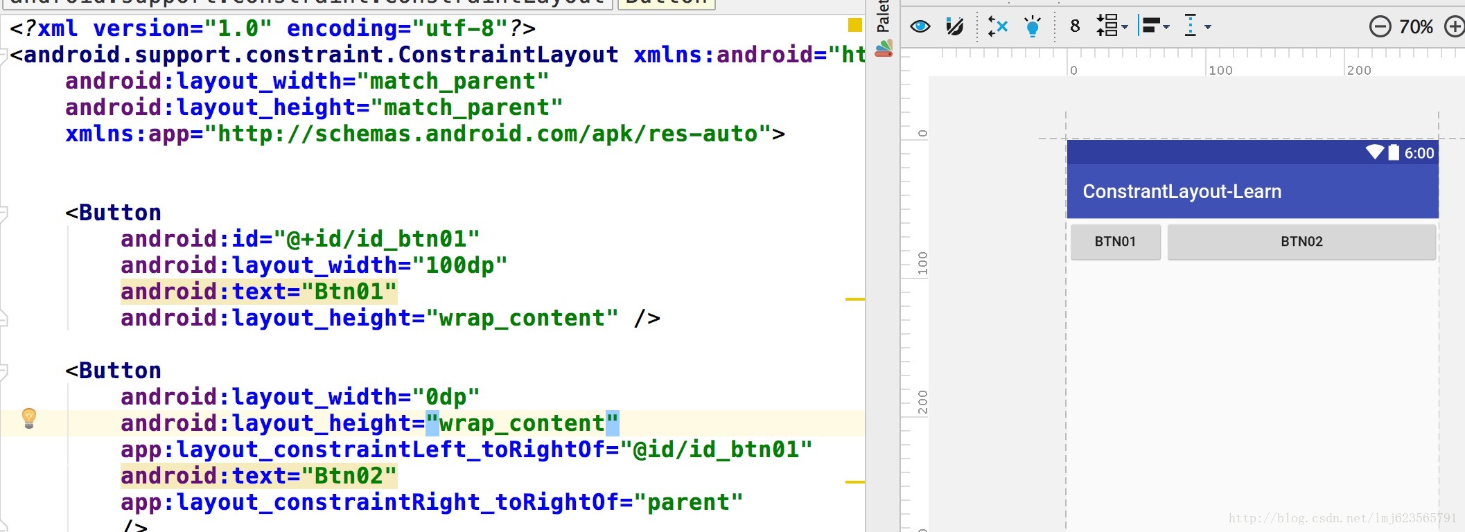
<RelativeLayout xmlns:android="http://schemas.android.com/apk/res/android"
    android:layout_width="match_parent" android:layout_height="match_parent">

    <Button
        android:id="@+id/id_btn01"
        android:layout_width="100dp"
        android:text="Btn01"
        android:layout_height="wrap_content" />

    <Button
        android:layout_width="wrap_content"
        android:layout_height="wrap_content"
        android:layout_toRightOf="@id/id_btn01"
        android:text="Btn02"
        android:layout_alignParentRight="true"
        />

</RelativeLayout>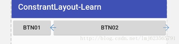
那么经过我们刚才的学习,把:
layout_toRightOf="@id/id_btn01",layout_alignParentRight="true"
分别替换为:
app:layout_constraintLeft_toRightOf="@id/id_btn01",app:layout_constraintRight_toRightOf="parent"
是不是觉得so easy ,但是我们看一下效果图:
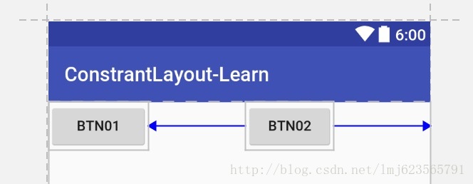
是不是和预期有一定的区别,假设你将Btn02的宽度设置的非常大,你会发现更加诡异的事情:
你会发现Btn02,好像疯了一样,我们设置的在btn01右侧,和与parent右侧对齐完全失效了!!!
别怕,接下来就让你认识到为什么这个控件叫做“Constraint”Layout。
在当控件有自己设置的宽度,例如warp_content、固定值时,我们为控件添加的都是约束“Constraint”,这个约束有点像橡皮筋一样会拉这个控件,但是并不会改变控件的尺寸(RL很明显不是这样的)。
例如上例,当btn02的宽度较小时,我们为其左侧设置了一个约束(btn01右侧),右侧设置了一个约束(parent右侧对其),当两个约束同时生效的时候(你可以认为两边都是相同的一个拉力),btn02会居中。
当btn02特别大的时候,依然是这两个力,那么会发生什么?会造成左侧和右侧超出的距离一样大。
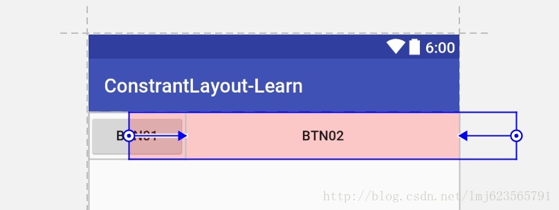
那么现在大家肯定有些疑问:
- 怎么样才能和上面的RL一样,宽度刚好占据剩下的距离呢(btn01右侧到屏幕右侧的距离)?
这个问题,问得很好,我们刚才所有的尝试都是在控件自身拥有特定的宽度情况下执行的;那么如果希望控件的宽度根据由约束来控件,不妨去掉这个特定的宽度,即设置为0试试?
对!当我们将btn02的宽度设置为0时,一切又变得很完美。
那么这里,你可能会问0值是什么含义,其实在ConstraintLayout中0代表:MATCH_CONSTRAINT,看到这个常量,是不是瞬间觉得好理解了一点。
- 最后一个问题,
MATCH_PARENT哪去了?
看官网的解释:
Important:
MATCH_PARENTis not supported for widgets contained in a ConstraintLayout, though similar behavior can be defined by usingMATCH_CONSTRAINTwith the corresponding left/right or top/bottom constraints being set to “parent”.`
所以你可以认为:在ConstraintLayout中已经不支持MATCH_PARENT这个值了,你可以通过MATCH_CONSTRAINT配合约束实现类似的效果。
好了,到这里,目前我们已经看到其已经和RelativeLayout势均力敌了,接下来我们看一下RL做不到的特性。
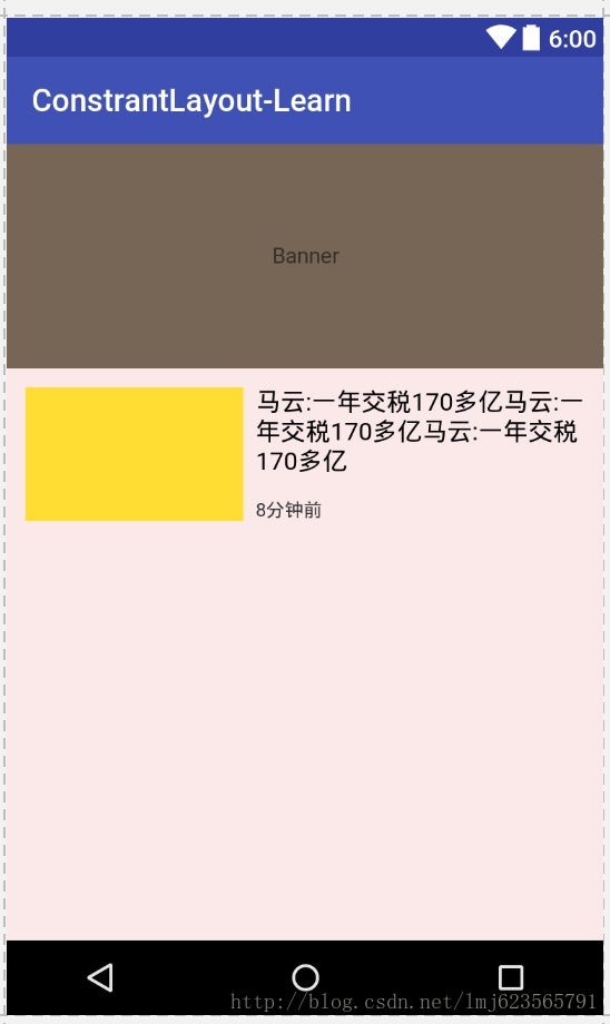
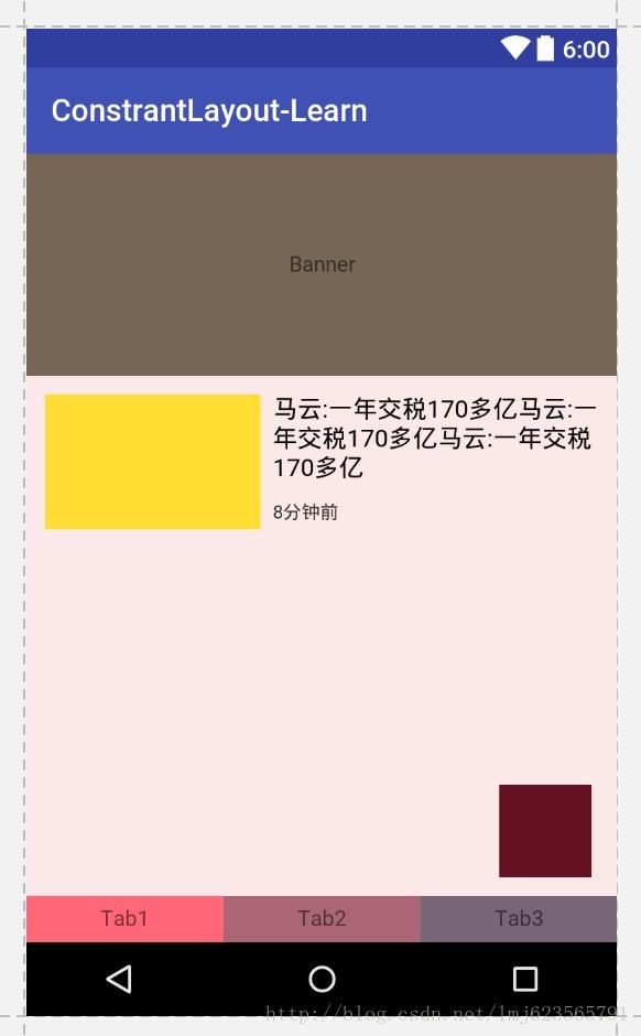
三、增加一个banner
我们现在以往在这个feed item顶部添加一个banner,宽度为占据整个屏幕,宽高比为16:6。
这里尴尬了,在之前的做法,很难在布局中设置宽高比,一般我们都需要在代码中显示的去操作,那么如果你用了ConstraintLayout,它就支持。
看一眼如何支持:
<android.support.constraint.ConstraintLayout
    ...
    tools:context="com.zhy.constrantlayout_learn.MainActivity">

    <TextView
        android:id="@+id/banner"
        android:layout_width="0dp"
        android:layout_height="0dp"
        android:background="#765"
        android:gravity="center"
        android:text="Banner"
        app:layout_constraintDimensionRatio="H,16:6"
        app:layout_constraintLeft_toLeftOf="parent"
        app:layout_constraintRight_toRightOf="parent" />


    <TextView
        android:id="@+id/tv1"
        app:layout_constraintTop_toBottomOf="@id/banner"
        ></TextView>
     ...
</...>我们添加了一个banner,还记得我们刚才所说的么,不要使用match_parent了,而是设置match_contraint,即0,让约束来控制布局宽高。
所以我们设置了宽、高都是match_contraint,然后这两个属性:
app:layout_constraintLeft_toLeftOf="parent"
app:layout_constraintRight_toRightOf="parent"
让我们的宽度充满整个父布局,在添加一个:
app:layout_constraintDimensionRatio="16:6"该属性指的是宽高比,所以16:6就可以完成我们的需求。
好了看下效果图:
这个宽高比属性,还支持这样的写法:
app:layout_constraintDimensionRatio="W,16:6"
app:layout_constraintDimensionRatio="H,16:6"
可以自己试验下。
好了,到这里,我们又新增了一个属性,还是个非常实用的属性。
那么,我们继续,再看一个似曾相识的功能。
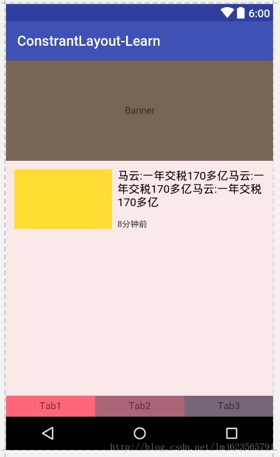
四、增加几个Tab
现在我们希望在底部增加3个tab,均分。是不是想到了LinearLayout和weight。
没错!ConstraintLayout也支持类似的属性。
虽然我知道,但是写到这我还是有点小惊喜~~
看下如何实现:
<TextView
    android:id="@+id/tab1"
    android:layout_width="0dp"
    android:layout_height="30dp"
    android:background="#f67"
    android:gravity="center"
    android:text="Tab1"
    app:layout_constraintBottom_toBottomOf="parent"
    app:layout_constraintLeft_toLeftOf="parent"
    app:layout_constraintRight_toLeftOf="@+id/tab2" />


<TextView
    android:id="@+id/tab2"
    android:layout_width="0dp"
    android:layout_height="30dp"
    android:background="#A67"
    android:gravity="center"
    android:text="Tab2"
    app:layout_constraintBottom_toBottomOf="parent"
    app:layout_constraintLeft_toRightOf="@id/tab1"
    app:layout_constraintRight_toLeftOf="@+id/tab3" />


<TextView
    android:id="@+id/tab3"
    android:layout_width="0dp"
    android:layout_height="30dp"
    android:background="#767"
    android:gravity="center"
    android:text="Tab3"
    app:layout_constraintBottom_toBottomOf="parent"
    app:layout_constraintLeft_toRightOf="@id/tab2"
app:layout_constraintRight_toRightOf="parent" />我们增加3个textview来冒充tab。我们看横向的依赖,3个tab两两设置了约束(即你在我们的左边,我在你的右边),最外层的设置了parent约束;再加上我们把宽度都设置为了match_constraint,so,这样我们就完成了3个tab等分。
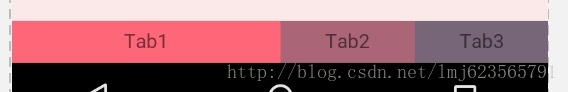
看一眼效果图:
你可能会说,LL配合weight更加灵活,可以单个设置占据的比例。
对,没错,我们也支持,我不是还没说完么。
现在我们可以给每个tab设置一个属性:
app:layout_constraintHorizontal_weight看到这个名字,应该就明白了吧,假设我们分别设置值为2,1,1。
效果图为:
是不是很惊喜,别急,刚才你说我不如LL,现在我要让你再看一些LL配合weight做不到的。
这里需要借助几张官网上的图了:
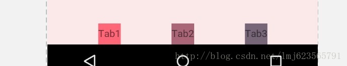
刚才我们说了,3个tab两两设置了依赖,即类似下图:
横向的相当于组成了一个链(Chains)。在这个链的最左侧的元素成为链头,我们可以在其身上设置一些属性,来决定这个链的展示效果:
该属性为:
layout_constraintHorizontal_chainStyle我们已经见过一种效果了,即按照weight等分,可以成为weighted chain。设置条件为:
chainStyle=”spread”,所有控件宽度设置为match_constraint,因为默认就是spread,所以我们没有显示设置。
其取值还可以为:
- packed
- spread_inside
我还是分别显示一下吧:
- spread + 宽度非0
spread + 宽度为0,且可以通过weight控制分配比例(上例)
spread_inside + 宽度非0
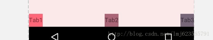
- packed + 宽度非0
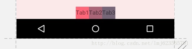
好了,差不多了,我们可以在横向或者纵向组成一个Chain,然后在Chain head设置chainStyle来搞一些事情。
官网有个图:
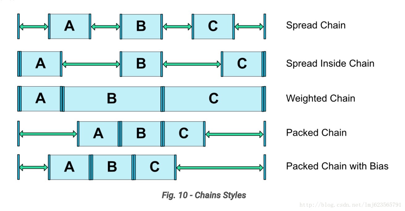
前四个我们都演示了,最后一个设计到一个新的bias属性,别急,咱们慢慢说~~
好了,到这里,我们再次见证了ConstraintLayout的强大。
我们最后再看一个例子。
五、增加浮动按钮
一个很常见的功能,我们现在希望在右下角增加一个浮动按钮。
看下如何实现:
<android.support.constraint.ConstraintLayout
    ...
    tools:context="com.zhy.constrantlayout_learn.MainActivity">

    <TextView
        android:layout_width="60dp"
        android:layout_height="60dp"
        android:background="#612"
        app:layout_constraintBottom_toBottomOf="parent"
        app:layout_constraintHorizontal_bias="0.9"
        app:layout_constraintLeft_toLeftOf="parent"
        app:layout_constraintRight_toRightOf="parent"
        app:layout_constraintTop_toTopOf="parent"
        app:layout_constraintVertical_bias="0.9" />

</....>
我们在最后追加一个TextView冒充我们的浮动按钮。可以看到我们设置了固定值,被设置约束为右下角。
正常情况我们可以通过margin来设置与右侧与底部的距离。
但是这里我们尝试使用量个新的属性:
layout_constraintHorizontal_bias
layout_constraintVertical_bias
即设置上下两侧间隙比例分别为90%与10%。这个很好理解,我们之前说了,再没有bias这个属性的时候,这两侧的拉力大小是一样的,但是你可以通过bias来控制哪一侧的力要大一些~~明白了么~
所以,该属性可以用于约束之前,控制两侧的“拉力”。
我们看一下效果图:
那么到这里,ConstraintLayout的属性我们基本上介绍完了:
我们看一下:
layout_constraintLeft_toLeftOf
layout_constraintLeft_toRightOf
layout_constraintRight_toLeftOf
layout_constraintRight_toRightOf
layout_constraintTop_toTopOf
layout_constraintTop_toBottomOf
layout_constraintBottom_toTopOf
layout_constraintBottom_toBottomOf

# 即文章的baseline对齐
layout_constraintBaseline_toBaselineOf

# 与left,right类似
layout_constraintStart_toEndOf
layout_constraintStart_toStartOf
layout_constraintEnd_toStartOf
layout_constraintEnd_toEndOf

# margin不需要解释
android:layout_marginStart
android:layout_marginEnd
android:layout_marginLeft
android:layout_marginTop
android:layout_marginRight
android:layout_marginBottom

layout_constraintHorizontal_bias
layout_constraintVertical_bias

layout_constraintHorizontal_chainStyle
layout_constraintVertical_chainStyle

layout_constraintVertical_weight

Guideline
好像,还有个比较特殊的,叫Guideline。
好吧,继续~
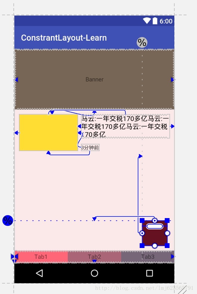
六、尝试使用Guideline
android.support.constraint.Guideline该类比较简单,主要用于辅助布局,即类似为辅助线,横向的、纵向的。该布局是不会显示到界面上的。
所以其有个属性为:
android:orientation取值为”vertical”和”horizontal”.
除此以外,还差个属性,决定该辅助线的位置:
layout_constraintGuide_beginlayout_constraintGuide_endlayout_constraintGuide_percent
可以通过上面3个属性其中之一来确定属性值位置。
begin=30dp,即可认为距离顶部30dp的地方有个辅助线,根据orientation来决定是横向还是纵向。
end=30dp,即为距离底部。
percent=0.8即为距离顶部80%。
好了,下面看一个例子,刚才我们的浮点按钮,我决定通过两根辅助线来定位,一根横向距离底部80%,一个纵向距离顶部80%,浮点按钮就定位在他们交叉的地方。
<android.support.constraint.ConstraintLayout
    ...
    tools:context="com.zhy.constrantlayout_learn.MainActivity">

    <android.support.constraint.Guideline
        android:id="@+id/guideline_h"
        android:layout_width="wrap_content"
        android:layout_height="wrap_content"
        android:orientation="horizontal"
        app:layout_constraintGuide_percent="0.8" />


    <android.support.constraint.Guideline
        android:id="@+id/guideline_w"
        android:layout_width="wrap_content"
        android:layout_height="wrap_content"
        android:orientation="vertical"
        app:layout_constraintGuide_percent="0.8" />

    <TextView
        android:layout_width="60dp"
        android:layout_height="60dp"
        android:background="#612"
        app:layout_constraintLeft_toRightOf="@id/guideline_w"
        app:layout_constraintTop_toBottomOf="@id/guideline_h" />

</....>
我感觉都不用解释了~~看眼效果图吧:
到此,属性基本上讲完啦~
可以看到,上述相当复杂的一个布局,在ConstraintLayout中完全没有嵌套!
本文通过实际的按钮,基本上介绍了ConstraintLayout所支持的所有的属性,全文没有提及拖拽,因为当界面复杂之后,想要完美的拖拽实在是太难了,而且谁也不期望,看不懂拖拽完成后的布局属性吧~
所以,我建议还是尽可能手写,通过本文这样一个流程,虽然支持的属性有20多个,但是分类后并不难记,难记也可以拿出本文翻一翻~
好了,思考了半天,如何通过一个案例介绍完所有的属性,总体来说还是完成了,给自己点个赞。
支持我的话可以关注下我的公众号,每天都会推送新知识~
欢迎关注我的微信公众号:hongyangAndroid
(可以给我留言你想学习的文章,支持投稿)

Recommend
About Joyk
Aggregate valuable and interesting links.
Joyk means Joy of geeK