

Material Theming with MDC: Shape
source link: https://medium.com/androiddevelopers/material-theming-with-mdc-shape-126c4e5cd7b4
Go to the source link to view the article. You can view the picture content, updated content and better typesetting reading experience. If the link is broken, please click the button below to view the snapshot at that time.

Material Theming with MDC: Shape
Shape theming on Android using the MDC library
This article is also posted on the Material Design blog.
Material Theming is a way to customize Material Components to align with your brand. A Material theme includes color, typography and shape parameters which you can adjust to get near-infinite variations of the components — all while maintaining their core anatomy and usability.

On Android, Material Theming can be implemented using the Material Components (MDC) library, from version 1.1.0 onwards. If you’re looking to migrate from the Design Support Library or MDC 1.0.0, take a look at our migration guide.
This article will be focusing on shape theming.
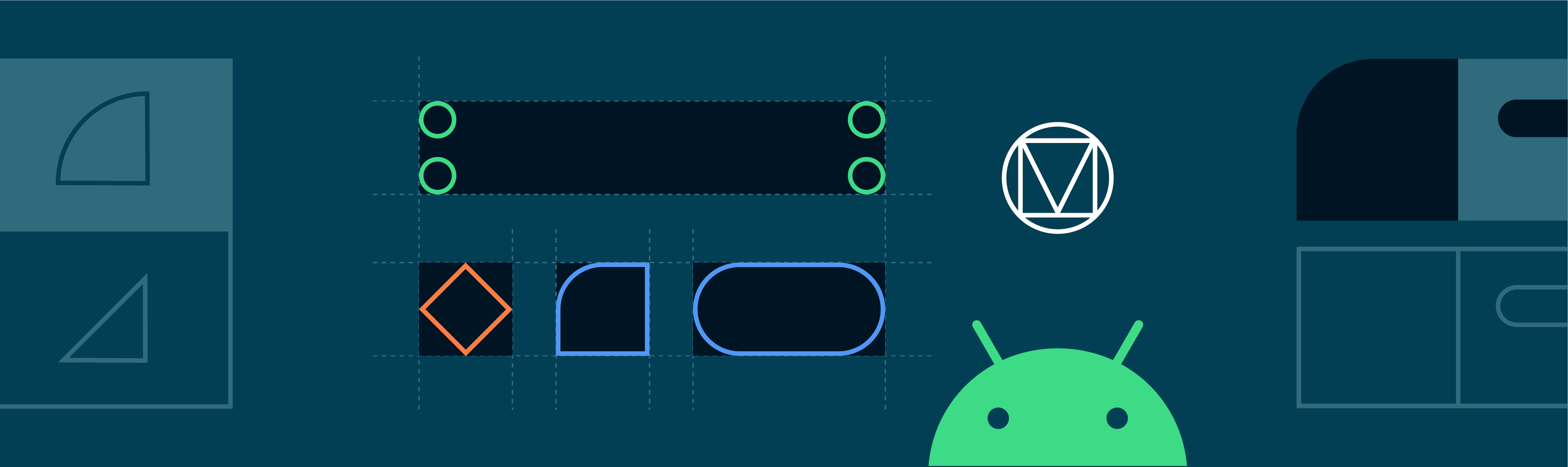
Most widgets have a background shape, but have you ever thought about the ways that shape influences user behavior? Just like color and typography, shape can guide a user’s attention, suggest interaction, and visually distinguish elements in your UI. Material’s shape theming gives you the ability to define global shape values that change the style of components across your app — for example, giving all your cards, dialogs, and menus really friendly rounded corners.
Shape attributes
Material Design provides 3 shape “categories” that are applied to the shapeable widgets of your app. Each of these have a design term (eg. “Small components”) along with a corresponding shape attribute that can be overridden in your app theme (eg. shapeAppearanceSmallComponent). There are default “baseline” values (corner size, corner family, etc.) for each category.

Material Components use these shape attributes to style backgrounds of the widgets.

They are applied with eg.
app:shapeAppearance=”?attr/shapeAppearanceSmallComponent”
in layouts and widget styles.
In the MDC themes these attributes map to styles, eg.
<style name=”Theme.MaterialComponents.*” parent="...">
    ...
    <item name=”shapeAppearanceMediumComponent”>
        @style/ShapeAppearance.MaterialComponents.MediumComponent
    </item>
<style />
ShapeAppearance styles and the corresponding attributes are new to MDC. These are discussed in more detail in the Shape resources section below.
Picking shape
Figuring out which shape categories to use and the values within them may be the responsibility of a designer and/or derived from your product’s brand. However, it’s still useful to know about the role of each category and in which scenarios they should be used:
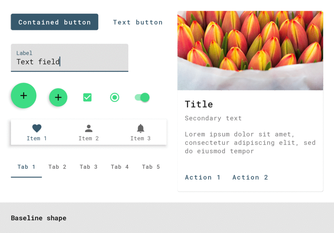
shapeAppearanceSmallComponentis for small-size components like buttons and text fieldsshapeAppearanceMediumComponentis for medium-size components like cards and dialogsshapeAppearanceLargeComponentis for large-size components like bottom sheets
See the shape guidelines for a complete list of mappings from component to shape categories.
Shape tool
Material Design provides a useful shape customization tool for previewing shape categories and how changes apply to the corners of various components.

Shape resources
Shape resources consist mainly of ShapeAppearance styles. These are analogous to TextAppearance styles for type theming; in this case a “style” only concerned with shape attributes. Let’s take a look at what’s available on Android vs. MDC and a few things to keep in mind when declaring styles.
XML shapes and android:background
Prior to MDC, you’d typically define a custom background in the res/drawable directory, eg.
<shape android:shape="rectangle">
    ...
    <corners android:radius="8dp" />
    <solid android:color="?attr/colorSurface" />
</shape>
which is applied to a widget like so:
<View
    ...
    android:background=”@drawable/shape_background” />
This is a simplified example. XML shape drawables can include a number of other elements, like <inset>s, <stroke>s, <gradient>s, etc. or support multiple states.
There are times when this approach is necessary but there are drawbacks to consider:
- It lacks many of the useful features of other theming systems (like color and type); predefined attributes to specify shape at the theme level, overlays and the ability to abstract away shape values in styles
- Material Design’s shape system supports both rounded and cut corners, but there isn’t an elegant solution to achieve cut corners in XML or programmatically
- Applying complex shape treatments, such as the top edge indent on a bottom app bar, would not be possible and would require implementing a custom
Drawable
ShapeAppearance styles
MDC offers a new way to define shape. ShapeAppearance styles can be seen as the Android equivalent of Material Design shape categories. They give you a means of defining shape characteristics without needing to deal with drawables directly. They currently only work with MDC widgets and are backed by a new MaterialShapeDrawable class, which is discussed in more detail below.
When defining your shape theme, we recommend two approaches to help separate concerns and create a single source of truth for shape theming values in your app:
- Store all
ShapeAppearancestyles in a single res/values/shape.xml file - Use the MDC
ShapeAppearancestyles as parents and adhere to the same naming convention
Attributes and values you can use within these styles align with those supported by MaterialShapeDrawable:
cornerFamilyis the family of all corners, eitherroundedorcutcornerFamilyTopLeft,cornerFamilyTopRight,cornerFamilyBottomLeftandcornerFamilyBottomRightallow you to change the family of specific corners and take precedence overcornerFamilycornerSizeis the size of all corners, typically adpdimensioncornerSizeTopLeft,cornerSizeTopRight,cornerSizeBottomLeftandcornerSizeBottomRightallow you to change the size of specific corners and take precedence overcornerSize
ShapeAppearance overlays
You can also define ShapeAppearance overlays which support all of the same attributes, and act similarly to theme overlays.
These can be applied alongside regular ShapeAppearance styles with app:shapeAppearanceOverlay to change the value of specific corner attributes. Here’s an example of a bottom sheet’s overlay, which changes the bottom corners to be flush with the screen, from the MDC source code:
Note: Some MDC widgets have overlays applied by default which you may need to consider when adjusting their shapeAppearance. Examples of this include FloatingActionButton and Chip which both set their cornerSize to 50% via an overlay.
Fill and stroke
Unlike XML drawables, ShapeAppearance styles don’t include any notion of fill or stroke. MDC tends to separate concerns by specifying this separately in the main widget styles:
<style name=”Widget.MaterialComponents.*” parent=”...”>
    ...
    <!-- Fill -->
    <item name=”backgroundTint”>?attr/colorSurface</item>
    <!-- Stroke -->
    <item name="strokeColor">?attr/colorOnSurface</item>
    <item name="strokeWidth">1dp</item>
    <!-- Shape -->
    <item name=”shapeAppearance”>
        ?attr/shapeAppearanceLargeComponent
    </item>
</style>
Note:ShapeAppearance styles and the backing MaterialShapeDrawable class only support solid colors for fills and strokes. There is currently no support for gradients and you would need to use XML drawables with a <gradient> in this case.
Overriding shape categories in an app theme
Let’s take a look at how you can add your chosen shape categories to your app theme by overriding relevant attributes.
First, we recommend setting up your theme(s) to gracefully handle light and dark color palettes while reducing repetition with base themes. For more on this topic, take a look at Chris Banes’ article on dark theme as well as the “Developing Themes with Style” talk given by him and Nick Butcher.
Once set up, override the shape attributes you wish to change in your base theme:
Material Design components will respond to theme-level shape overrides:
MaterialShapeDrawable
Shape theming is powered by MaterialShapeDrawable. It’s the default background drawable for all MDC widgets and handles rendering shape. Unlike other drawables, it’s not usable in XML and needs to be handled programmatically.

A MaterialShapeDrawable can be instantiated like so:
ShapeAppearanceModel
ShapeAppearanceModel is the programmatic equivalent of a ShapeAppearance style and stores data regarding families and sizes of shape corners and edges. MaterialShapeDrawable uses this class to render its shape.
A builder pattern is used to instantiate a ShapeAppearanceModel:
For a more advanced example involving edges and custom paths, see BottomAppBarCutCornersTopEdge from the MDC catalog.
Fill and stroke
MaterialShapeDrawable handles rendering of fill and stroke. A number of methods exist to adjust these properties:
Elevation and overlays
MaterialShapeDrawable is responsible for rendering overlays to convey elevation in a dark theme. MDC widgets handle this by default. Here’s how this functionality is enabled and used:
Take a look at the color theming article as well as Chris Banes’ article on dark theme for more information.
Shadow rendering
Elevation shadow rendering by the platform is only supported from API 21 onwards. MaterialShapeDrawable offers optional support to backport shadow rendering:
Corner interpolation
MaterialShapeDrawable offers methods to interpolate the sizes of all corners. This is a [0.0, 1.0] multiplier on the set corner sizes and can be useful for animations and transitions.
Shape in MDC widgets
Earlier we said that MDC widgets respond to overrides of theme level shape attributes. But how would you know, for example, that a button uses shapeAppearanceSmallComponent as the style for its container? Let’s take a look at a few options.
Build a Material Theme
Build a Material Theme is an interactive Android project that lets you create your own Material theme by customizing values for color, typography, and shape. It also includes a catalog of all theming parameters and components. Determining which widgets respond to changes in theme type attributes can be done by:
- Cloning the project and running the app in Android Studio
- Adjusting values in res/values/shape.xml as well as res/values/themes.xml
- Observing visual changes by re-running the app

MDC developer docs
The MDC developer docs have recently been refreshed. As part of this we’ve included attribute tables which include design terminology and default values used in the library. For example, check out the “Anatomy and key properties” sections of the updated buttons doc.

Source code
Inspecting the MDC source code is arguably the most reliable approach. MDC uses default styles to achieve Material Theming so it’s a good idea to look at these as well as any styleable attrs and the java file(s). For example, check out the styles, attrs and java file for MaterialButton.
An interesting observation is how MDC widgets use default styles to ensure MaterialShapeDrawable is the default background. The general approach is:
- Set
android:background(and other legacy background-related attrs) to@nullor@emptyIn the widget default style - If no background is detected when parsing attributes, instantiate a
MaterialShapeDrawableprogrammatically and set this as the background - If a background has been set (eg. in a layout or custom style) then respect this and do not use
MaterialShapeDrawable

Shape in custom views
Your app may include custom widgets you’ve built or gotten from an existing library. Making these views responsive to Material Theming is useful when using them alongside standard MDC widgets. Let’s take a look at what to keep in mind when supporting shape theming for custom widgets.
Use MDC attrs in <declare-styleable>s and default styles
Allowing your custom views to be styled involves using a <declare-styleable>. Reusing attr names from MDC can be useful for consistency. Default styles that use <declare-styleable>s can also reference MDC theme shape attrs for their values while also using the @null/@empty approach for MaterialShapeDrawable backgrounds:
Keep elevation and overlays in mind
If you want your custom view to support elevation overlays or backported shadow rendering, it’s a good idea to override the setElevation method and pass the value to the MaterialShapeDrawable background:
OK Google, what’s next?
We’ve been through the process of implementing color theming in your Android app using MDC. Be sure to check out our other posts in this series on why we recommend using MDC, color theming, type theming, dark theme, and Material’s motion system.
As always, we encourage you to file bug reports and feature requests on GitHub. Also be sure to check out our Android companion example apps.
Recommend
About Joyk
Aggregate valuable and interesting links.
Joyk means Joy of geeK