

Thinking Like a Front-end Developer
source link: https://ishadeed.com/article/thinking-like-a-front-end-developer/
Go to the source link to view the article. You can view the picture content, updated content and better typesetting reading experience. If the link is broken, please click the button below to view the snapshot at that time.

I asked on Twitter about what CSS topics I should write about? One of the suggestions that caught my eyes is about how to think about implementing a layout in CSS. That includes thinking about the possible solutions, and asking a lot of questions to get it right.
In this article, I will show you my approach to think about a new layout, and how you can apply these steps to your work. Are you ready? Let’s dive in.
Put the design details aside
The first thing that I usually do is putting the design details aside. That means, I highlight the main parts of a specific layout and then start thinking about them. I know that details are important, but this is temporary, so we can focus on the high-level details first. Consider the following UI:
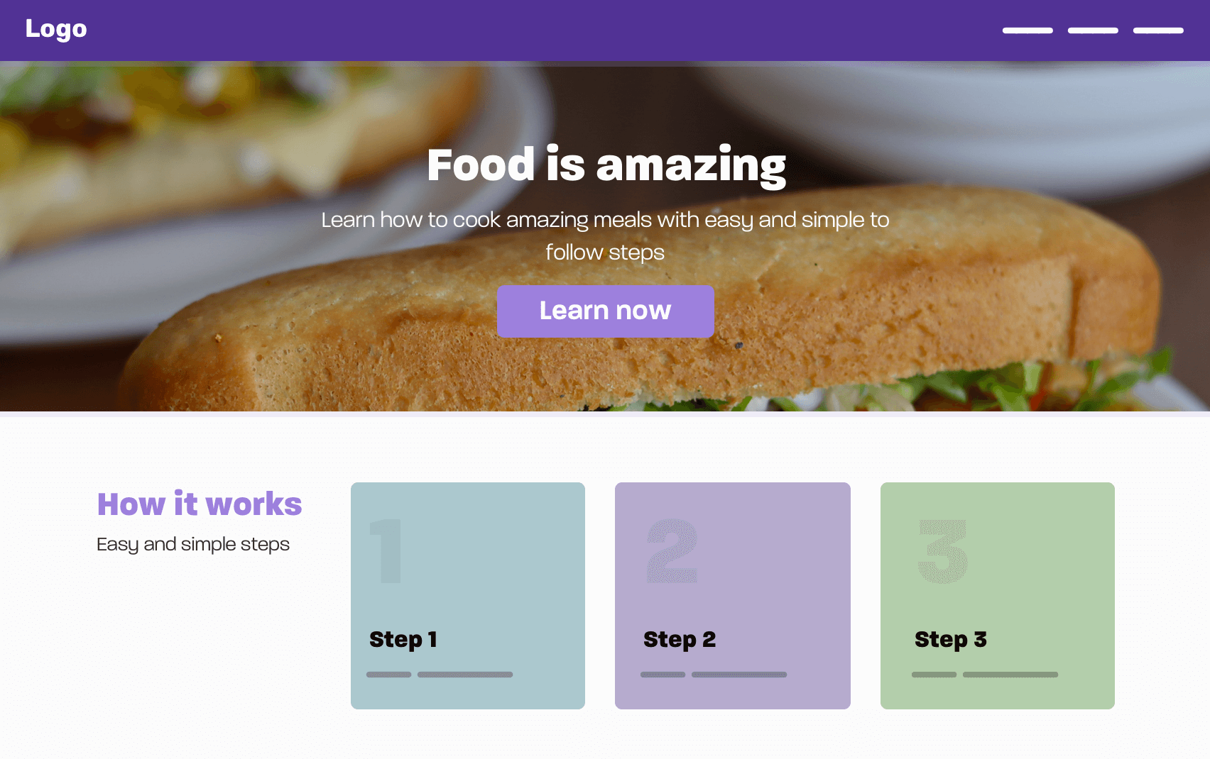
In this design, we have the following:
- Header/Navigation
- Hero section
- How it works
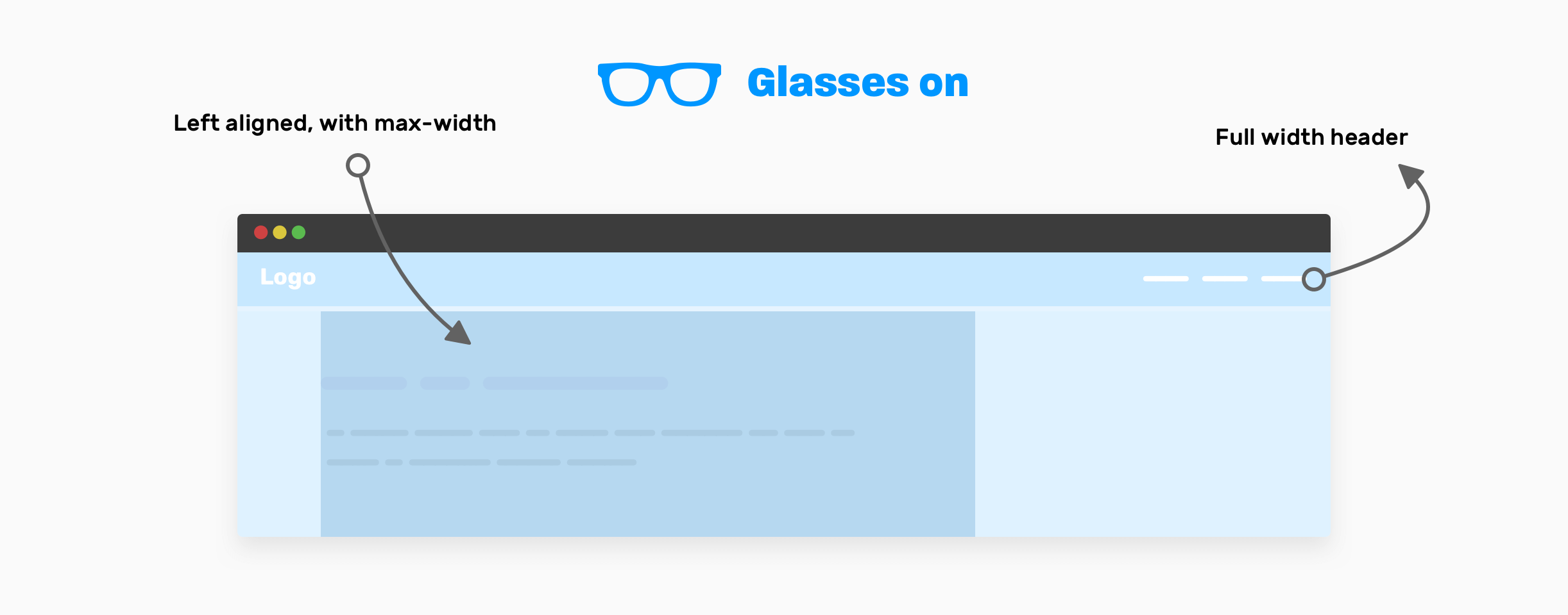
It can be tempting to start thinking about the small details first, rather than high-level thinking. If I were asked to visualize that, I will imagine that a front-end developer must wear a pair of glasses that let him/her see the high-level layout items only.
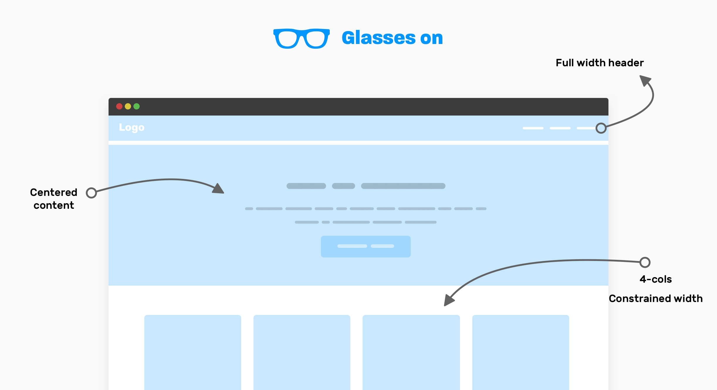
Notice that with the glasses on, you can only see the important high-level components of the UI. This can help you to think about how to layout the components, instead of thinking about the little bits for each one.
Here is how I think about it:
- Full-width header: it looks like the header is taking the full width of the viewport, and its content is not constrained within a wrapper.
- The content of the hero element is centered horizontally, and notice that you need to set a
max-widthfor it (The paragraph has two lines). - How it works: this is a 4-columns layout, with the whole section constrained into a wrapper.
Now, when I want to work on the above in code, I will make a quick prototype like this, just to quickly see some progress.
<header></header>

<section class="hero">
  <!-- A div to constraint the content -->
  <div class="hero__content"></div>
</section>

<div class="wrapper">
  <!-- 4-columns layout -->
  <section class="grid-4"></section>
</div>
Since we have a 4-columns section, I will go with CSS grid for this. It’s a perfect use-case for it.
.wrapper {
  margin-left: auto;
  margin-right: auto;
  padding-left: 1rem;
  padding-right: 1rem;
  max-width: 1140px;
}

.hero__content {
  max-width: 700px;
  margin-left: auto;
  margin-right: auto;
}

.grid-4 {
  display: grid;
  grid-template-columns: repeat(4, 1fr);
}
This is quick high-level thinking with the glasses on. I still didn’t even think about responsive design. I have some questions regarding details of some components but I won’t dig into that for now. Stay tuned for this for the details section at the end of the article.
Now that you got the idea, I will go through more examples of high-level thinking so you can get better at it.
Article page
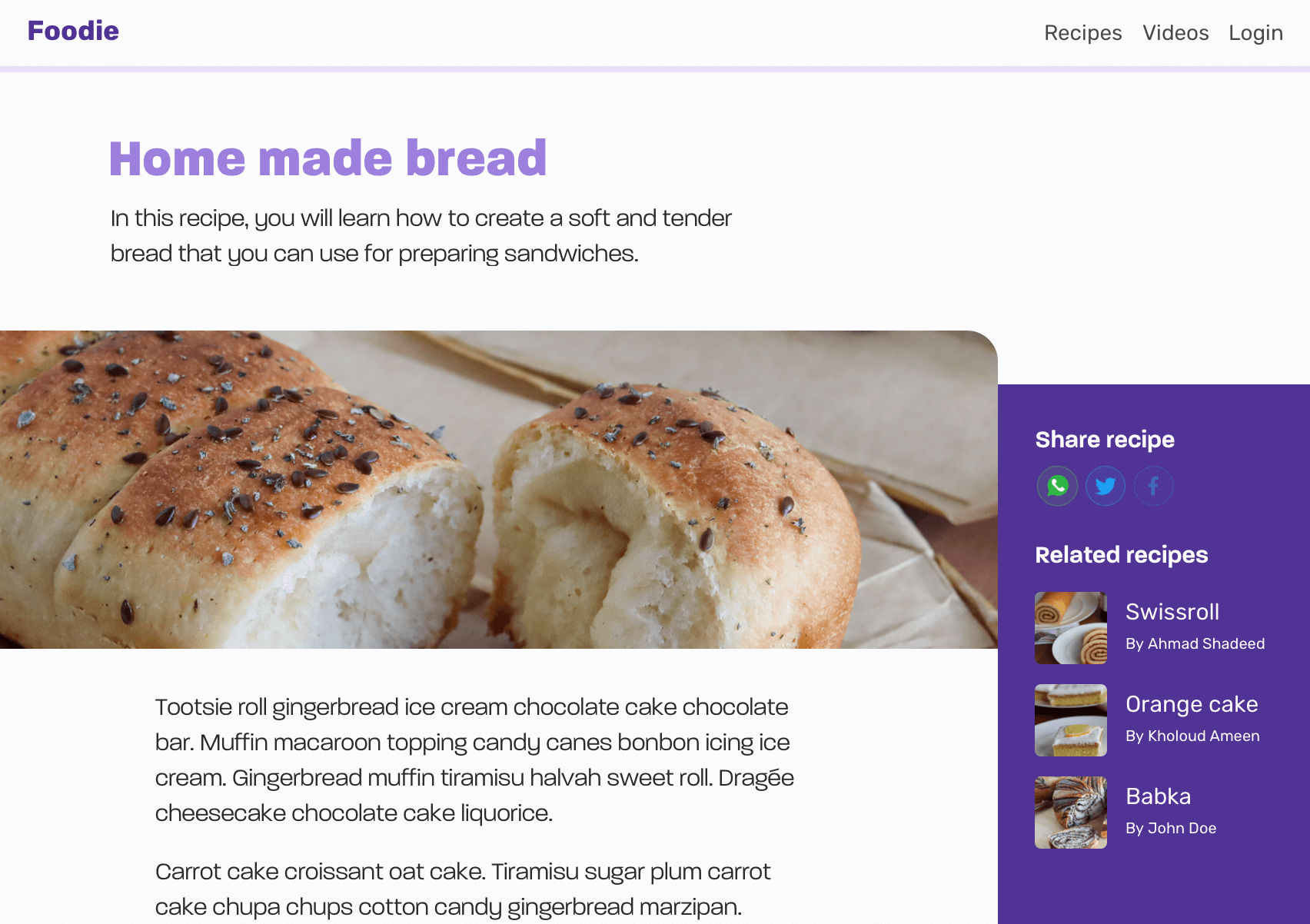
In this example, we have an article page layout. Here is the UI, which contains:
- Header
- Page header
- Article thumb
- Article content
- Sidebar (Aside)
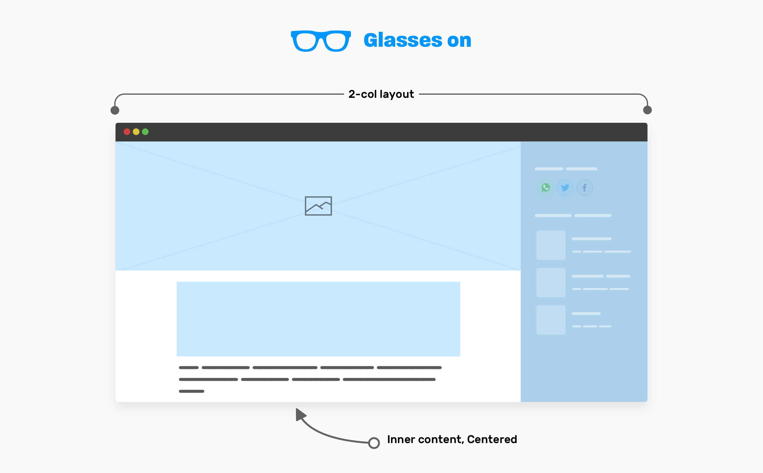
Now that you have an idea about how the design looks, let’s wear our glasses on to see only the high-level details.
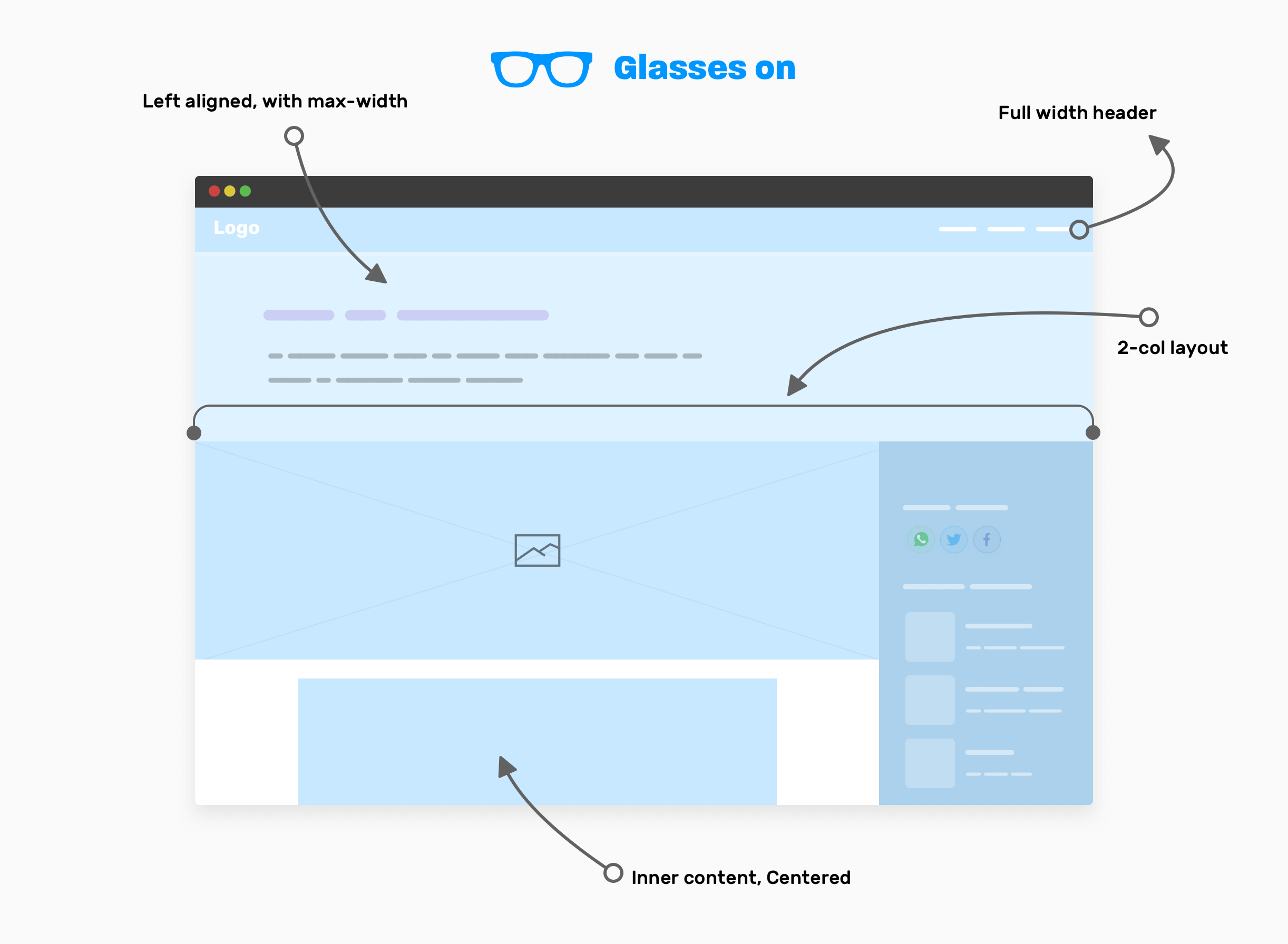
With our glasses on, here are the high-level components that we have:
- The website header is taking the full width.
- Page header: contains the article title and description, and its content is left-aligned, with a
max-width. - Two columns layout that contains the main and sidebar elements.
- The inner content of the article, which is centered horizontally and has a
max-width.
Article - Page header
There is no need to use any layout method here. A simple max-width will do the job. Make sure to add horizontal padding to avoid the edges being stick to the edges on smaller viewports.
.page-header {
  max-width: 50rem;
  padding: 2rem 1rem;
}
Article - Main and sidebar
The main element is taking the full width of the viewport minus the sidebar width. Usually, a sidebar is expected to have a fixed width. For that, using CSS grid is perfect.
.page-wrapper {
  display: grid;
  grid-template-columns: 1fr;
}

@media (min-width: 800px) {
  grid-template-columns: 1fr 250px;
}
For the inner content of the article, it should be constrained within a wrapper.
.inner-content {
  max-width: 50rem;
  margin-left: auto;
  margin-right: auto;
  padding-left: 1rem;
  padding-right: 1rem;
}
Now that you got the idea of the high-level decision that you need to take while building a layout, the next step is to think about handling each section in the design.
Digging into the details
How it works
In the first example of the article, I said that I will dig into the details of how it works section later. Here we go.
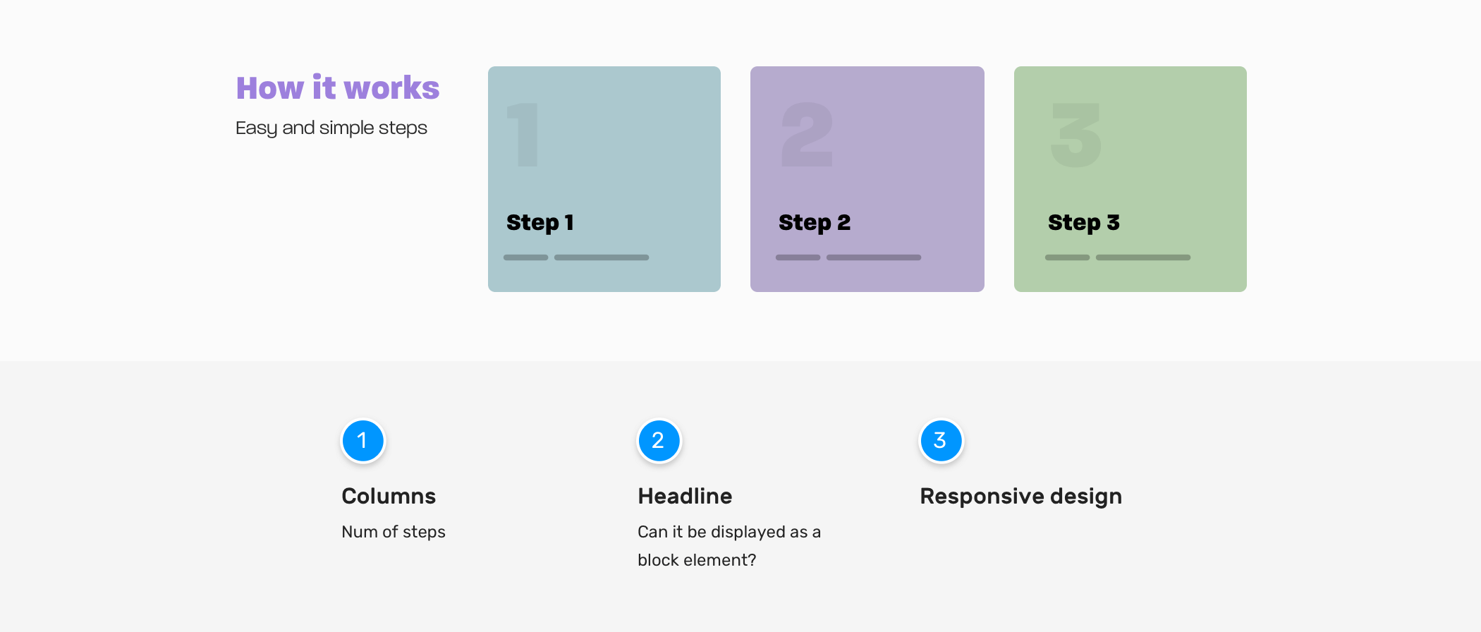
Columns
- Do we have cases where the number of steps can be less or more? If yes, how we should handle that?
- Do we need the columns to be equal in height, especially when a card has a very long text?
Headline
- Do we need the section headline to stay on the side? Or there are cases where it should take the full width?
Responsive design
- When we should stack the section child elements? Do we have a kind of trigger moment for this? If yes, what is it?
Here are some possible scenarios for the section. What do you think? As a front-end developer, you’re expected to consider such edge cases. It’s not just about creating a UI without considering such hidden bits.
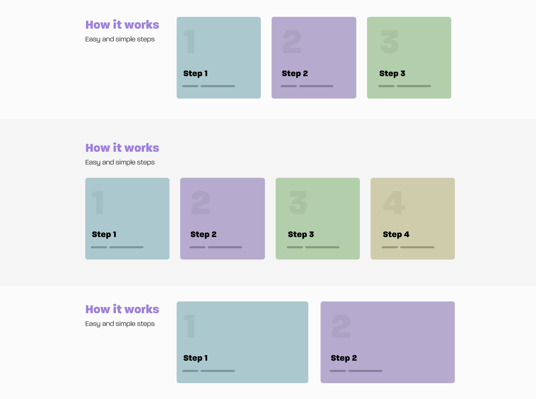
I can’t get into the specifics of how to code each variation in there, since the article is focused on the thinking process, but I’m eager to show you something cool.
Notice in the first and third variations in the previous mockup, the number of steps is 3 vs. 2. Can we make our CSS dynamic to handle that for us? I mean, to expand the items when they are only two.
<div class="wrapper">
  <section class="steps">
    <div>
      <h2>How it works</h2>
      <p>Easy and simple steps</p>
    </div>
    <div class="layout">
      <div class="layout__item">
        <article class="card"></article>
      </div>
      <div class="layout__item">
        <article class="card"></article>
      </div>
      <div class="layout__item">
        <article class="card"></article>
      </div>
    </div>
  </section>
</div>
.steps {
  display: grid;
  grid-template-columns: 1fr;
  grid-gap: 1rem;
}

@media (min-width: 700px) {
  .steps {
    grid-template-columns: 250px 1fr;
  }
}

.layout {
  display: grid;
  grid-template-columns: 1fr;
  grid-gap: 1rem;
}

@media (min-width: 200px) {
  .layout {
    grid-template-columns: repeat(auto-fit, minmax(200px, 1fr));
  }
}
I used CSS grid minmax() and the auto-fit keyword. This is helpful in such cases where the number of cards can increase or decrease. See the video below:
Hero section
The first thing I do when I want to build a new section or component is to ask lots of questions. For the hero section, here is what I’m considering.
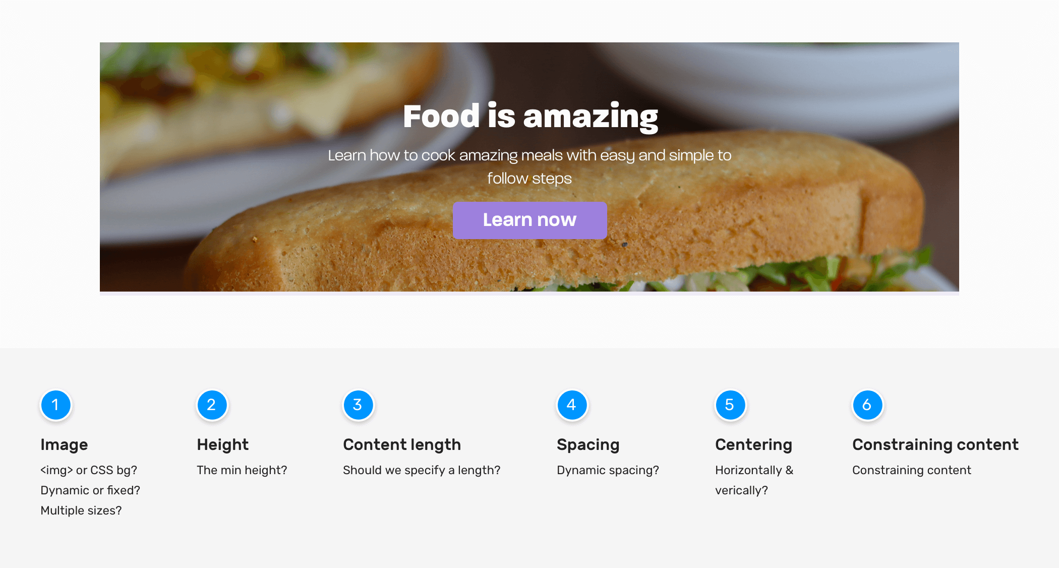
Hero Image
- How should the image be represented? Is it something that changes every day or should it be updated from a CMS?
- Should we use an HTML
<img>or a CSS background? - What’s the expected aspect ratio of the image?
- Do we need to use multiple image sizes based on the viewport size?
- Is it possible that the hero image can be a video? I have situations where the client said we need a video instead of the image, after working on the image implementation.
Hero height
- What’s the minimum height?
Content length
- Do we need to set a maximum length for the title and description? If yes, what’s the minimum and maximum that the design is expected to handle?
Spacing between elements
- How to handle the vertical spacing?
Content Centering
- How to center the content horizontally and vertically? Given that we only know the width, and the height is unknown.
Constraining content
- For better readability, it’s better to constraint content. What’s the ideal width for that?
Responsive design
- Do we need to change font sizes based on the viewport width? If yes, should we go with
pxbased units, viewport units, or CSSclamp()function?
Depending on the nature of the project you’re working on, you should find answers to these questions. This will help you to determine how the hero component needs to be built. Sometimes, it can be hard to get an answer to each question, but the more you asked, the higher the likelihood of getting a good bug-free result.
In this component, I will tackle the spacing between child elements. I like to use flow-space utility. I learned about it from Piccalil blog by Andy Bell. The goal is to provide spacing between direct sibling elements.
<section class="hero">
  <!-- A div to constraint the content -->
  <div class="hero__content flow">
    <h2>Food is amazing</h2>
    <p>Learn how to cook amazing meals with easy and simple to follow steps</p>
    <a href="/learn">Learn now</a>
  </div>
</section>
.flow > * + * {
  margin-top: var(--flow-space, 1em);
}
Final thoughts
As you’ve seen, the process of implementing a compoennt is not only about making it an exact match of the design, but also to ask and think about edge cases. I hope you learned at least one thing from this article.
Thank you for reading.
More resources from the blog
Update: 25 Nov 2020
I just realized that the title of the article is an exact match of Chris Coyier’s talk. You can view it on Youtube. What a coincidence!
I wrote an ebook
I’m excited to let you know that I wrote an ebook about Debugging CSS.
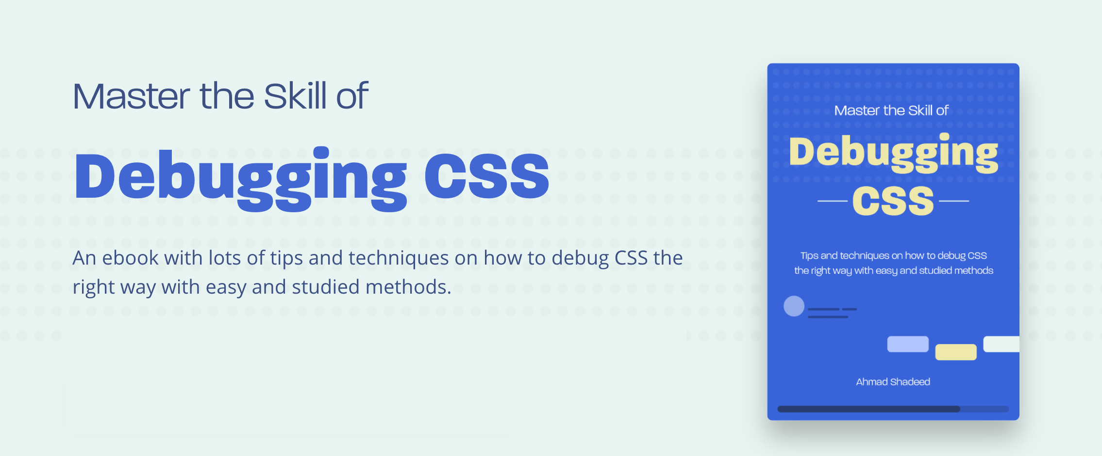
If you’re interested, head over to debuggingcss.com for a free preview.
Recommend
-
10
This is the prose version of a talk I delivered for Manchester FRED (FRont-End Developers) event on the 27th February 2014. If you’re curious, you can also
-
11
6 things you should learn in 2021 Framework In 2021, we'll probably see a duel between Facebook's ReactJS and the community-driven VueJS. React currently has 159,000 stars on GitHub, while Vue has been starred even mo...
-
10
Resources To Level Up Your Front-End Developer SkillsResources To Level Up Your Front-End Developer Skills by@techieabhishek
-
4
How to create a better front-end developer experience Skip to main content Who are the first user...
-
9
Tips for a beginner Front-end Developer Aug 3 ・1 min read
-
12
With so many languages, frameworks, and libraries to choose from, often beginners find themselves scratching their heads on how to start off their development journey. This article aims to d...
-
12
10 VSCODE Lighters For Every Front-end Developer Aug 27 ・2 min read ...
-
45
Hiring a Front-end Developer?Hire front-end developers from our network of top talent. Vetted by experts and hand-selected to match exactly what you need.Hire a Front-end...
-
9
Critical Path Rendering It is the sequence of steps a browser undergoes to convert HTML,CSS and JS into pixels Why do you need to understand it ? By optimizing the critical...
-
6
What is HTML All The Things HTML All The Things is a web development podcast and discord community which was started by Matt...
About Joyk
Aggregate valuable and interesting links.
Joyk means Joy of geeK