

Icons — how to get them right the first time (without drowning in feedback)
source link: https://treatwell.engineering/icons-how-to-get-them-right-the-first-time-without-drowning-in-feedback-f427b29673c7
Go to the source link to view the article. You can view the picture content, updated content and better typesetting reading experience. If the link is broken, please click the button below to view the snapshot at that time.
Icons — how to get them right the first time (without drowning in feedback)
The solution is solid research on the subject matter, that speaks louder than personal opinion.
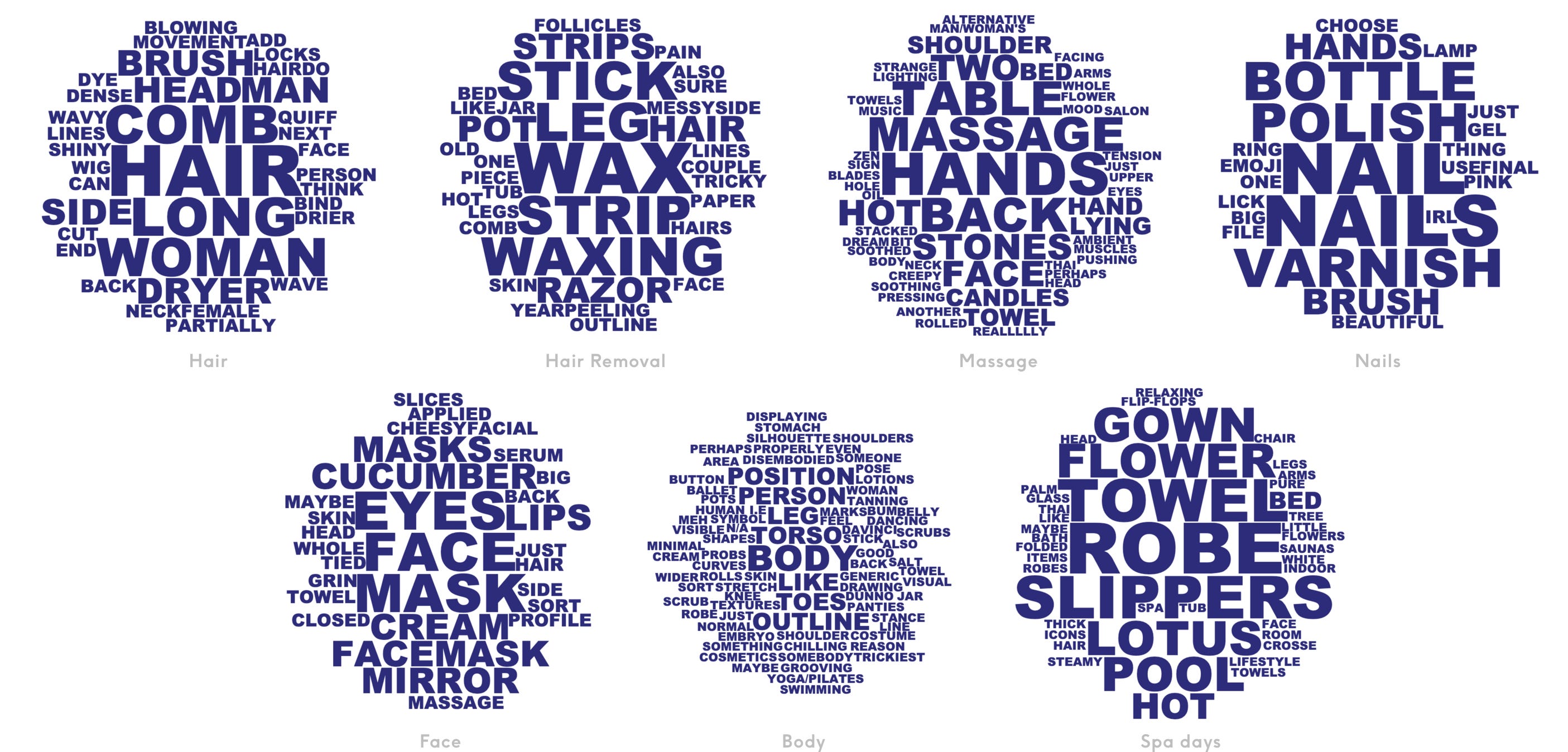
Today, Treatwell is the largest hair and beauty marketplace in Europe. A 24/7 beauty booking platform that puts customers and salon owners in control, Treatwell customers can book at times and prices that suit them, giving them all the style know-how they need to look and feel amazing. Users navigate the app or site to find their desired treatment to book via the following categories — hair, hair removal, massage, nails, face, body, and spa days. I was tasked with designing icons to represent each of these categories.
If you’ve designed icons (or anything) before, you may have found yourself in the middle of a feedback loop you can’t escape. I often find my work falls flat when I can’t back it up.
Give this three-step guide a go. I found the process essential to the success of designing these icons.
Caveat: I only came up with these steps because I actually rushed off and went into step three at 100 mph. I naively thought — “I know what I’m doing, I’ve made plenty of icons before, I’ve heard of The Noun Project*, this will be easy!”. It was not. I quickly ended up in a — design, share, feedback, repeat loop without an end in sight. If that sounds familiar, try these steps and see if they work for you.
Step 1 — Crowdsource the subject matter 🏟

An icon (just like explaining anything) can mean one thing to one person, and something completely different to another.
Take it out of your hands and ask around.
Before doing any design work, list out the icons you need and send a survey to colleagues or users. Ask them to — “please read the words below and describe what image comes to mind”. Add the responses to a word cloud generator and you’ll quickly see what everyone's thinking.
So simple and eye-opening.
Step 2 — Cross reference with data 🤖
At this point, pictures were starting to form from each of the clouds. Take ‘Face’ for example, the icon could be — a face with cucumbers for eyes, a mirror, a face mask?
The icon’s purpose is to represent Treatwell’s treatment categories, so as well as reflecting the user’s interpretation of those categories, the icon needs to reflect users' behaviour. Checking the data and looking at the most booked treatments gave me the chance to observe interpretation VS behaviour.
Below are the top 5 most-booked treatments in Treatwell’s ‘Face’ category.
- Eyelash extensions
- Eyebrow and eyelash tinting
- Facials
- Eyebrow threading
- Eyebrow waxing
Eyelash and eyebrow treatments dominate the list with facials only appearing once. This threw out my earlier assumption of — a face with cucumbers for eyes, a mirror, a face mask? and made sure I better represented users behaviour. Clearly the ‘Face’ icon needed to include eyes and eyebrows.
Step 3 — Put pen to paper 🎨

Tips when putting pen to paper (or the digital version) can be personal per designer. I wouldn't say starting drawing it out on paper is best for everyone for example but, I always keep these questions in mind when I’m designing icons.
- What do we already have, that we like, that I can reference?
- Is it pixel perfect (at smaller sizes this is a must, even today)?
- Is it clear what it is when you zoom out?
- What would other designers think?
- Is it true to my findings or am I biased?
- Can users understand what it is, even out of context or in isolation?
To sum up 🎉
What does success mean for this project? Are the icons…
- Recognisable?
- On brand?
- On-grid?
- Universal?
- Entertaining?
This guide won’t help you answer all of these questions. But it did give me a great starting point. It enabled me to say why an icon is what it is. It enabled me to anchor the feedback to a proven source of truth, and when I walked stakeholders through this process, some didn't have any feedback at all.
Top tip — take it slow and if you can, do at least Step 1 and when asked, make sure you can clearly say why an icon is what it is.
* thenounproject.com is a great resource and a good starting point. But if you need a set of icons that are unique and at the core of a business, this is by far the best process I can recommend.
Recommend
About Joyk
Aggregate valuable and interesting links.
Joyk means Joy of geeK