

Transforming 3D Experiences for 2D Screens
source link: https://blog.prototypr.io/transforming-3d-experiences-for-2d-screens-1eacf5bf9521
Go to the source link to view the article. You can view the picture content, updated content and better typesetting reading experience. If the link is broken, please click the button below to view the snapshot at that time.

Transforming 3D Experiences for 2D Screens
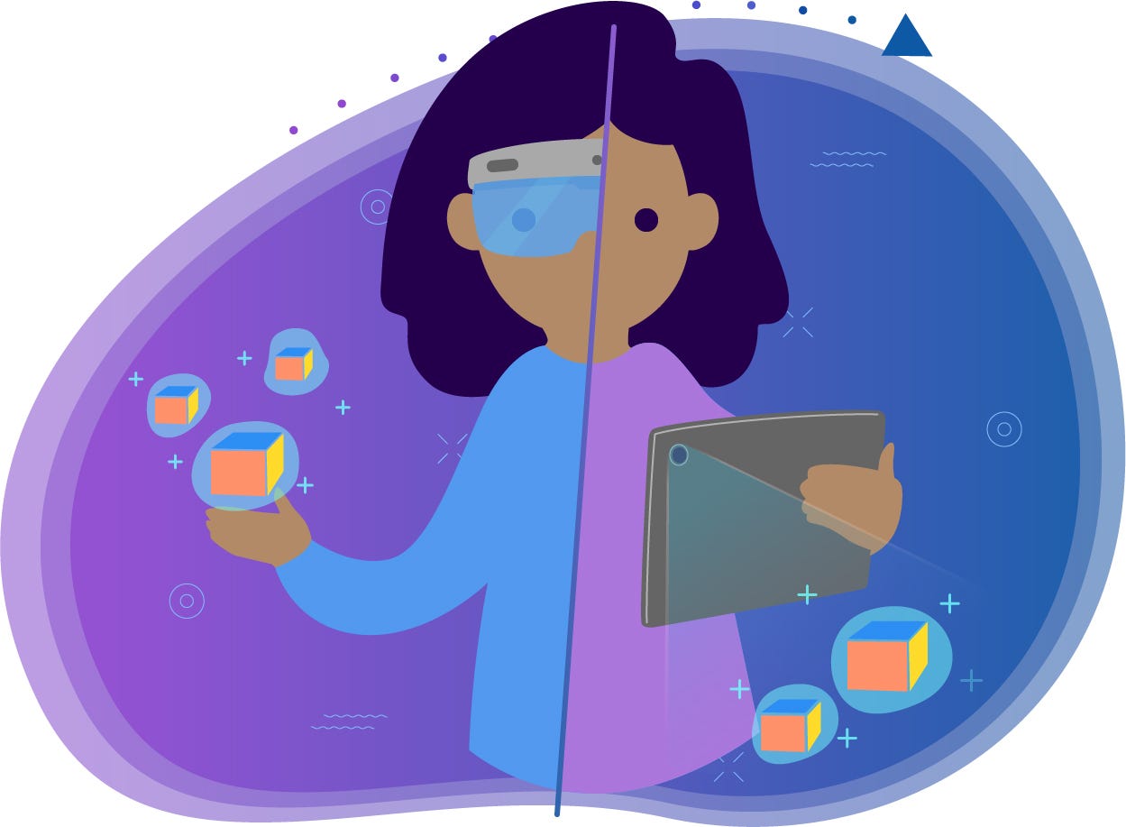
Designing Augmented Reality for Headsets vs Mobile
Co-authors: Hannah Nye, Victoria Claypoole

If you’re lucky enough to work in an industry that’s beginning to grasp the importance and possibilities of Augmented Reality (AR), then you already know that designing for it is a similarly challenging and rewarding experience. However, not all AR is created equal; there are vast differences between optical see through (headsets) and camera see through (mobile/tablet) form factors. Headsets provide a richer and more immersive experience than mobile devices, but until they become more obtainable for the average consumer, mobile AR will be the primary way most people experience the digital/physical world crossover. But how does something that was designed for the spatial world translate to a 2D screen?
Calibrating…
Headsets can get you so spoiled. Throw on a HoloLens 2, and watch in amazement as it automatically maps your environment in seconds. It’s not surprising considering that this device is designed for this very purpose. As soon as we turn our headsets on, they are hard at work, scanning our environment. Our mobile devices are multi-taskers. They don’t exist solely to provide AR experiences. So, you’ll find that one of the first modifications you’ll have to make to your AR experience or application when transferring it to mobile is adding in an extra step for users (dreaded, I know) to scan their environment by moving their mobile device around. It’s important to be concise and clear in our instructions for this step, but an animated gif goes a long way too! If you can add in a progress bar to show how much of the environment the user has left to scan, even better.

No more “hands-free” :(
Let’s look at the physical limitations when switching from headset to mobile. While a HoloLens 2 allows users to reach out and grab objects, 2D mobile screens become a physical barrier to those types of natural interactions. Not only that, but users will be exerting more effort to physically hold their device up — whether on smartphone or tablet. Because of this, we should provide shorter AR experiences when using mobile form factors — ensure the user is in AR mode only when they need to be in AR mode. When users aren’t interacting or exploring their AR space, return them back to a 2D screen so they can rest their arms.
Another tip is to provide one-handed interactions for mobile AR. Since users will have to hold their phone or tablet up to see their AR space, interactions that normally involve both hands when using a headset will have to be translated into a one-handed interaction for mobile. If two handed interactions are unavoidable, be sure to provide a thumbs-only interaction that allows users to keep their hands holding the mobile device.
Figuring out when AR mode is appropriate
When you first built your AR application, I’m sure you noted tasks your user had to complete, and, in turn, determined what the best interactions were that supported their end goals. However, this all gets thrown up in the air as AR experiences move from a strictly 3D to 2D/3D hybrid. Interactions and UIs designed to be used spatially might not make much sense anymore in a 2D environment. That means we must now decide what to spatialize and what to keep locked to a mobile device’s screen.
First, it is important to consider if what we’re having users do is even relevant to their 3D space at all. If the answer is no, like messing with their user profile, take advantage of all the screen real estate that a mobile device has to offer and do not present those interactions in AR mode. Besides the task even making sense in AR, there is another consideration for mobile. AR is a huge battery drain on mobile devices, so if passthrough mode (being able to see the AR world through the device’s camera) isn’t relevant, back to 2D mode we go.

Once you’ve determined what is relevant to display in AR mode, you must then decide what to spatialize and what to lock to the mobile display. We’ve found that any important information or controls that are interacted with at high frequencies should be locked to the mobile device’s screen. This includes form inputs, 3D object manipulation controls, and most buttons. However, depending on the complexity of the application, this might mean a less immersive experience. To combat this, make all your UIs easily collapsible.
So, what’s left to put in the 3D world besides our models? Anything that is spatially relevant and connects the 3D world to the 2D display. Here’s an example. Maybe your application has multiple 3D objects placed in the world, and the user wants to change the color of one of them. The user could tap the screen to select the object. After the object becomes selected, the color selector UI would be locked to the screen with the name of the object presented. In the 3D world, the object would enter an active state, with a spatialized label also presenting the name of the object and bridging the divide between object and UI.

Interaction Consistency
Now for a big question: How consistent do we stay between the two platforms? And the answer is: As much as possible! As much as we would like for our designs to be identical, the different ways we interact within 2D and 3D environments are so inconsistent that there is a lot to consider before transporting over a design. In fact, optimization and consistency can almost seem like a contradiction! Just like any first step in design and UX — first consider your end goal and user. Do you intend for your user to frequently jump between the two devices? Or are the platforms intended to be used by separate users? We don’t want to create a barrier to user adoption because of frustration from having to learn a new system design. On the other hand, we also don’t want to create frustration from a difficult interaction meant for a different/original platform. Here are some best practices for optimization and consistency:
1. Provide an identical structure, where possible
Although designs may look or interact differently, the easiest thing to offer our user in terms of continuity is an identical information architecture. The organization of content for a system and the way it is accessed can be structured similarly to work with the user’s existing mental model. For example, imagine a Help menu in the 3D headset counterpart of an app is accessed through a hand gesture on the Main Menu. The 2D mobile version of the application can provide a Help button from the main menu too. Although the user may have to learn the new interaction of how to access the Help menu, they do not have to relearn where the Help menu can be accessed within the structure of the system. This is the first step to providing a translatable design from 3D to 2D.
2. Prioritize your must-have information
High priority information and interactions should be easily accessible on both platforms. On the mobile device, this can be locked to the screen (while not covering the entire AR view). On the headset, this can be a consistent world locked object for static experiences or an easily accessible tag-along for location-agnostic experiences.
3. Find your bridges
Think of bridges as UI components that act similarly on each platform. By identifying your bridges, you can take advantage of the existing native standards for each platform to create a system with intuitive interactions. For example, full screen UI on a 2D screen and a tag-along UI in the 3D space have a similar effect — both demand the user’s attention with UI. Another example is the “pin in space” option the HoloLens offers for its UI screens. The Android equivalent could be the split screen feature offered for multitasking; the user can drag a window to a certain part of the screen to “pin” it. Offering a similar native experience will provide a smoother, more intuitive transition between the two spaces.
4. Use consistent UI
This may be a no-brainer, but it’s easy to get lost in updating and changing designs when optimizing for a different platform. When porting designs from 3D to 2D, try to keep the UI as similar as possible. If users learn that a circular button opens a help menu in the 3D experience, they will expect and more quickly understand if a similar circular button is repurposed on 2D screens. By keeping visuals consistent, we reduce the learning curve and frustration different platforms bring with them.
5. Substituting cues
Inherent in the move from 3D to 2D is the loss of some of the spatial cues that can make or break an interaction.But don’t despair, we’ve now gained haptics! Haptics are great for simulating 3D object manipulations. Yes, haptic gloves exist for headsets, but they aren’t practical or affordable for a lot of use cases. Depending on your target mobile device, you maybe be able to tap into its ability to provide haptic feedback. Here’s a little example of substituting audio for haptic cues. Maybe your application instructs a user to drop a 3D object into a specific location. In your headset version, an audio cue increases in volume as you get closer and closer to dropping the object in the intended zone. For our mobile version, the audio feedback could be substituted with vibration. As you move objects closer/farther away from the intended target, the vibration would slowly increase/decrease. You could still play the audio feedback, but adding in the haptics really enforces the intent of the interaction.
Mark your exits
This is more of a reminder. Any practitioner of UX knows it’s important to mark your exits, especially when we’re putting users into a specific mode. Since we want to maximize our screen real-estate as much as possible for mobile AR, all superfluous controls will be removed, putting our users into the dreaded “mode.” Because of this, it’s important to always clearly show our users where to exit.

Conclusion
When transforming 3D experiences for 2D screens, as always, consider the task first. Ask yourself, “Does this even make sense in AR?” Keep things as consistent as possible between 3D and 2D form factors. Even if all your interactions and UIs aren’t 1:1, offer bridges between platforms. Lock what’s important to the mobile display, substitute haptic cues where appropriate, and mark your exits. Happy designing!
Recommend
About Joyk
Aggregate valuable and interesting links.
Joyk means Joy of geeK