
8

用CSS代码写出的各种形状图形的方法
source link: https://yanhaijing.com/css/2014/04/04/with-css-code-to-write-various-shapes-graphic-method/
Go to the source link to view the article. You can view the picture content, updated content and better typesetting reading experience. If the link is broken, please click the button below to view the snapshot at that time.
一共收集整理了图形20个,比较实用,同时也为了熟悉CSS的代码。整合了一下,有错误欢迎指出。
1.正方形
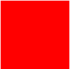
#square {
	width: 100px;
	height: 100px;
	background: red;
}
2.长方形

#rectangle {
	width: 200px;
	height: 100px;
	background: red;
}
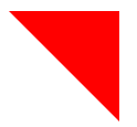
3.左上三角

#triangle-topleft {
	width: 0;
	height: 0;
	border-top: 100px solid red;
	border-right: 100px solid transparent;
}
4.右上三角
#triangle-topright {
	width: 0;
	height: 0;
	border-top: 100px solid red;
	border-left: 100px solid transparent;
}
5.左下三角
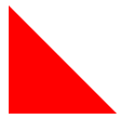
#triangle-bottomleft {
	width: 0;
	height: 0;
	border-bottom: 100px solid red;
	border-right: 100px solid transparent;
}
6.右下三角
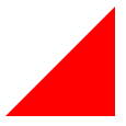
#triangle-bottomright {
	width: 0;
	height: 0;
	border-bottom: 100px solid red;
	border-left: 100px solid transparent;
}
7.平行四边形
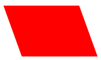
#parallelogram {
	width: 150px;
	height: 100px;
	-webkit-transform: skew(20deg);
	  -moz-transform: skew(20deg);
	    -o-transform: skew(20deg);
	background: red;
}
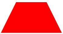
#trapezoid {
	border-bottom: 100px solid red;
	border-left: 50px solid transparent;
	border-right: 50px solid transparent;
	height: 0;
	width: 100px;
}
9.六角星

#star-six {
	width: 0;
	height: 0;
	border-left: 50px solid transparent;
	border-right: 50px solid transparent;
	border-bottom: 100px solid red;
	position: relative;
}
#star-six:after {
	width: 0;
	height: 0;
	border-left: 50px solid transparent;
	border-right: 50px solid transparent;
	border-top: 100px solid red;
	position: absolute;
	content: "";
	top: 30px;
	left: -50px;
}
10.五角星

#star-five {
   margin: 50px 0;
   position: relative;
   display: block;
   color: red;
   width: 0px;
   height: 0px;
   border-right:  100px solid transparent;
   border-bottom: 70px  solid red;
   border-left:   100px solid transparent;
   -moz-transform:    rotate(35deg);
   -webkit-transform: rotate(35deg);
   -ms-transform:     rotate(35deg);
   -o-transform:      rotate(35deg);
}
#star-five:before {
   border-bottom: 80px solid red;
   border-left: 30px solid transparent;
   border-right: 30px solid transparent;
   position: absolute;
   height: 0;
   width: 0;
   top: -45px;
   left: -65px;
   display: block;
   content: '';
   -webkit-transform: rotate(-35deg);
   -moz-transform:    rotate(-35deg);
   -ms-transform:     rotate(-35deg);
   -o-transform:      rotate(-35deg);

}
#star-five:after {
   position: absolute;
   display: block;
   color: red;
   top: 3px;
   left: -105px;
   width: 0px;
   height: 0px;
   border-right: 100px solid transparent;
   border-bottom: 70px solid red;
   border-left: 100px solid transparent;
   -webkit-transform: rotate(-70deg);
   -moz-transform:    rotate(-70deg);
   -ms-transform:     rotate(-70deg);
   -o-transform:      rotate(-70deg);
   content: '';
}
11.五边形
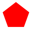
#pentagon {
    position: relative;
    width: 54px;
    border-width: 50px 18px 0;
    border-style: solid;
    border-color: red transparent;
}
#pentagon:before {
    content: "";
    position: absolute;
    height: 0;
    width: 0;
    top: -85px;
    left: -18px;
    border-width: 0 45px 35px;
    border-style: solid;
    border-color: transparent transparent red;
}
12.六边形
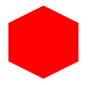
#hexagon {
	width: 100px;
	height: 55px;
	background: red;
	position: relative;
}
#hexagon:before {
	content: "";
	position: absolute;
	top: -25px;
	left: 0;
	width: 0;
	height: 0;
	border-left: 50px solid transparent;
	border-right: 50px solid transparent;
	border-bottom: 25px solid red;
}
#hexagon:after {
	content: "";
	position: absolute;
	bottom: -25px;
	left: 0;
	width: 0;
	height: 0;
	border-left: 50px solid transparent;
	border-right: 50px solid transparent;
	border-top: 25px solid red;
}
13.桃心

#heart {
    position: relative;
    width: 100px;
    height: 90px;
}
#heart:before,
#heart:after {
    position: absolute;
    content: "";
    left: 50px;
    top: 0;
    width: 50px;
    height: 80px;
    background: red;
    -moz-border-radius: 50px 50px 0 0;
    border-radius: 50px 50px 0 0;
    -webkit-transform: rotate(-45deg);
       -moz-transform: rotate(-45deg);
        -ms-transform: rotate(-45deg);
         -o-transform: rotate(-45deg);
            transform: rotate(-45deg);
    -webkit-transform-origin: 0 100%;
       -moz-transform-origin: 0 100%;
        -ms-transform-origin: 0 100%;
         -o-transform-origin: 0 100%;
            transform-origin: 0 100%;
}
#heart:after {
    left: 0;
    -webkit-transform: rotate(45deg);
       -moz-transform: rotate(45deg);
        -ms-transform: rotate(45deg);
         -o-transform: rotate(45deg);
            transform: rotate(45deg);
    -webkit-transform-origin: 100% 100%;
       -moz-transform-origin: 100% 100%;
        -ms-transform-origin: 100% 100%;
         -o-transform-origin: 100% 100%;
            transform-origin :100% 100%;
}
14.无限大符号
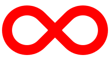
#infinity {
    position: relative;
    width: 212px;
    height: 100px;
}


#infinity:before,
#infinity:after {
    content: "";
    position: absolute;
    top: 0;
    left: 0;
    width: 60px;
    height: 60px;
    border: 20px solid red;
    -moz-border-radius: 50px 50px 0 50px;
         border-radius: 50px 50px 0 50px;
    -webkit-transform: rotate(-45deg);
       -moz-transform: rotate(-45deg);
        -ms-transform: rotate(-45deg);
         -o-transform: rotate(-45deg);
            transform: rotate(-45deg);
}


#infinity:after {
    left: auto;
    right: 0;
    -moz-border-radius: 50px 50px 50px 0;
         border-radius: 50px 50px 50px 0;
    -webkit-transform: rotate(45deg);
       -moz-transform: rotate(45deg);
        -ms-transform: rotate(45deg);
         -o-transform: rotate(45deg);
            transform: rotate(45deg);
}
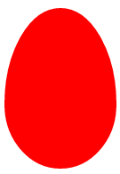
#egg {
   display:block;
   width: 126px;
   height: 180px;
   background-color: red;
   -webkit-border-radius: 63px 63px 63px 63px / 108px 108px 72px 72px;
   border-radius:        50%   50%  50%  50%  / 60%   60%   40%  40%;
}
16.提示对话框

#talkbubble {
   width: 120px;
   height: 80px;
   background: red;
   position: relative;
   -moz-border-radius:    10px;
   -webkit-border-radius: 10px;
   border-radius:         10px;
}
#talkbubble:before {
   content:"";
   position: absolute;
   right: 100%;
   top: 26px;
   width: 0;
   height: 0;
   border-top: 13px solid transparent;
   border-right: 26px solid red;
   border-bottom: 13px solid transparent;
}
17.十二角星

#burst-8 {
    background: red;
    width: 80px;
    height: 80px;
    position: relative;
    text-align: center;
    -webkit-transform: rotate(20deg);
       -moz-transform: rotate(20deg);
        -ms-transform: rotate(20deg);
         -o-transform: rotate(20eg);
            transform: rotate(20deg);
}
#burst-8:before {
    content: "";
    position: absolute;
    top: 0;
    left: 0;
    height: 80px;
    width: 80px;
    background: red;
    -webkit-transform: rotate(135deg);
       -moz-transform: rotate(135deg);
        -ms-transform: rotate(135deg);
         -o-transform: rotate(135deg);
            transform: rotate(135deg);
}
18.八角星

#burst-8 {
    background: red;
    width: 80px;
    height: 80px;
    position: relative;
    text-align: center;
    -webkit-transform: rotate(20deg);
       -moz-transform: rotate(20deg);
        -ms-transform: rotate(20deg);
         -o-transform: rotate(20eg);
            transform: rotate(20deg);
}
#burst-8:before {
    content: "";
    position: absolute;
    top: 0;
    left: 0;
    height: 80px;
    width: 80px;
    background: red;
    -webkit-transform: rotate(135deg);
       -moz-transform: rotate(135deg);
        -ms-transform: rotate(135deg);
         -o-transform: rotate(135deg);
            transform: rotate(135deg);
}
19.钻石
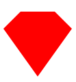
#cut-diamond {
    border-style: solid;
    border-color: transparent transparent red transparent;
    border-width: 0 25px 25px 25px;
    height: 0;
    width: 50px;
    position: relative;
    margin: 20px 0 50px 0;
}
#cut-diamond:after {
    content: "";
    position: absolute;
    top: 25px;
    left: -25px;
    width: 0;
    height: 0;
    border-style: solid;
    border-color: red transparent transparent transparent;
    border-width: 70px 50px 0 50px;
}
20.八卦
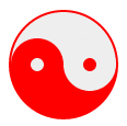
#yin-yang {
	width: 96px;
	height: 48px;
	background: #eee;
	border-color: red;
	border-style: solid;
	border-width: 2px 2px 50px 2px;
	border-radius: 100%;
	position: relative;
}
#yin-yang:before {
	content: "";
	position: absolute;
	top: 50%;
	left: 0;
	background: #eee;
	border: 18px solid red;
	border-radius: 100%;
	width: 12px;
	height: 12px;
}
#yin-yang:after {
	content: "";
	position: absolute;
	top: 50%;
	left: 50%;
	background: red;
	border: 18px solid #eee;
	border-radius:100%;
	width: 12px;
	height: 12px;
}
原文:http://www.wzsky.net/html/Website/CSS/115159.html
原文网址:http://yanhaijing.com/css/2014/04/04/with-css-code-to-write-various-shapes-graphic-method/
 关注微信公众号 颜海镜
 赞赏支持 微信扫一扫
Recommend
About Joyk
Aggregate valuable and interesting links.
Joyk means Joy of geeK