

Go faster with your own re-usable Blazor components
source link: https://jonhilton.net/build-your-own-re-usable-blazor-components/
Go to the source link to view the article. You can view the picture content, updated content and better typesetting reading experience. If the link is broken, please click the button below to view the snapshot at that time.
Go faster with your own re-usable Blazor components
June 30, 2020 · 8 minute read · Tags: blazor
Take a look at any web application these days and you’ll notice something…
No matter what the sector, design or purpose, the “modern web app” generally consists of a few key UI elements or components.
Even the most unusual, complex, visually interesting designs have some degree of consistent UI, with specific elements or components used and re-used throughout the application.
Take the BBC homepage for example.

Look at this with a view to identifying the key elements and they soon start to leap off the screen.
The obvious ones here are the stories, each with their own headline, image and category.
But we also have sections, and even things like the heading “Welcome to the BBC” (chances are these headings are consistent across the site).
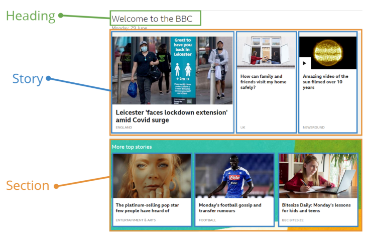
There are probably more, but here are the key “elements”…
- Heading
- Section
- Story
- Headline
- Category
- Image
- Story
Notice too how these are hierarchical in nature (so a section can contain one or more stories, each story includes a headline etc.)
This is a perfect fit for a “component-based” approach to building your web application, where each component is relatively straightforward in itself and can be used in lots of places to build your entire application (with as little effort and fuss as possible!)
Considering Blazor for your next project?
Learn my simple, repeatable process for transforming ideas into features using Blazor's component model.
4 days, 4 emails; enter your email in the box below and I'll send you Lesson #1.
How to create re-usable components in Blazor
So how do we tackle this with Blazor?
How can we create our own re-usable components and use them to rapidly build an entire application?
Standing on the shoulders of giants
Worth saying, you always have the option of letting someone else do this work for you!
You can lean on any of a number of existing component libaries for Blazor.
These can be massive time-savers and also save you from spending endless hourse on non-functional requirements (like making your site responsive etc.)
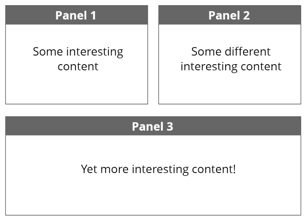
Let’s say, for arguments sake we’re building a simple “dashboard”.
We want the dashboard to comprise several panels, something like this…
Visually a panel is pretty straighforward.
A couple of divs inside another div should do it!
<div class="border-2 border-gray-600 m-4">
    <div class="bg-gray-700 text-white text-2xl p-2 font-bold text-center">
         Panel 1
    </div>
    <div class="p-6">
        This is a panel
    </div>
</div>
Note, I’m using TailwindCSS, primarily because I find it a super fast way to iterate on a design and quickly modify the appearance of my components.
If that’s not your cup of tea you absolutely don’t have to use TailwindCSS to build re-usable components, ultimately you can choose to apply styles however you wish!
However, the strange thing about Tailwind (especially if you’ve never used it) is it looks really complicated and verbose, and like something you would never wish to use…
But then, when you do use it and you discover for yourself how quick it is to iteratively improve the look n’ feel of your site (and how easy it is to maintain your site when something needs tweaking later) the whole concept suddenly makes a lot of sense.
I swear it’s like some weird jedi mind trick or something!
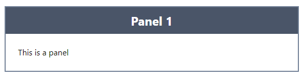
Run this in the browser and we have a panel.
Make it re-usable
So far so good, but is this really re-usable? Unless we want every panel to say “This is a panel”, probably not…
We need a way to set this title and contents to different values for each panel.
Let’s tackle the title first.
Panel.razor
<div class="border-2 border-gray-600 m-4">
    <div class="bg-gray-700 text-white text-2xl p-2 font-bold text-center">
         @Title
    </div>
    <div class="p-6">
        This is a panel
    </div>
</div>

@code {
    [Parameter]
    public string Title { get; set; }
}
Now we can set this title every time we render a panel.
Index.razor
<Panel Title="Still a panel"/>
<Panel Title="Speak for yourself"/>
And here’s the result…
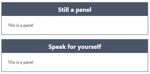
That’s better!
Different content
Now for the “contents” of the panel.
Unlike the title, the contents are likely to require more than just some text.
Imagine a real dashboard; panels could show graphs, tables, images and any number of other things.
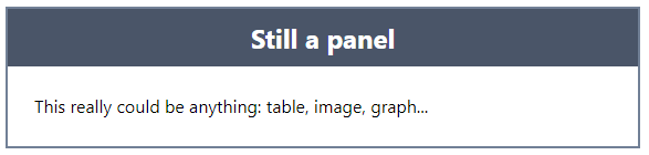
What we need, is a way to declare an instance of our component, put content in the “middle” of it, and have that rendered in the component itself…
<Panel Title="Still a panel">
    <p>This really could be anything: table, image, graph...</p>
</Panel>
With this approach we can keep our consistent look and feel, but put virtually anything in the panel itself.
Blazor handles this using something called a RenderFragment.
Here’s how it works.
<div class="border-2 border-gray-600 m-4">
    <div class="bg-gray-700 text-white text-2xl p-2 font-bold text-center">
        @Title
    </div>
    <div class="p-6">
        @ChildContent
    </div>
</div>

@code {

    [Parameter]
    public string Title { get; set; }

    [Parameter]
    public RenderFragment ChildContent { get; set; }

}
When we declare a property of type RenderFragment and call it ChildContent we tell Blazor to go ahead and automatically populate this with the contents we included when we declared an instance of our component.
From here we can simply render these contents wherever we wish in our component using @ChildContent.
Set styles from “the outside”
Finally, let’s say we’re happy with this basic panel but sometimes we want it to have a red background, and white text…
We need a way to specify our style preferences when we render the Panel…
Panel.razor (code)
@code {

    [Parameter]
    public string Title { get; set; }

    [Parameter]
    public RenderFragment ChildContent { get; set; }

    [Parameter]
    public string TitleStyle { get; set; }

}
Here we’ve exposed a TitleStyle parameter which expects a string (containing CSS classes).
Now we need a way to render these extra classes in the div which dispays our panel’s title…
Panel.razor (markup)
<div class="@($"text-white text-2xl p-2 font-bold text-center {TitleStyle}")">
    @Title
</div>
This is a littly clunky, but breaking it down, we’ve essentially wrapped the entire existing class value in this…
@()
This makes it possible to use C# to declare an interpolated string…
$"text-white text-2xl p-2 font-bold text-center {TitleStyle}"
Which means we can append the value of TitleStyle to the existing hardcoded CSS classes.
Now we can specify the style when we declare an instance of our Panel component.
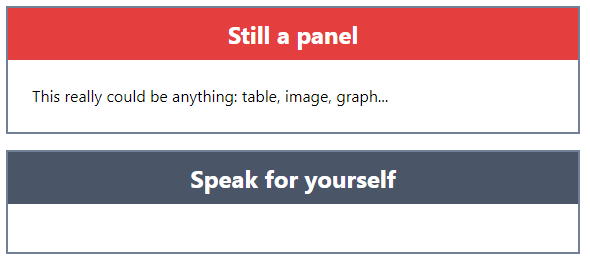
<Panel Title="Still a panel" TitleStyle="bg-red-600">
    <p>This really could be anything: table, image, graph...</p>
</Panel>

<Panel Title="Speak for yourself" />
And when Blazor renders our two Panel instances, one will have a red background (because it’s important, so very important!)
Now this works, but what if we want to render more than one of these “important” panels?
We don’t really want to litter our code with repeated references to bg-red-600, not least because we might want to tweak that color, or add additional styles to it at a later date.
This is where a little component composition goes a very long way.
Compose those components
The tempation is to somehow modify (or even duplicate) our existing Panel component to handle this requirement to have a re-usable “Important” panel.
However, components offer us an alternative approach.
We can create a more specialized version of Panel to use whenever we need an angry looking red panel.
ImportantPanel.razor
<Panel Title="@Title" TitleStyle="bg-red-600">
    @ChildContent
</Panel>

@code {

    [Parameter]
    public string Title { get; set; }

    [Parameter]
    public RenderFragment ChildContent { get; set; }

}
Note how this wraps the existing component and sets its TitleStyle property…
Now we can use ImportantPanel and still specify a Title and ChildContent to render…
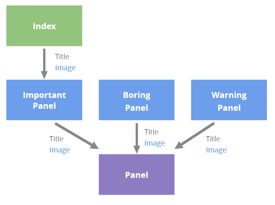
Index.razor
<ImportantPanel Title="Still a panel">
    <p>This really could be anything: table, image, graph...</p>
</ImportantPanel>

<Panel Title="Speak for yourself" />
Are we done then?
Not quite.
I’m not sure about you, but I’m a little concerned about that ImportantPanel.
It’s fine at the moment, but if we add additional parameters to Panel it feels like it’s going to be a bit of a hassle to go and update ImportantPanel to pass them along.
It could get worse too, if we end up with lots more specialised panels, every one would need to be modified every time Panel exposes a new parameter.
Say for example we added an Image parameter to Panel.
We’d have to modify ImportantPanel and any other specialized panels to accept this Image parameter, even if they don’t need to do anything with it other than pass it along to the Panel.
Thankfully, there is an alternative.
We can drastically simplify ImportantPanel by making it accept and forward any and all parameters we throw at it.
Here’s how…
ImportantPanel.razor
<Panel @attributes="Attributes" TitleStyle="bg-red-600"/>

@code {

    [Parameter(CaptureUnmatchedValues = true)]
    public Dictionary<string, object> Attributes { get; set; }

}
The Attributes dictionary is a Parameter decorated with the option to CaptureUnmatchedValues.
This means when we declare an instance of ImportantPanel and specify parameters, any parameters not explicitly referenced in ImportantPanel will be gathered up into this dictionary.
Then we just need a way to “splat” them on to our Panel component.
That’s what @attributes="Attributes" does; it’s literally called “Attribute Splatting”.
Now we have an ImportantPanel which should be a breeze to maintain. In fact, we only need to come back to and modify it if we decide that important panels need to behave differently, or we need to tweak its appearance.
In Summary
Once you get the hang of “thinking in components”, composing your application from lots of small, single-purpose components becomes a breeze.
Use these Blazor features to keep your app on track:
- Parameters (to pass values to your components)
ChildContentParameters (to render the “contents” of your components)CaptureUnmatchedValues(to capture any parameters you don’t need to explicitly handle)- Attribute splatting (to pass multiple attributes onto another component in one go)
Considering Blazor for your next project?
Learn my simple, repeatable process for transforming ideas into features using Blazor's component model.
4 days, 4 emails; enter your email in the box below and I'll send you Lesson #1.
Next up
Dark mode for your web applications (using Blazor and Tailwind CSS)Recommend
About Joyk
Aggregate valuable and interesting links.
Joyk means Joy of geeK