

Scaling Analytical Insights with Python (Part 2)
source link: https://kdboller.github.io/2017/10/11/scaling-analytical-insights-with-python_part2.html
Go to the source link to view the article. You can view the picture content, updated content and better typesetting reading experience. If the link is broken, please click the button below to view the snapshot at that time.
Scaling Analytical Insights with Python (Part 2)
Oct 11, 2017
If you would like to read Part 1 of this Series, please find it at this link.
A fair amount has happened since my Scaling Analytical Insights with Python (Part 1) post back in August. Since that time, I decided to resign from FloSports in order to join Amazon’s Kindle Content Acquisition team as a Sr. Product Manager -- this obviously includes moving my family from Austin, TX to Seattle. While this was taking place behind the scenes, I had every intention to return to my write up of Part 2 of this series. Note that I’ve decided to put Part 3 on hold, and I may potentially not revisit the topic of using Python for financial analysis for a decent while.
In this Part 2 post, I’ll combine several resources which I believe are remarkably useful, and this post will tie together a few key pieces of analyses for better understanding a direct-to-consumer, subscription / SaaS customer base. In order to meld all of this together, I’ll also use one of my favorite data analytics / data science tools, Mode Analytics. At the end, what I hope you’ll find both helpful and cool is an open source Mode Analytics report, which can be found here; this is a slimmed down version of the type of report I would produce in my former role as the head of the data warehouse and data analytics, and all of the code and visualizations are able to be cloned into your own Mode report (assuming you create an account, which is free).
To quickly summarize what this post will cover (note that each part will use the same e-commerce user data set which Greg Reda referenced in his original post, found here):
- Recreate Part 1’s subscriber cohort and retention analysis, this time using Mode’s SQL + Python
- Create a projected LTV analysis using exponential decay, leveraging an excellent blog post by Ryan Iyengar, which can be found here.
- Develop an RFM (Recency, Frequency, Monetary Value) analysis, one method e-commerce sites use to segment and better understand user / subscriber buying behaviors
- Show how this all ties together using a brief write up and visualizations from both SQL and Python in an overall, open source Mode Report
All of the code can be found in the Mode Analytics report, again included here -- you do not need to create a Mode Analytics account in order to see the report, however cloning it requires a free account. The original data set can be found at the link provided before, and everything else (SQL, Python code, how to build charts and visualizations) is all available within the report.
To start with, I took the relay-foods data set and added it as a public file on Mode -- here are Mode’s instructions on how to do that (I also added an all_time dataset, more on that in the projected LTV portion). The Python code in this portion of the post, again available in the Notebook section of the report here, is identical to the code utilized in my prior post -- the difference is that a dataframe created from an SQL query is utilized within a Mode Python notebook. Additionally, the SQL code provided below shows a minor data enrichment step that I took on this dataset, where I categorize the first payment for a user as ‘Initial’ and any subsequent payments as ‘Repeat’. This is a fairly minor but quick example of the type of business logic that you can apply to data sources, generally using aggregate fact tables as I’ve mentioned in the past.
with payment_enrichment as (

  select

    order_id
    , order_date
    , user_id
    , total_charges
    , common_id
    , pup_id
    , pickup_date
    , date_trunc('month', order_date) as order_month
    , row_number() over (partition by user_id order by order_date) as payment_number

  from kdboller.relay_foods_v1
  )

  select
    pe.*
    , case when payment_number = 1 then 'Initial' else 'Repeat' end as payment_type

  from payment_enrichment as pe
As the next step in this analysis, I will build a projected LTV analysis, again referencing another helpful resource which I found online -- Ryan Iyengar posted this on Medium a little bit over a year ago and can be found here. If you’ve ever conducted an LTV analysis in Excel, you know that this can be rather time consuming and these models can become extremely large and much less dynamic than one would prefer. You would think that there has to be a better way to calculate a single value which is rather critical to understanding the health of a subscription business. Fortunately, there are a number of much better, highly repeatable ways to do this. Furthermore, evaluating different start/end date ranges for cohorts to include, e.g., to normalize for particularly strong “early adopter” cohorts, is a significant advantage of conducting this type of analysis in SQL and / or Python.
With all of this said, Ryan’s post definitely requires a fairly thorough understanding of SQL, particularly given the significant use of common table expressions (CTEs). Given the length of the resulting query, I’ve not pasted it directly into this post but you can find several build ups to the final query within the Mode Report. If you have specific questions on the background or rationale for this piece of my post, I would refer you to his rather insightful and informative post. For purposes of my post, I’ve shown how to create the needed data from the original data set we’re using, provide some observational takeaways from our dataset below and also show a few key charts that Mode allows me to add to my overall report within the LTV section.
LTV Section -- summary of the queries
The SQL queries related to LTV, which piggyback off of Ryan’s extremely helpful work, start with the numbering of 2 - 8 within the report. Within Mode, I try to order my queries using this system in order to track the natural progression of the queries written within the project -- a nice feature request would be to have some type of a folder-ing system in order to organize these into payment, LTV, and RFM query sections. Query #2 modestly manipulates the dataset in order to pull back a return that is consistent with the dataset which Ryan uses in his post -- this should make it very straightforward to follow. I also built out the queries to mimic where Ryan pauses during his blog post, so that it is easier to follow between his post and the Mode report that I created.
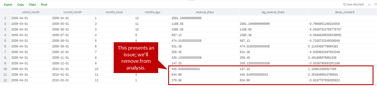
Within queries 4-6, you’ll see that while performing this I detected an anomalous situation within one of the cohorts (see screenshot below this paragraph). In the 2009/04/01 cohort, in the three latest months the cohort’s revenue share actually dramatically increased; while reactivations, users who leave a cohort and then later return, are not uncommon, this significantly skewed the forecasted revenue and therefore LTV for this particular cohort. As a result, rather than projecting a decay in revenue, the model was forecasting a greater than 20% month over month increase (for the whole forecast). While there are probably a few preferred ways to normalize this, in the interest of time I decided to just exclude this cohort from the analysis -- I would say that something similar to this happens in almost every analysis, and it’s obviously critical to vet the data and determine how to adjust as needed. The adjustment decisions will somewhat vary given a company’s industry, future prospects, and maturity.
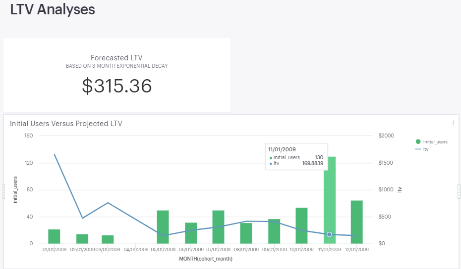
Queries 7 and 8 complete the query with the final expected return, one which shows the projected LTV for each cohort and one which shows the overall forecasted LTV when taking into account all cohorts forecasted projections and initial users. You can see from the below screen scrape copied from the Mode Report output, the overall LTV is ~$315. In addition to that, we see that the initial cohort, most likely the “early adopters”, have a much higher LTV than seen in subsequent months -- with the caveat that we only have 12 monthly cohorts to evaluate and this is a rarely new company given this example, next steps could include further segmenting users and finding each LTV, as well as potentially normalizing overall LTV by excluding the “early adopter” contribution from this analysis. It’s also worth noting that the LTV is much lower with the higher volume recent cohorts, and we would want to understand if we can more effectively grow our user base while ideally growing, or at minimum maintaining, our LTV over time. Please note that you should also calculate a gross margin, or preferably a contribution margin, to reflect the true underlying economics and LTV for each subscriber.
RFM Analyses
In this last section, I’ve included a Recency, Frequency, Monetary Value (RFM) analysis. While in the course of reviewing effective ways to segment subscribers and after discovering this methodology, I then found this helpful notebook on Joao Correia’s GitHub. Here’s a very brief rundown of RFM.
Recency: how recently from an evaluated date, e.g., today, a user / subscriber has purchased from a site.
Frequency: the number of times that a user / subscriber has purchased on a particular site in their entire lifetime as a customer.
Monetary Value: the dollar amount that the user / subscriber has paid in total from all of their purchases during their entire lifetime as a customer.
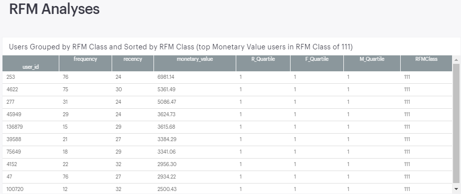
While there are a few ways to complete the RFM analysis, including via SQL, part of my intent here is to show how the useful work of others can be repurposed with a rather straightforward initial dataset. Within the Python notebook, RFM Analyses section, you will see that I’ve largely followed Joao’s notebook. As in his notebook’s conclusion, I show below the the top ten customers in the RFMClass 111 -- this represents the users who are in the top quartile for all three RFM metrics; these users have paid rather recently, and have also paid more times and at a higher monetary value than 75% of the site’s other users. As a result, these users are prime for qualitative surveys requesting feedback on what they love and what could be better, and you can also study their site behavior to understand what they may be doing differently than other visitors, among several different evaluations you can take on.
Utilizing Plotly within the Mode report, I then added three visualizations which help me to better understand the data and are also meant to anticipate potential questions from business stakeholders. The first shows the distribution of users within each RFMClass. On a positive note, 81 users are in the 111 class, but 75 are in 344 and 65 are in 444 -- these are users who have not paid in a while, and who have also paid far fewer times and at a much lower monetary value than the median value for all users. We would want to see if we could resurrect these users or if there’s something that happened which caused them to (almost) never return to our site.
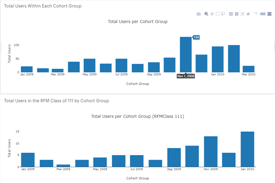
Lastly, I would want to know how each RFMClass indexes in terms of cohort groups -- are earlier cohorts the ones that are primarily in the 111 class? If so, that would probably be a cause for concern. In reviewing the two charts (below), the first with total users by cohort and the second with RFM Class 111 users by cohort, we see that the largest contributors to the RFM Class 111 are from November 2009 and January 2010. However, when reviewing the first chart with total users per cohort, we see that November 2009 was a particularly large cohort, and on a relative basis is not as strong of a contributor to the top RFM class. An even better output would calculate, for each cohort, what percent RFMClass 111 users comprised of each monthly cohort; but I’ll leave that for another time / potentially a follow-up post.
And this largely concludes a post that I’ve been waiting to write for over two months. Hopefully this conveys the value of stepping out of Excel and leveraging the public contributions of insightful people and the benefits of tools such as SQL and Python.
Some quick notes on the benefits of working with Mode (also, here's a post from Mode’s blog regarding their take on getting out of Excel and into SQL and Python):
- Charts can be created either in SQL (built-in chart functionality) or in Python
- Reports are highly reproducible and can be cloned if you want to preserve a previous one, e.g., quarterly reviews
- Mitigates need to create a dataset and read out as a CSV into Jupyter notebook; read queries directly into Python notebook as a dataframe
- With the caveat that not all Python libraries are available, although quite a few are, and computing power is an area in which Mode is constantly looking to improve
Starting from a rather basic user data set and using Mode Analytics, we were able to complete the following:
- Contribute two public datasets onto Mode's platform
- Group the users into monthly cohorts via SQL and Python
- Build retention curves / retention heatmaps for these monthly cohorts in Python
- Calculate a weighted average retention curve for the cohorts in Python
- Project LTV for the entire company and for each cohort using SQL
- Conduct an RFM analysis and understand the distribution for each class and the contribution by Monthly cohort in Python
- Finally, we leveraged Mode Analytics to produce an intuitive, comprehensive report
- This report is rather extensible to add in additional analyses and can also be easily updated as new monthly data rolls in
Hopefully you found this post as helpful as I’ve found Mode to be, as well as the referenced posts that we leveraged, and please let me know if you have any questions or thoughts in the comments section.
Recommend
About Joyk
Aggregate valuable and interesting links.
Joyk means Joy of geeK