

15 Terms You Need to Get Used to As a UX Designer
source link: https://uxplanet.org/15-terms-you-need-to-get-used-to-as-a-ux-designer-52b593566b7a
Go to the source link to view the article. You can view the picture content, updated content and better typesetting reading experience. If the link is broken, please click the button below to view the snapshot at that time.
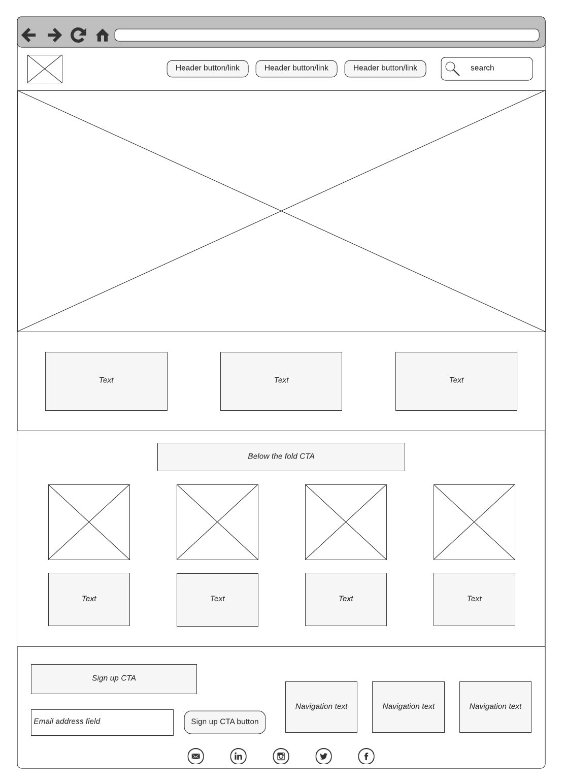
1. Wireframe
A wireframe is a simplified representation of your website or application. It consists of lines and text that can be hand-drawn or electronic. The focus of the wireframe should be structural elements that represent priority. In this stage, visual design and color are not presented. Like the picture shown below.

2. Mockup
A mockup is a high-fidelity simulation of the product. It has a richer visual element than wireframe, including graphics, layout, and style. Mockups focus on how the users will interpret the design through its visual elements.

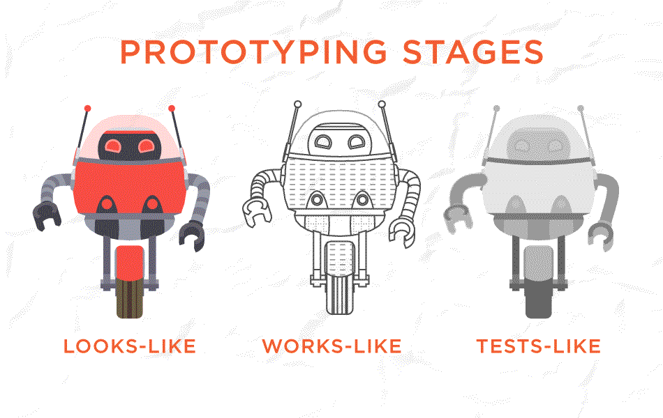
3. Prototype
Compare to wireframes, prototypes are more flexible. They can be responsive and may contain images or content. Prototypes are made from paper or digital tools like Adobe XD. All wireframes are prototypes but just low fidelity without many details. But a high-fidelity prototype is not a wireframe. It takes you as close as to a real representation of UI and should feel like real software to users.
4. A/B Testing
A/B testing is a controlled experiment for comparing two versions of the design. The goal is to identify which one is more successful. It is a way of testing the designers' hypotheses. A/B testing allows them to confirm whether the hypotheses will work out well or not. It helps you with making the right decisions.

5. Affordance
Affordance is a feature of an object that made actions possible. Users should understand the affordance of a feature of an object without having to know how to use it. In order words, affordance is a hint for users to interact with a product. For instance, a button should be designed to look as if it should be pushed.

6. Accessibility
Accessibility is about users with disabilities or special needs. It focuses on whether those users can access an equal user experience. Common barriers to accessibility issues are color blindness, hearing difficulties, wheelchair-user concerns, etc.

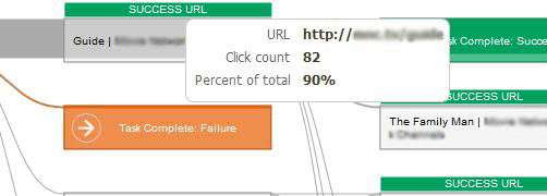
7. Clickstream
Clickstream is a way of collecting and analyzing data to track users’ actions. It usually takes place during users’ interaction with the product. It is also a method to get unbiased quantitative data about user behavior.
8. Diary Study
A Diary study is a way of a research method used to collect qualitative data about user behavior over time. It is usually designed for understanding long-term user behavior and experiences.

9. Card Sorting
Card sorting is a research method where participants label notes according to certain criteria. It helps designers structure content that is easy to navigate within the information architecture.

10. KPI — Key Performance Indicator
KPI is a way of monitoring or measuring progress towards a goal. Oxford’s Dictionary saysit is a quantifiable measure used to evaluate the success of an organization in meeting objectives. In other words, KPI is a way to show where the gaps are and where to put more attention. KPI's can be used at every level in an organization to keep track.

11. Mood Board
A mood board is a collection of features such as fonts, images, icons, and other UI elements. They help to define the artistic direction of a project. It should be also focused on meeting user needs and problem-solving.

12. Heat Map
It is a map that tells you what part of the webpage a user is more focused on. It uses a color scheme, ranging from warm colors, like red and blue at the cooler end of the color spectrum. The warmer areas say the areas where users are focusing on more.

13. Eye Tracking
Eye-tracking is the measurement of eye activity on a screen. It involves measuring either where the eye is focused or the motion of the eye as an individual view a web page. You can get information on what users look at most and in what order.

14. Fishbone Diagram
It is a diagram designed to visualize all the potential causes of a problem to discover the root cause. The head of the fish states a problem and bones along the spine represent categories of factors. When applied correctly, it ensures that you address the actual cause of the problem.

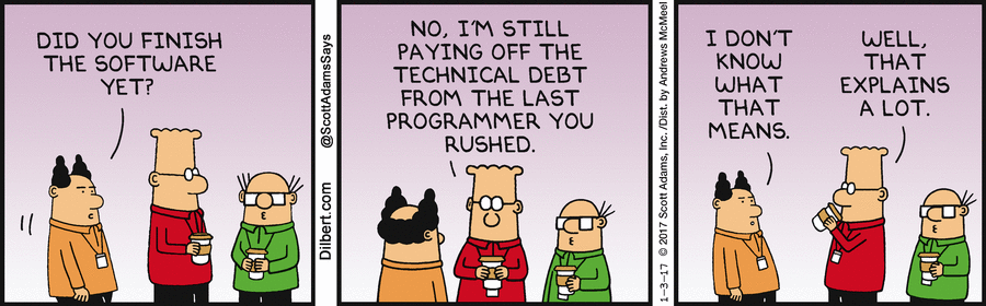
15. Tech debt
Technical debt or design debt is a cost of more rework caused by choosing an easy solution now. Instead of using a better approach that would take longer. Development teams, for example, would take shortcuts to deliver functioning products faster. Then later on they would work on it again to meet the standard quality.
Recommend
-
5
1. FintechFintech is the combination of the words “financial” and “technology.” It is about finance and technology coming together to offer innovative solutions o businesses.Since the...
-
9
1. Front-end VS. Back-endFrontend and backend are two of the most used terms in the tech industry.
-
5
20 Basic Color Related Terms You Need to Know As a UX/UI DesignerThe most common terms are explained in plain English.
-
4
7 Skills You Need To Thrive As A Web Designer In 2021Web design is an ever-evolving field. Those of us that have been in the industry a long time (i.e., six months plus) have seen the launch of more products, the establishment of more ideas,...
-
9
16 Quotes You Need to Read as UX Designer March 25, 2018
-
4
18 Essential Graphic Design Terms You Need to Know By Tamal Das Published 3 hours ago If you're just starting out in the world of gr...
-
10
Not FoundYou just hit a route that doesn't exist... the sadness.LoginRadius empowers businesses to deliver a delightful customer experience and win customer trust. Using the LoginRadius Identity...
-
8
35 Common Product Design Terms You Need to Know October 15, 2022
-
4
News » Topics »
-
6
Design 77 Web Design Terms You Need to Know (Web Design Glossary) By
About Joyk
Aggregate valuable and interesting links.
Joyk means Joy of geeK