

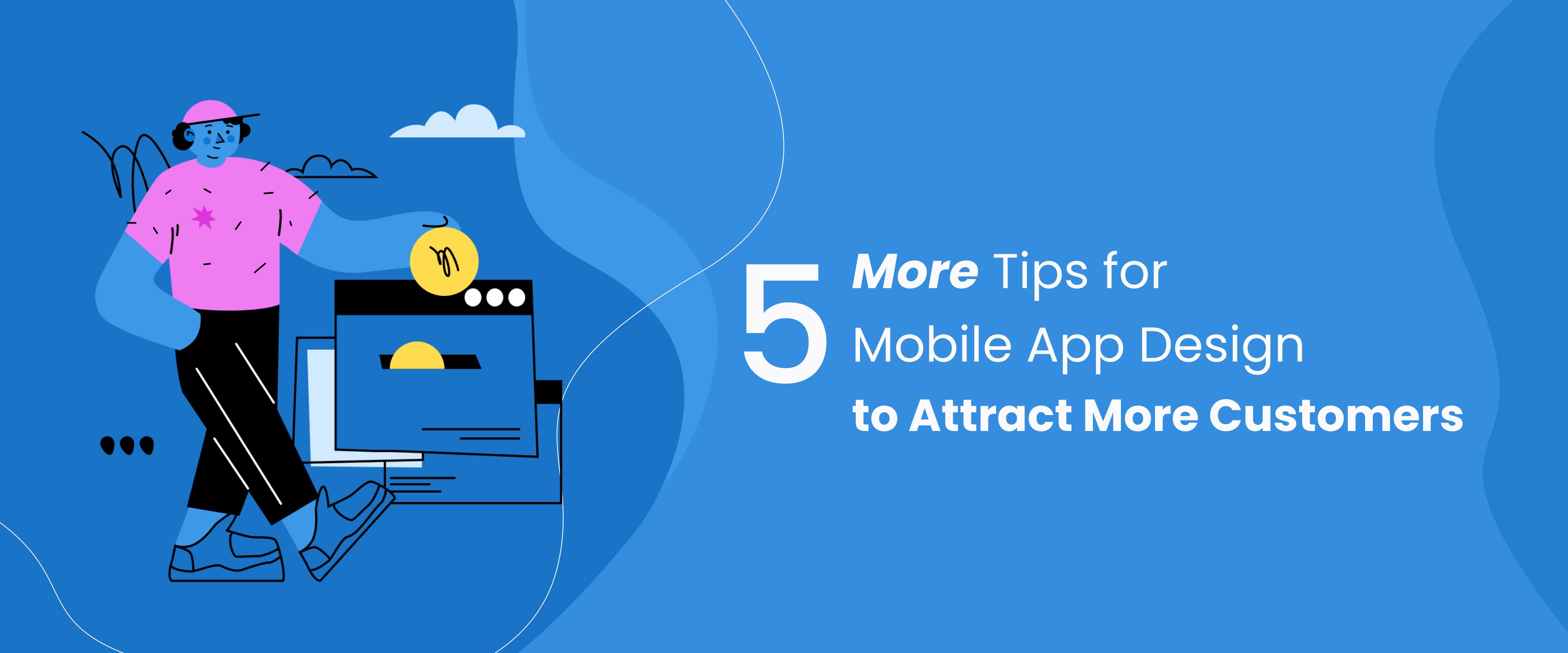
5 More Tips for Mobile App Design
source link: https://uxplanet.org/5-more-tips-for-mobile-app-design-956b2891de62
Go to the source link to view the article. You can view the picture content, updated content and better typesetting reading experience. If the link is broken, please click the button below to view the snapshot at that time.

5 More Tips for Mobile App Design
On How to Attract More Customers

Last time, we had shared 5 tips for designing mobile applications that are bound to attract customers. And we had promised to come back with 5 more tips. So, here we are, with 5 more tricks to gain your customers’ attention and trust.
Without wasting any more of your precious time, let’s get started!


1. Leave the graphic designer behind
One of the main problems why a mobile application looks great but leaves behind a poor user experience is because it has been designed by a graphic designer or a somebody who calls themselves a UX/UI designer but is actually a graphic designer in their mind.
And it’s not the fault of the designer who designed the application but of the community who fail to understand that the job role or the thought-processing of a graphic designer is not the same as that of a UX/UI designer.
While both have to work hard in their respective fields, the skills needed for both fields are different. One has to learn the skills of the other in order to understand their job.
So, if you are a graphic designer turned UX/UI designer or have hired somebody similar, the first thing you should request of your “graphic” designer is, “Please sit back, relax and do not interfere in my UX design. I’ll call you later when you’re needed.”
Yes, that’s exactly how it should be. A graphic designer tends to make things pretty. It’s not bad; it’s just that it’s not how a mobile application design works. In an application design. It’s always usability over aesthetics. So, use the logical mind all along, and at the end when you are brushing things up to make the interface look attractive, that is the best time to bring in the graphic designer.

2. Informational Hierarchy
When you are providing lots of information on a screen, you should make sure that everything is properly arranged in the order in which you would want your end-user to view the information or interact with the system. This is a way of guiding your customer through your application.
So, unless you would want your application to serve as a maze for the end-user, you should see to it that every element on the screens is arranged as per their importance and as per the user flow. And remember to label them properly.
Or else it would be like walking into the general store, and not having any signs to know which section is which.
Arranging and labelling elements in a thoughtful and meaningful way will help a user to find their way through the app easily, and find the necessary functionalities.

3. Test your application
Once you are done with planning and designing your application, create a prototype to make sure that the flow is correct, and that all the necessary screens have been created.
Creating a prototype has multiple advantages.
First, you get to confirm that the user flow is perfect and no screens are missing.
Secondly, you’ll have an impressive presentation to show your investors or your clients (if you’re a designer). Instead of showing static screens and explaining everything, you can give them a hands-on experience of your application in its (almost) basic stage.
Thirdly, prototypes are like stage 01 MVPs. You can use your prototype to allow your end-users to browse through the application. Then using their feedback and by generating heatmap of their interaction with the prototype, you can rework on certain areas of the application, if needed.
Testing an application is extremely important before releasing it in the market. It might either give you a hint into the success of your application or it might let you know the areas that need improvement.

4. Keep It Simple
Yes, whatever you do, keep your application simple and to the point.
There are some applications that have only 4–5 screens because that’s enough to serve the purpose.
An application doesn’t need to be large, it needs to be useful.
And if it can be done in the minimal number of screens and with the minimal number of elements, then nothing is better than that. The simpler you make it, the easier it will be for your customers to use it.

5. Use meaningful aesthetics
Now we come to the point that people usually think of when they hear the word “attractive”. Yes, the aesthetics! Finally!!
The aesthetics depend on a lot of things like the industry, the target market, demographics of your target audience and, something which most designers miss, on the personality of your brand.
Like every human, every brand has its own unique personality. This is reflected in the different areas of customer experience, right from the marketing campaigns to the email that customer receives after signing up or as a follow up.
Along with the above factors, there are a few more things to consider. These include, but are not restricted to, following the trend and being interactive.
Now, following the trend is a personal choice. Maybe your application serves a purpose that is better presented in retro style. So be it!
But what you should do is have a clean interface with good contrast. Ultimately, readability and intuitiveness are the prime features that decide the initial fate of an application.
Want to put a cherry on the cake?
Include micro-interactions.
Micro-interactions refer to the tiny animations that happen when you tap on a CTA or move to another screen. These animations have multiple advantages:
- They make the interaction with the application interesting
- They acknowledge the action taken by the user
- They make the user experience memorable
- They can make your application unique if you opt for custom animations
So, when you’re planning the look and feel of your mobile application, make a checklist and ensure that all these factors are taken into account.
So, that’s it! We have covered 10 basic points that can help you make your mobile application a successful one. Hope these help!!
The illustrations used in this post are a generous contribution of Craftwork to the design community. Thank you, Craftwork!
About the author:
Sudeshna Adhikary is a UX researcher at Design Studio. Creativity is her middle name. Exploring, learning, believing in super-human powers, talking and eating are her favourite things to do.
Recommend
-
9
As of now, just over 50% of world wide web traffic is being generated by mobile devi...
-
14
With iOS 14, mobile app SDKs are now more valuable Press Release Mitsubishi Group Invests Additional $120M in a Liquidity Group Fund – Mars Growth, as it Ramps Up Growth Financing in ASIA PAC Tech Companies, Re...
-
6
Mobile SEO is the process of optimizing your website to make sure your site looks incredible, functional, and legible on mobile devices. When you perform mobile SEO, you provide a positive experience for users on phones, tablets, laptops, des...
-
4
8 Simple Tips for Using an API in a Mobile AppAn API (application programming interface) is the heart of any application development. It allows software programs t...
-
12
Top 5 Tips for Optimizing Your Mobile App to Get More Users Consumers use smartphones for a plethora of day-to-day tasks, including shopping....
-
5
7 Tips on Making a Popular Mobile AppThe foundations of app love behind UX/UI designSmart...
-
5
...
-
9
Mobile Design Systems – Tips and Examples
-
4
SmartData Collective >
-
9
About Joyk
Aggregate valuable and interesting links.
Joyk means Joy of geeK