

Replicating Bill Details UI in Xamarin Forms
source link: https://askxammy.com/replicating-bill-details-ui-in-xamarin-forms/
Go to the source link to view the article. You can view the picture content, updated content and better typesetting reading experience. If the link is broken, please click the button below to view the snapshot at that time.
Replicating Bill Details UI in Xamarin Forms
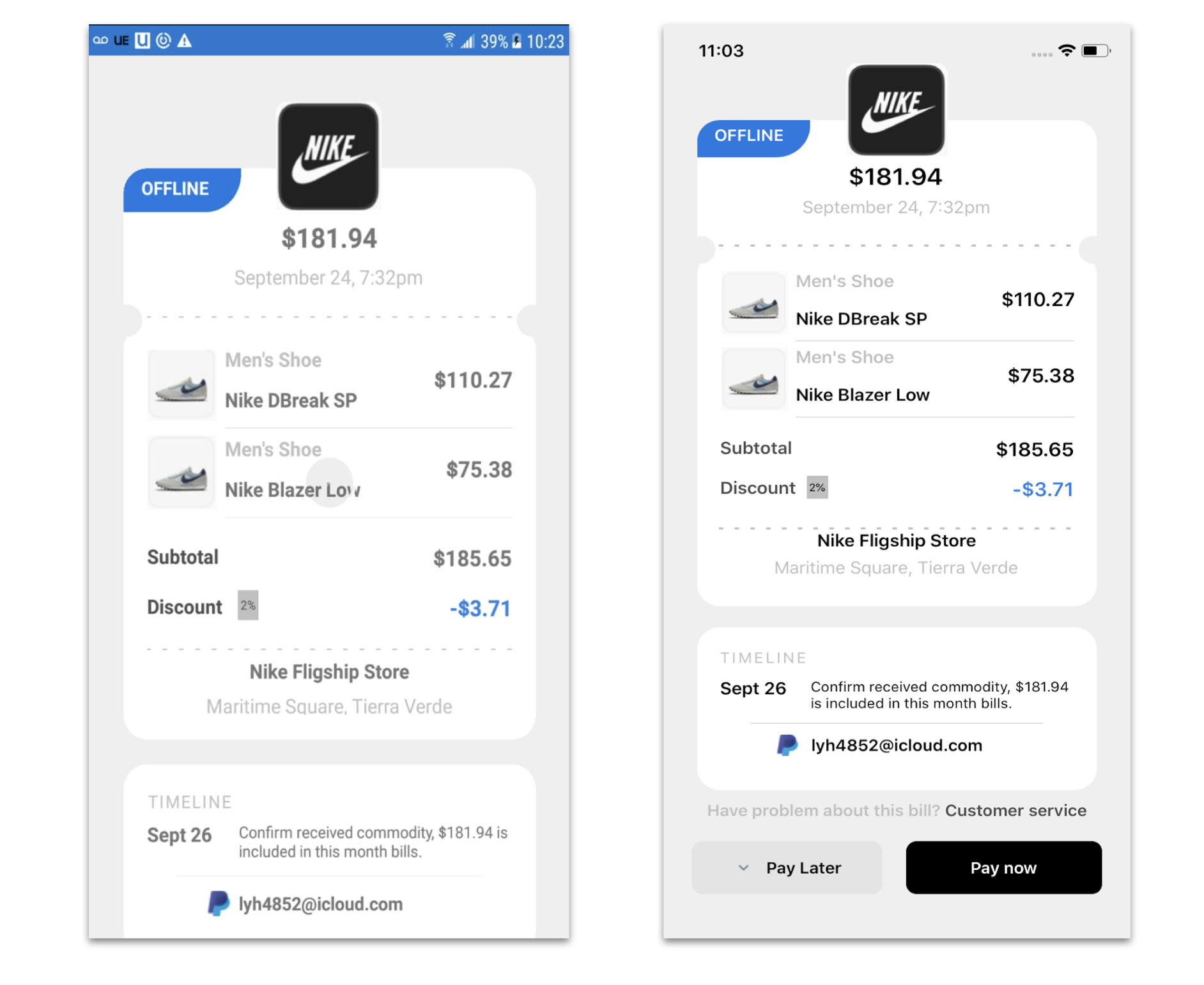
 In this case we are going to replicate a Bill Details UI Ap obtained from Dribble. You can check the design here!
 Before starting, to get the best out of the post, I’ll leave you some instructional notes so that you have a better experience reproducing the UI:
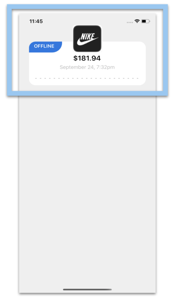
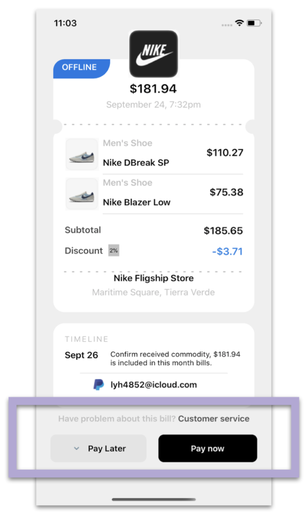
 At the beginning, you will see an image with the original UI where you will see divided into blocks as we’ll be working on each part of the design. Each block presents the image with the design explicitly that we’ll be working on that block, they are highlighted in a box. In each of the code blocks, you can see a comment that says: “Here add the code that is being explained in the next block“. To keep you as focused as possible, this part indicates to you that the next block code explanation goes right where the comment line is added.
Let’s start!
Let’s divide the original design into blocks
To better understand, I have divided the original design into blocks, which are listed in the order in which we will be reproducing each one, these are:


<!-- Main Structure--> <Grid RowSpacing="0" RowDefinitions="Auto,Auto,Auto,Auto,Auto"> <!-- Here add the code that is being explained in this block--> </Grid>
Once the main structure is defined, let’s start! 
To replicate the first block we’ll be dividing into three parts:
 Frame with price information
 Main image
 Indicator Bar
Starting with the Frame with price information, we will be exploring the Shape and the Styles! Let’s start with the .xaml implementation:
<!-- Frame with price information--> <Frame Grid.Row="0" Margin="30,90,30,0" HeightRequest="100" > <Grid RowDefinitions="Auto,Auto,Auto" HorizontalOptions="Center"> <Label Grid.Row="0" Text="$181.94" Style="{StaticResource MainAmount}" Margin="0,20,0,0"/> <Label Grid.Row="1" Text="September 24, 7:32pm" HorizontalOptions="Center" Style="{StaticResource SecundaryText}"/> <Line Grid.Row="2" Style="{StaticResource DivisionLine}" /> </Grid> </Frame>
And then, as we see below, let’s create the three styles that will be applying to our controls: MainAmount, SecundaryText, and DivisionLine.
<Style x:Key="MainAmount" TargetType="Label"> <Setter Property="FontAttributes" Value="Bold"/> <Setter Property="FontSize" Value="22"/> <Setter Property="HorizontalOptions" Value="Center"/> </Style> <Style x:Key="SecundaryText" TargetType="Label"> <Setter Property="TextColor" Value="Silver"/> <Setter Property="FontSize" Value="16"/> </Style> <Style x:Key="DivisionLine" TargetType="Line"> <Setter Property="TranslationY" Value="{d:OnPlatform Android='15', iOS='20'}"/> <Setter Property="VerticalOptions" Value="Center"/> <Setter Property="HorizontalOptions" Value="Center"/> <Setter Property="StrokeDashArray" Value="1,6"/> <Setter Property="X2" Value="320"/> <Setter Property="StrokeLineCap" Value="Square"/> <Setter Property="Stroke" Value="Silver"/> <Setter Property="StrokeThickness" Value="2"/> </Style>
Now, let’s continue with the Main image
<!-- Main image--> <Image Grid.Row="0" Source="Nike" HorizontalOptions="Center" TranslationY="-35" HeightRequest="90" WidthRequest="90"/>
And finally, let’s add the indicator Bar. To do it, I used a PancakeVew! 
<!-- Indicator Bar--> <PanCake:PancakeView Grid.Row="0" CornerRadius="20,0,0,30" TranslationY="90" TranslationX="30" HorizontalOptions="Start" VerticalOptions="Start" WidthRequest="100" HeightRequest="35"> <Grid RowDefinitions="*" BackgroundColor="#1277e3" Padding="15,5"> <Label Grid.Row="0" Text="OFFLINE" FontAttributes="Bold" TextColor="White" FontSize="15"/> </Grid> </PanCake:PancakeView>

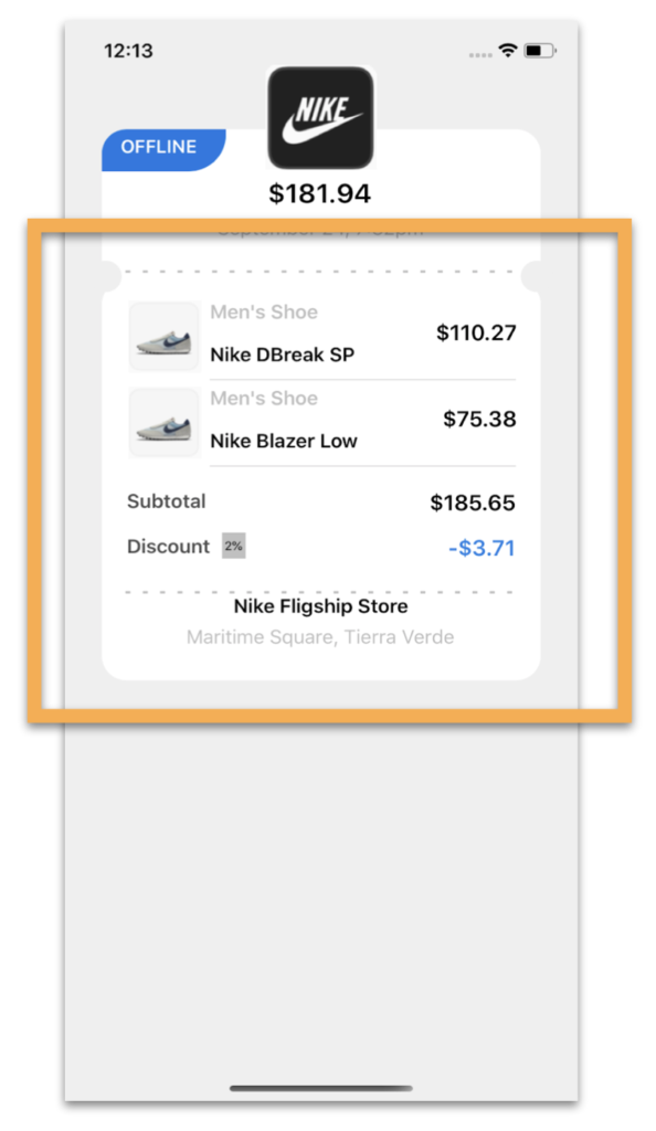
 Because Shapes help us give the “Invoice” look we need! To get the shape of the rounded edges where the Frames meet, I created two circles and played with the Translation properties. Let’s see!
To replicate, let’s divide into parts: Product List, Amount of products and the Rounded Border (With Shapes ). The first one is the Product list implementation:
<!-- 2. Details & Total--> <Frame Grid.Row="1" Margin="30,-15,30,0" HeightRequest="292"> <Grid RowDefinitions="Auto,Auto,Auto,Auto,Auto,Auto,Auto" ColumnDefinitions="*,*"> <!-- Product list--> <CollectionView Grid.Row="1" Grid.Column="0" Margin="0,-15,0,12" Grid.ColumnSpan="2" VerticalOptions="StartAndExpand" VerticalScrollBarVisibility="Never" HeightRequest="145" ItemsSource="{Binding items}"> <CollectionView.ItemTemplate> <DataTemplate> <Grid RowDefinitions="Auto,Auto,Auto" ColumnDefinitions="Auto,*,Auto"> <Image Grid.Row="0" Grid.Column="0" Grid.RowSpan="2" HeightRequest="60" WidthRequest="60" Source="{Binding Picture}" Margin="0,5,0,0"/> <Label Grid.Row="0" Grid.Column="1" Text="{Binding Name}" Margin="0,5,0,0" FontAttributes="Bold" FontSize="16" TextColor="Silver"/> <Label Grid.Row="1" Grid.Column="1" Text="{Binding Description}" FontAttributes="Bold" FontSize="16" VerticalOptions="End" Margin="0,0,0,5"/> <Label Grid.Row="0" Grid.Column="2" Grid.RowSpan="2" Text="{Binding Price}" VerticalOptions="Center" FontSize="18" FontAttributes="Bold"/> <Line Grid.Row="2" Grid.Column="1" Grid.ColumnSpan="2" X1="260" StrokeThickness="0.5" Stroke="Silver"/> </Grid> </DataTemplate> </CollectionView.ItemTemplate> </CollectionView> <!-- Here add the code that is being explained in the next step--> </Grid> </Frame>
The second one is the Amount of products part. Keep in mind that this part must the added in the block code previously added, exactly where says: “<!– Here add the code that is being explained in the next step–>”
<!-- Amount of products -->
<Label Grid.Row="2" Grid.Column="0" Text="Subtotal" FontSize="16" TextColor="#4f4f4f" FontAttributes="Bold" Margin="0,0,0,10"/> <Label Grid.Row="3" Grid.Column="0" Text="Discount" FontSize="16" TextColor="#4f4f4f" FontAttributes="Bold"/> <Label Grid.Row="3" Grid.Column="0" Text="2%" BackgroundColor="Silver" Padding="2" FontSize="10" VerticalTextAlignment="Center" HorizontalOptions="Center" TranslationX="10" TranslationY="-2"/> <Label Grid.Row="2" Grid.Column="1" Text="$185.65" FontSize="18" FontAttributes="Bold" Margin="0,0,0,10" HorizontalOptions="End"/> <Label Grid.Row="3" Grid.Column="1" Text="-$3.71" FontSize="18" FontAttributes="Bold" TextColor="#2880e5" HorizontalOptions="End"/>
<!-- Line Division--> <Line Grid.Row="4" Grid.Column="0" Grid.ColumnSpan="2" Margin="0,0,0,15" Style="{StaticResource DivisionLine}" /> <Label Grid.Row="5" Grid.Column="0" Grid.ColumnSpan="2" Text="Nike Fligship Store" FontAttributes="Bold" FontSize="16" HorizontalOptions="Center"/> <Label Grid.Row="6" Grid.Column="0" Grid.ColumnSpan="2" Text="Maritime Square, Tierra Verde" HorizontalOptions="Center" Style="{StaticResource SecundaryText}"/>
And finally, the Rounded Corners with Shapes !
<!-- Rounded borders--> <Ellipse Grid.Row="1" HorizontalOptions="Start" TranslationY="-322" TranslationX="20" Fill="#efefef" VerticalOptions="End" HeightRequest="26" WidthRequest="26" StrokeThickness="0"/> <Ellipse Grid.Row="1" HorizontalOptions="End" TranslationY="-322" TranslationX="-20" Fill="#efefef" VerticalOptions="End" HeightRequest="26" WidthRequest="26" StrokeThickness="0"/>

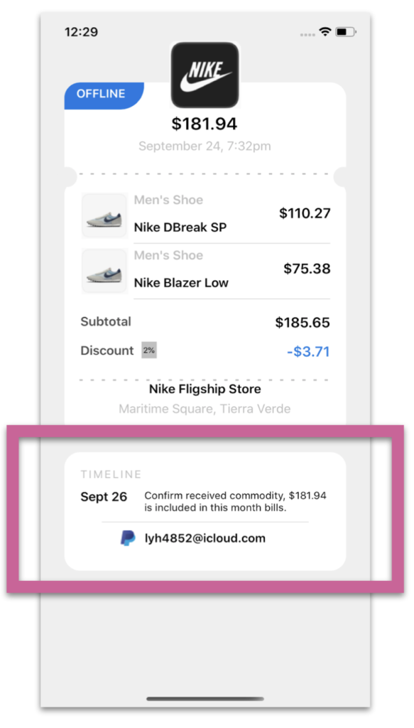
In the third block, we will develop the timeline of our App! .
<!-- Timeline--> <Frame Grid.Row="2" Margin="30,20,30,0" HeightRequest="113"> <Grid RowDefinitions="Auto,Auto,Auto,Auto" ColumnDefinitions="Auto,*"> <Label Grid.Row="0" Grid.Column="0" Text="TIMELINE" TextColor="Silver" FontSize="14" CharacterSpacing="2"/> <Label Grid.Row="1" Grid.Column="0" Text="Sept 26" Padding="0,0,15,0" FontSize="16" FontAttributes="Bold" /> <Label Grid.Row="1" Grid.Column="1" Text="Confirm received commodity, $181.94 is included in this month bills." FontSize="13" LineBreakMode="WordWrap"/> <Line Grid.Row="2" Grid.ColumnSpan="2" HorizontalOptions="CenterAndExpand" Margin="0,5,0,0" X1="260" StrokeThickness="0.5" Stroke="Silver"/> <Image Grid.Row="3" Grid.Column="0" HorizontalOptions="End" Source="LogoPaypal" TranslationY="3"/> <Label Grid.Row="3" Grid.Column="1" Padding="0,5,0,0" HorizontalOptions="Start" Text="[email protected]" HorizontalTextAlignment="Center" FontSize="15" FontAttributes="Bold"/> </Grid> </Frame>

Finally, let’s add the Payment buttons block. It’s important to see FormattedText, it helps us to create a single label with different characteristics. . .
<!-- Paymnet buttons--> <Label Grid.Row="3" HorizontalTextAlignment="Center" Margin="20,10,20,0" > <Label.FormattedText> <FormattedString> <Span Text="Have problem about this bill?" FontSize="15" FontAttributes="Bold" TextColor="Silver"/> <Span Text=" Customer service" TextColor="#4e4e4e" FontAttributes="Bold" FontSize="15"/> </FormattedString> </Label.FormattedText> </Label> <Grid Grid.Row="4" ColumnDefinitions="*,*" Padding="15"> <Button Grid.Column="0" ImageSource="Arrow" Text="Pay Later" TextColor="Black" FontAttributes="Bold" BackgroundColor="#e4e4e4" CornerRadius="10" HeightRequest="50" Margin="10,5,10,20"/> <Button Grid.Column="1" Text="Pay now" TextColor="White" FontAttributes="Bold" BackgroundColor="Black" CornerRadius="10" Margin="5,5,10,20" HeightRequest="50"/> </Grid>
.Tagged AskXammy, Replicating UI, UI, Xamarin, Xamarin Forms
Recommend
About Joyk
Aggregate valuable and interesting links.
Joyk means Joy of geeK