
Multi-step forms vs. single-step forms
source link: https://www.arengu.com/blog/multi-step-forms-vs-single-step-forms
Go to the source link to view the article. You can view the picture content, updated content and better typesetting reading experience. If the link is broken, please click the button below to view the snapshot at that time.

If you run an online platform —whether it is a social network, an e-commerce or a subscription media site—, you know asking for data is crucial. But of course, users may feel overwhelmed when they see a long form to fulfill.
So, what's the best option to display all your fields? Single-step forms or multi-step forms? Today, we take a look at the two approaches and analyze the pros and cons of each. Keep reading!
Advantages of single-step forms
Do you remember the rule everybody has mentioned at least once in one’s lifetime: Less is more? There can be many fields where you can’t apply it, but it’s definitely right when it’s about forms.
Frictionless signup with complex actions behind
Why having several steps on a form when you can have just one? Displaying a single-step form does not mean you're getting unqualified leads. The truth is, you can execute many actions to verify and qualify users, without having hurt your form's conversion rate.
With Arengu, you can create and interconnect actions that will be executed on the back of your form. You can integrate your form with other providers to enrich the data you get, verify email addresses or automate actions based on the logic you set. All this, by simply asking for one email address.
As mentioned before, depending on the type and the quantity of information you want to ask for, you should choose accordingly. Not every online business needs the same kind of information. So, even if multi-step forms usually present higher conversions, this doesn't have to be the case for everyone. Let's see it with an example.
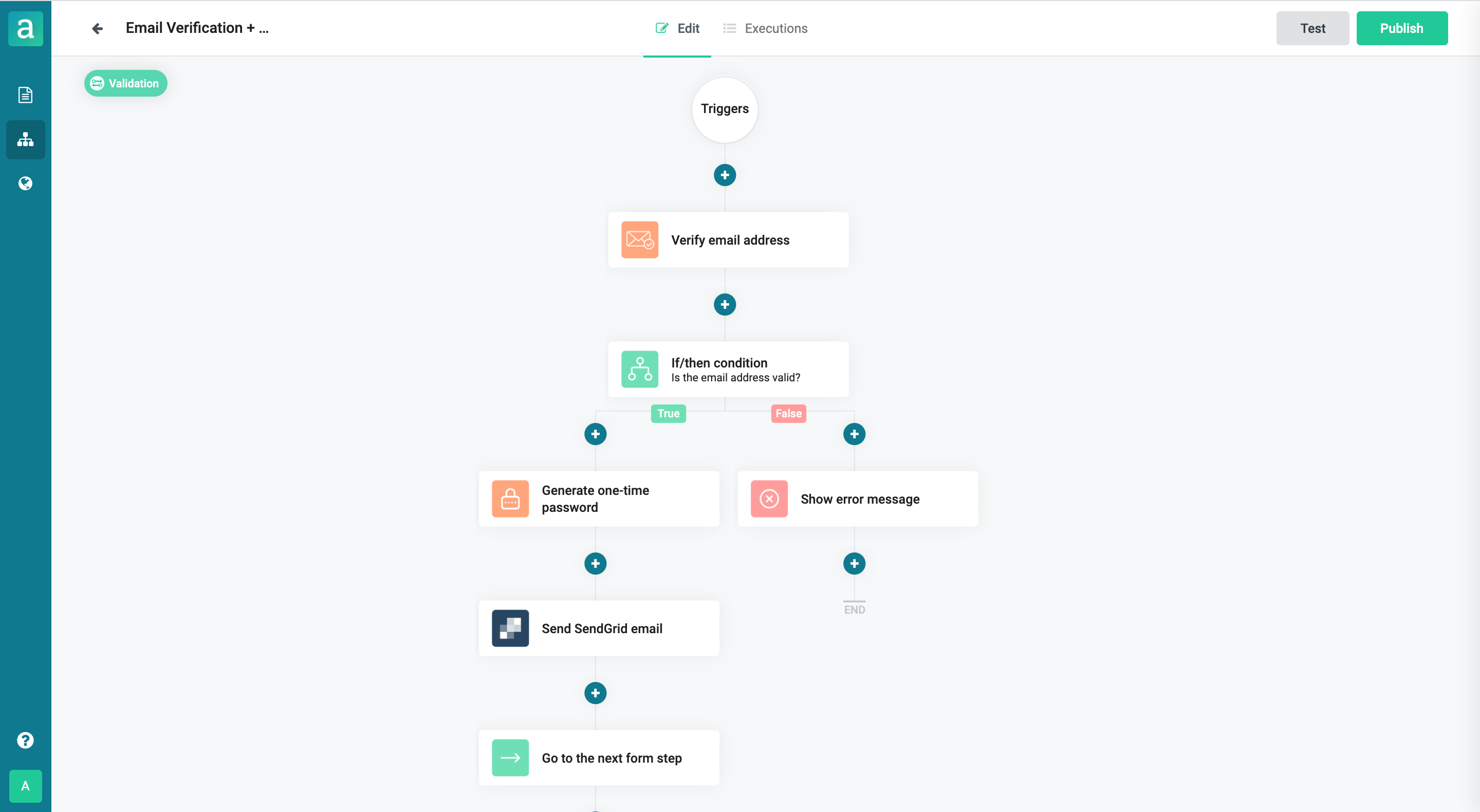
This single-step form only asks for the user email. It is a one step form with just one field.

Yet, behind it, there is an email verification action that filters spam accounts, temporary emails and email aliases, to ensure an optimal lead quality. Plus, there is an extra email verification action, executed with a one-time password, that is sent to the user's email address.

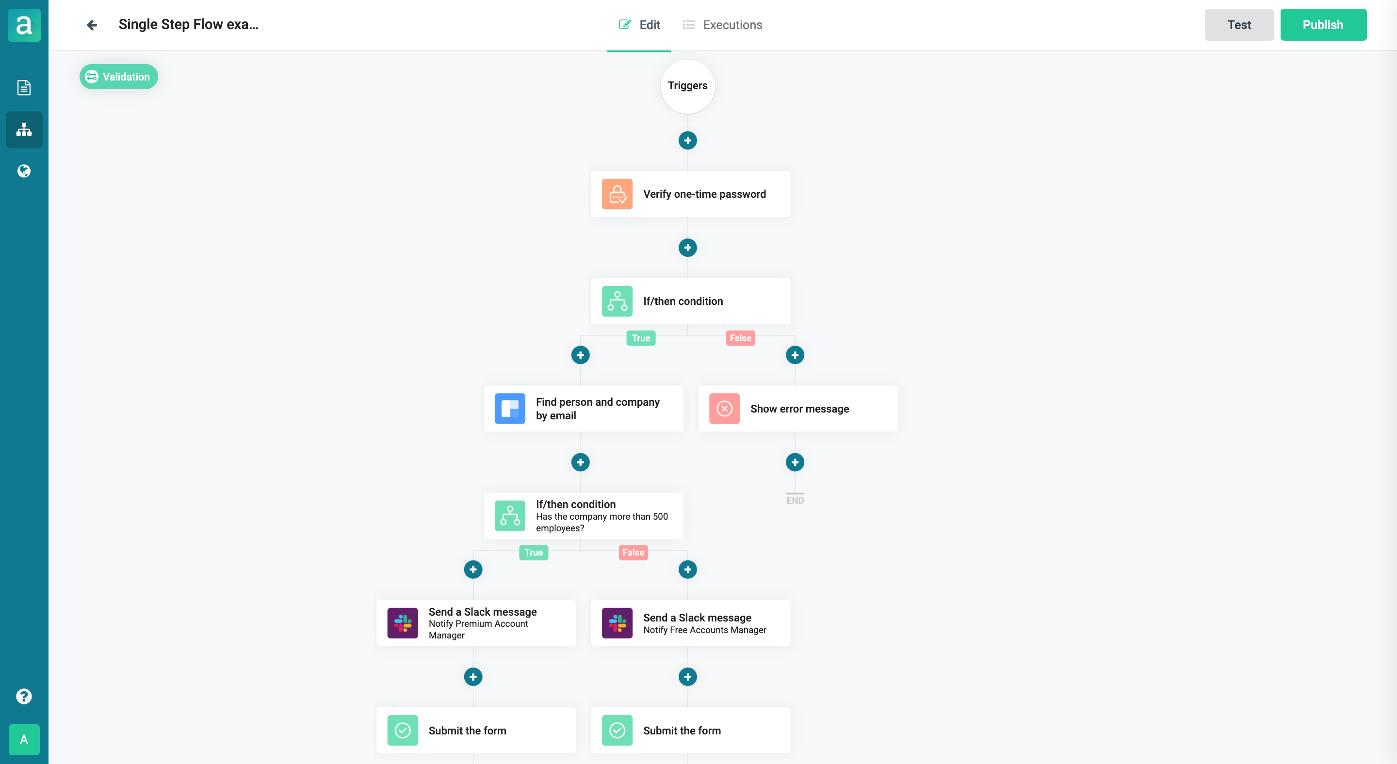
After this first flow, the user introduces the provided one-time password and a second flow is executed. Here, the one-time password is verified. When correct, a data enrichment action is executed. This action will tell us the number of employees of the company, simply out of the email address of our user. Depending on the result, different notifications are sent to different team members.

As you can see, even if a form contains few fields, this doesn't mean it is a simple form.
Some forms that actually convert better when they include just one step are contact forms, support forms, feedback forms or registrations for events.
When in doubt, you can always test your form by using A/B tests and see which option is better for you.
Advantages of multi-step forms: Why do multi-step forms convert that much?
Multi-step forms are said to convert up to 300% more. But, why?
These forms present better conversion when the information to be asked tend to be long. The process can become tedious, and that's why splitting the whole form into different pieces may return better results.
If your business actually needs to ask for several pieces of information, these are some of the advantages of using multi-step forms.
Multi-step forms reduce psychological friction
Users can answer many questions across the multi-step forms, but they won’t feel overwhelmed compared to the feeling of completing a single step long one.
Elements like progress bars makeusers feel like completing the form. It seems like a task to complete. And our brain is not comfortable with unfinished work. So that’s why they feel committed to filling since the very first moment.
Several steps work better with committed users
Users will be more willing to hear what you want to communicate. By filling out your form, they are showing their interest. So when you contact clients and possible clients, the chances of being heard increases. Take into account that right now they think you have the helpful information they need. So they won’t let it go.
This works even better if you add explicit messages of these kinds of actions on the last step of the form, e.g. ‘we’re working on your quotation, how can we send it to you?’. This way, they will feel keen to give this information to you, and they will be expecting your email or your call.
Tips to improve a single-step form or a multi-step form
Whether you prefer to use just one step or several steps, consider these tips to improve your conversion rates.
Ask advantageous questions for both
Think about what kind of information you need and what type of information your users might be willing to share. There can be some general issues, concerning questions users don't like to ask. One of them, for instance, is the phone number.
Many users abandon a form when they are asked for their phone number. The case is even more severe if this field is mandatory. Even though phone numbers may be asked as a verification method, users tend to think it will be used to spam them with information about the company.
Of course, you don’t want your users to feel this way, do you? So be careful with these types of questions. Ask them things they might be willing to answer. It’s even better whether these questions are beneficial to them.
For example, if you want to find the best option for your next trip, you will probably be happy to introduce the dates when you want to travel, as they are essential to look for the info you want. But your feeling might not be the same if they ask for your phone number.
Never forget the price
When dealing with payment forms, users want to know the costs of the products they are about to acquire. Many times landing pages don’t show them, and they are difficult to find. It can even appear as a CTA stating: ‘Ask us.’ Users don’t want to waste their time, so most of the time they just abandon the landing page. Showcasing your price can mean a huge difference in conversion rates.
Smart forms are the answer. In Arengu, we help your business to create the best forms to generate leads and convert. Are you ready to generate more leads, enrich your data and automate your workflows with the Arengu smart forms? Try it for free now or schedule a demo with our team to know everything about Arengu!
Recommend
About Joyk
Aggregate valuable and interesting links.
Joyk means Joy of geeK