

Sharpnado.Tabs 2.0: Xamarin.Forms tabs receive a Badge of honor
source link: https://www.sharpnado.com/sharpnado-tabs-2-0/
Go to the source link to view the article. You can view the picture content, updated content and better typesetting reading experience. If the link is broken, please click the button below to view the snapshot at that time.
 https://github.com/roubachof/Sharpnado.Tabs

- Fully customizable
- Underlined tabs, bottom tabs, Segmented control, scrollable tabs
- Badge on tabs
- Component oriented architecture
- Layout your tabs and ViewSwitcher as you want
- Shadows included in TabHost
- Bindable
What's really new
- A
BadgeViewwith a lot of customization - Full
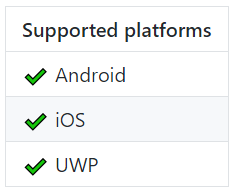
UWPsupport! - Bindable layout with
ItemsSourceandItemTemplate
End of an area
When I started created open source components, I got lazy.
I created only one big library called Sharpnado.Presentation.Forms.
I started created the Xamarin.Forms components in it.
It started with HorizontalListView, Tabs, TaskLoaderView and a very simple MaterialFrame.
Quickly, I figured it was a bad idea for several reasons:
1. Bad visibility for your components
Each component was a bit dissolved in the idea of a toolbox.
For example I wanted to highlight my favorite component, the TaskLoaderView, but felt it was kind of struggling with others having better love.
2. Bad for modularity
Each developer should just use the components he needs.
3. Bad for development
The Silly! App repo is the sample app for all sharpnado's components, but it's also my main development solution.
Since the Sharpnado.Presentation.Forms started to reference others sharpnado's packages like Shadows or MaterialFrame, I coulnd't add them as submodule in the solution.
To sum-up
Now that Tabs is out of the Sharpnado.Presentation.Forms project, the project now only contains source code for the HorizontalListView.
Utimately, it should also have its own repo and then Sharpnado.Presentation.Forms should just become a gateway to the others nugets and maybe also a fat nuget just regrouping all the nugets as dependencies.
BadgeView (Chips)
You can add a badge on any UnderlinedTabItem and BottomTabItem.
By default the BadgeView is placed in the top right corner of the TabItem by setting HorizontalOptions=End and VerticalOptions=Start.
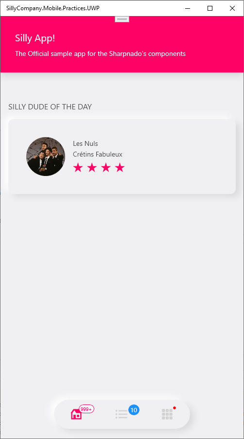
Badges on BottomTabItem
SillyBottomTabsPage.xml from the Silly! app
<!-- Example of segmented tab bar (rounded floating tabs) -->
<tabs:TabHostView Grid.Row="2"
WidthRequest="280"
HeightRequest="60"
Margin="15"
HorizontalOptions="Center"
VerticalOptions="Start"
CornerRadius="30"
IsSegmented="True"
Shades="{sh:NeumorphismShades}"
TabType="Fixed"
SelectedIndex="{Binding Source={x:Reference Switcher}, Path=SelectedIndex, Mode=TwoWay}">
<tabs:TabHostView.Tabs>
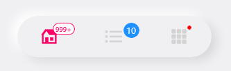
<tabs:BottomTabItem IconImageSource="house_96.png" Label="{localization:Translate Tabs_Home}">
<tabs:BottomTabItem.Badge>
<tabs:BadgeView BackgroundColor="White"
BorderColor="{StaticResource Accent}"
TextColor="{StaticResource Accent}"
Text="999+" />
</tabs:BottomTabItem.Badge>
</tabs:BottomTabItem>
<tabs:BottomTabItem IconImageSource="list_96.png" Label="{localization:Translate Tabs_List}">
<tabs:BottomTabItem.Badge>
<tabs:BadgeView BackgroundColor="DodgerBlue"
BadgePadding="4,2"
TextSize="13"
Text="{Binding ListPageViewModel.SillyCount}" />
</tabs:BottomTabItem.Badge>
</tabs:BottomTabItem>
<tabs:BottomTabItem IconImageSource="grid_view_96.png" Label="{localization:Translate Tabs_Grid}">
<tabs:BottomTabItem.Badge>
<tabs:BadgeView Margin="20,5"
BackgroundColor="Red"
ShowIndicator="True"
TextSize="14"
Text="3" />
</tabs:BottomTabItem.Badge>
</tabs:BottomTabItem>
</tabs:TabHostView.Tabs>
</tabs:TabHostView>
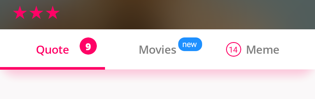
Badges on UnderlinedTabItem
SillyDudePage.xml from the Silly! app
<tabs:TabHostView x:Name="TabHost"
                    Grid.Row="4"
                    Margin="-16,0,-16,30"
                    BackgroundColor="{DynamicResource DynamicBottomBarBackground}"
                    CornerRadius="20"
                    Shades="{DynamicResource DynamicTabsShadow}"
                    TabType="Fixed"
                    SelectedIndex="{Binding Source={x:Reference Switcher}, Path=SelectedIndex, Mode=TwoWay}">
    <tabs:TabHostView.Tabs>
        <tabs:UnderlinedTabItem Style="{StaticResource SegmentedTabStyle}" Label="Quote">
            <tabs:UnderlinedTabItem.Badge>
                <tabs:BadgeView BackgroundColor="{StaticResource Accent}"
                                BadgePadding="6,2"
                                FontFamily="{StaticResource FontExtraBold}"
                                TextSize="12"
                                Text="9" />
            </tabs:UnderlinedTabItem.Badge>
        </tabs:UnderlinedTabItem>
        <tabs:UnderlinedTabItem Style="{StaticResource SegmentedTabStyle}" Label="Movies">
            <tabs:UnderlinedTabItem.Badge>
                <tabs:BadgeView BackgroundColor="DodgerBlue"
                                BadgePadding="6,1,6,2"
                                Text="new" />
            </tabs:UnderlinedTabItem.Badge>
        </tabs:UnderlinedTabItem>
        <tabs:UnderlinedTabItem Style="{StaticResource SegmentedTabStyle}" Label="Meme">
            <tabs:UnderlinedTabItem.Badge>
                <tabs:BadgeView Margin="20,0"
                                HorizontalOptions="Start"
                                VerticalOptions="Center"
                                BackgroundColor="White"
                                BorderColor="{StaticResource Accent}"
                                TextColor="{StaticResource Accent}"
                                Text="14" />
            </tabs:UnderlinedTabItem.Badge>
        </tabs:UnderlinedTabItem>
    </tabs:TabHostView.Tabs>
    </tabs:TabHostView>
Properties
Property
Description
Default
Text
Sets the text for the badge text.
If it's an integer, the badge will be hidden if the value is 0.
string.Empty
TextSize
Sets the text size used for the badge text.
10
TextColor
Sets the text color used for the badge text.
Color.White
FontFamily
Sets the font family used for the badge text.
null
BadgePadding
Precisely adjust inner text margin.
new Thickness(4, 2)
ShowIndicator
Shows a small dot instead of the babdge.
false
BackgroundColor
Sets the background for the badge.
Color.Red
BorderColor
Sets a border color for the badge.
Transparent
Margin
Sets a precise margin for the badge.
10
HorizontalOptions
Sets the horizontal location of the badge.
LayoutOptions.End
VerticalOptions
Sets the vertical location of the badge.
LayoutOptions.Start
Recommend
About Joyk
Aggregate valuable and interesting links.
Joyk means Joy of geeK