

Stupid Swift Tricks #7
source link: http://www.wooji-juice.com/blog/stupid-swift-tricks-7-user-guide.html
Go to the source link to view the article. You can view the picture content, updated content and better typesetting reading experience. If the link is broken, please click the button below to view the snapshot at that time.
Stupid Swift Tricks #7
Writing a User Guide In It
There’s a school of thought that says iOS apps shouldn’t have user guides, because they should be simple enough not to require them. This is a pretty good rule of thumb for many consumer apps, but for Pro apps like Ferrite or Hokusai it breaks down, because if you simplified them enough that a user guide was never required, they would no longer be Pro apps.
Of course, this isn’t an excuse for neglecting the user experience. You should still try to make an app as clear and easy to use as possible — apart from anything else, it’s well-known that many people will never read the user guide even if you make one.
But I believe it’s good practice to make a thorough user guide for Pro apps, all the same. Apart from anything else, I often use it to guide my thoughts on design during the development of an app. I’ll write a rough draft of an app’s user guide while I’m prototyping it: partly as a reference for myself on the design decisions I’ve made, but also because if a particular design is too complicated or confusing to explain concisely in the user guide, it’s probably too complicated or confusing to ship.
My workflow on the user guides I’ve made to date has been pretty straightforward: I start out writing the guide as Markdown text, and maintain it that way during development. At some point, the user guide needs to go into the app for real, and when I get there, I render it to a static HTML file.
Then I’ll add additional HTML for elements that don’t have Markdown equivalents, apply CSS styling, and embed it in the app, where it gets displayed in a WebKit WKWebView. From that point on, the user guides have been maintained by hand-editing the HTML.
In my apps, I do have a few “replacement tokens” that get substituted when you open the User Guide — for example, ${device} appears at various points in the HTML, and I have code that automatically replaces it with “iPhone” or “iPad” depending on the device you’re reading it on. I also have a command-line tool that exports a generalised (iPhone/iPad-agnostic) version as a single-file HTML document, which I also make into a .PDF, and these get uploaded to the support site when a new version is released.
Ongoing Maintenance
Hand-editing HTML is far from ideal, but with the bulk of the work on the user guide already done, the changes required are usually fairly limited, and this has kept it workable — up until now.
With iOS 13, things started to get a bit more complicated. For example, in Ferrite, the UI is slightly different between iOS 12 and iOS 13, requiring chunks of the user guide to be swapped in or out depending on the OS — and in the print/website version, it needs to include both versions, marked with appropriate headings.
On iOS 13 the apps also use SF Symbols and I wanted to show those in the guide to help people recognise the various buttons. This is not straightforward, because even though SF Symbols seem to be implemented as a font behind-the-scenes, they’re only available using UIKit calls — you can’t embed them in HTML. So, I had to implement a workaround where the user guide refers to images with special “sfsymbols://” URLs that get intercepted by the app and rendered as appropriate.
This makes the user guide harder to maintain, especially as it needs to still look correct on iOS 12 devices. And in print/on the website, where SF Symbols aren’t available — not just from a technical standpoint (which could probably be worked around) but also because Apple’s license on SF Symbols doesn’t allow their use outside of apps — the symbols need to be omitted in a way that still looks clear and readable.
I came up with solutions to these issues, mostly based around the dubious use of CSS selectors, but it stretched things close to breaking point: it worked, but only just. I wanted to add new features to the User Guides — and with Mac Catalyst turning up, and with me investigating the possibility of Mac versions of some of my apps, it was clear that I needed to move away from hand-maintaining HTML toward a more robust solution.
Templating
The obvious way to handle this kind of complexity is by using some kind of specialised markup. Markdown itself is a great way to write static text with formatting — it’s easily readable by humans and there are well-established libraries for turning it into HTML for machines — so it might seem tempting to revert to maintaining the user guide in Markdown, with some automated process to turn it into HTML on-demand.
However, what we really need is something more… programmery.footnote 1
It’s because we need to…
- Swap parts in and out between devices/OSes (if-then-else statements).
- Build lists and loop over them (for-in) to create the Table of Contents, keyboard shortcuts list, and so on.
- Make custom macros/shortcuts, so we can write something like Press {Button: delete} and get a button with the appropriate rendering — for example, the trashcan symbol where available, and “Delete” text where not (i.e. we need to be able to call functions).
All of these are fairly programmery things, that are also really useful for making the user guide easy to write and maintain.
There are lots of template languages — particularly in scripting languages used for web development (Python, Ruby, PHP, etc) — that add features like these to HTML. However, we need to generate these at runtime, and Apple aren’t super keen on you embedding general-purpose scripting languages in apps (besides which, there are speed, memory and download-bloat concerns).
Plus, at the end of the day, many of these still boil down to HTML or XML, but with additional commands added for embedding code — not exactly the most readable thing.
I really wanted something that was not HTML-based and was both more clean to write (the way Markdown is), and also parsed as early and as natively as possible (i.e. not throwing one giant string at a template engine at runtime).
The solution turned out to be writing the User Guide in, of all things, Swift. After all, you don’t get parsing much more native and early than getting the compiler to do it for you!
Srsly?
This seems like a pretty ridiculous idea: programming languages are not known for being a great way to write plain human-readable text — they’re full of syntax designed for machines, not people, with lots of punctuation and other clutter designed to reduce ambiguity for the machine, rather than improve clarity for the human at the keyboard.
But recently Swift has gained a number of features that actually make this pretty great. Here’s a snippet of the Ferrite User Guide as shown on iPad:
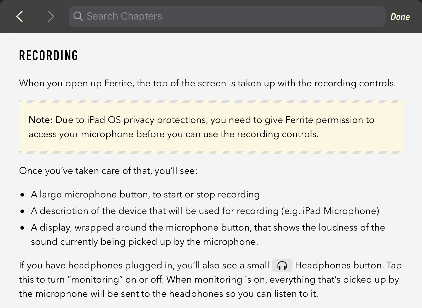
And here’s how the code for it looks:
Swift
Ferrite User Guide
Chapter(.recording)

P
{
    """
    When you open up \(.appName), the top of the screen is taken up
    with the recording controls.
    """
}

Note
{
    """
    Due to \(.platformOS) privacy protections, you need to give
    \(.appName) permission to access your microphone before you
    can use the recording controls.
    """
}

P { "Once you've taken care of that, you'll see:" }

List
{
    •"A large microphone button, to start or stop recording"

    •"""
    A description of the device that will be used for recording
    (e.g. \(.deviceExample) Microphone)
    """

    •"""
    A display, wrapped around the microphone button, that shows
    the loudness of the sound currently being picked up by
    the microphone.
    """
}

P
{
    """
    If you have headphones plugged in, you'll also see a small
    \(button: .headphones) button. Tap this to turn "monitoring"
    on or off. When monitoring is on, everything that's picked
    up by the microphone will be sent to the headphones so you
    can listen to it.
    """
)

Scope(.print)
{
    P
    {
        """
        The recording panel is slightly different depending on
        the version of iOS you are using — if you are using
        iOS 13 or later, more features are available, along with
        a more modern design.
        """
    }
}
It’s not as clear as something purely human-oriented like Markdown, but it’s way clearer than HTML — and doesn’t look too much like a bunch of program code either. It looks like some unusual-but-readable document markup. It has some familiar HTML tags, like P, and some dedicated ones, like Note (which puts the text into a “call out” box) and Scope (which only includes its contents in the context(s) listed).
But it’s all compilable directly by Swift, and turns into a data structure. There’s virtually no parsing at runtime (the text inside quotes supports some basic Markdown-style features like asterisks for bold text — that’s the only runtime-parsed part, and it’s pretty much just search-and-replace).
The vast majority is handled by the compiler while building the app, and results in a data structure that can trivially turn itself into HTML for display — whether in-app or written out to a file, so it can be cached, or uploaded to the support site.
I can also pass in flags (like .print) during rendering, to clue it in as to whether it’s running in-app or generating a document offline, what device it’s running on, and so on. And I can run other functions over the data structure — for example, the app extracts keywords for the search index, and builds the table of contents, by examining the data.
To keep this from getting too long and technical, I’ve split the technical details off into a second part.
1. (And not just because when all you have is a compiler, every problem looks like a program.) ←
Recommend
About Joyk
Aggregate valuable and interesting links.
Joyk means Joy of geeK