

7 Incredible Web Design, Branding, Digital Marketing Experiences
source link: https://www.kaushik.net/avinash/web-design-branding-digital-marketing-experiences/
Go to the source link to view the article. You can view the picture content, updated content and better typesetting reading experience. If the link is broken, please click the button below to view the snapshot at that time.
7 Incredible Web Design, Branding, Digital Marketing Experiences
 We are surrounded by incredible digital experiences. Masterful design, branding and marketing.
Yet, it would be fair to say we are also drowning in awful digital experiences – or, at the very minimum, experiences that seem to be stuck in 1991.
As a Digital Marketing Evangelist you can imagine how much that pains me.
When I work with companies, I do my very best to bring my deep and undying passion for creativity and digital awesomeness to them. One manifestation of that is the stories I tell by comparing and contrasting the client's digital existence with others I consider best of breed.
In this blog post I want to try and do something similar by sharing some of my favorite digital experiences with you. There are 7 in total.
Each example is truly amazing and for each I'll share my perspective on why. In each case there are also tips that highlight things that overtly or covertly make the company delightful.
What can you expect?
Inspiring landing pages, cool calls to action, delightful cart and checkout experiences, website copy delicious enough to eat, copy that convinces people to buy by respecting their intelligence, ecommerce reimagined, higher conversions via greater transparency, and examples of how to truly live your brand's values online through an experience that leaves your customers happy and willing to pay more for your products!
Here are the companies and stories covered in this post:
My goal with this post is that by the time you are finished reading, you'll have identified 7 specific things to work on in your digital experience (though there are 18 lessons listed here). And if at least some of you cringe when you contrast your website with the examples below, that's a plus.
Ready to see some pretty sexy-functional-cool stuff? Let's go …
Songza: Smart Homepages That Anticipate and Deliver Delight
I. Love. Songza.
I really do. It is such a cool service. The music collection is wonderful. I love the social nature of sharing playlists. The suggestions engine they have. And, I cannot stress how much I love this, the nag-free experience they deliver.
There is a lot any business — B2C, B2B, A2Z — can learn from Songza.
I want to highlight their home page … it is simple, beautiful and incredibly smart!

I'm visiting it on Saturday evening local time. The page knows that! Then it auto-magically creates five options for me of the music I could possibly want. Party options, relaxing options, entertaining cool friends or eating dinner. I press a button and – boom! – Music! Tied to one of 5 things almost all of us are likely to want to do at the moment we visit Songza.
It is not that hard to do this. They use geo/ip to work out where I am. They check if the service is available (they are not in all countries). They work out my local time. Then they match it back to their rules engine that serves me the best options. Try Songza at different times of the day. You'll be amazed at how clever they are with the music options they serve when you visit them at 0600 hrs (music for singing in the shower!) or 1345 hrs or 2200 hrs.
Songza demonstrates great use of technology, but not in an in your face look at how smart we are way. They deliver delight. I smile every time I see the home page they create for me.
Of course there is still the search box on top of the page. For the small % of times they might get day/time wrong, that text is a drop box so you can change it to what you want. At the bottom of the page they explain in three short sentences what they do. (Their wonderful slogan: Playlists by Music Experts. 100% Free. No Audio Ads.) Can you explain your value proposition in nine words? Then, they show external endorsements.
So why is it that YouTube's home page is still such a cluttered mess?
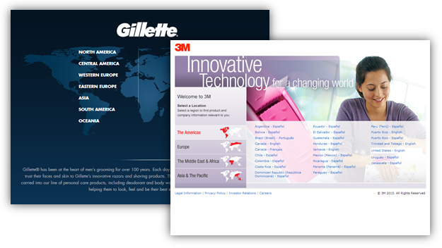
Why is it that when I visit www.3m.com or www.gillette.com they ask me to pick my country? (OMG! In 2013!)
Why is it that when I just visited news.yahoo.com, the ad says "New Rule in Texas!", and the page is exactly the same for me in California or someone in London? Why is it that www.orbitz.com uses none of my location signals to customize content on their home page to appeal to me? Why not, at least, show me "Current Deals from San Jose" (my closest airport)?
Sad, right?
There is one other thing that immensely delights me about Songza.
I was listening to my "Write Great Blog Posts" music. I noticed that I was not logged in. So no social features/recommendations available.
I prepare for the inevitable pause in music and click on Log in …

Astonishingly, there is no pause in music!
The page reloads with the log in screen and I'm able to type my username / password to now access more content / features. With, did I say this already, no interruption in my music!

I know it is such a small thing. But it matters so much from a consumer experience because it delivers a tiny jolt of delight and it makes your customers smile.
Starting with Amazon.com and right down to the smallest site in the world, when I click to log in I know everything I'm looking at, work I've already done, is going to go away. I'm taken to a new screen. After I type my info I know that they'll redirect me to the home page, regardless of where I was.
Why? Why not Songza your experience?
John Lewis: Thoughtful Cart and Checkout Experiences for Nonline Outcomes
If you've ever asked me the fastest way to improve your bottom-line of your digital experiences, it is likely that my answer was: "Reduce the cart and checkout abandonment rates."
It takes a lot to get someone to your website. It takes even more to get them to come back the 5 times it takes your average customer to hit the Add To Cart button. But if they do, take their money!
Sadly cart abandonment rates routinely run north of 65%. Abandonment rates during checkout are often even higher.
That is so sad. If someone has taken out their wallet to give you money, why not take it?
Part of the problem is that most cart experiences stink. They are full of nonsenseware – cross-sells and up-sells, all kinds of seals and logos, irrelevant other products, promotions, mobile app pimping and so much more.
Here's an awesome cart/checkout experience, from John Lewis, a UK brand I love …

The first thing you'll notice is that the cart page is uncluttered. The products you are purchasing dominate the page, right under the main site header. All other recommendations, logos, etc. are below the fold.
The cart itself has 7 different, subtle but clever, things (red numbers above).
1. Big font delivery text. No doubt about what I need to do to hit the goal. 2. The button, in a different color, is easy to find (no hunting expedition!), and does not say Start or Checkout or other boring stuff. It says Continue securely . How soothing. :) 3. Shows me again if the product is in stock. 4. In case I was thinking of abandoning, there is a nice heart logo and Add to Wish List , what a cool way to still keep the customer. 5, 6, 7. Another confidence builder: Communicates that they ship everywhere, and whether the particular product is available for each option. I was also impressed at their clever way to drive you to the store by having "Click & Collect" right there. A really nice way to do a multi-channel strategy.
Neither Macy's, Best Buy, nor PetSmart does anything close to this clever. Not just the online + offline part (though they all want multi-channel desperately), but the whole cart experience.
I also like the checkout experience….

8. The phone number is there (again in case you were thinking of abandoning). 9. This may be me but I love the truck, and subsequent art on the site. 10. They have a Help in the top nav (and tell you it will pop up :). 11. Lastly, they build confidence by showing a date and time (and in a subtle way, they push you to the store where you will surely buy other stuff!).
A really wonderful experience. Oh, and through the checkout process they refrain from nonsenseware. Just a simple, uncluttered nag-free, ads-free focused-on-checkout experience.
I can't resist, I have one more example for you. One of my favorite checkout experiences around, and it is from Ringadoc …

I like that they reiterate their value proposition again. They also make it clear they only serve California, rather than telling you after you click the Submit button!. (They say this all over their site but do so here again in case you missed it.) I really like the big boxes, big text. The entire "checkout" page is what you see above (I've reduced the size). There is nothing else on that page. Talk about nonsenseware-free!
Bonus: Ringadoc also has a great home page, in case you are looking for inspiration. They sell a very complicated product, and they do it very smartly.
Innocent: Passionate Copy and Heart-warming Visual Design
Television has its fair share of horrible commercials. But a vast majority of TV commercials, or magazine ads or even billboards, are clever/beautiful/joy-evoking. They go to great pains to create a connection with a product's brand by living their brand values in the ad (with imagery, with words, with music, with celebrities). The product/brand managers at 7 for all mankind clothes, Bertolli pasta sauce, Pepsi, Dodge Dart, etc. work very hard on every single frame or picture or second of music.
But when it comes to the web, they all seem to leave their creativity, passion, and brilliant minds at home. Try any of the sites mentioned above. They have boring images (or garish ones that say "LOOK AT ME!!!!!"). They have copy that a dead cat might have written.
Why leave your passion behind when it comes to the web?
Another example is Innocent (another UK brand!). Here's an example of what I mean by not leaving your passion, love, smarts behind when you crate your digital experience. How awesome is their page for roasted aubergine moussaka veg pot?

Then the Veg Pot itself (big image!), and underneath it the ingredients and nutritional info. Then the product description, more on this in a second. And finally (did you see the bee?) the reviews.
One nice clean and tight package that delivers everything you want as a customer, and nothing else – and all delivered with a unique brand experience.
My favorite part is the product description; take 30 seconds and read it:
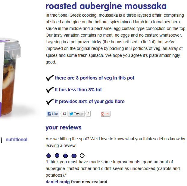
Isn't it amazing? (If you are the aubergine type.) That is mouth-watering yummy text. It is copy by someone who loves their product and can't wait to share it with you. That is selling with passion!
I love the 3 bullet points. They could have ten, but they went with the 3 that communicate the product's value proposition with the biggest impact.
Read their invitation to get you to write a review. How nice.
Then some reviews (they float by). This one with only four circles, but somehow makes the whole thing more credible.
And this is not a one-off deal. Each product description is written with the same unique blend of love, passion, smarts and good copy.
Here's the one for bombay curry:
Bombay butternut squash curry with basmati rice, yoghurt & cumin
Ah. Autumn in Bombay. Right now, the home of Bollywood, 22 million people and 102,224 rickshaws is pretty balmy. Temperatures hover around 28C, blue skies reign and spices waft along on the cool breeze. But seeing as it's more hatscarfcrispyleaf weather round here, we're hoping this aromatic curry will warm up your lunch break. We've combined tasty butternut squash, fennel spiced red peppers and fresh spinach with a delicious mix of Bombay spices and a dollop of cooling yoghurt for a healthy curry to heat you up when it's nippy out. So whack on another jumper, kick back and enjoy your Mumbai moment*.
*Bombay is more commonly known as Mumbai. It is also known as Mambai, Kakamuchee and Galajunkja for future reference/taxi directions
Mmm, hmm, good! :)
The potential impact of the copy we use on our websites is often deeply under-appreciated. Innocent has a great digital brand experience overall. But what stands out for me is the copy. It demonstrates love for their product, it sells with passion, it communicates the brand's core values.
There are a million sites you could contrast with Innocent. Let me use Ragu, the famous maker or pasta and pasta sauces.
This is their page for Old World Style Marinara sauce….
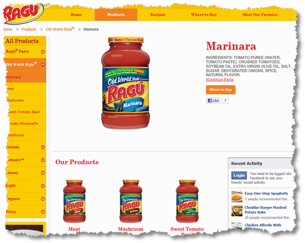
A small part of me died.
The complete copy on this page, completely bereft of any passion or love or soul, is the list of ingredients. IN ALL CAPS!
Nothing about what makes this product unique. Nothing about the brand's value or promise. Nothing about … anything. Not even nutrition facts or pictures of yummy food made with the sauce. Just the ingredients.
And this approach pervades the Ragu website. For example, check out their Meet Our Farmers page. Maybe you expect this page to showcase how cool Ragu is because it buys from small family farms or does organic farming or does not use chemicals. Or maybe you expect to see videos of farmers picking their produce or interviews to underline that Ragu is not a nameless, soulless corporate giant. Or maybe information about how Ragu farmers support local communities. Or … well, there are a million things I would do if I had a "Meet Our Farmers" page.
But if you were expecting any of those things, you'll be just as heart broken as I was. That page features 3 rolling images (which scroll by before you can finish reading or seeing the photos). Underneath are two, mostly likely stock, photos of Farmers "Chuck" and "Frank" bearing copy that is almost certainly lawyer-approved – it is bereft of any passion. Plus: No videos. No sweeping photos. No environment commitment. Nothing.
And I'm sure that like every big company, Ragu and its parent company spent millions of dollars on this website. I have zero doubt that the brand manager for Ragu and SVP of the foods division are amazingly smart people full of passion. Yet.
The web can sell product. The web can infect your potential customers with the passion you feel for your job. The web can, in a very real way, create experiences that live your brand's values. The web can really do … so much. But you have to try.
If you were looking for inspiration, look no further than Innocent. Oh, and if you want a taste of how much more awesome than above they are … just click on links titled bored?, beat january, and blog in the site header.
AAA Life Insurance : Truly Customer Centric "Convince Me To Buy" Experience
At a former employer we used to obsess about CMTB. Where's the CMTB? Wait that's not CMTB, that's just treating customers dumb? What subtle CMTB clues can we put on the page?
CMTB stood for convince me to buy. It was our short hand for persuasive content that always took the customer perspective, treated the customer with respect, and created a simple experience requiring the fewest back button presses / having to go back to Google.
This is a great story about CMTB.
I want to buy term life insurance. I only have the vaguest idea of what it is, but I know I want it. So I Google term life insurance online quote and spent most of my time with two companies. MetLife and AAA . Each website has a form you can fill.
The yellow box below is the MetLife form. It asks some basic information that is easy to type in, Female, Excellent Health, DoB, Coverage. I got tripped up on Term Length. I was not sure what the implication of my choice might be. I go back and complete the Life Insurance Calculator , but it does not cover this. Anyway. I choose 30 and hit Go.

The AAA form asks for a bit more info (height and weight) and, smartly, captures my email address. But there is nothing that trips me up. That makes me happy. I click Next.
MetLife presents me with this rather ok'ish page. The nice doggie says $377/month and asks me to Continue. There are three reiterating bullet points.
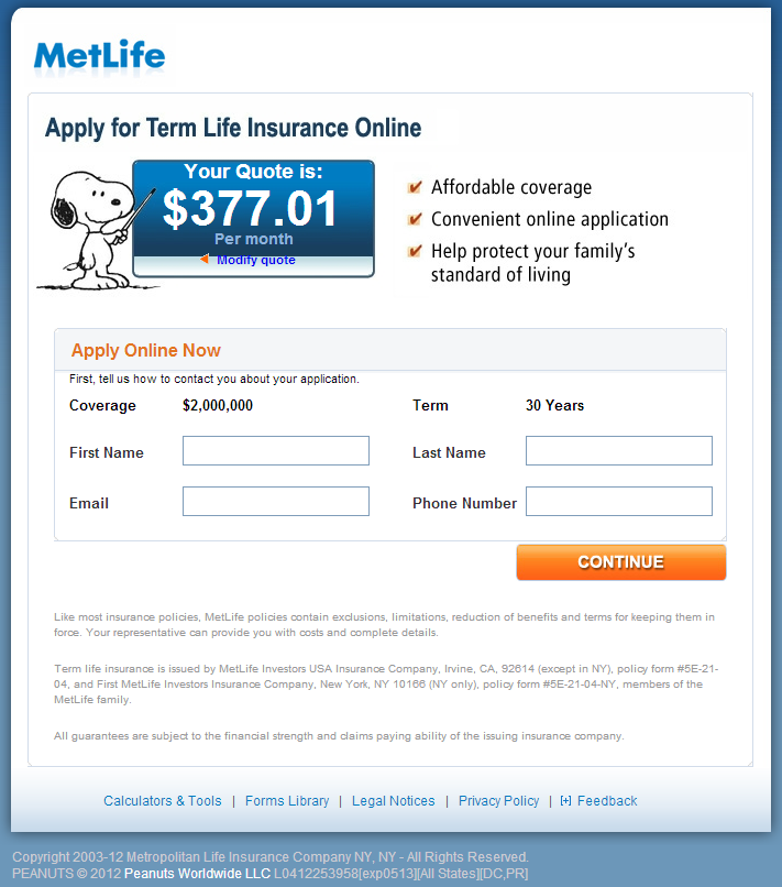
But there is very little CMTB.
And $377 seems like an insane amount of money to pay each month.
My only choice though seems to be to Modify Quote link (it looks a bit weird, but you can see it above if you try for a couple of seconds).
So I abandon.
AAA on the other hand takes me to a page that …. well … seems to be designed for humans. There is a happy family (awww). There is a bold claim: Term Life for Less. (Not: "Affordable coverage." Subtle difference in persuasiveness.)
Scroll back up. Look at the MetLife page (and that is the whole page up there). Then scroll back down and look at the AAA page. What do you think?

The AAA page also includes a handy dandy "Estimate Your Needs" calculator in case that is of value. Calculate Now! :)
But to me the pièce de résistance is the box you see in the middle. Rather than one number ($377!) I get an extremely simple-to-understand graph that is immediately soothing because it illustrates that I have a choice.
First thing to notice is that the graph tops out at $275 (I'm already saving $102 over MetLife, hurray!).
Let's look at the other delightful things about this awesome example of a CMTB page, first let's zoom into it …

1. I really like the clean title. Your Term Life Quote. MetLife has something inside the blue box, much less clearly stated. 2. There is a crystal clear path back to where I came from in case I made a mistake. 3. To ensure I made no mistakes my choices are clearly stated again. How nice is this? 4. AAA gives me lots of choice. Remember they never asked me to pick my term. They realized very cleverly that a lay person would not know what it is, and, more importantly, a lay person would not realize the implications of that choice (on rates). Now I can see what the implication of choosing 30-year term is: biggest bill. But … 5. This is a stroke of genius. Next to the text "Adjust Coverage Amount" they have a red bar I can move to figure out the if I can come up with a "happy number" for myself! Sweet!!
So what happens?
I don't abandon.
I move the bar! I try various positions, for example I adjust the coverage to $300,000 and realize that it would be extremely easy for me pay $48 per month….

Assuaged, I try other positions and end up with a 20 year term for $90/month that gives me pretty good coverage.
Then I click Next and start my application.
There are 2 major differences, IMHO, between the approaches of the companies. Actually, 3 differences:
1. AAA's visual experience is substantially better than MetLife. It is modern, easy on the eyes, and full of persuasive elements. 2. The team at AAA likely is not just a "web team," they understand what trips people up and they work to eliminate those trip wires. For example, they choose to present term options when they will make sense to prospective customers. 3. They assume intelligence at the other end (in their prospective customers). Rather than thinking "we can funnel the most if we just spit out one number," their approach is "let's create an extremely simple visual summary of choices, and put our customer in charge of figuring out what works for them."
Every large successful old school company has a tendency to try to do business online just as it has always been done offline. "Let's just get people on the phone and our sales reps will convert!" "When people walk into the office, they are very simple-minded and don't know what they want, let's do that on the web."
AAA shows that a old school company can learn new tricks, that it can assume a little bit of intelligence on the other side and deliver an experience that can convert at a higher rate, even with some data (ooohhhhh scary data!), by trusting their customers to have a big say in how much they want to pay and what tradeoffs they want to make.
I love AAA. And I do have a 30-year Term Life Insurance policy from them.
CMTB rocks!
Shopbop: (Luxury) Ecommerce and Branding Done Right!
I don't often get an opportunity to do this, but when I do I love shopping at Nordstrom. The stores are almost always beautifully done, the displays are lovingly put together, and – my favorite – the staff are informed and kind. It is on those rare occasions that I truly understand what "retail therapy" means.
Neiman Marcus is another example of a store where shopping is often fun. It is often clear that a lot of thought was put into every little thing, including the underside of tables, to encourage you to stay, explore and buy.
It is the look, the feel, the little touches that make you happily part with your cash.
Recently, I wanted to buy a dress for myself. I went through the shopping experience for a few different sites, picking the same brand BCBGMAXAZRIA.
So what do the NM and Nordstorm experiences look like?
One word: Generic.
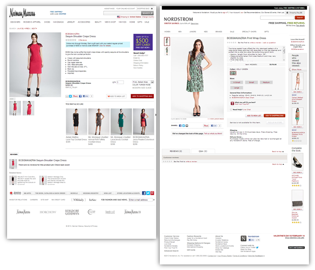
See what I mean? This blog runs WordPress. I can buy a theme for $20 that would give me exactly the same layout, look and feel as the above two "luxury" "top-tier" retailers. How lame is that? $20!!
When I visit Macy's, I do have lower expectations. I don't mind that the BCBG page there looks generic, has utterly clinical product descriptions, and contains irrelevant stuff and text ads on the page. It is ok that when I'm shopping for a $368 dress they show "Ads by Google" to Lean Cuisine (PS: I'm not fat), NextTag, UGG, and Nordstrom. (Though the tradeoff between making two cents from me via the ad click rather than $368 from the dress might be questionable.)
But with Neiman Marcus, with Nordstrom, I don't expect that. I expect that they'll have a beautiful brand experience, use fast-loading technology to do clever things, allow me to explore products, make smart recommendations. And so much more. I expect all that because they expect me to pay their prices!
After spending millions upon millions of dollars in their offline retail experience, it is incredible that their choice of online experience is to barely beat one that can be had with a 20-dollar WordPress theme.
At least the Neiman Marcus page is not 30% empty white nothingness like Nordstrom's is.
So, is it possible to replicate the incredible in-store experience on the web? In fact, can you one-up the store and do things online that you can't even do offline?
Meet the incredible luxurious, beautifully dressed-to-impress experience of Shopbop … The first thing you might notice (please do visit the site) is how focused (and beautiful, did I already say beautiful?) the experience is. Everything seems to be placed in exactly the right place with a great attention to detail. Unlike almost every other site on planet Earth, the product takes center stage on Shopbop. You see the dress, and that is all you see, until you are ready to see the other stuff.
The price is easy to see, colors easy to find and change, micro conversions cleverly tucked under the Add To Cart button.
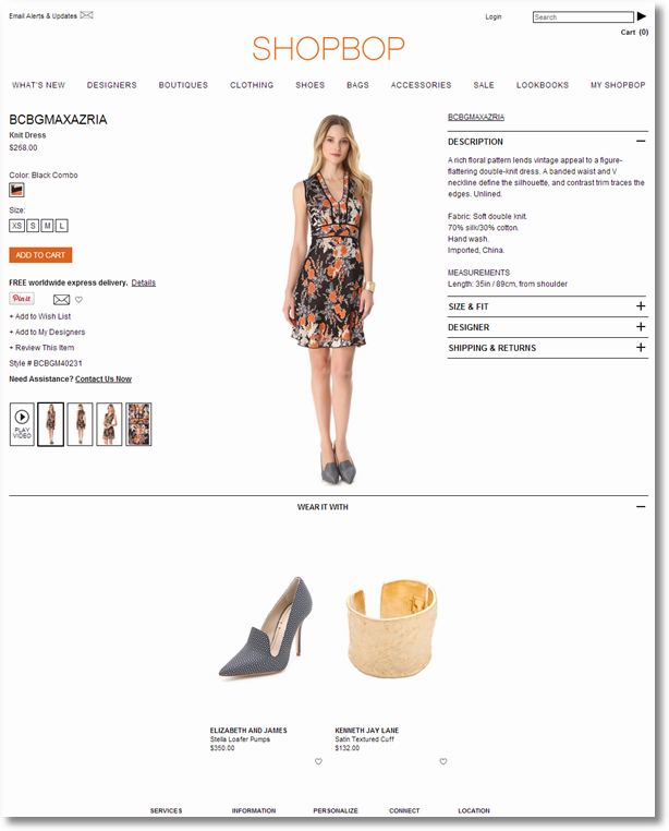
The bottom part of the page is taken up by well thought out recommendations to accessorize the dress. [Many, many retailers get greedy here and throw up completely random stuff, or nothing at all. Both are such big mistakes. Remember, you are trying to create a unique brand experience.]
Let me drill down into some of the more subtle features that make Shopbop's experience so much better than its peer set:
1. I love clean headers. Hovering over them brings up focused small sub menus (unlike sub menus with 900 items each for NM, NO). 2. I love this. When you pick your size the Size & Fit box on the right automatically opens! It shows the normal distribution of XS, S, L etc, but it also shows, how cool is this, the Model's size (S in this case), her height, bust, waist and hip size! You can't try the dress on, but this data helps you understand if it will look on you just like it does on the model. (Not in my case.) 3. The description is not clinical, it paints a picture.
4. In case you are not ready to buy (don't abandon!) you can add it to a wish list, add it to your designers, email it to your mom (and beg her to buy it for you), etc. Micro-conversions FTW! 5. I lied earlier. This is my favorite bit. If you click to play the video it does not open a new pop-up, it does not open a new frame, it does not do things you expect on all other sites. The model you see above just starts moving! She shashays right where her image is, in the white space. Nothing else changes on the screen. It's like magic. Try it on the site.
6. When you click on the model, the zoom is delightful. It takes over the entire right side and shows a detailed view just as long as the model …
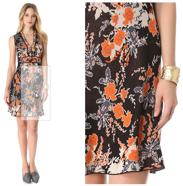
Both Nordstorm and Neiman Marcus have zooms, try them on their sites and you'll see why Shopbop's is so much better.
7. Hyper-relevant accessories to make the dress, and you, pop. The experience with the accessories is the same, big, bold, beautiful with just the information you need (right on the dress page) and nothing that you don't need…

On and did you see a subtle example of CMTB? When I picked my shoe size, I see "Only 1 left." Nice. I instantly head to the checkout. :)
Shopbop is not as big as Nordstorm or Neiman Marcus or Debenhams or other top-tier stores. It does not have the complexity or the number of products that they do. It does not have nearly as many layers of management as they all do.
But I humbly believe that none of those are reasons to have generic web experiences intended to sell non-generic products. If we don't put in the effort to create beautiful, smart, friendly, brand-enhancing, thoughtful experiences, how can we ever expect the web to deliver the kind of feeling someone gets when they walk into our stores? How can we expect to make lots of happy customers and lots of money as customers and their shopping preferences move online?
You want a premium price? How about a genuinely premium shopping experience.
Bonus: If you want another example of a great top-tier store that does digital really well, check out Barneys New York.
Security Choice: The Power of Conversion Through Transparency
This deep into the post I'm confident that you are on to my bias for white space (I love good white space, Shopbop, and don't love the wasted white space, Nordstorm) and uncluttered experiences (a common theme thus far). I have to admit, I do like sexy and nothing says sexy like uncluttered experiences where the content has lots of room to breathe.
That said, one of my most-tweeted quotes is: "Never sacrifice functionality at the alter of sexiness."
I firmly believe that.
This example will prove that I'm very comfortable with the cluttered and a little garish, as long as the experience is deeply functional.
The story is that like every other human being on the planet I worry about the safety of mi casa. At least in our neck of the woods the brand that many people know is ADT. So like every other human on the planet I go to my favorite search engine and type in "ADT Security Plans."
I was looking for two things. 1. What is the cost of, and options for, an ADT security system? 2. What will be the monthly fees?
I get a bunch of paid and organic search results.
Here's the first one…

Protectyourhome.com gives me some hints when it comes to the answer to the first question. I can see some equipment, though it is unclickable and the page does not say anything about the equipment you get for $49 (and note the weasel word: "Starting at").
I like the bonus. But there is no indication as to what the monthly cost will be, and there is no online quote option. Being wary of the phone hard sell, I just click the back button. It is easier.
I click on the next link, it takes me to Homesecurityteam.com. I scroll down the page and see the package, offer for free consultation and the happy family:
But there is no direct indication of what the monthly price will be. I'm still quite skeptical about these affiliates because I feel that they are just trying to pawn me off to ADT and collect their bounty. So I click on the back button.
(In writing this post I now see that the top nav has a link called Pricing . I'm not sure if that is for the security system or the monthly plans. I should have clicked on that to check.)
The third link is to the ADT website. Now they can acquire me (I'm pre-convinced!) by creating a great experience, reassuring me with clear pricing, and they won't even have to pay a bounty to their aggregators!
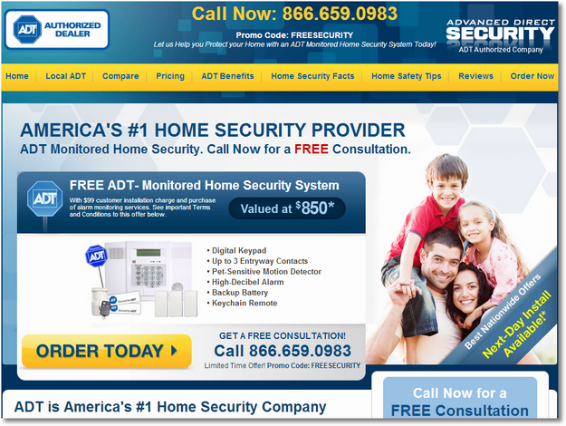
Here's the landing page…

It looks pretty. But a quick glance will show that they are offering me the worst possible deal. Not only are they not giving me the $100 Visa card like others, ADT is not telling me what the monthly price will be or what my options are for monthly security monitoring!

There is a "Low Monthly Fees" bullet, but there is little detail (weasel word alert: "about $1 a day").
And it is as if html has not been invented. My only option is to have ADT "Call Me."
I realize that ADT has always done phone sales and is comfortable with that. But in the age of digital (and at 0200 hrs when I'm searching for security), why not deliver a digital experience that expresses your value proposition in such a clear and compelling way that it can convert better than your call center?
But that is not the worst part. (Though it is all pretty awful.)
The worst part is the asterisk. Do you see it next to the $49? And five more times on the page?
I was really curious what the terms were to get $49 installation. What was included?
If you scroll and look carefully you'll find an * and a link toTerms and Conditions . If you click on it (get ready to weep) you'll see the page you see on the right.
K. M. N.
The finest American lawyers hugged the finest Direct Marketing experts and produced this horrendous baby.
It is impossible to understand. It is more complex than the International Space Program. And, worst of all, in the end all you can sadly think is: "ADT is one big scam."
Not the impression you want to have about a security company.
I can customize and buy a car online. Why can't ADT figure out how to create a digital experience that is transparent? One where I can go pick my components, choose between five plans, and send them an installation order?
IMHO there are 2, amongst others we can't guess, contributing factors. 1. ADT assumes there is zero intelligence on the other side (in its prospective customers). 2. ADT believes that its operators are best equipped to oversell me.
In the long run, both create unhappy customers.
But my experience was not entirely futile.
The last link I clicked on took me to this fantastic page from Security Choice … Take your time … Can you figure out how much the security service costs? :)

Nine dollars! The page answers the one question you want answered to get ADT into the consideration funnel. How hard was that?
It's got all the other stuff, too. But by naming the price, your mind does not go instantly on guard, like it did with all the other folks. You think, "Nine bucks, I can do that, thank you. Can you tell me more?" And you … click on the $9, and you get to a sweet comparison table of all the plans. It also happens to include textual explanations for those amongst us who want to know more (and of course delightfully will help the company's SEO strategy).
But there is more to the Security Choice landing page than just passing the all-important transparency test. There are 11 other things you should consider for your landing page optimization strategy:

1. Without a doubt my favorite element was the transparency / answering the first question I had quickly. 2. Nice CMTB "Act now and rest easy tonight!" 3. They want you to call them. Is that clear on this page? :) And when you call them the first thing they (or DirecTV or Crutchfield or any DR company) will ask for is the Promo Code. Clearly marked here. 4. Did you see, did you see? They can tell where I'm visiting them from! (3M, Gillette – boo!) Another nice CMTB.
5. This was close to my favorite: today's date and exactly how long they are open today! They know my location, my time zone, they tie it to their working hours and then create a sense for urgency for me. Nice. 6. Free system valued at $850. Need they say more? Another wonderful example of CMTB. 7. You had me at hello, but sure, I'll take a $100 card, too. 8. Telling me information I don't know ("save 20% on your homeowners insurance"), information that will push me to buy. 9. Everyone on the Internet loves speed. Does your page communicate what aspect of speed you deliver on?
10. If you are ready, a clear call to action stands out. Notice it does not say Call Us, it says Call Me. Make the conversion as easy and as painless as possible. 11. If all of the above did not already make the sale, there is additional information.
Of the tabs in 11 they should probably highlight the last one, "How Safe is Your Neighborhood." I type in 94043 and I get: 233 burglaries, 1,820 property crimes, 6 murders and more! Scary stuff, but ties clearly to what they are selling. The data is for 2008, but works like a charm in driving conversions.
ADT's business is undeniably complex, and it is difficult for someone from the outside, me, to understand it all. But if I might be so bold I would recommend that they fill out that form on Security Choice's website. The call is free and someone at Security Choice could share digital best practices with ADT. :)
Ok, question for you: Are your landing pages this good? Do they understand the singular thing the Visitor is looking for and deliver that answer in size 68 font this clearly? And do you have enough wood behind that arrow? All 11 of these incredibly persuasive elements?
No? Why not? Don't you love happy customers and big revenues?
Method: Amazing, Immersive, Love-Evoking Brand Experiences.
I've saved one of my absolute favorite sites for my last example. It is one that pulls together lots of little things that I've mentioned in this post, and does a few things above and beyond.
Rather than one page or one thing, I want to highlight the entire Method website (even though sometimes in Chrome it acts weird).
It is an amazing, immersive brand experience. Without trying very hard, you get a really great sense of the brand (and all its quirkiness). The site's visual design is beautifully consistent with that of the product, and consistent with the look and feel of the products when you bump into them at Target or other retail stores in the real world.

Amazing right?
Not just sexy, functional too.
The top nav is super clean, just three things: Shop, Clean Happy, Methodology. The color palette ensures that you see them easily.
Then if you want, a subtle second nav with product segments.
One big promo at the bottom of the page. And one giant rotating "hero" in the middle of the page that grabs your attention – as much with the beautifully photographed products as the delightful copy!
If you want to contrast how absolutely amazing Method's home page is, try comparing it with another company – (one that also spends millions upon millions on TV and other offline advertising — Lysol. Go ahead, click on that link. You'll see what I mean. Amazing, right?
With Method, beauty is not skin deep. It is very hard to make a dish washing liquid page one that people will remember visiting.
Checkout the product page for the clementine dish washing soap. Giant image (oh, I love this so much!). Beautiful copy, excerpt: "wash more dishes than you can shake a spatula at. when the plates pile up, there’s no greater relief (short of having someone else tackle them for you) than knowing you have an ample reserve of natural, ultra grease-fighting dish soap."
Clear call to action. Product reviews (integrated with Facebook). Sharing options. Two tabs with more details "what's in it" and "scents". Just reading the what's in it will improve your confidence in the brand 100x.
Another contrasting moment, with another much bigger, much richer company. Palmolive. (Small warning: The page automatically plays music!). If you choose the Original dishwashing liquid you are taken to this page. Compare it to Method's. Again, amazing difference.
If you click on any Buy Now link on any Palmolive product on the site you are unceremoniously dumped on this page.
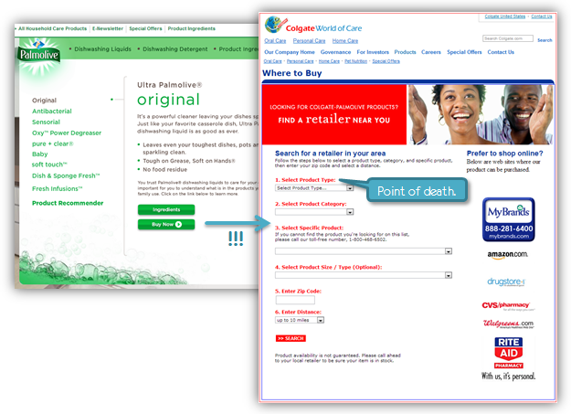
It is a website called "econsumeraffairs.com", not what you might expect: Colgate or Palmolive. The site has no Palmolive branding on it. It doesn't remember the product you want to buy (OMG!). You are supposed to be so desperate to buy Palmolive that you'll survive the shock of ending up on this page and then answer seven (7!) questions
Yes. I was speechless.
(Oh, and I died on the first Want to buy a Colgate-Palmolive product? question. It says Select Product Type. Your options: Household surface care, Fabric care, Oral care, Personal care. What category does dish washing liquid fall into?)
What another example? Check out Finish, and any product (say, Finish Gel). Incredible.
Let's get back to the happy stuff.
As in the case of Innocent earlier, I'm really delighted with the love and attention the team at Method pays to the words they use. For example, click out the site footer…

Does that not make you smile? You can say "Like us on Facebook", sounds a bit desperate. Why not say "like to be our friend?" Much better, right? Or say "lights, camera, videos" for YouTube. Why not say "greenskeeping + sustainability" instead of "Environmental responsibility" like every other site?
Some sites just try to be cute, or come across as trying too hard. But as you see the footer above, or when you experience the Method site, you don't get that sense of neediness.
I'm sure the thing you clicked on first in the footer was the humanifesto. Here is that awesome beast of a thing:

Every Brand Marketer says that their brand stands for something. Every Brand Marketer has written down the brand persona. Every Brand Marketer knows the brand attributes.
Yet you would not know that were you to visit their site. Say Bounty or Iams or Downy or Gain or Vicks.
Why don't they have a Humanifesto? Does the internet stink at branding?
Today, you as a Brand Marketer are slowly losing control of your God-given right to deliver the first impression of your brand in a controlled 30-second TV ad or via a glossy print buy in Martha Stewart Living . If people discover you digitally, what is your plan to make them fall in love with your brand?
And if they do visit your digital existence, and they are impressed enough to sign up for a longer term relationship with you (OMG, true gift from god! Not just a unmemorable one-night stand via tv, but the start of an actual direct customer connection – and many future dates!), what does that experience look like.
Does it look like this?
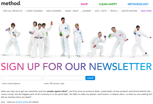
First, I bow to the coolness of that graphic. These people really want my email address! They made me smile.
Next, notice the overall branding – consistent, lovely color palette, totally on brand.
Then, checkout the CMTB. Just two boxes and Submit (clear call to action). In bold people against dirty, me! The notice the cute "psst … read our privacy policy." How often do you draw attention to your privacy policy as a way of converting your website visitors?
Oh, and above is the whole page.
To get some perspective, let's try to do it for a different company. Let's pick Febreze (again, a brand with millions upon millions in actual spend on Marketing and Branding).
If you click on their Get Newsletter link, I get shuttled to a website called Home Made Simple and this profoundly generic page (compare to above) that is asking me to Complete Your Sign Up :

Where's Febreze?
I doubt the fact that they are asking me to fill out 14 fields will escape your attention. 14. And they are asking for my date of birth! And asking me to make up a security question and remember the security answer.
For. A. Newsletter!!
How is it possible that P&G, a company with unlimited money and unlimited creativity – and, I know for a fact, some of the smartest Brand Marketers on the planet – can create something so gosh darn …. cheap, onerous and uncreative?
Digital provides every Brand Marketer an almost infinite capability to express creativity. I love that the ones at Method do such an incredible job of expressing that creativity. End result? I pay more money for soap that I suspect is no better than any other, but boy do I feel better using it.
That, ladies and gentlemen, is marketing that works! You exchange creativity, passion and love for your products for my money.
Closing Thoughts / 7 Experiences, 18 Lessons.
Above and beyond all else, it is my hope that this post provides specific guidance on what incredible web design, branding and digital marketing experiences are.
I hope that the actual examples provide concrete evidence of the awesomeness that is all around us.
I hope they inspire you to take a long hard look at your own digital existence and want to move from good to magnificent. And do remember that you have to take none of this at face value. You have free tools like Google Analytics Content Experiments (now with the power of multi-armed bandits!), and eminently affordable ones like Optimizely and Visual Website Optimizer to run experiments that will prove I'm right. Sorry, I meant so say tools that will prove to you what works best for your business. The missing ingredient is inspiration (in spades above) and your courage (I know you have tons of it).
To accelerate your experimentation I've summarized a cluster of short lessons from experiences covered in this post. They are collected in this pdf file, please click the link to download: 18 Lessons from 7 Incredible Digital Experiences.
I hope you find these lessons to be of value.
Now go, carpe diem!
As always, it is your turn now.
Which of the 7 was your favorite example? Which one was a surprise? Do you have a digital experience that you absolutely positively love like crazy? Is there a digital experience you find utterly frustrating? What was your key learning from this blog post (from our 18 lessons)? Is there something specific you are going to change about your own digital experience?
Please share your lessons, frustrations, examples, stories, inspiration via comments below.
Thank you.
Recommend
About Joyk
Aggregate valuable and interesting links.
Joyk means Joy of geeK