

Python for Finance: Dash by Plotly
source link: https://kdboller.github.io/2018/07/13/python-for-finance-plotly-dash.html
Go to the source link to view the article. You can view the picture content, updated content and better typesetting reading experience. If the link is broken, please click the button below to view the snapshot at that time.
Expanding Jupyter Notebook Stock Portfolio Analyses with Interactive Charting in Dash by Plotly.
Part 2 of Leveraging Python for Stock Portfolio Analyses.
In part 1 of this series I discussed how, since I’ve become more accustomed to using pandas, that I have signficantly increased my use of Python for financial analyses. During the part 1 post, we reviewed how to largely automate the tracking and benchmarking of a stock portfolio’s performance leveraging pandas and the Yahoo Finance API. At the end of that post you had generated a rich dataset, enabling calculations such as the relative percentage and dollar value returns for portfolio positions versus equally-sized S&P 500 positions during the same holding periods. You could also determine how much each position contributed to your overall portfolio return and, perhaps most importantly, if you would have been better off investing in an S&P 500 ETF or index fund. Finally, you used Plotly for visualizations, which made it much easier to understand which positions drove the most value, what their YTD momentum looked like relative to the S&P 500, and if any had traded down and you might want to consider divesting, aka hit a “Trailing Stop”.
I learned a lot as part of building this initial process in Jupyter notebook, and I also found it very helpful to write a post which walked through the notebook, explained the code and related my thinking behind each of the visualizations. This follow-up post will be shorter than the prior one and more direct in its purpose. While I’ve continued to find the notebook that I created helpul to track my stock portfolio, it had always been my intention to learn and incorporate a Python framework for building analytical dashboards / web applications. One of the most important use cases for me is having the ability to select specific positions and a time frame, and then dynamically evaluate the relative performances of each position. In the future, I will most likely expand this evaluation case to positions I do not own but am considering acquiring. For the rest of this year, I’m looking to further develop my understanding of building web applications by also learning Flask, deploying apps with Heroku, and ideally developing some type of a data pipeline to automate the extracting and loading of new data for the end web application. While I’m still rather early on in this process, in this post I will discuss the extension of the notebook I discussed last time with my initial development using Dash by Plotly, aka Dash.
Dash by Plotly.
If you have read or reference part 1, you will see that once you created the master dataframe, you used Plotly to generate the visualizations which evaluate portfolio performance relative to the S&P 500. Plotly is a very rich library and I prefer to create visualizations using Plotly relative to other Python visualization libraries such as Seaborn and Matplotlib. Building on this, my end goal is to have an interactive dashboard / web app for my portfolio analysis. I’m continuing to search for the optimal solution for this, and in the meantime I’ve begun exploring the use of Dash. Plotly defines Dash as a Python framework for building web applications with the added benefit that no JavaScript is required. As indicated on the landing page which I link to, it’s built on top of Plotly.js, React, and Flask.
The initial benefit that I’ve seen thus far is that, once you’re familiar and comfortable with Plotly, Dash is a natural extension into dashboard development. Rather than simply house your visualizations within the Jupyter notebook where you conduct your analysis, I definitely see value in creating a stand-alone and interactive web app. Dash provides increased interactivity and the ability to manipulate data with “modern UI elements like dropdowns, sliders and graphs”. This functionality directionally supports my ultimate goal for my stock portfolio analyses, including the ability to conduct ‘what if analyses’, as well as interactively research potential opportunities and quickly understand key drivers and scenarios. With all of this considered, the learning curve with Dash, at least for me, is not insignificant.
Jose Portilla’s “Interactive Python Dashboards with Plotly and Dash”
To short circuit the time that it would have taken for me to read through and extensively troubleshoot Dash’s documentation, I enrolled in Jose Portilla’s Plotly and Dash course on Udemy. The detail page for that course can be found here. I have taken a few of Jose’s courses and am currently taking his Flask course. I view him as a very sound and helpful instructor – while he generally does not presume extensive programming experience as prerequisites for his courses, in this Dash course he does recommend at least a strong familiarity with Python. In particular, having a solid understanding of Plotly's syntax for visualization, including using pandas, are highly recommended. After taking the course, you will still be scratching the surface in terms of what you can build with Dash. However, I found the course to be a very helpful jump start, particularly because Jose uses datareader and financial data and examples, including dynamically pulling stock price charts.
Porting Data from Jupyter Notebook to Interact with it in Dash.
Getting Started
Similar to part 1, I created another repo on GitHub with all of the files and code required to create the final Dash dashboard.
Below is a summary of what is included and how to get started:
- Investment Portfolio Python Notebook_Dash_blog_example.ipynb – this is very similar to the Jupyter notebook from part 1; the additions include the final two sections: a ‘Stock Return Comparisons’ section, which I built as a proof-of-concept prior to using
Dash, and ‘Data Outputs’, where I create csv files of the data the analyses generate; these serve as the data sources used in theDashdashboard. - Sample stocks acquisition dates_costs.xlsx – this is the toy portfolio file, which you will use or modify for your portfolio assessments.
- requirements.txt – this should have all of the libraries you will need. I recommend creating a virtual environment in Anaconda, discussed further below.
- Mock_Portfolio_Dash.py – this has the code for the
Dashdashboard which we’ll cover below.
As per my repo’s README file, I recommend creating a virtual environment using Anaconda. Here’s a quick explanation and a link to more detail on Anaconda virtual environments:
I recommend Python 3.6 or greater so that you can run the Dash dashboard locally with the provided csv files.
Here is a very thorough explanation on how to set up virtual environments in Anaconda.
Last, as mentioned in part 1, once your environment is set up, in addition to the libraries in the requirements file, if you want the Yahoo Finance datareader piece to run in the notebook, you will also need to pip install fix-yahoo-finance within your virtual environment.
Working with Dash
If you have followed along thus far in setting up a virtual environment using Python 3.6, and have installed the necessary libraries, you should be able to run the Python file with the Dash dashboard code.
For those who are less familiar: once in your virtual environment, you will need to change directory, cd, to where you have the repo’s files saved. As a quick example, if you open Anaconda Prompt and you are in your Documents folder, and the files are saved on your Desktop, you could do the following:
cd .. # This will take you up one folder in the directory.

cd  Desktop # this will take you to your Desktop.

dir # This is the windows command to display all files in the directory.  You should see the Mock_Portfolio_Dash.py file listed.

python Mock_Portfolio_Dash.py # this will run the Dash file
# You will then go to your browser and input the URL where Python says your dashboard is running on localhost.
If you would like the full explanation on the Jupyter notebook and generating the portfolio data set, please refer to part 1. At the end of the Jupyter notebook, you will see the below code in the ‘Data Outputs’ section. These minor additions will send CSV files into your local directory. The first is the full portfolio dataset, from which you can generate all of the visualizations, and the second provides the list of tickers you will use in the first, new stock chart’s dropdown selection.
# Generate the base file that will be used for Dash dashboard.

merged_portfolio_sp_latest_YTD_sp_closing_high.to_csv('analyzed_portfolio.csv')
I’ll highlight some key aspects of the Mock Portfolio Python file and share how to run the dashboard locally.
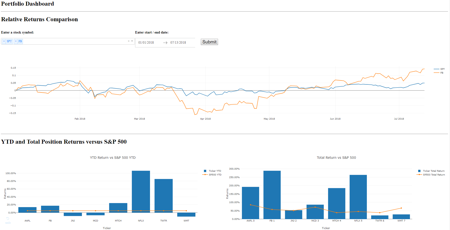
For reference while we break down the .py file, below is a screen grab of the first three charts that you should see when running this Dash dashboard.
At the beginning of the .py file, you import the libraries included in the requirements.txt file, and then write
app = dash.Dash()
in order to instantiate the Dash app. You then create two dataframe objects, tickers and data. Tickers will be used for the stock tickers in one of the chart’s dropdowns, and the data dataframe is the final data set which is used for all of the visualization evaluations.
You wrap the entire dashboard in a Div, and then begin adding the charting components within this main Div. Lines 35 - 72 in the .py file produce the ‘Relative Returns Comparison’ chart, including the stock symbol dropdown, the start/end date range, the Submit button, and the chart’s output. For brevity, I’ll break down the first of the three sections within this portion of the .py file.
html.H1('Relative Returns Comparison'),
	html.Div([html.H3('Enter a stock symbol:', style={'paddingRight': '30px'}),
		dcc.Dropdown(
			id='my_ticker_symbol',
			options = options,
			value = ['SPY'],
			multi = True
			# style={'fontSize': 24, 'width': 75}
			)

			]
As mentioned, using Dash means that you do not need to add JavaScript to your application. In the above code block, we label the output with an H1 tag, create another Div, and then make use of a dropdown from the dash_core_components library. You set the id to ‘my_ticker_symbol’, we’ll review where this comes in to play shortly, set a default value of ‘SPY’ from the options list (generated from tickers dataframe), and then set multi-select to be True. There is a bit of a learning curve here, at least for me, and this is where a course such as Jose Portilla’s can short circuit your learning by providing tangible examples which summarize Dash documentation – Jose actually uses a similar example to this stock list dropdown and date range picker in his course.
Below this, in rows 75 - 93, you’ll see the code for the bottom left chart on the dashboard. This chart is the same as what was provided in the Jupyter Notebook in part 1, but I find using Dash for all of these outputs in a dashboard layout to be a better user experience and easier to work with than within Jupyter notebook (I continue to prefer notebooks for conducting analysis to anything else I’ve used to-date).
# YTD Returns versus S&P 500 section
	html.H1('YTD and Total Position Returns versus S&P 500'),
		dcc.Graph(id='ytd1',
                        figure = {'data':[
                            go.Bar(
    						x = data['Ticker'][0:20],
    						y = data['Share YTD'][0:20],
    						name = 'Ticker YTD'),
    						go.Scatter(
							x = data['Ticker'][0:20],
							y = data['SP 500 YTD'][0:20],
							name = 'SP500 YTD')
                            ],
                        'layout':go.Layout(title='YTD Return vs S&P 500 YTD',
                            barmode='group',
                            xaxis = {'title':'Ticker'},
                            yaxis = {'title':'Returns', 'tickformat':".2%"}
                            )}, style={'width': '50%', 'display':'inline-block'}
                            )
For those comfortable using Plotly, the syntax should be familiar in terms of creating the data and layout objects required to plot the Plotly figure. This syntax included above is different than that used for the charts in the notebook, as I prefer to create traces, generate the data object based on these traces, and use the dict syntax within the layout object. In taking Jose’s course and reviewing the Dash documentation, I’ve just found it easier to conform to this syntax in Dash – it can sometimes get unwieldy when troubleshooting closing tags, parentheses, curly braces, et al, so I’ve focused on getting accustomed to this structure.
@app.callback(Output('my_graph', 'figure'),
				[Input('submit-button', 'n_clicks')],
				[State('my_ticker_symbol', 'value'),
					  State('my_date_picker', 'start_date'),
					  State('my_date_picker', 'end_date')

				])
def update_graph(n_clicks, stock_ticker, start_date, end_date):
	start = datetime.strptime(start_date[:10], '%Y-%m-%d')
	end = datetime.strptime(end_date[:10], '%Y-%m-%d')

	traces = []
	for tic in stock_ticker:
		df = web.DataReader(tic, 'iex', start, end)
		traces.append({'x':df.index, 'y':(df['close']/df['close'].iloc[0])-1, 'name': tic})

	fig = {
		'data': traces,
		'layout': {'title':stock_ticker}
	}
	return fig

if __name__ == '__main__':
    app.run_server()
Lines 229 - 252 (provided above) drive the interactivity for the first ‘Relative Returns Comparison’ chart. Below is a quick overview of what this code is doing:
- In order to create interactive charts,
Dashuses a callback decorator: “The “inputs” and “outputs” of our application interface are described declaratively through theapp.callbackdecorator.” - In the app callback, we output the dcc.Graph specified earlier with an id of ‘my_graph’.
- You use the Submit button as the input, and we have three default states, ‘my_ticker_symbol’ with the default ‘SPY’ value declared in the dcc.Dropdown discussed earlier, as well as a default start date of 1/1/2018 and end date of today.
- Below the callback is the function the callback decorator wraps. As described in
Dashdocumentation, when an input property changes, the function the decorator wraps is called automatically. “Dash provides the function with the new value of the input property as an input argument and Dash updates the property of the output component with whatever was returned by the function.” - Within the for loop, for the y-values I divide the closing price on any given day,
df['close'], by the first closing price in the series generated by the date range provided (df['close'].iloc[0]). - I do this to look at the relative performance of two or more stocks indexed at 0, the start of the date range. Given the large differences in share price, this makes it much easier to compare the relative performance of a stock trading over $1,800 (e.g., AMZN) versus another trading below $100 (e.g., WMT).
- I’d quickly mention that there is sometimes a misconception that a stock is “cheap” if it trades at a lower price and “expensive” if it trades where AMZN currently does. Given this misconception, companies will sometimes split their stock in order to make the share price appear more affordable to small investors even though the company’s value / market cap remain the same.
- Regardless, the benefit of this chart is that it allows you to quickly spot over / under-performance of a stock relative to the S&P 500 using dynamic date ranges. This provides useful information regarding value contribution to your overall portfolio, and also when it might be time to consider divesting an under-performing holding.
Conclusion and Future considerations.
This concludes my initial review of Dash for stock portfolio analyses. As before, you have an extensible Jupyter notebook and portfolio dataset, which you can now read out as a csv file and review in an interactive Dash dashboard. As discussed before in Part 1, this approach continues to have some areas for improvement, including the need to incorporate dividends as part of total shareholder return and the need to be able to evaluate both active and all (including divested) positions.
The most significant benefits I’ve found with this approach include the additional interactivity, and my preference for the dashboard layout of all of the charts versus in separate cells in Jupyter notebook. In the future, I’m planning to incorporate greater interactivity, including more ‘what-if-analyses’ to assess individual stock’s contribution to overall performance.
The additional options that I’m currently considering to deliver an end-to-end web application with a data pipeline include:
- Mode Analytics with Google BigQuery: I’ve written before about how much I enjoyed using Mode Analytics at my former company. The benefits of Mode include the fact that it already supports rich visualizations (no coding required), including a built in Python notebook. However, I do not believe there’s a way to extract data from a finance API, including Yahoo Finance and IEX. The data from those sources could be read in to a private database, e.g., using Google BigQuery, which you could connect to Mode. However, for now this seems like a limitation as I believe more of my future charts and use cases will require data pulled from APIs (as opposed to stored in a database).
- Heroku with Postgres and Pipeline: As part of Jose’s course, he shows you how to deploy a
Dashapp toHeroku(another benefit of his course). As of now, I believe that leveraging Heroku’s app functionality is a potential long-term solution. This is another reason why I’m taking Jose’sFlaskcourse; I’ve never built a web app, and he shows how to use SQLAlchemy as the database for the Flask app. Furthering my understanding of deploying an app with a database on Heroku, my focus will be determining the best way to pull in finance-API data to be analyzed within an interactive web app which I can refresh with new data on a specified schedule..
The long-term solution requires a lot more learning for me, but it’s definitely a challenge that I want to take on the rest of this year. I hope that you found this post useful, and I welcome any feedback in the comments, including additional options which I have not mentioned and you believe would be better suited for this application and its analyses.
If you enjoyed this post, it would be awesome if you would click the “claps” icon to let me know and to help increase circulation of my work.
Feel free to also reach out to me on twitter, @kevinboller, and my personal blog can be found here. Thanks for reading!
Recommend
About Joyk
Aggregate valuable and interesting links.
Joyk means Joy of geeK