

Flutter 1.22版本新增的Button
source link: http://www.cnblogs.com/mengqd/p/13922838.html
Go to the source link to view the article. You can view the picture content, updated content and better typesetting reading experience. If the link is broken, please click the button below to view the snapshot at that time.

Flutter 1.22版本新增了3个按钮, TextButton、OutlinedButton、ElevatedButton ,虽然以前的 Button 没有被废弃,但还是建议使用新的 Button 。
为什么会新增 Button ?因为想要将以前的按钮调整为统一的外观比较麻烦,因此以前经常使用自定义的按钮,而新增的按钮解决了此类问题,可以非常方便的设置整体外观。
1.22版本前的按钮 主题 1.22版本后的按钮 主题 FlatButton ButtonTheme TextButton TextButtonTheme OutlineButton ButtonTheme OutlinedButton OutlinedButtonTheme RaisedButton ButtonTheme ElevatedButton ElevatedButtonTheme样式对比:
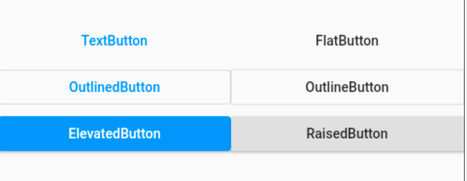
外观上并没有很大的不同,但TextButton、OutlinedButton、ElevatedButton 将外观属性集合为一个 ButtonStyle ,非常方便统一控制。
TextButton、OutlinedButton、ElevatedButton 这3个按钮的用法和属性完全相同,下面以 TextButton 为例。
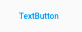
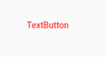
简单使用:
TextButton(
  child: Text('TextButton'),
)
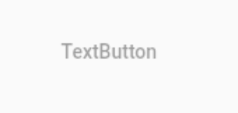
当 onPressed 不设置或者设置为 null 时,按钮为不可用状态。
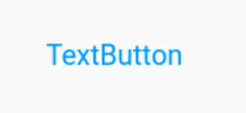
TextButton(
  child: Text('TextButton'),
  onPressed: (){},
)
onPressed为点击回调, onLongPress 为长按回调。
下面是最重要的属性 ButtonStyle ,一切外观都是通过这个属性进行控制,属性如下:
const ButtonStyle({
  this.textStyle, //字体
  this.backgroundColor, //背景色
  this.foregroundColor, //前景色
  this.overlayColor, // 高亮色,按钮处于focused, hovered, or pressed时的颜色
  this.shadowColor, // 阴影颜色
  this.elevation, // 阴影值
  this.padding, // padding
  this.minimumSize, //最小尺寸
  this.side, //边框
  this.shape, //形状
  this.mouseCursor, //鼠标指针的光标进入或悬停在此按钮的[InkWell]上时。
  this.visualDensity, // 按钮布局的紧凑程度
  this.tapTargetSize, // 响应触摸的区域
  this.animationDuration, //[shape]和[elevation]的动画更改的持续时间。
  this.enableFeedback, // 检测到的手势是否应提供声音和/或触觉反馈。例如,在Android上,点击会产生咔哒声,启用反馈后,长按会产生短暂的振动。通常,组件默认值为true。
});
这些属性的用法也和以前的不一样,比如 textStyle 并不是直接设置 TextStyle,下面设置字体:
TextButton(
  child: Text('TextButton'),
  onPressed: () {},
  style: ButtonStyle(
    textStyle: MaterialStateProperty.all(TextStyle(fontSize: 20)),
  ),
)
注意:字体颜色的设置不通过 textStyle 设置,而是通过 foregroundColor :
TextButton(
  child: Text('TextButton'),
  onPressed: () {},
  style: ButtonStyle(
    foregroundColor: MaterialStateProperty.all(Colors.red),
  ),
)
根据按钮的状态改变字体颜色:
TextButton(
                    child: Text('TextButton'),
                    onPressed: () {},
                    style: ButtonStyle(
                      foregroundColor:
                          MaterialStateProperty.resolveWith((states) {
                        return states.contains(MaterialState.pressed)
                            ? Colors.blue
                            : Colors.red;
                      }),
                    ),
                  )
其他属性用法和上面类似,不在一一介绍。
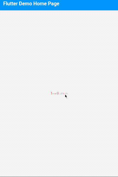
进行全局控制:
MaterialApp(
  title: 'Flutter Demo',
  theme: ThemeData(
    textButtonTheme: TextButtonThemeData(
      style: ButtonStyle()
    ),
    elevatedButtonTheme: ElevatedButtonThemeData(
        style: ButtonStyle()
    ),
    outlinedButtonTheme: OutlinedButtonThemeData(
        style: ButtonStyle()
    )
  ),
  home: MyHomePage(title: 'Flutter Demo Home Page'),
)
ButtonStyle内的属性配置和单个按钮的用法是一致的。
通过上面的介绍,建议使用 TextButton、OutlinedButton、ElevatedButton 替换 FlatButton、OutlineButton、RaisedButton 。
交流
老孟Flutter博客(330个控件用法+实战入门系列文章): http://laomengit.com
欢迎加入Flutter交流群(微信:laomengit)、关注公众号【老孟Flutter】:


Recommend
About Joyk
Aggregate valuable and interesting links.
Joyk means Joy of geeK