

Google app tests a darker shade of gray, shows a few signs of AMOLED black
source link: https://www.androidpolice.com/2020/01/29/google-app-tests-a-darker-shade-of-grey-shows-a-few-signs-of-amoled-black/
Go to the source link to view the article. You can view the picture content, updated content and better typesetting reading experience. If the link is broken, please click the button below to view the snapshot at that time.
Google app tests a darker shade of gray, shows a few signs of AMOLED black

This post is dedicated to some of our Android Police readers and the most passionate commenters who have repeatedly argued that dark gray doesn't count as a proper dark mode and that absolute black is the only AMOLED-friendly color that matters. I won't dare discuss this further — I once tried, it was futile. Anyway, just for you, AMOLED lovers, the Google app is now testing a darker shade of gray across the app header, though sadly it still counts as gray and not black. However, if you look closely, you'll notice some full black elements have started popping up in the Google app.
The new darker header can be spotted most prominently in search results. In the screenshots below, you can see that the background header behind the Google logo as well as the filler in the search bar are both darker shades of gray. As a matter of fact, the search bar is now around the same darkness as what the header was, and the header is even darker than that. The color behind the search results is also a little darker, but you'll need a color picker tool to notice that.

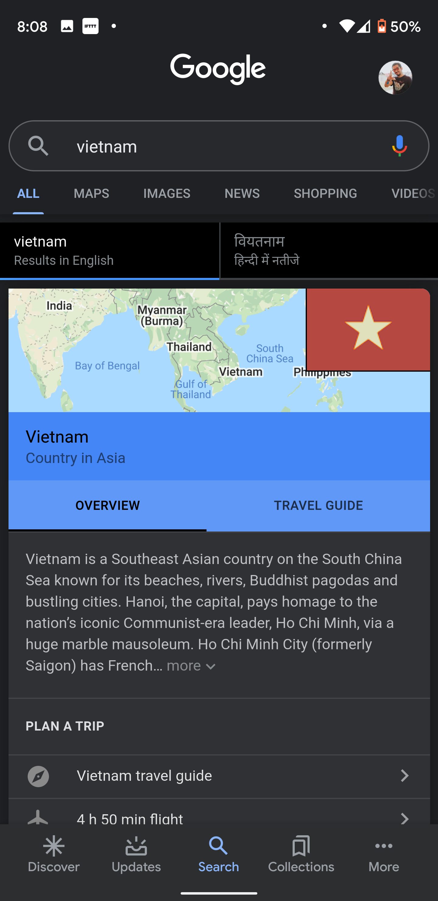
Left: Dark. Right: Darker.
Most of the other elements remain unchanged: the search results, bottom five tabs, and even standalone screens like Collections, More, Settings, the account picker pop-up, search widget, and so on remain the same as they were. If Google is considering darkening the whole app, these should follow soon for consistency's sake.
The only place where you might see this more than in regular searches is if you switch to the Shopping tab or if you look for Sports. The former shows this darker shade more prominently, while the latter has actually switched to the full black theme. Yes, you get honest to God #000000 cards. If you ask me, they don't look that good with the rest of the dark gray app. While full black wouldn't be my first choice, I'd prefer it over the mishmash of shades we have right now when looking at sports results.
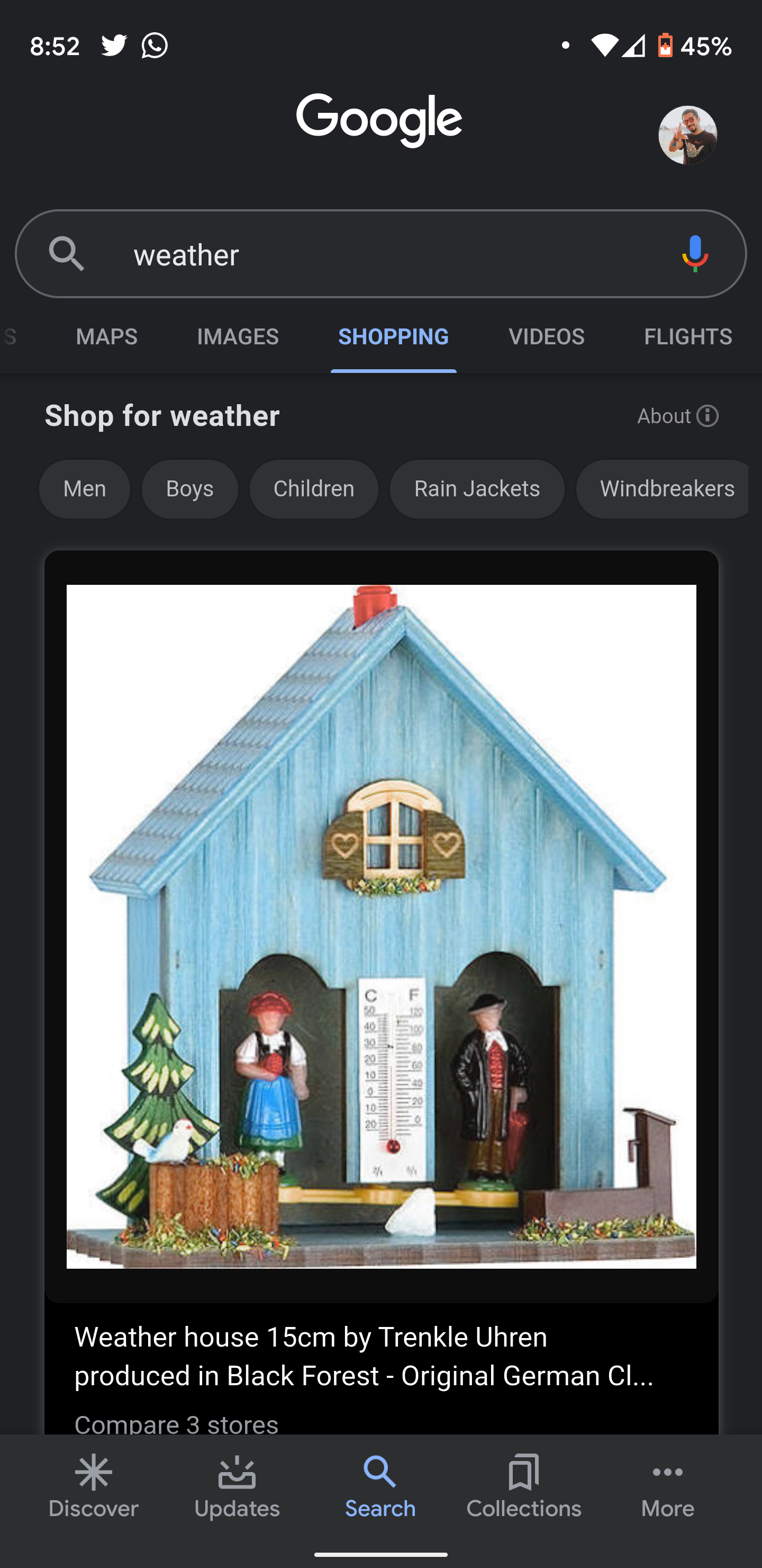


Left: Shopping results show a bit more darkness. Middle & Right: Sports have full black cards now.
These changes are available via a server-side switch in the Google app. Despite being on the latest beta v10.94.8 (APK Mirror), many of us have the black Sports cards in dark mode, but don't have the new darker backgrounds in search results. Try your luck and keep your eyes open for more darker elements with time... maybe.
- Thanks:
- Samarth Verma,
- Anthony Maki,
- Armando
Recommend
About Joyk
Aggregate valuable and interesting links.
Joyk means Joy of geeK