

13 Top React Component Libraries for 2020
source link: https://blog.bitsrc.io/13-top-react-component-libraries-for-2020-488cc810ca49
Go to the source link to view the article. You can view the picture content, updated content and better typesetting reading experience. If the link is broken, please click the button below to view the snapshot at that time.
React UI libraries you should know in 2020

Dec 23 ·13min read

0. Building Your Own Library
If you’re thinking of sharing your own UI components but don’t feel like wasting a tremendous amount of time configuring and maintaining a component library, try using Bit ( Github ) instead.
Bit lets you export reusable components as independent Lego pieces, from any project you choose.
Components are organized into shared collections in bit.dev where they can be viewed in Bit’s playground, installed using NPM/Yarn or imported using Bit (imported components can be modified and pushed back to their shared collection).
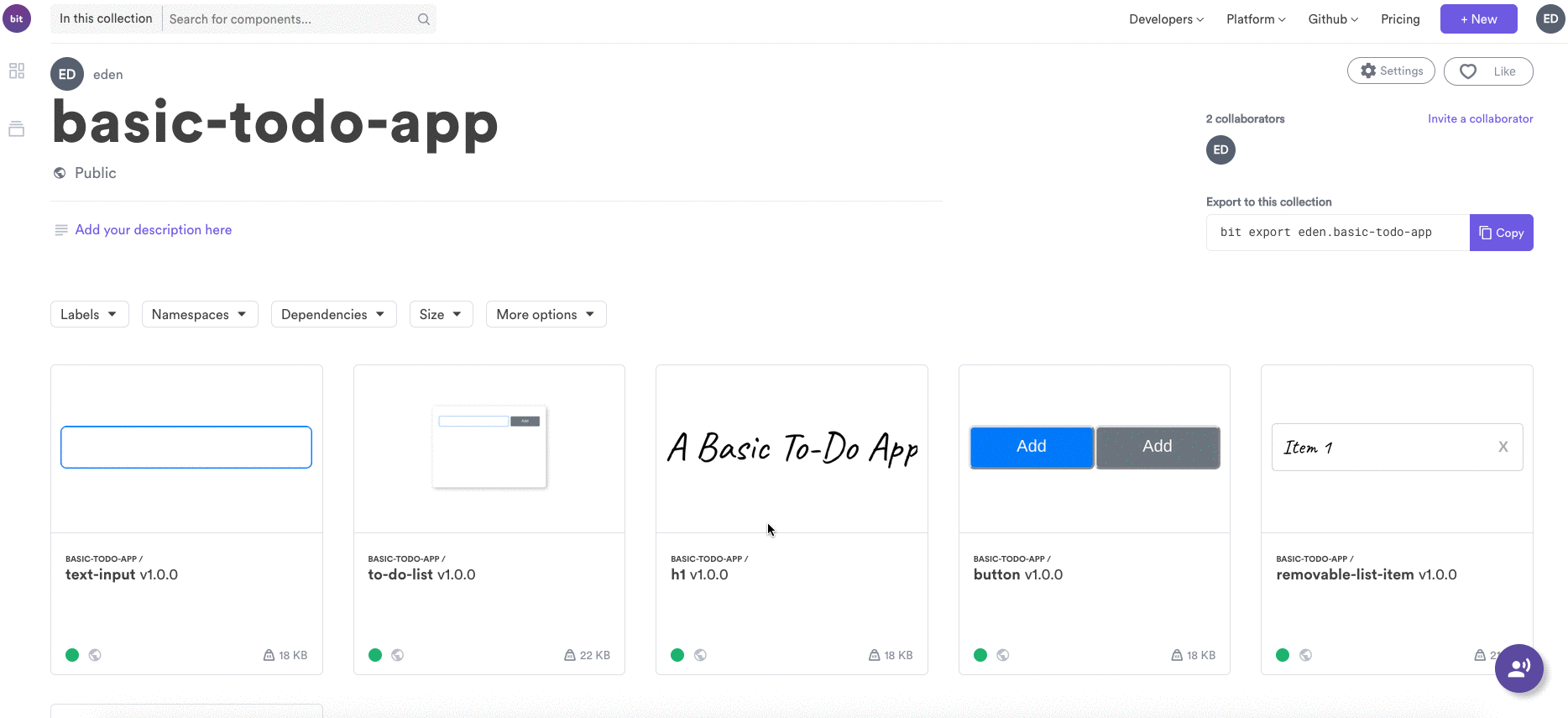
Example
Here’s a short example, using a simple to-do app :

git clone https://github.com/giteden/basic-todo-app.git
Let’s say I want to export my app’s components to a shared collection (library)
Initialize a workspace and log in:
$ cd basic-todo-app
$ bit init
$ bit login
Add (all) components:
$ bit add src/components/*
Configure a React compiler (components are built independent of your project’s build configurations) :
$ bit import bit.envs/compilers/react --compiler
Tag and export to a shared collection (create your own collection in bit.dev):
$ bit tag --all 1.0.0
$ bit export username.collection
Voilà! My app’s components are now available in my shared library :
1. Rebass
The first one I’m going to be covering, is Rebass , a tiny UI components library capable of creating a very powerful set of themeable UI elements based on the Styled System library.

Some of the key features of this library are:
- It provides a very simple start, there is no need to write a lot of boilerplate code, you just import it and start extendinng the primitive components and create the ones you need.
- Thanks to the fact that it’s based on Styled System props, it provides an amazing developer experience (or DX, as I like to call it).
- Once you start getting used to the workflow and syntax, you can start implementing themes, providing an amazing level of customization and extensibility to your application. The best part? The themming system is fully compatible with Theme UI, which is another way of saying: it’s built on top of a very solid library that was designed to provide themming to your react apps.
- Designed with mobile-first in mind, it provides a very up-to-date design philosophy right out-of-the-box.
- Flexbox layout with the Box and Flex components as primitive components for you to extend.
- Minimal footprint. Remember I said it was a tiny library? Well, it sits at about 4KB, what more can you ask of that?
And as if you needed further verification of the viability of this components library, it has over 6k stars on GitHub and over 30k weekly downloads on NPM .
2. Ant-design components
In contrast to Rebass, which was a very basic and minimalistic set of extensible components, Ant-design components provides a fully fledged list of over 50 customizable components that you can use to create a beautifully crafted application.

But the catch here is that on top of that, these components were all crafted based on a design language developed by the creators of this library (which by the way, it’s just one of the many forms their design philophy takes, you can find it also as a set of Axure files or even an Angular and Vue-based versions as well).
I encourage you to go and review their Design Language philosophy which essentially explains their thinking behind every aspect of the the components. It’s very detailed and explains the why behind every design choice (i.e spacing between components, text alignment on user input and so on).
To top it all out, this set of components has over 53k stars in GitHub and over 6k weekly downloads of their NPM version (which might or might not be out of date, so stick to downloading it directly from GitHub if you can).
3. React bootstrap
Remember the good old bootstrap library? It was actually a mix of CSS and JS files, which allowed you to easily add pre-styled and pre-programmed UI components.
What better match, then, than bootstap and react? This particular library takes care of bridging the gap between the old and the new ways by bringing the power of React to an already powerful library.

Everything you could do with Bootstrap you can do it with this alternative, the only difference, is that you’ll be following the React components pattern.
If you were a user, just a fan of the original or you’re looking to quickly improve your CSS / JavaScript skills; then you’ll want to double check this alternative. At the time of this writing, the original bootstrap’s version is 4.4 and React Bootstrap is reporting to be using version 4.3, so they’re no that far behind.
Finally, the popularity contest: React Bootstrap’s GitHub project thas over 16.7k stars and is being downloaded from NPM over 470k times every week. (yeap, it’s quite popular!)
4. Material UI
The folks from Ant-design created their own design language and implemented their react components based on it. Google on their own side, created their own design language called Material Design, which is based on cards, grid-based layouts and responsive animations.

In turn, the Material-UI library implements Google’s design language in a way that you can make use of it on your react-based projects.
The quality and length of the documentation created for this library is also something that should be noted. After all, you need to understand how to use it, and the more features it packs, the more problems you’ll run into, so having a very extensive and well thought out documentation is very important.
Finally, another very big selling point, is that instead of just giving you the tools to create your own site, they offer you a list of themes you can chose from. This comes in handy specially if you’re on the design-challenged side of front-end development. Mind you, some of the best ones are not free, but there is nothing stopping you from grabbing a free one and extending it to get the right look & feel you’re after. So take a look!
With all that being said, it’s no wonder why this project has over 52k stars on GitHub and over 800k downloads per week on NPM . If you’re looking for a complete react-compatible theme for your website ,think about this option and test it out before you make up your mind.
5. React Spinner
Have you heard the phrase “sometimes, less is more” ? This is the perfect example of that. React Spinner , unlike the previous options I’ve covered, isn’t interested in the overall look of your application, or how is the internal architecture designed. Instead, it cares about one thing and one thing alone: loading spinners (or loading indicators).

This might not be one of the most popular projects out there, but it’s definitely one that packs as punch. If you’re looking to add a way for your users to understand something’s happening, this library provides you with over 20 react-compatible loading indicators.
Considering this library gets around 69k downloads every week from NPM and over 1k stars in GitHub , I think it’s safe to assume it not only is useful, but also that the community itself is actively using it.
6. Semantic UI React
Semantic UI is a jQuery-based library, which adds extra functionality to your pipeline. Think bootstrap but with focus on the semantics of UI development.
The problem with it, is that it’s not 100% react-compatible and here is where Semantic UI React comes into play.

This library comes with a huge list of pre-built components designed specifically to make sense and produce a semantically-friendly code. The original version worked based on using HTML + CSS and a bit of JavaScript, you’d define your HTML elements, assign specific pre-built CSS classes and then call the right JavaScript function.
Now, thanks to the added compatibility with React, you’ll use JSX code, to directly define the components and bind it with its React Component code. I other words, you don’t need to worry about correctly selecting the right element and adding the code, the reactive approach simplifies that considerably.
This particular library has over 10.6k stars on GitHub and is being downloaded over 100k times every week from NPM .
7. Grommet
Grommet is yet another component library intended to help you in the task of creating your own websites simpliy by mixing and matching parts. That being said, this one has a strong focus on accesibility (by providing features such as keyword navigation, screen reader tags and so on), responsiveness and theming.

And if you´re not designed-inclined, which some developers aren’t (me being one of those for example) they even provide you with a design kit and a complete icon set .
The design kit comes in different flavors such as Sketch for MacOS (seen in the screenshot below), Adobe XD and more.

Finally, the icon set can be seen in full on their site, but the image below shows how easy it is to install them into your project and add them to your code.

The library has over 5.6k stars on GitHub and while the NPM downloads don’t compare with some of the previous ones, it is being downloaded over 16k times a week.
8. Gestalt
And to continue with the list of component libraries, Gestalt was developer by Pinterest and follows their internal design lenguage. Just like Material UI and Ant-Design follow other design languages, Gestalt was created to help streamline communication between designers and developers by enforcing a whole lot of pre-defined components.

Mind you, they’re not particularily pretty, I mean, have you seen the UI of Pinterest? But if you’re working on a prototype or want a way to easily get your devs and designers in-line, this is a very good option.
In GitHub, the library has over 3.3k stars but is not that popular on the NPM community with barely 800 downloads a week.
9. Fabric React
Yet, another library built by one of the big players, this time it comes from Microsoft. That’s right, Fabric React can help you build Office-like user experiences. Which doesn’t mean you’re copying Office, mind you, but you gain access to similar behavior and graphics.
Look at the combobox shown below:

Fabric React provides compatibility with Desktop, Android and iOS devices and it’s used by sites such as Office 365, OneNote, Azure DevOps and others.
Again, when it comes to react component libraries, going with the ones that actually follow a design language (such as this one, which follows Microsoft’s Office Design Language) makes a lot more sense, since there should be a strong design logic behin them. So, if you’re after creating a web app with office-like UI, consider taking a look at this one.
As for popularity, Fabric React is not high up with the “cool kids”, but it’s doing alright with over 6.2k stars on GitHub and 77k downloads per week from NPM .
10. OnsenUI
Onsen is a components library with Mobile-first design in mind. The catch here is that it was written in pure JavaScript and has no big framework dependencies. In other words, it’s not stricly a React-based library, you can potentially use it with any of the major UI frameworks out there.

Ofcourse, why would I be mentioning this here if it didn’t have any React bindings? I wouldn’t, really, so yes, there are react bindings you can use to simplify the integration of Onsen into your React projects.
If you’re after a mobile-first application, consider going with Onsen UI, it will give you the ability to create robust UI experiences, with minimum effort and out-of-the-box compatibility with the major platforms.
Unlike our previous examples though, although this library has a decent following on GitHub with over 7.8k, NPM is a very different story with just over 12k downloads per week.
11. React Virtualized
Much like the React Spinner project, React Virtualized is meant to solve a single problem: efficiently rendering lists and tabular data in your pages. I know what you’re thinking: how hard can it be to render a table? Or a simple dropdown list? But what happens when your dropdown has over 1k elements, or when you’re trying to render 100 columns on a single table?
Those edge cases and others are the ones this particular project is attempting to tackle.

Their website has a very simple, yet powerful demo you can play around with and understand the power this library brings to the mix. Change the numbers around and add copious amount of elements to your lists and see how easy it can adapt. Then think about how much code you’d have to write to make your own lists as flexible and then download React Virtualized.
The project has over 17.5k stars on GitHub and it’s downloaded around 460k times every week from NPM . So yeah, take a look at it.
12. Blueprint
Remember when I said OnsenUI was a mobile-first components library? Well, Blueprint is definitely NOT the same. They say so right on their website, this project is focused on developing data intensive desktop applications that run on modern browsers (including, for some reason IE11).

With this library you have access to components such as DateTime pickers, different types of dropdowns (including ones with auto-suggest while you type), highly interactive tables (here is where the data-intensive part comes into play) and a host of over 300 icons for all your graphic needs.
This library was built by the team at Palantir, company that focuses on creating ways for users to easily interact with and browse through data, which explains why Blueprint is meant for such applications.
Keep that in mind if you’re building something that needs to deal with a lot of data, you might benefit from using something like React Virtualized if you’re just trying to show the data but if you need a bit more, then consider taking a good look at Blueprint.
On GitHub , this project has over 15k strars, so it’s actually very popular and every week it’s downloaded over 100k times from NPM .
13. React Desktop
Finally, to close the review of these 13 react component libraries for 2020, I want to tell you about React Desktop . This project is unique in this list because it’s the only one that tries to mimick the desktop experience for the web.
Take a look at the following screenshots to understand what I mean by that.
Recommend
About Joyk
Aggregate valuable and interesting links.
Joyk means Joy of geeK